Ah, postcards. The travel microblogs of yore. For decades they were the preferred (if not only) method for sending updates and short messages from near and far to friends and family. If you ever find yourself bored in an antique store, head over to the postcard section (usually stuffed in a shoebox) and spend some time reading the messages scribbled on them. My favorite message to date was sent from Lutsen, MN and read, simply, “At last I have found a slot machine. I shall postpone my return.”
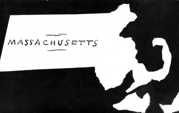
The messages on the backs of old postcards vary wildly. And thankfully for us, so do the images on their fronts. Here, I’ve compiled a small collection of Massachusetts map postcards. You will notice that the only thing that ties many of these postcards together thematically is that they depict space. The way space is being represented (or, er, distorted) depends on the purpose of the card. Above is what is called a real photo postcard. Technically, postcards of this kind still exist (as long as it is a postcard made from a real photo, right?). But in the eyes of a collector, this type of card is generally from 1890s – 1930s. The scratched out negative map of Massachusetts above, which I found on eBay, represents the only real photo map postcard I have ever seen. It’s not a bad likeness either, if you ask me.
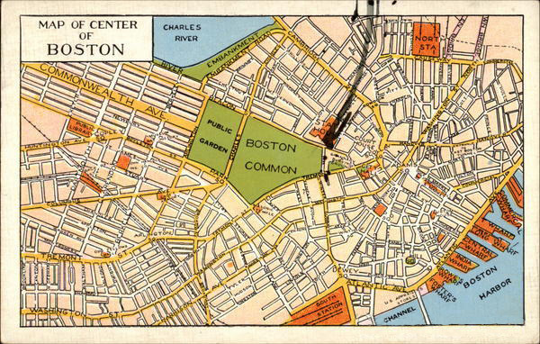
The most straight-up map postcard you will see would be something like this “Map of Center of Boston.” It is basically a reference map for walking, or possibly even driving. Postcards of this type were reasonably commonplace (especially when branded for promotional purposes) throughout the 20th century. But I wonder when people were supposed to use this map of the “center” of Boston. Perhaps it was meant to be employed as a reference until no longer needed, and then sent. Or, it could have been sent ahead to a future tourist who would be visiting the city soon. Upon his visit, that tourist would likely then encounter a number of other postcard maps designed specifically for him (e.g., he would probably run into postcards of historic subject matter such as Paul Revere’s Ride and The Freedom Trail).
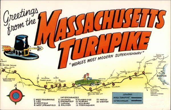
Here’s another kind of postcard map. This one promotes the Massachusetts Turnpike as the “World’s Most Modern Superhighway.” Ha. I must say, I like a few things about this postcard. First, you have to love any design that is adorned with a battle-torn, anachronistically buckled pilgrim hat. I mean, didn’t we all learn that Pilgrims didn’t wear buckled hats on our 2nd-grade field trips to Plymouth Rock? Second, the card implies that the greetings are coming directly from the highway (written whilst driving, in fact). So I have to ask: Who wants to be greeted from a highway? Perhaps that is also a thing of yore. Finally, as an extension of my second point, another question: Who likes a highway enough to buy a postcard of it? I mean, I know that turnpikes were new and hip and everyplace likes to tout their transportation infrastructure as supreme, but… um… I’d rather get a postcard of the Union Oyster House or something.
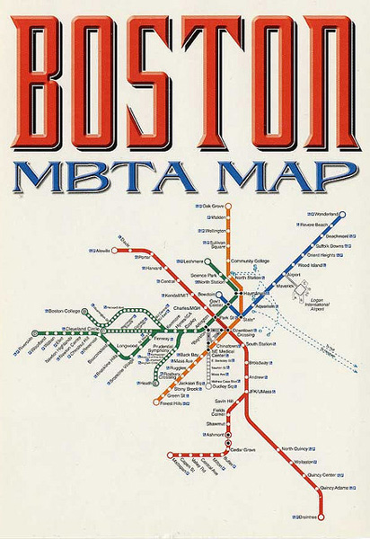
Speaking of transportation infrastructure, here is a postcard of the Boston T system (another gem from Cartophilia). Andy and I have had quite a lot of back-and-forth about the date of this map. Tricked by typographic design (and subtle yellowing), we both initially assumed it was from the 60s or 70s. But after a bit of research, Andy believes it is likely from the last 10 years (N.B. look forward to a future post on the changing style of Boston T maps over the years). This, like the map of downtown Boston, could be used as a reference for T riders, but the degree to which the design is reminiscent of Harry Beck’s famous London Underground map leads me to believe that it was likely sold equally as an art postcard.
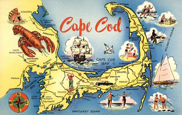
With this card, we move on from postcards with potential artistic appeal to those with indistinct artistic appeal. Here we have a fairly common type of map postcard. I might call this an “arbitrarily proportional symbol” tourist map, where the variable is “fun.” Because, let’s face it, what’s more fun than lobster? Sailboats, waterskiing and compass-rosing appear to be reasonably fun. But it’s fairly clear that tall-shipping is the second-most-fun thing to do on the Cape. Cartoon-style and automobile-themed postcard maps of the Cape were fashionable throughout the 20th century.
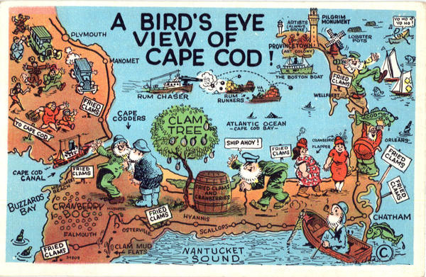 According to this map postcard, fried clams are notably more fun than lobster. This card comes from an era when lampooning was the norm (exaggeration was also the norm, as in this postcard of a Maine potato). While most of the postcards we see on the racks these days are picturesque aerial views or scenic shots of monumental architecture, this card comes from an era when making things look significantly worse than reality somehow attracted tourists. (N.B. P-town as an “Art Colony” inhabited by “always broke” artists).
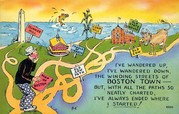
I would also file this postcard under “things portrayed worse than reality.” This style of postcard with bright yellows and oranges, saturated greens, rosy faces and grossly caricatured animals (like the cow and fish here) was common from the 1930s-1950s. They are often printed on card stock that resembles linen in texture (in fact, most postcards from this era are referred to as linens). This type and style of postcard often gets a lot of attention because some cards tend to be quite risqué.
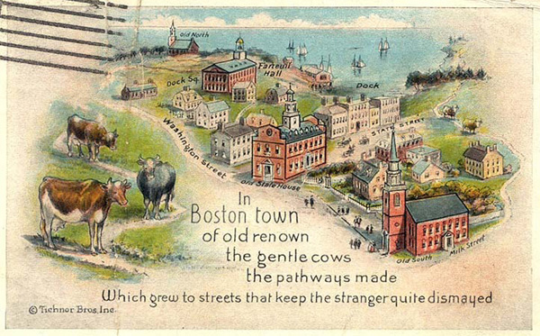
The topic of this postcard and the linen one above it (the confusion of navigating Boston) is one that lives on today. But faulting wandering cows for meandering urban design is now known to be misplaced blame. The truth is a shame though, because the myth was clearly fodder for some choice cards in the early 20th century. Either way, it seems to me that given the rate at which the extent of buildable land was increasing in the 1800s, it’s no wonder Boston’s streets aren’t strictly gridded.
For fear of this post getting a bit long, I’ll end with this card (from the BPL). It’s hardly a map of Massachusetts, I know. But it is definitely a map (and Boston is labeled on it), so I had to include it. Plus, how could I not include this postcard? I mean, just look at it. I have to say, without knowing what was going on in 1915, this card is a bit difficult to decipher (difficult-to-decipher cards were definitely a thing in the early 1900s—or at least, they are difficult to decipher by the standards of a 2010s blogger). It clearly states that Boston is the “Finest City” in the… er, world. But of the majority of the card’s design remains incomprehensible to me. For example, who is this person and what is she doing with a cage on her back? What’s that diamond city in the north? And, lastly, why is the earth wearing a belt (without any pants)?
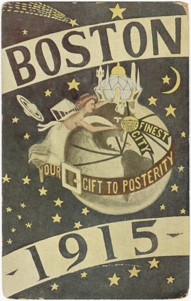
She has biplane wings on her back. Looks like she’s flying in to bestow upon Boston the honor of Finest City, which is memorialized with that shining city trophy at the top.
Not sure about the belt though. Maybe it’s a sash??
Of course, biplane wings! Thank you, Devin. That makes a bit more sense than a cage. Any idea what the flow lines represent? New Orleans, Panama, Brazil, Boston, Africa, Europe, Asia…? Most all of the continents seem to be covered.
The flow lines look like shipping lanes through the Panama Canal.
Good eye. That would make good sense. It looks like the Panama Canal was completed right around the same time this postcard was printed. Thanks for clearing up some of the confusion I had with this card.
What do we suppose is on that trophy thing, anyway? Apart from a couple of spikes, it looks like the State House dome, the Bunker Hill Monument… and a minaret. That last one seems unlikely.
The trophy looks like an amalgam of all the cool city-skyline-like things worldwide: domes, minarets, monuments, church spires etc. all set on a big diamond.
I think we can say that the MBTA postcard dates from some time between 2002 and 2004. The postcard was most likely made after the Washington St branch opened but before the Silver Line was extended to the airport. According to Wikipedia, the Silver Line Washington St opened in July 2002, and the Silver Line to the airport opened in December ’04/January ’05, and those dates are roughly consistent with my admittedly imperfect memory of the Silver Line opening.
Other reasons this map can’t date back to the ’60s or ’70s: until 1983, the red line’s northern terminus was Harvard Square. (All dates in this paragraph from Wikipedia; these events all happened long before I was in Boston.) Likewise, Quincy Adams station was not open until ’83. Finally, the map depicts the Orange Line in its current alignment, which opened in ’87. (Station names were different previously–the old elevated Orange Line used to have a stop in Dudley Square, for instance.)
Thanks for spelling that out, Richard—those are the same facts I ran through in my head, also bearing in mind that the map’s style is the modern one, apart from the sharp corner in the Blue Line which has been smoothed out in recent years. I hadn’t noticed the Silver Line at first and thus only knew it had to be later than 1987, because I really have no idea when this map design was introduced. That bit of modern history has been hard to track down on the internet. (But this is a whole topic of its own.)
So the postcard is interesting. It’s pretty new, obviously, but the typographic style seems so much older. Perhaps they had the design for a while and just updated the map as it changed. Or they just have a different sense of aesthetics than I do!
I think, though I am less certain, that the overall style and typography of the MBTA’s system maps does indeed date back to a system-wide rebranding back in the ’60s. It’s been refined a bit since then, and of course updated with changes to the network, but the basic idea hasn’t changed.
One used to be able to see an old enamel system map on one of the platforms at Chinatown that was particularly fun — not only did it date back to before the red line extension to Alewife, but it also listed station names in both Roman and Chinese scripts! Sadly, it’s been covered over by a more recent printed-vinyl map, which is all in English. While it existed, though, one could see that it was designed along the same lines, with a few minor cosmetic differences. As I recall, termini were simply square ends, not the large white circles of the modern maps, and curves in the lines were blockier rather than rounded, as they are now.
I’m pretty sure Transit Maps of the World (Mark Ovenden) has some examples of these older maps, but I don’t have my copy in front of me at the moment.
Also, the labeling of Hynes/ICA rather than just
Auditorium (previously) or just Hynes limits it to within 1990–2006.
The Pilgrim hat on the Mass Pike postcard was the official logo of the Pike until fairly recently when the arrow was taken out for political correctness considerations. The arrow through the Pilgrim hat was said to further the stereotype of the Native Americans as war mongering savages.
All Mass Pike signs had this arrow through hat logo and there may be some outliers still hidden around the state, though the Turnpike Authority attempted to replace them all with a sans-arrow version of the Pilgrim hat.
You can see the old sign here:
http://www.alpsroads.net/roads/ma/i-90/arrow.jpg
Thanks for that info, Jef. That’s a fascinating bit of history. I’m surprised I don’t remember those signs (or at least that image). Perhaps my modern mind has expunged some of the Bay State’s historical design indiscretions.
Wikipedia says it was retired in 1989, which is “fairly recently” in my mind. 🙂
(1) The MBTA was created in 1964. Very soon after they took over from the old MTA, the MBTA hired an architectural firm, Cambridge Seven Associates, to create a new image for the transit system. Cambridge Seven was responsible for the color-coding of the lines, the T-in-a-circle logo, and the terms “Inbound” and “Outbound”. I believe that this was the first use in the US, possibly in the world, of using color as the primary identifier for a subway line. Cambridge Seven also created the first diagrammatic map of the T system. For many years this was nicknamed a “spider map” because of its appearance. As an earlier post has noticed, it has evolved many times over the years.
(2) The belt around the globe reminds me of the old logo for Schlitz, “The Beer that Made Milwaukee Famous”. That logo dates back to the late 1800s. But I’m unaware of any connection to Boston.
(3) The “minaret” has a vague resemblance to the water tower atop Fort Hill in Roxbury. The other “spikes” could be church steeples — Old North, Park Street?
Great comments, Charles. Thanks for that info on Cambridge Seven. That is some fascinating history. Thanks also for pointing out the 1915 card’s resemblance to the Schlitz logo. You are exactly right. I had actually run across the logo recently while wasting time on Google Books. You are right, the resemblance is uncanny. Good call with the other landmark candidates too. The structure on the left does indeed look like the tower at Fort Hill.
Just found this on the Boston 1915 Movement: http://www.jphs.org/20thcentury/woodbourne-and-the-boston-1915-movement.html
It was about good government, economic development, and future prosperity in the Automobile Age.