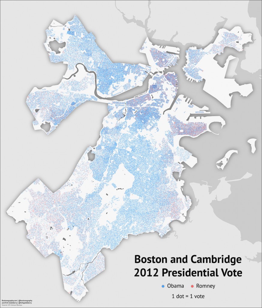
You’ve seen tables and maps of counties and towns with the numbers for President Obama and Governor Romney in November’s election. But you may not have seen the detailed story in Boston. Well, that’s what we present above, in collaboration with friend, colleague, and scholar Kirk Goldsberry, a geographer currently at Harvard whose Texas election maps made the rounds recently (although lately he’s known for his NBA visual-spatial analytics). This is about as detailed as one can get: it’s a map showing a dot for every Obama and Romney vote in Boston and Cambridge. Dots are distributed randomly within precincts, minus areas that are unpopulated according to several data sources—note that although this is a 1:1 map, the dot locations do not reflect actual individual voter locations.
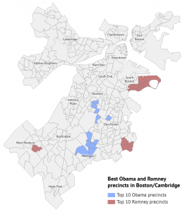
The first thing you’ll notice is that these cities are very, very blue (i.e., Democratic). The split in Boston was 79% to 19% in favor of Obama; in Cambridge it was 86% to 11%. Given the blue baseline, it’s interesting to pick out the areas of Romney support, but even there you won’t find much in the numbers. According to early data, Romney carried only two precincts in Boston (in South Boston), one of which gave him a slight majority and the other of which he won with a plurality on a margin of four votes. He outperformed his national vote share (about 47%) in only one additional precinct, and he lost by less than a 10% margin only in a further three. In other words, you might say that Romney performed reasonably well in only six of 253 precincts in Boston. Across the river in the People’s Republic he didn’t have a prayer anywhere: his best precinct gave him only 18.7% of its vote.
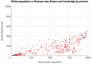
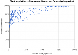
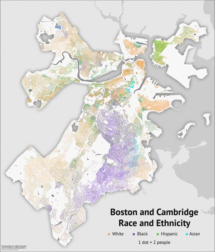
The “strong” Romney areas were in South Boston, and you can see some moderate support in places like the North End, Charlestown, Beacon Hill, Back Bay, West Roxbury, and part of Dorchester. Looking at the dot map you may start to think of race and ethnicity patterns in the city, and indeed there are very real correlations. As was the national trend, Romney’s strongest support was in areas with a mostly white population. Obama’s support, meanwhile, was exceptionally high in areas with mostly black population. It’s harder to see on the map because of the overall blue-ness, but among the 61 precincts with a majority black population, Obama averaged 96% of the vote.
Compare the vote map with a map of a few race and ethnicity categories below. Whether we like it or not, voting patterns are inextricably linked to—and to some extent predictable by—demographic patterns, and not just the super basic racial patterns we’ve mentioned here. To fully understand the electoral landscape of the city, there are many other correlations to investigate.
Stepping back to the state level, Massachusetts is near the top of the list of “blue states,” reliably voting Democratic in national elections and being home to the “Massachusetts liberal” bogeyman. Take a look at a county-level map of the 2012 presidential election and you’ll see that Massachusetts was one of only four states in which President Obama won every county. (Two of the other three are our neighbors, Vermont and Rhode Island.)
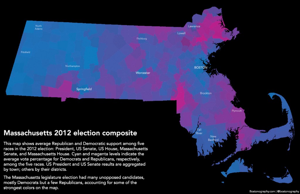
But counties—largely meaningless non-entities here—in one race paint a simplistic picture. What are the actual partisan voting patterns within the state? Here’s one way of looking at it:
This is a visual technique I first tried on 2006 elections in Ohio. It combines red–blue spectrum maps of several different races into a single, averaged image. In this case we have the major national and state elections of 2012: President, US Senator, US House, Massachusetts Senate, and Massachusetts House. Essentially, maps were overlaid on one another and average blue and red pixel values were calculated. (They were then converted to something more like cyan and magenta for aesthetic and legibility purposes.) It’s not a proven technique and we can’t claim that it accurately represents regional political sentiment, but it does roughly represent voting patterns in the recent election.
What probably strikes you first is a few particularly red areas. These are home to the several state races that had an unopposed Republican candidate, and they only stand out because the rest of the state is so blue. If for some reason you doubt Democratic strength in Massachusetts, consider this: in the recent election 3 of 9 US House districts, 24 of 40 state Senate districts, and 90 of 160 state House districts had no Republican candidate. That’s right, a majority of state legislative districts had no Republican candidate. (Not all of these had unopposed Democratic candidates; some had third party or independent challengers.)
Bottom line? Whether it’s the city or the state, this is blue country, my friends. But you knew that already.
Data sources:
- Statewide: Boston Globe – start here.
- City of Boston election results
- City of Cambridge election results
- Boston precincts shapefile with Dem/GOP results
- Cambridge precincts shapefile with Dem/GOP results
- Boston precincts shapefile with unpopulated areas subtracted
- Cambridge precincts shapefile with unpopulated areas subtracted
- Boston area block groups shapefile with demographcis
If you’re going to do these analyses for more than Boston Proper, why not include Brookline? I say this both out of self-interest (it’s my hometown!) and because you leave the entire center of your maps vacant. If Cambridge is worthy of inclusion, why not Brookline?
Well, the reasonable excuse is that Brookline doesn’t seem to have published precinct-level results yet. The bad excuse is laziness; these data are a pain to get into mappable format so we just went with the two cities. It would be great to be much more inclusive, but it’s difficult when cities think that “data” = PDFs.
Brookline would be the obvious next candidate given the geography, though. I’d be interested to see how much the patterns carry over from adjacent Boston neighborhoods. We may do some more of this in the future, and hopefully some Brookline data will be available soon.
“Data” = PDFs. Ha! That’s a total “fuck you” to transparency.
Well, both are reasonable excuses. I just think it’s funny to see a big chunk of Boston missing from most maps, like there’s some giant, unpopulated ice field just south of Brighton….. Culturally, those borders are not especially meaningful.
I think that we often use political boundaries as a convenience, but sometimes lead to distorted analyses, particularly for entities with complex shapes. For an extreme example, most maps of Los Angeles can rarely say anything meaningful about Harbor Gateway unless they include surrounding cities/unincorporated areas. (Not that they won’t try: http://projects.latimes.com/mapping-la/neighborhoods/neighborhood/harbor-gateway/)
Yeah, I’m with you on boundaries, especially around here with weird shapes like Allston-Brighton and major parts “Boston” not actually being in Boston. The boundaries are unfortunate as far as maps go—civically necessary, but so often not meaningful in the context of what’s being mapped.