Back in January, the MBTA and City of Boston sponsored a developer challenge to develop new apps and visualizations making use of real-time bus locations and Hubway bike sharing station data. For the visualization challenge, they provided three days’ worth of bus GPS location reports as well as point-to-point trips in the Hubway system. Just before the data become the officially out-of-date age of one year old, which is too old especially in light of the recent Hubway expansions, we figured we should post what we put together for the contest.
We worked with Kirk Goldsberry—Geography professor at Michigan State University, current visiting scholar at Harvard’s Center for Geographic Analysis, and frequent proposer of cool map ideas, known best these days for his NBA spatial/visual analysis—who had also been interested in mapping this kind of data and who had some good ideas for how to approach it. Dr. Goldsberry’s plan was to focus not simply on the point data but rather on the broader paths and areas affected by these data. In what areas might we find activity associated with buses? What parts of the city see the most Hubway riders on their streets? We weren’t able to address the idea fully, but it was from this angle that we viewed the data, especially the Hubway trips.
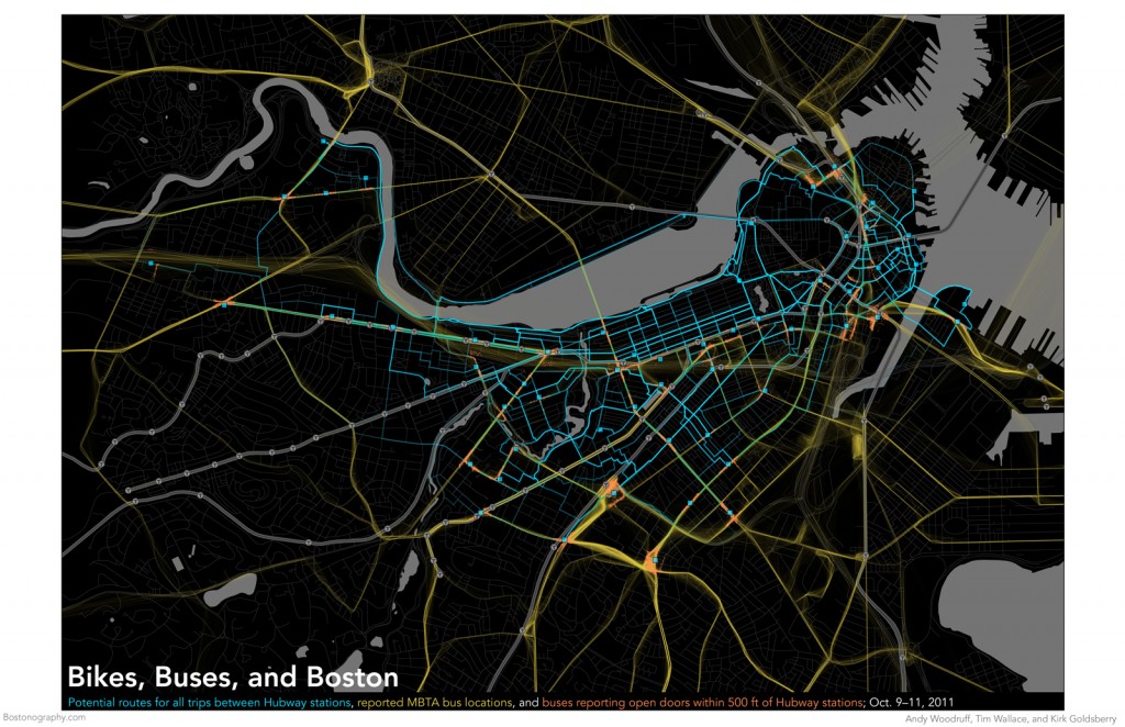
One part of our submission was a set of overview graphics. (Download it in higher resolution as a PDF if you wish.) Above is an overview map of the bike and bus trips in the center of town, in our classic style of crazy jumbled lines. The bus locations, shown in yellow, are straightforward plots of the GPS coordinates. The Hubway trips, each one shown in semi-transparent blue, are speculations about the routes riders may have been, based on the origin and destination stations. (More interesting maps and explanations of that in a moment!) The final thing on this map is orange points indicating where buses reported doors open near Hubway stations, presumably where passengers boarded or alighted. It’s a feeble way to get at possible connections between the bus and bike systems, indicating the opportunities to transfer from bus to bike or bike to bus. Altogether it’s hard to say whether this map reveals anything in particular, but it shows the coverage of the systems in question, anyway.
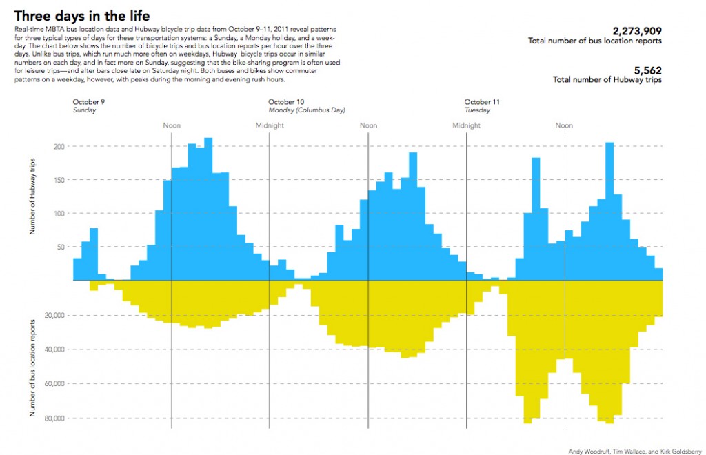
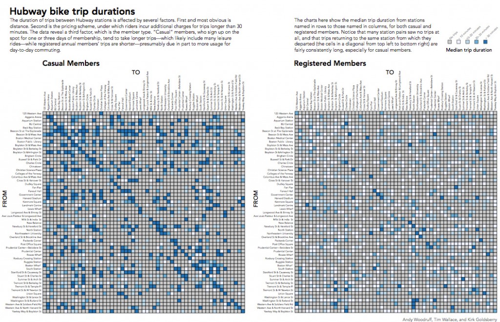
Following the overview map were two quick charts, above. The first shows the number of Hubway trips and bus location reports per hour over the three days. There’s a different pattern on each day: one is a Sunday, the next is a holiday, and the third is a regular weekday. The third shows a predictable bimodal distribution with intense morning and evening rush hours, while the others peak in the middle of the day. Our favorite (but troubling) thing revealed by this chart is the small Hubway spike around 2 AM Sunday morning: presumably people are pouring out of bars and hopping on Hubway bikes. The second type of chart is a matrix of all the Hubway stations, showing the median trip duration from each station to every other station. The two take-home points here are that yearly registered Hubway members take shorter trips than the “casual” (one or three day) members and that the longest trips tend to be the ones that start and end at the same station. In both charts we can see a lot of non-commuting usage of the system, which raises interesting questions of exactly what role bike sharing plays in the overall transportation system.
A final question we wished to address was that of common routes taken by Hubway users. Without knowing the exact location of each bike, via GPS or RFID, we had to extrapolate potential routes based on reported “departure” and “destination” locations. This is an important point—these routes are “potential” or “possible”, not actual. They are based on Google Bicycling directions via the Google Directions API. After calculating all potential routes, we sliced the data up by routes “to” and “from” each station. Once we had all of these routes, we could count the number of potential routes at each road segment. The last step of production was made much easier by using Matt Ericson’s MultiExporter .jsx script for Adobe Illustrator. The result is a set of 57 small multiple maps highlighting areas of Boston with the highest potential for Hubway activity. Some areas, like the corner of Beacon & Arlington Streets, could have had as many as 650 bicyclists pass through over the course of the three days when the data was collected. Meanwhile, the largest number of bicyclists to leave any location headed in the same direction was 230. That number of people likely headed southwest from South Station. Take a look at the maps below or (warning: gigantic file!) download the full resolution versions here.
[portfolio_slideshow pagerpos=disabled size=full include=”1844,1845,1846,1847,1848,1849,1850,1851,1852,1853,1854,1855,1856,1857,1858,1859,1860,1861,1862,1863,1864,1865,1866,1867,1868,1869,1870,1871,1872,1873,1874,1875,1876,1877,1878,1879,1880,1881,1882,1883,1884,1885,1886,1887,1888,1889,1890,1891,1892,1893,1894,1895,1896,1897,1898,1899,1900″]
There are a lot of other ways to look at the data, some of which we tried but didn’t publish, so we’d be happy to whip up other maps if there are requests and we can remember how we did any of this. Otherwise, dear readers, do you see any especially interesting patterns?
Credit goes to Tom Auer for first suggesting the approach of looking at volume by street segments.


The high number of round trips with unregistered users makes a lot of sense. I think a lot of tourists use the hubway system as a sight-seeing system, whereas the registered users are using it as tranportation. I see a lot of routes along the river that would back that up.
I think the drunk-bike usage is not the worst trend in the world. It shouldn’t be actively encouraged, but I also don’t think it should be discouraged too much. Better to take a wobbly bike than to drive.
It tells me using the T and walking is preferred to using the T and biking.
I would be interested in seeing the table you did for Hubway trip duration – only instead of showing trip duration, have it show total number of trips. You can kind of see what the popular destinations/origins are for each station in the last set of maps, but the tables allow you to see that information much more quickly (and easily, given the lack of reference points on those maps). It think that would be especially interesting broken down by casual user vs. member.
Pingback: Visualizing Hubway, for real this time | Bostonography