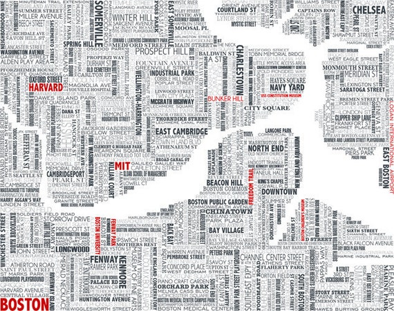
Typographic maps—that is, maps constructed mostly by typography—are quite the rage these days. I think I got in on, well, if not the ground floor then a fairly low level of the fad some four years ago with a small type-based map of the Prudential area in Boston (shown below), which later grew into a whole line of typographic map posters. Besides those posters, a number of other typographic maps of Massachusetts and/or Boston have since shown up on our radar, so here they are. Click ’em for the source pages, where there are larger images and usually prints for sale. Do let us know of any that were left out!
 As far as posters go, probably the “original” city typographic map is that of Ork Posters, which fills neighborhood areas with text bearing the neighborhood names. I vaguely recall that an early version of this used an “Allston-Brighton” label that essentially meant that their labels were switched, because “Allston” is first in the name but Brighton is first on the map. Or maybe I imagined that.
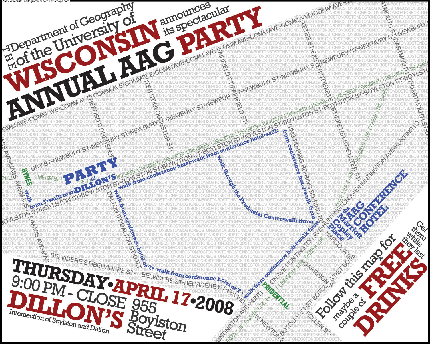 This is the first one I did, in 2008. It’s an invitation to a departmental party during the Association of American Geographers conference, which was in Boston that year. My roommate, who was in charge of the planning, commissioned a map and typographic map was my idea. Later I expanded this style into more of a full city map.

 Local designer Michael Weinstein has a couple of text-based Boston maps. The first, called Welcome to Boston, shows inner neighborhood names (plus Brookline and Cambridge) in different stylized ways, along with the T lines. Prints are for sale. The second shows the towns and streets along the Boston Marathon route, in a similar style.
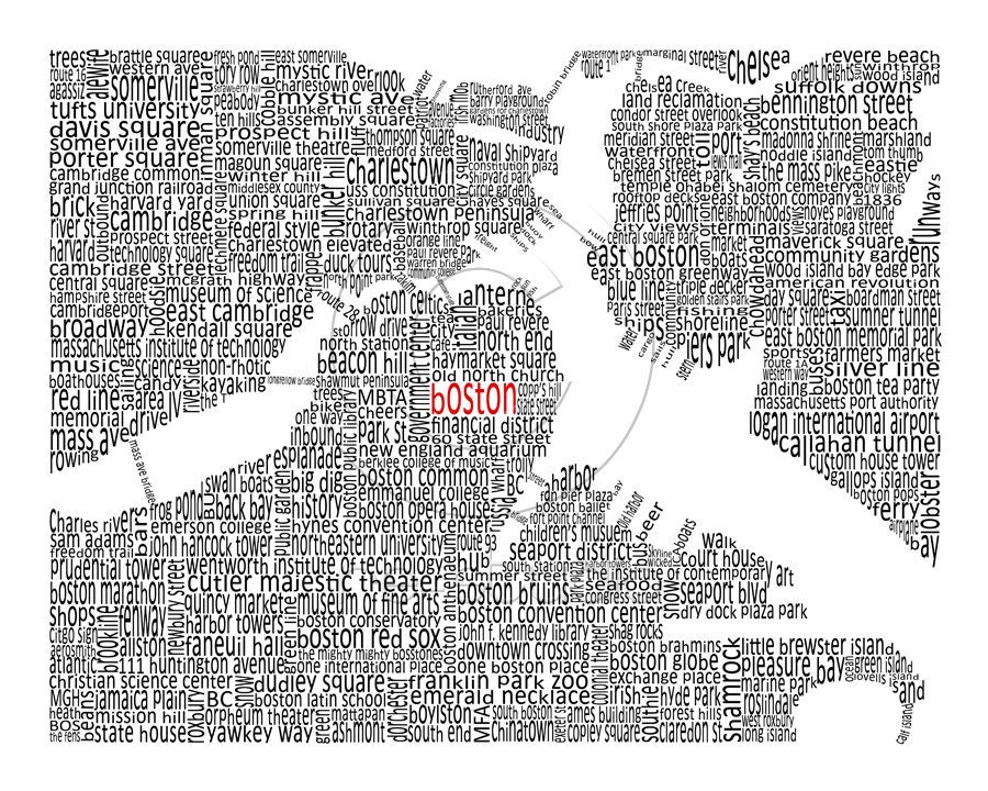
 This map from UrbanFootPrintDesign is solidly filled with horizontal and vertical text of several different styles (I haven’t taken a close look at how many typefaces are here), showing streets names, place names, and landmarks.
 Using a similar technique but somewhat different style is this one by Jessica Harrington. She’s got a few other maps of regional interest, too, so poke around that Etsy shop linked in the image.
 A typographic transit map from Fadeout Design shows nothing but the MBTA lines (yeah, Silver Line included) as text. The text is the names of stations. I think I’ve seen something like this but including a bunch of bus routes, too. Was that also just imagination?
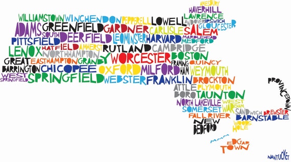 Here’s colorful one of the state filled with town names, by Molly Mattin. This and some of the other examples are not exactly typographic maps, of course, since they are hand-drawn illustrations.
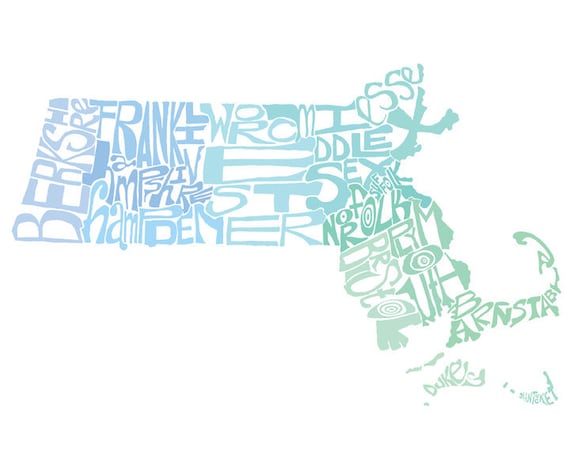 Finally, a county name map illustration from CAPow (Crystal Powell). I like the way that some of the coastal letters have the rugged edge of the actual coastline.
When did we get “North Dorchester” and “South Dorchester” on maps? That seems like a pretty arbitrary distinction, especially when you’re mapping the whole city from a neighborhood perspective.
Reminds me of the oddly-named “Southern Jamaica Plain Health Center,” which is located smack-dab in the middle of JP 🙂
Agreed, it’s awfully arbitrary when you’re tying to make a neighborhood map meant to appeal to people’s sense of identity. “North Dorchester” and “South Dorchester” seem to stem from city planning districts, which probably just divide Dorchester because it’s big. The BRA has neighborhood maps with that division, but then they also do things like combine Back Bay and Beacon Hill.
Thanks for that JP note; didn’t know about that. Pretty amusing!
Though my work is an attempt at mimicking an established style – the classic subway map – and not inventing new typographic styles, I invite you to check it out anyway. Like the maps above, many of them celebrate the rich variety of neighborhoods in Boston: http://www.mapuccino.com/mapuccino_collection.php