
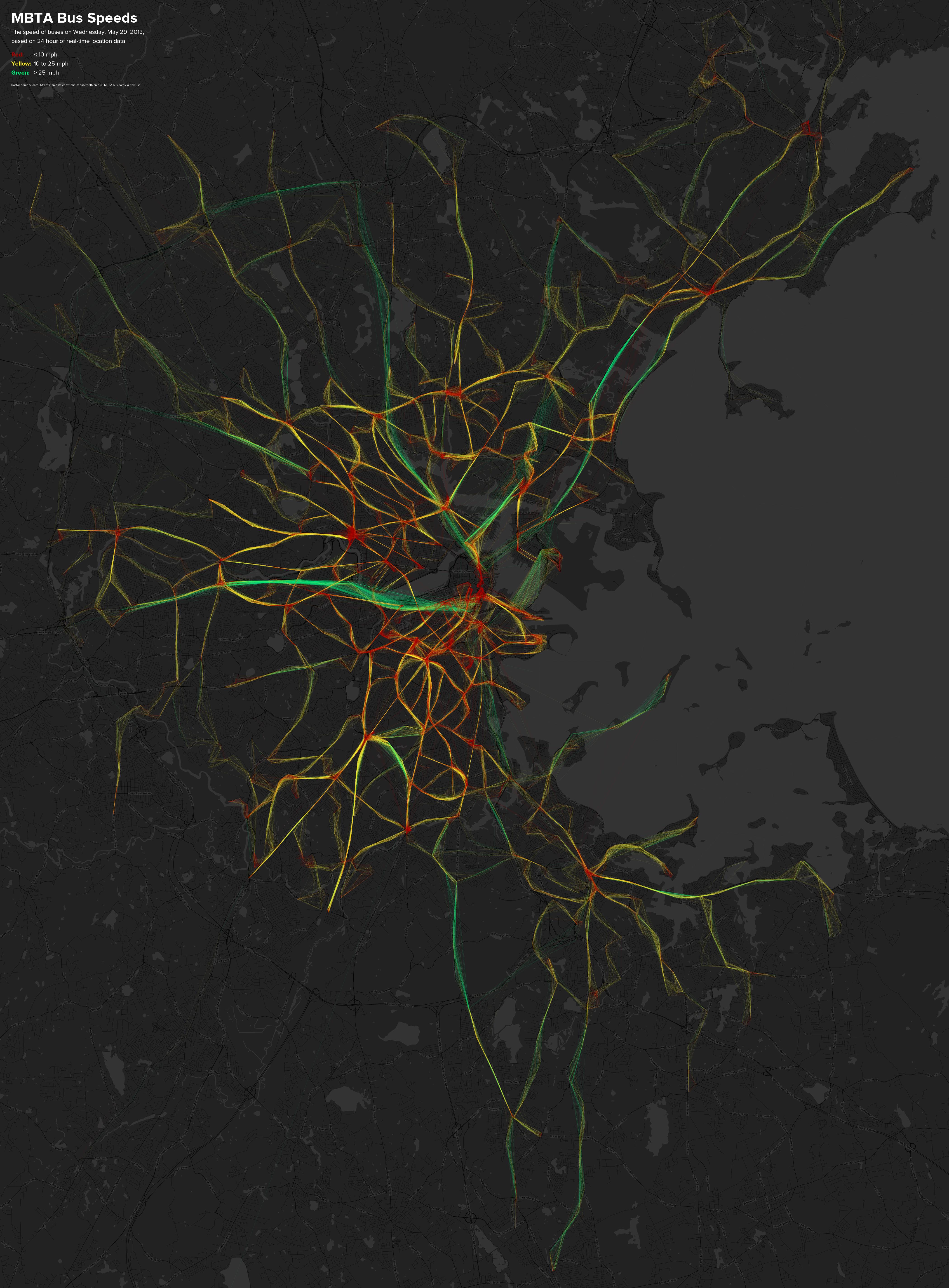
‘Tis the season to revisit and update some of our past projects. You may remember the map from November 2011 showing 24 hours of GPS location data from MBTA buses, colored according to their speeds. (A local adaptation of maps made by the venerable Eric Fischer once upon a time.)
The cool thing about the existence of such a map in the first place is that the data behind it are live and constantly published. It’s the same data that has helped you catch the bus on time thanks to apps built around it. Every minute it’s something new, so why limit mapping to a single snapshot in time? I’ve learned better ways to automate this mapping since making that first map, so with a bit of code we can sit back and let the maps draw themselves as time goes on.
Starting today, we’ll keep an archive of daily bus location/speed maps, and also maintain more of a live map that shows the most recent data. The latter is a web map that you can pan and zoom, and it’s updated every hour. It shows either the most recent three hours—so you can look at different times of day and see, for example, the difference between rush hour and late night—or the full 24 hours of the previous day.
As the collection of archived maps grows, you can find a particular day’s map at a URL of this format:
https://bostonography.com/bus/archive/mbta-bus-YYYY-MM-DD.jpg
(e.g., https://bostonography.com/bus/archive/mbta-bus-2013-05-29.jpg)
The most recent day’s map will always be at:
https://bostonography.com/bus/archive/yesterday.jpg
Meanwhile, check out the web map, and discuss!

Details for nerds
Design: The design and concept of the maps are essentially the same as the older map. They are partly meant to convey overall patterns of MBTA bus service and allow comparison over time, and partly meant to be pretty pictures.
Color: Unlike the original map, these are more true to the traffic light metaphor commonly used in traffic maps. I wanted to stick with this because it’s fairly well planted in most of our brains, and further because the colors are all vibrant (unlike proper sequential color schemes), which is important in an aesthetic piece like this. Red-yellow-green is a big problem for color blind people, however. Thanks to some tips from Twitter peers, I worked with colors that vary in levels of blue. Viewed through the helpful tool Color Oracle the colors can be distinguished, although obviously they’re not great.
Technical: We hit the NextBus data feed frequently and save bus locations to a database. The database keeps a rolling 24 hours of data, so old records are deleted as new ones arrive. Image rendering is done by some pretty simple PHP scripts that grab the data, string the points together into lines based on vehicle ID, calculate distances and speeds, then draw thousands of lines either on top of a street map image (for the static, archived maps) or on blank map tiles (for the web map). The code is available on GitHub, with the caveat that it represents an easy way of doing this, not necessarily a good way. Improvements welcome, especially if I can understand them!
Base map: The street map underneath the bus lines uses OpenStreetMap data and was a quick design in TileMill. In the web map, the tiles are served using this thing.
Pingback: Boston Weekly Roundup: Live MBTA Bus Speeds & More!
Pingback: Curioso mapa diario de las velocidades de los autobuses que recorren Boston | Teknófilo
Pingback: Your Favorite Traffic Map is Lying to You - Joshua Stevens