UPDATE! We’ve got a new and better version of the neighborhood mapping project! Head on over to bostonography.com/hoods!
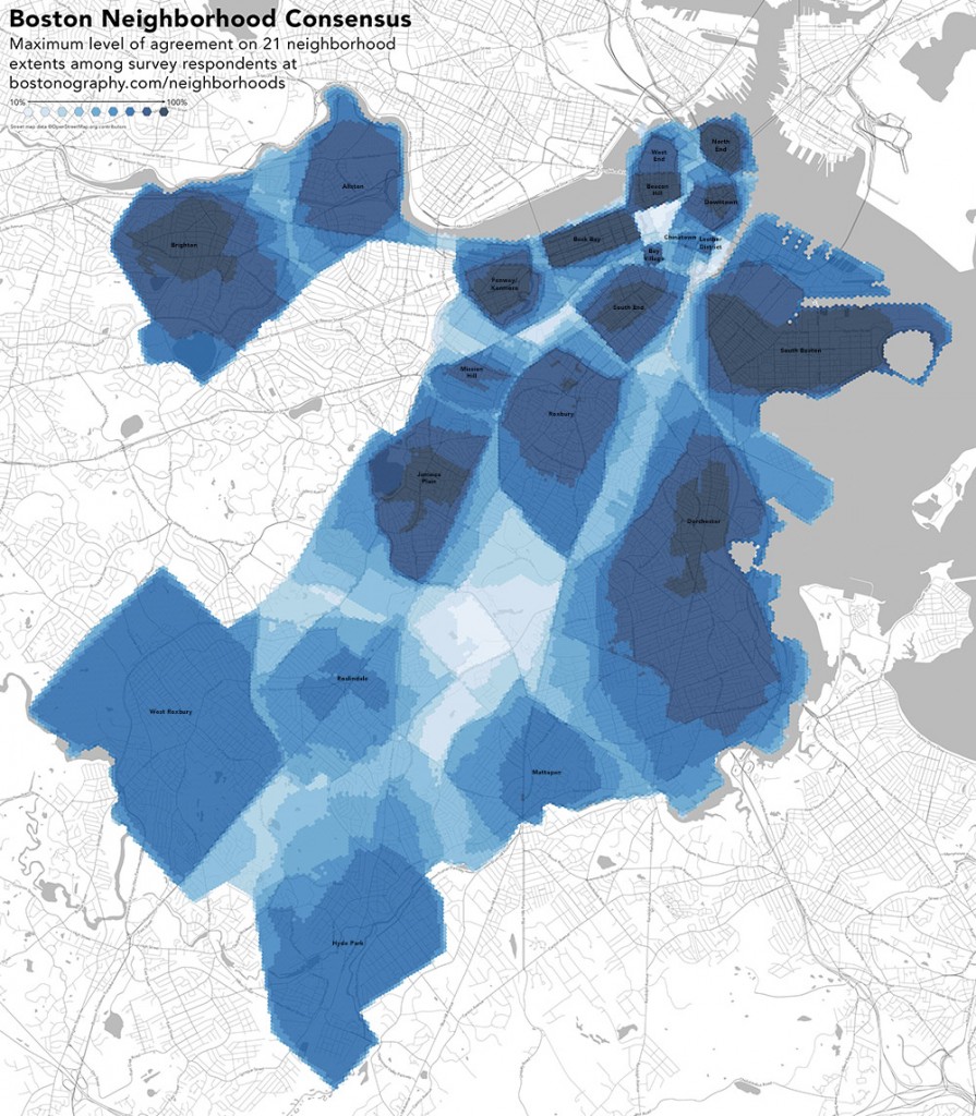
Below is a map that has been shown off a bit recently, both on Twitter and by me at a couple of events this month (namely, at a Boston Indicators Project open house and in the related Data Day also organized by MAPC). Loyal Bostonographers will recognize this: it’s an update to the survey data we’ve been collecting and last analyzed almost a year ago. Because the same types of questions invariably come up, I’d like to briefly explain what’s going on with this map.
What is this?
This is a summary map of data collected in our neighborhood boundaries survey. We asked people to draw boundaries for 21 Boston neighborhoods and have overlaid the resulting shapes (about 4,800 from 950 respondents) to measure the amount of overlap and calculate consensus within each neighborhood.
Do people who live in a neighborhood see it differently from others? Do people who have lived there a long time see it differently from people who have lived there a short time?
Good question! Our survey did not collect any information on where people live or how long or anything like that. It’s a major reason why you should take this map with a grain of salt. Our results are interesting and should prompt further exploration, but they shouldn’t be seen as conclusive about anything because of the lack of this kind of information. Opinions of people who do not live in a given neighborhood shouldn’t be ignored, but to be certain about anything we’d do better to distinguish between residents and outsiders.
Why are Charlestown and East Boston excluded?
This survey was about the major top-level neighborhoods, and at that level Charlestown and East Boston can’t really be disputed because they are physically separated from the rest of Boston. Yes, there are smaller neighborhoods within both of them, but that’s not the level we were looking at here.
Then why are tiny neighborhoods like Bay Village and the Leather District on this map?
Quite simply, it’s because they are apparently important enough to have their own parking permits. That has a very practical impact on neighborhood definition.
Why is [Fort Point, Upham’s Corner, Readville, &c. &c.] not on the map?
See answers above. This map is about the larger major neighborhoods. Life may revolve around smaller subneighborhoods, sure, but that is for another survey. At the moment we’re interested in the fact that nobody can agree on the definitions of the big neighborhoods. An interesting future study would be more free-form, asking people simply to draw and name whatever they see as their neighborhood.
Why is Roslindale so ill-defined?
This may be in part due to genuine uncertainty about the neighborhood, but it’s also a lack of data. The outer neighborhoods didn’t get as many responses as the well-known inner neighborhoods. There is a lot of noise within the data, and when there isn’t enough signal to drown it out, the certainty appears to be less.
What can be concluded from this map?
As mentioned earlier, we can’t say anything confidently. But it seems that the old, central neighborhoods are easily defined—and fair enough, they tend to have distinctive visual identities that anyone can notice—while the other residential neighborhoods are less clear, even where there used to be real historical boundaries. The conclusion I’d suggest is that despite the practical necessity of boundaries, they’re arbitrary and meaningless in most aspects of life!

Pingback: Links 7/1/13 | Mike the Mad Biologist
Pingback: @bostonography Crowdsourced neighborhood map of #Boston | Jack Gately