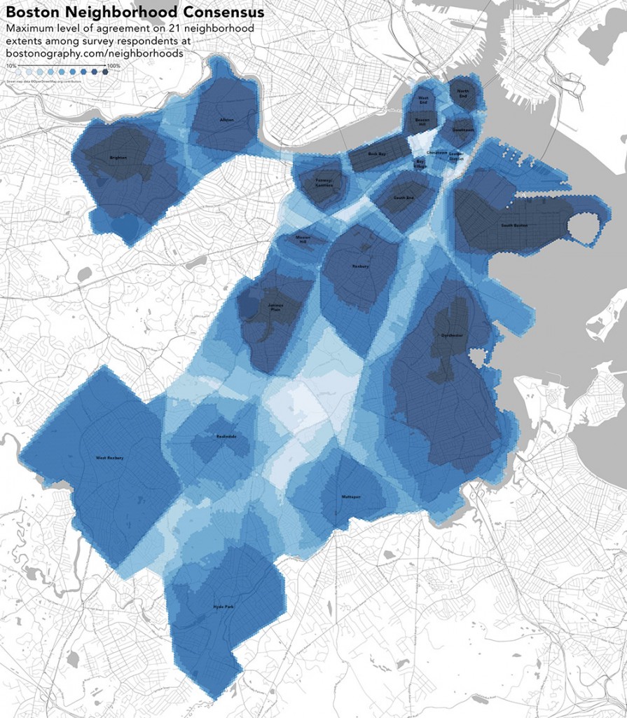
When you think of your neighborhood, you probably think of many things—people, institutions, cultures… and geography. In your mind it probably has a spatial extent, or a center, or some fuzzy definition of what is “here” and what is “there.” Share that geography by drawing your Boston-area neighborhood on this map. Why do it? Quite simply, because if enough people contribute to the map, it will be a fascinating data set that shows we collectively see our city. It’s mostly for fun, but possibly meaningful to policymakers and such.

We’ve done crowdsourced neighborhood mapping before and were pleased with the response. Longtime payers of attention to this space will remember the project we started a couple of years ago:
See some maps and discussion of that project here, here, and here. It was a fun project, and we were able to see some cool results. But that project was limited in several ways.
So we’d like to do it again… but better! If that’s all you need to hear, head straight on over to the new version of this survey and draw your neighborhood. Or read on to see why we’re doing this again, what we’re doing differently, and how the results can be much more meaningful.
The original idea was a reaction to regularly written news articles and internet comments about disputed boundaries between neighborhoods in Boston, and the fact that no single official set of boundaries exists. Fine, we thought, if you all say everyone else is wrong, show us what you think is right. And although the result of this, expectedly, seemed to represent fuzzy notions of place, the whole concept really revolved around questions of division and dispute.
Now we’d like to approach this as a general question of geography and the image of the city. The entire premise is much more open and, we think, much more in tune with what neighborhoods actually are—personal spaces, subjectively defined. We don’t want to ask “where is the line between these two places?” but rather “what is this place?”. Although in the end the map will still be built upon lines and discrete shapes, the data should now be more versatile and meaningful. Thanks to our carto-friend Nick Martinelli, there’s an easy implementation of a survey to address some of the new questions. With all that in mind, below is a summary of some of the improvements in this version of the project, which we think will provide a lot of new and interesting possibilities.
A wider scope
It was clear early on that our original project was very narrowly defined, and thus only narrowly meaningful. It was restricted to the city of Boston and a specific set of neighborhoods. While this did address some particular questions, with those limitations it’s impossible to get a real picture of the subjective internal boundaries of the broader “city” of Boston and its surroundings. Not everyone in Boston identifies with the a neighborhood in our list, and not everyone here lives in the city of Boston. So the new version leaves everything much more open. There is no predefined list of neighborhoods (you provide the names), and it’s meant for any and all cities/towns in Greater Boston.
A wider audience
We were always very hesitant to draw any real conclusions from the first project, and a big reason for that is that it is a self-selection bias. Quite simply, our data did not represent residents of Boston—it represented people who look at this site or other sites that linked to it. We don’t know exactly who those people are, but we’re pretty confident that they’re not a representative sample of people who live in the city.
The new version certainly doesn’t solve that by itself, but we’ve taken a couple steps to make it easier to reach more people. For one, it’s mobile-friendly, so anyone on a smartphone can contribute. Second, the drawing method is, we hope, a little simpler. Instead of clicking a multitude of vertices, you just trace a shape. We imagine that this would work well if someone were to, say, carry around an iPad to survey people. Just put the tablet in front of someone and ask them to draw on the map with their finger.
Not just borders
Not everyone thinks of their neighborhood in terms of where it starts and ends. For many, it’s a collection of points—perhaps a square, or a store, or a church—nodes and landmarks in the Kevin Lynch sense. In an attempt to capture neighborhoods as collections of landmarks, the map lets you drop a point marker as something that defines a neighborhood. It might be what you consider the central point of the neighborhood, or it might just be some place that you strongly associate with the neighborhood. What it means is up to you!
Authoritative data
Another shortcoming of the first version is that we had no way of knowing how trustworthy a submission was. It could have come from someone who has lived in the neighborhood for fifty years, or it could have come from someone who’s never even been there. Unless it was obviously a random scribble, we had no choice but to treat everything equally. The new survey, however, includes a couple of optional questions asking respondents how long they have lived in the neighborhood and city, if at all. This may be helpful in analyzing and mapping data, for example allowing us to give more weight to longtime residents, or to map how boundaries may have shifted over time.
Stories
Neighborhoods aren’t just shapes or points on a map. They are collections of experiences. A fun new feature here lets people share stories or comments about the neighborhoods they’ve drawn. You might use it to explain why you drew the shape the way you did, to share an anecdote about the place, or any number of things. There’s only so much a line on a map can say, so we want to make sure there’s a way to tell the rest of the story.
See results
Another new thing here is that you can see what everyone else has drawn so far. You might use this to guide your own drawing (although steering clear of the influence of others is preferred) or simply to browse and compare your map to the crowd’s. You can also vote, as it were, for neighborhoods that people have drawn, helping lend more weight to those. You’ll also be able to see any stories that people have attached to their neighborhoods. The raw data itself is also much more accessible to everyone.
Technology
Finally, and not insignificantly, this new version is a big upgrade in technology. Whereas the first one used Google Maps and a disaster of a database, the new one uses open-source maps on the front end (built on Leaflet and map tiles from Stamen) and the super powerful and easy-to-use CartoDB to store and display data. The drawing itself uses an unholy hacked-up combination of Leaflet.FreeDraw and Leaflet.Editable. If you’re not one for map technology, the upshot is that all this will make it much, much easier to submit, extract, and analyze data in different ways.
One of the best consequences of the original project was that it inspired Nick Martinelli to develop a similar project for several cities in the Pacific Northwest. Nick built everything in a much better and more reusable way, and posted his code to GitHub. That, in turn, is what we’ve used for our new version, along with a few modifications. So, thanks Nick! If anyone else out there is looking to do something like this, take a look at his project. You can get it up and running in almost no time.
Help draw THE map of Boston!
Enough talk! We want to know what Greater Boston looks like in the eyes of its residents. Please take a couple of minutes to draw your neighborhood at: bostonography.com/hoods
We will make some composite maps once there’s some data to work with, of course, but you too can look at the data and makes some maps! You can always get up-to-date polygon data and point data. (Warning: you may encounter some rude shapes in that data. This, we have found, is an inevitable consequence of asking people to draw things on the internet.)
