Cartography Twitter has become abuzz with some local map news: last week Boston Public Schools ditched the classic Mercator projection in favor of the Peters projection for classroom maps. A trivial-sounding story to some, it’s interesting because it’s change motivated by social justice—seemingly bold but in fact a late shot in a decades-old cartographic controversy. So, perhaps we can briefly share a bit of background on map projections with Boston-area map readers.
The first thing to know is that there is no such thing as an undistorted flat map. Every single one is “wrong” in some way or another. A globe is the only way to represent the world without significant distortion. Any attempt to flatten out the round Earth sacrifices accuracy in at least one way: size, shape, and/or direction.
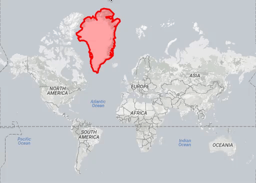
The Mercator projection, which you see in things like Google Maps, and which you probably knew from classroom walls, is known for gross distortion of size at high latitudes. Thus Europe appears bigger relative to, say, Africa than is true; and Greenland looks to be the size of South America when in reality it’s something like one eighth the size.
Although areal distortion is a side effect of the Mercator map’s original purpose—it preserves angles and was useful for navigation—some have argued that its exaggeration of northern latitudes promotes a very Eurocentric view of the world. Other map projections that maintain size accuracy (equal-area projections) are viewed as socially just, giving due attention to parts of the world long oppressed by European colonialism. In the 1970s Arno Peters made some waves promoting the projection which will now grace the walls of Boston schools, and which famously (to cartographers) made an appearance on The West Wing. BPS is a little late to the party, but has adopted the map for essentially the same reason: to remove an imperialist image and promote a different view of the world.
Many cartographers are critical of this projection, as the claims behind it are not novel and even erroneous, with some frustration that it proclaims “truth” yet necessarily trades one form of distortion for another. (Notably, shapes are badly distorted.)
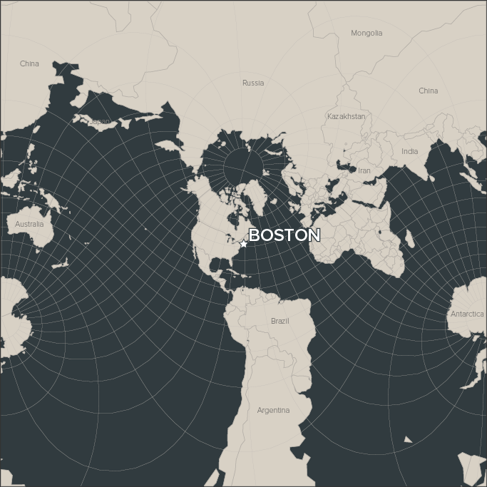
No matter what side one takes, the fact is that a map projection is one of many tools in the cartographer’s kit that can be used to subtly—or boldly—promote a certain agenda or worldview. And as everyone knows, the only accurate world maps are those that correctly show Boston at the center of it all, right?
(adapted from Mike Bostock’s Projection Transitions)
Pingback: The Boston Projection – GeoNe.ws