Mapping Hubway availability

As an occasional Hubway user, I sometimes feel like some kind of transportation gambler. There’s a risk with each trip. Will docks be available where I’m going? Will bikes be available when I want to return, and docks available back home? A losing bet can pretty easily turn a 10 minute bike ride into a 30 minute walk, or some kind of multiple-transfer MBTA nightmare. This is especially true if the trip is going to or from an area without redundant coverage, where there is no second station within convenient distance of the origin or destination.

My potential Hubway trips are frequently to the same place (Inman Square, specifically Parlor Sports of course) and at similar times, so I wondered if the station I want is always freakin’ full, or only often full at the time of day I want it. Or, more generally: when and where is Hubway generally available or unavailable?

By hitting the station data feed regularly, it’s possible to keep track of the availability of bikes and docks over time. This is done masterfully over here, where you can see charts showing when during the current day each station was totally full or totally empty. (Or see the summary of the previous day, and the links at the bottom to the same for many other cities.) Notice the green slivers showing times when every station in the system has both bikes and docks available—it turns out that 100% Hubway availability usually only occurs for a few minutes each day.

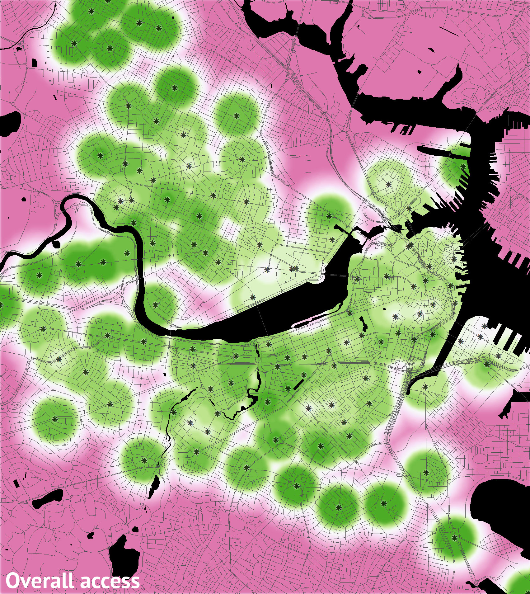
Of interest to a cartographer, too, is the basic map of overall Hubway availability (above) that colors each station according to how often it has both bikes and docks available and furthermore calculates some clusters of similar availability. I was motivated to expand on this idea to longer patterns by collecting more data and breaking it into a couple of different measures and multiple time slices.

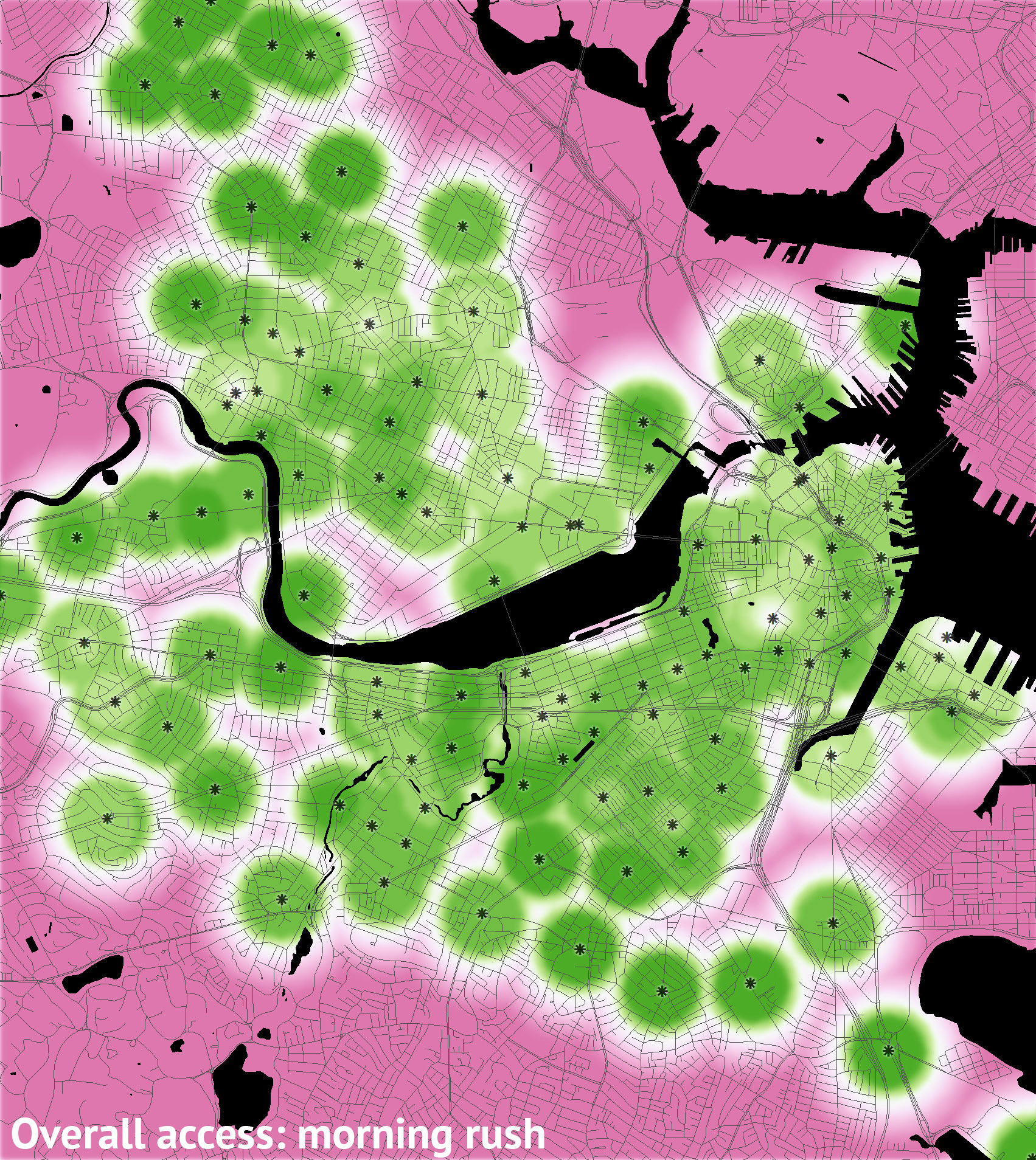
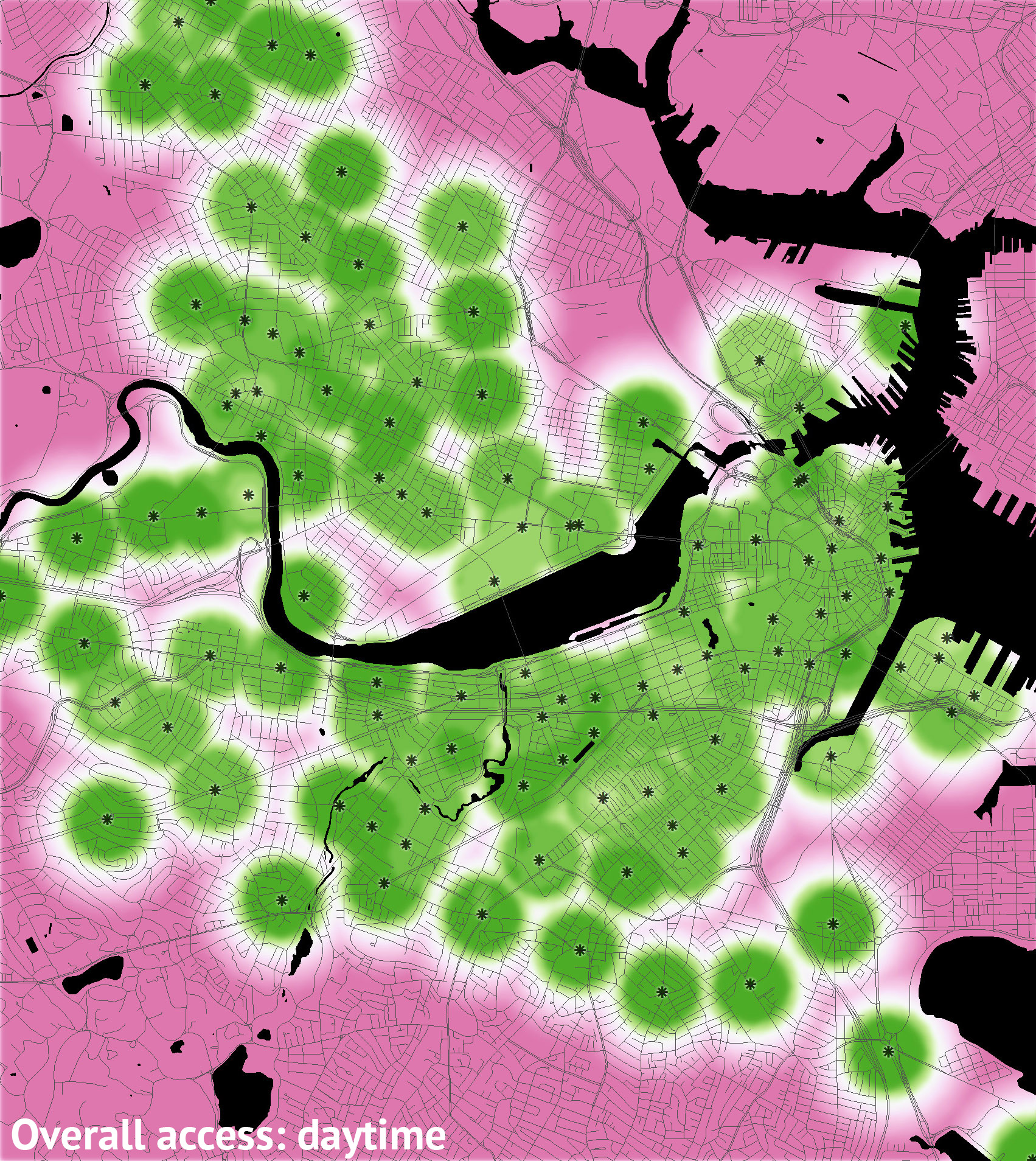
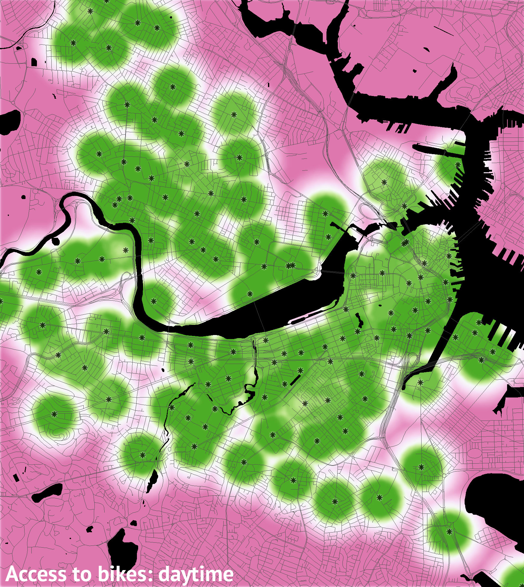
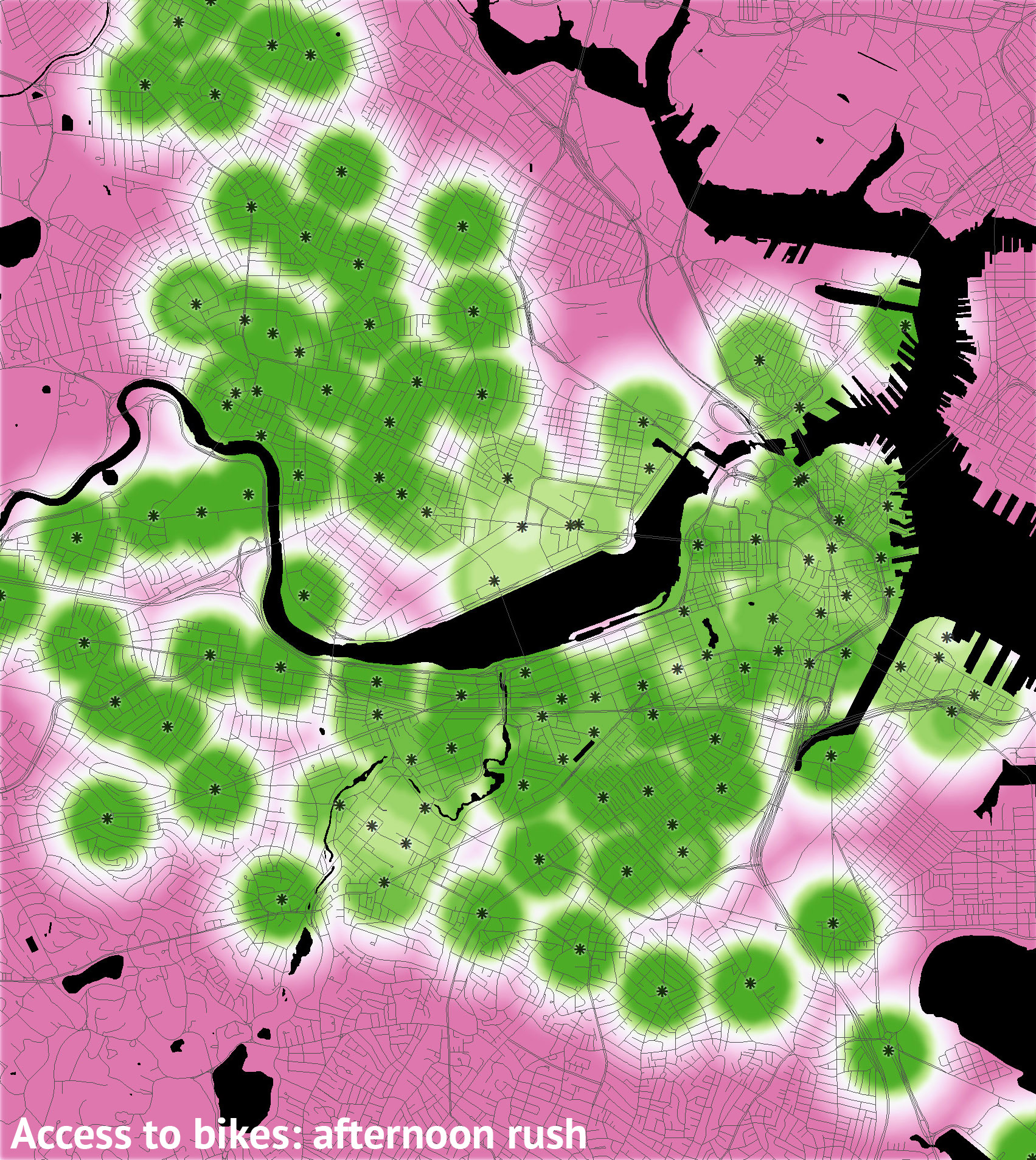
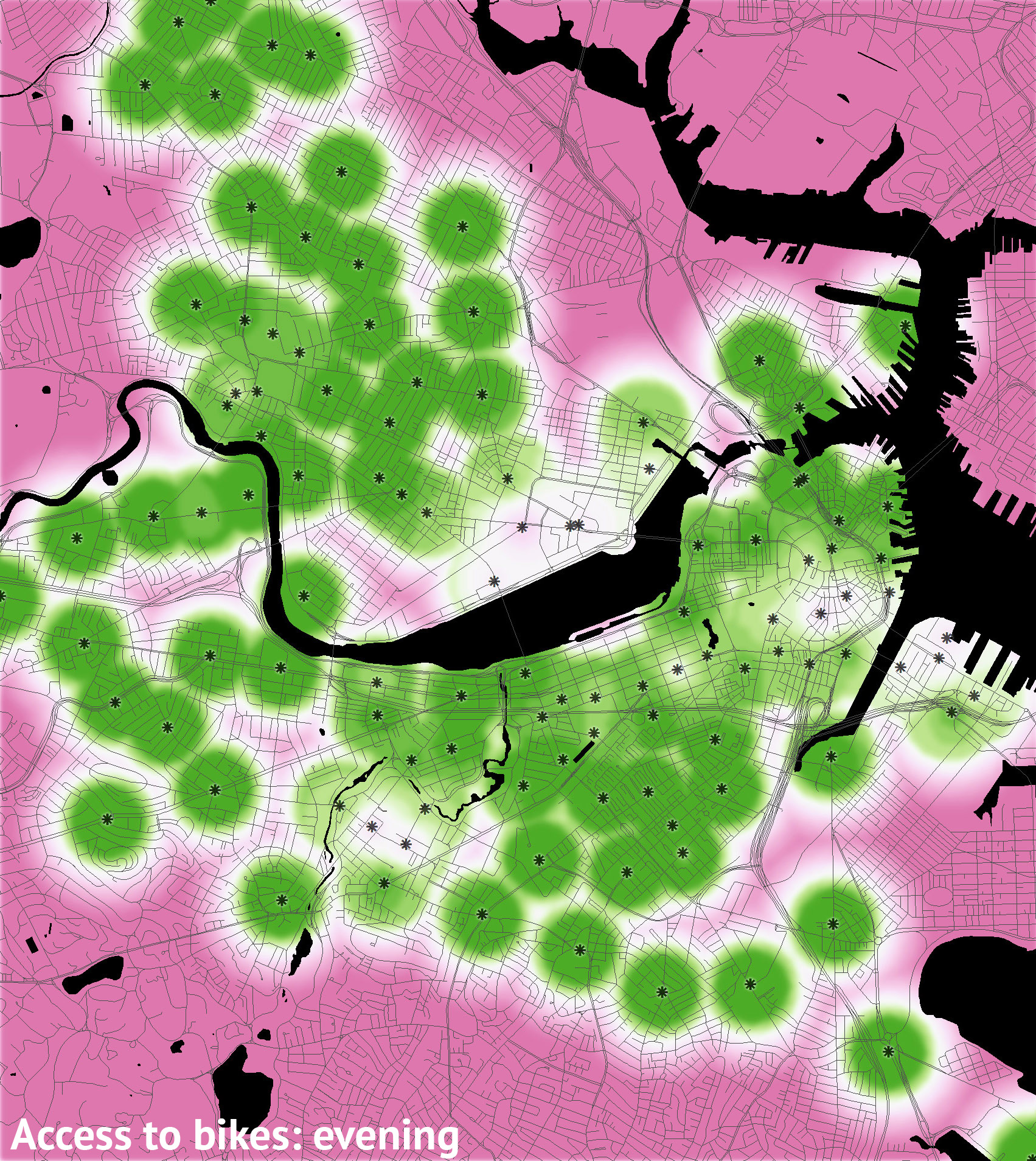
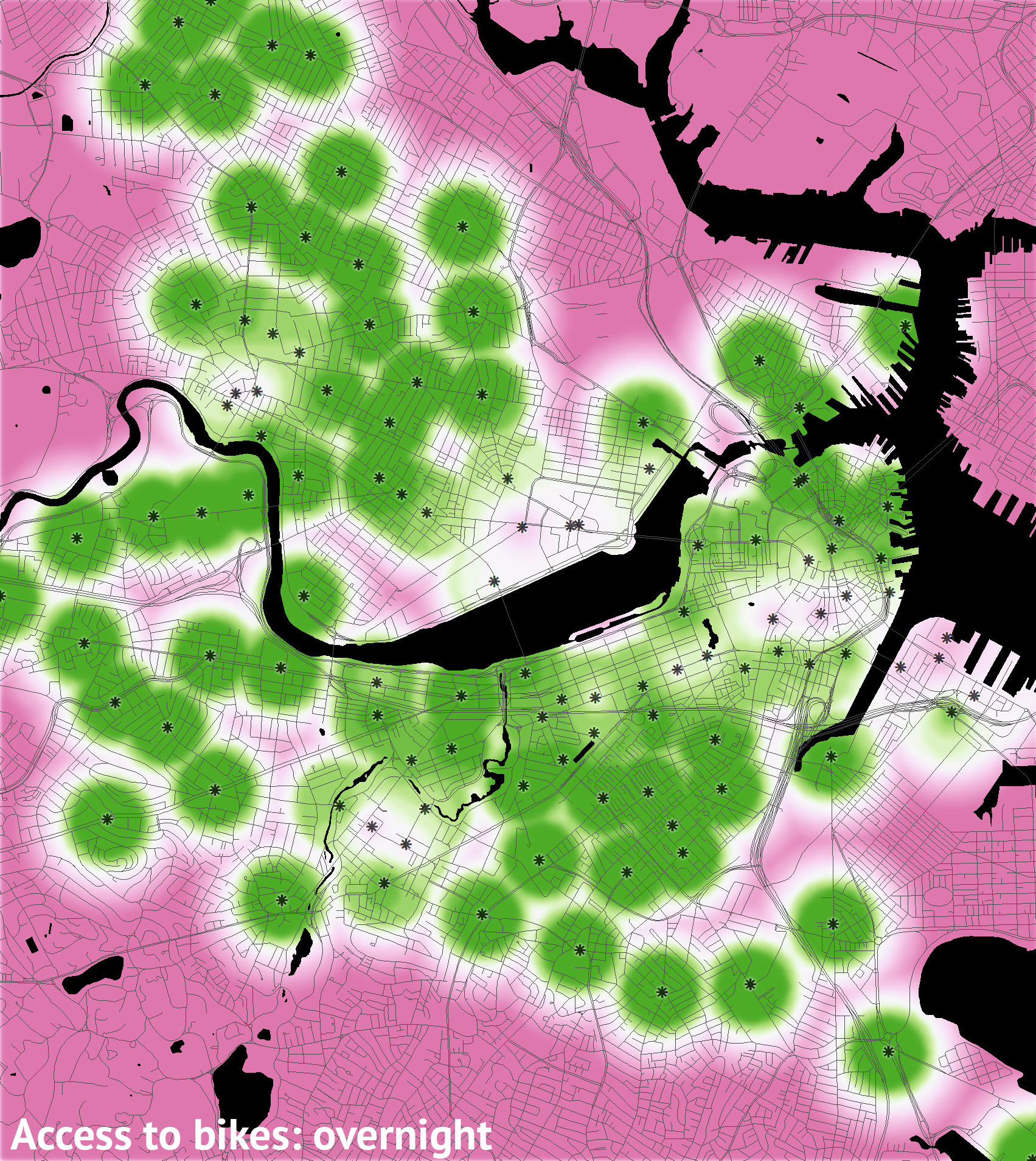
So using approximately the past month of data, below is a series of maps of access to the Hubway system. A few observations follow at the end, but first a bit about the maps. They mostly represent the percent of time during which Hubway stations are available for use. They show a calculation of accessibility based on the following:

  • Distance: Hubway bikes are not available to you if you are too far from stations, obviously. For this part, 100% accessibility is assumed within 1000 feet of a station, and then it drops off farther away until somewhere around 1 km, at which point one is assumed to be beyond Hubway access. A simple distance map is overlaid on the interpolated availability maps described below.
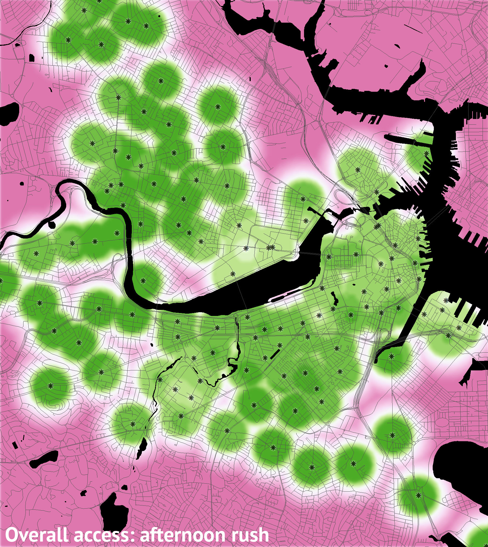
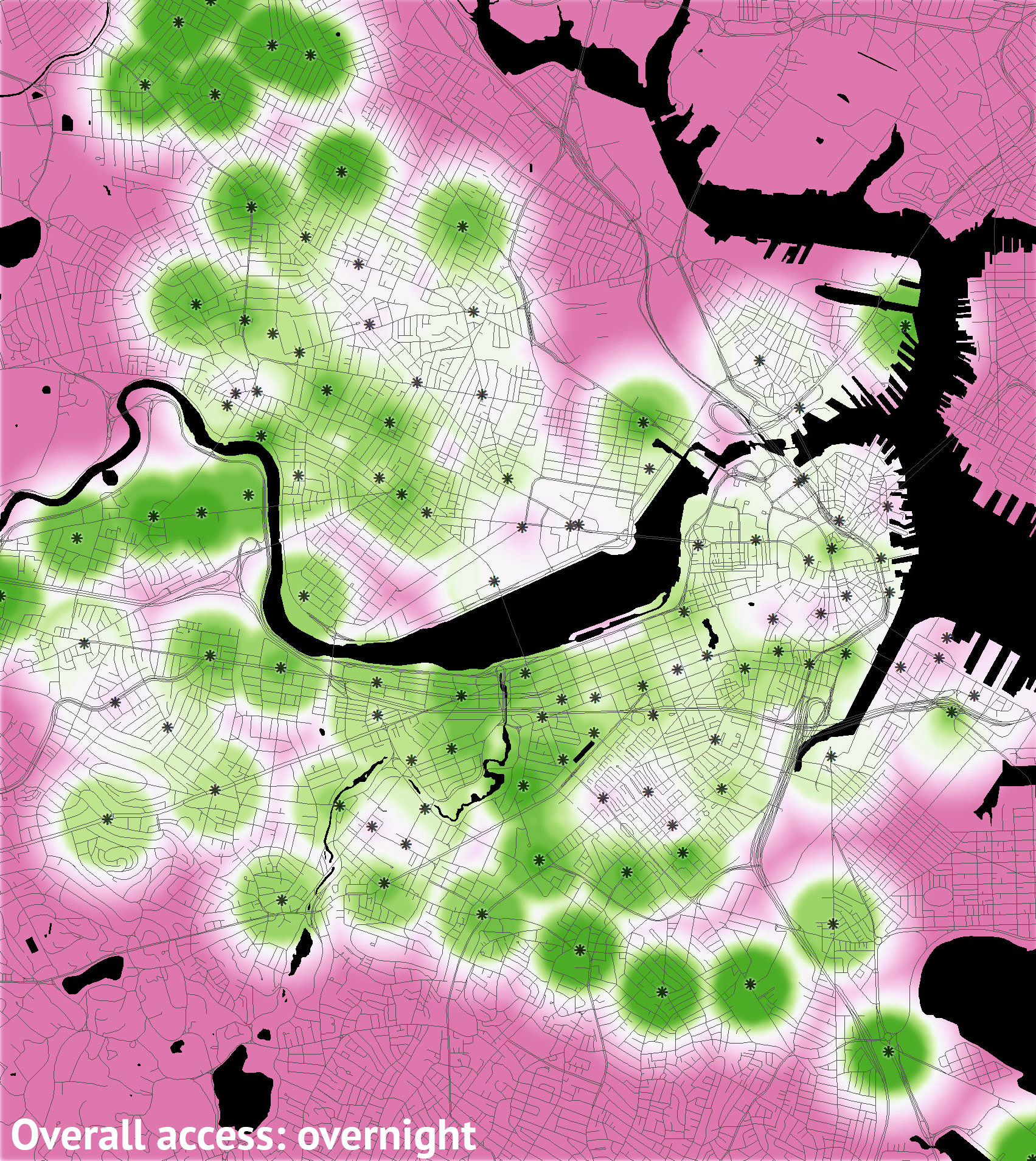
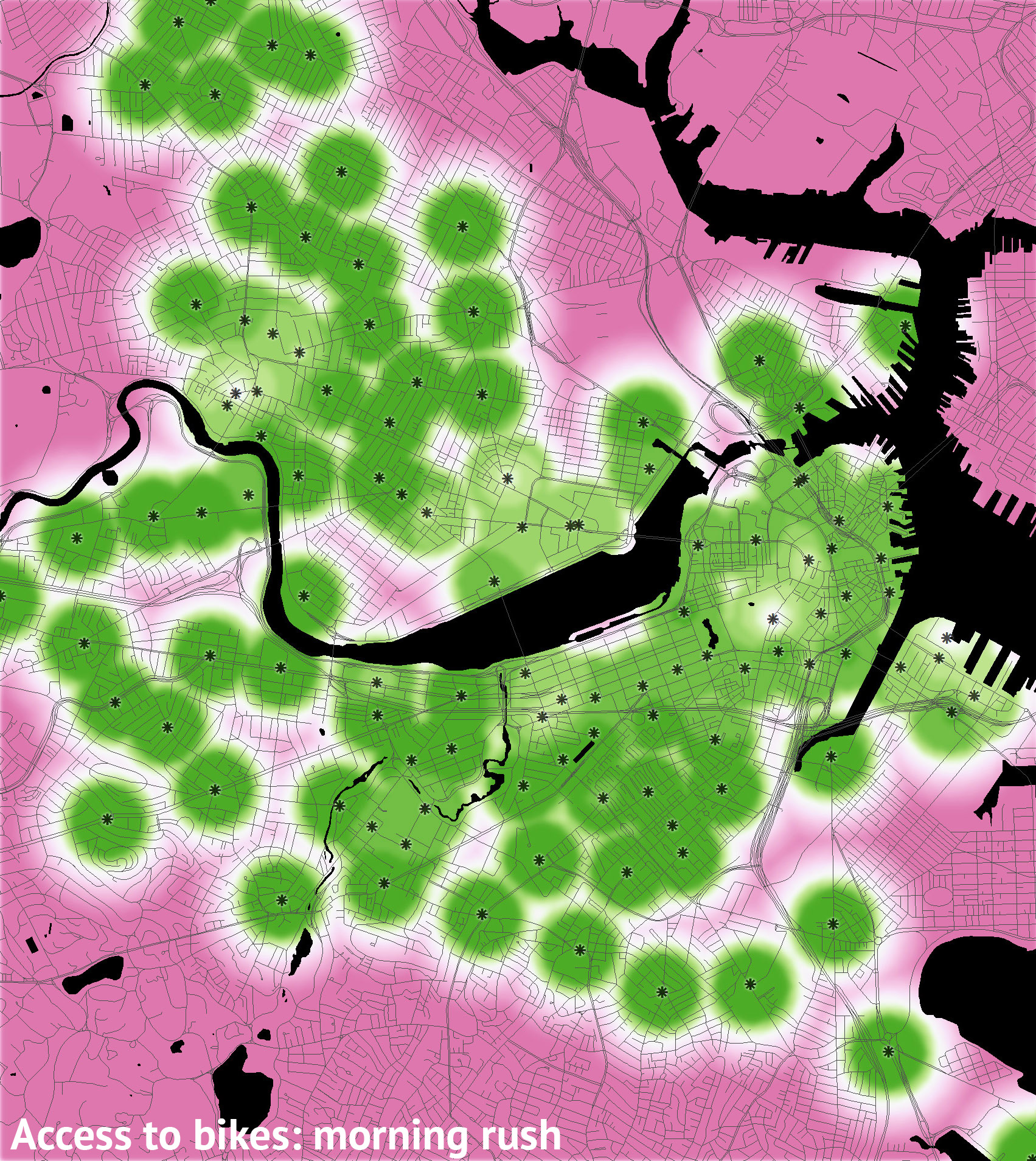
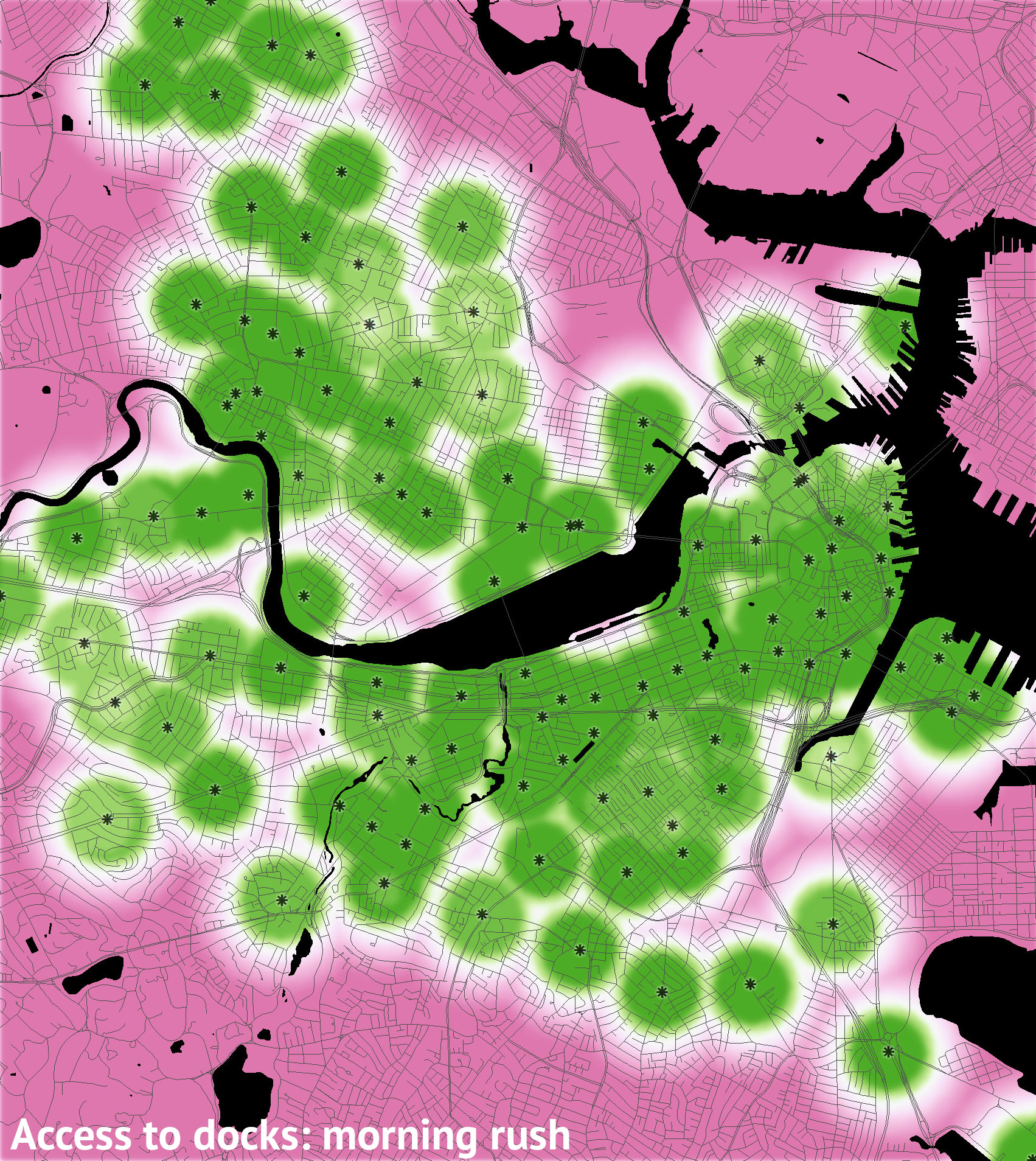
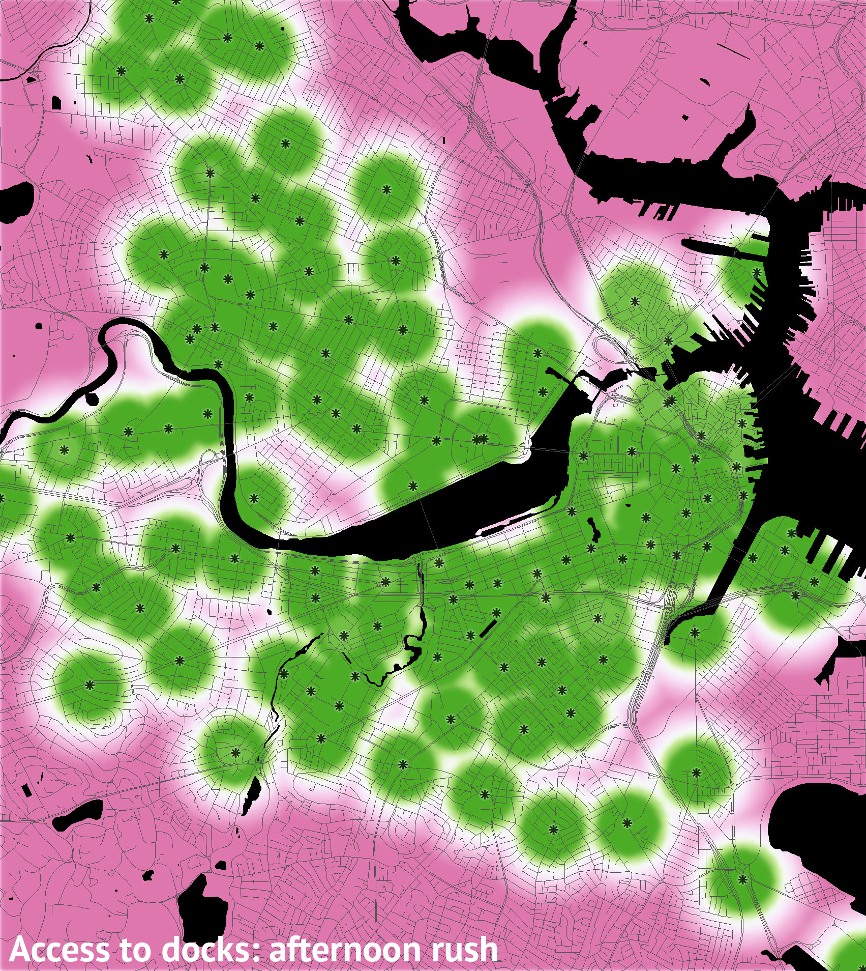
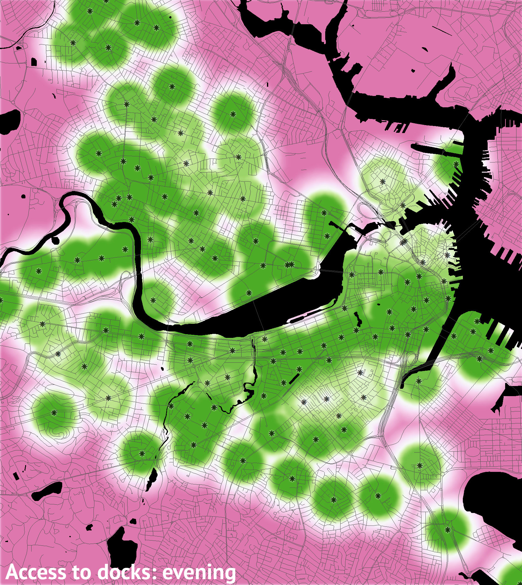
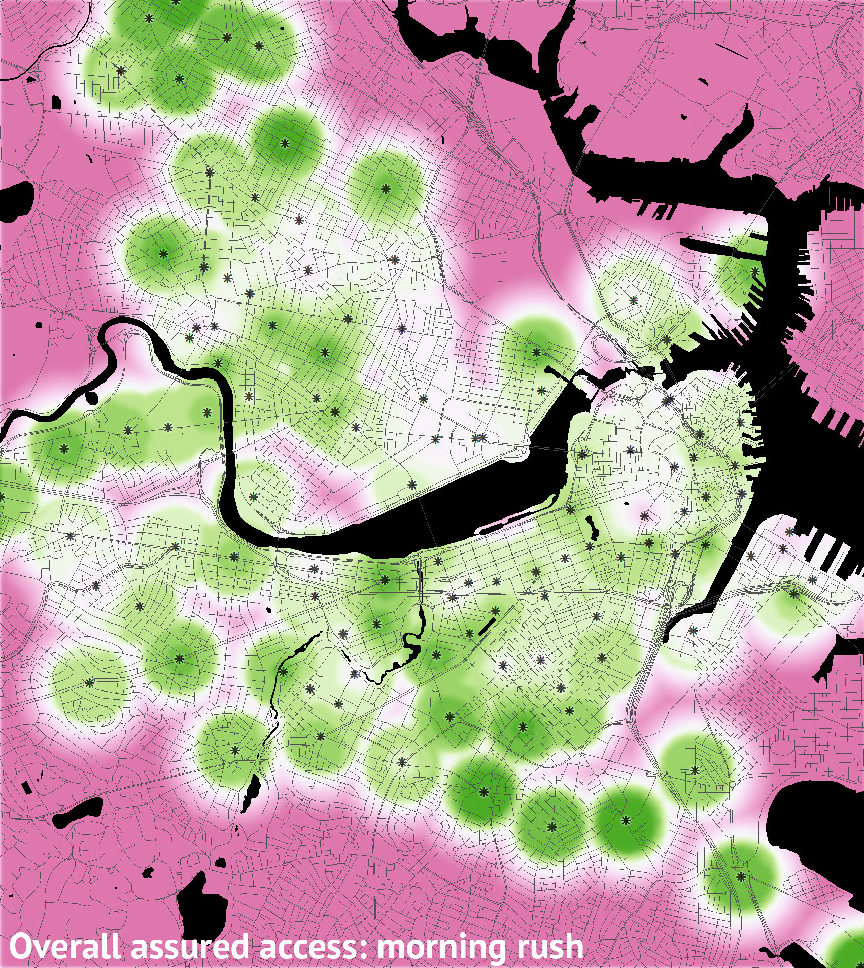
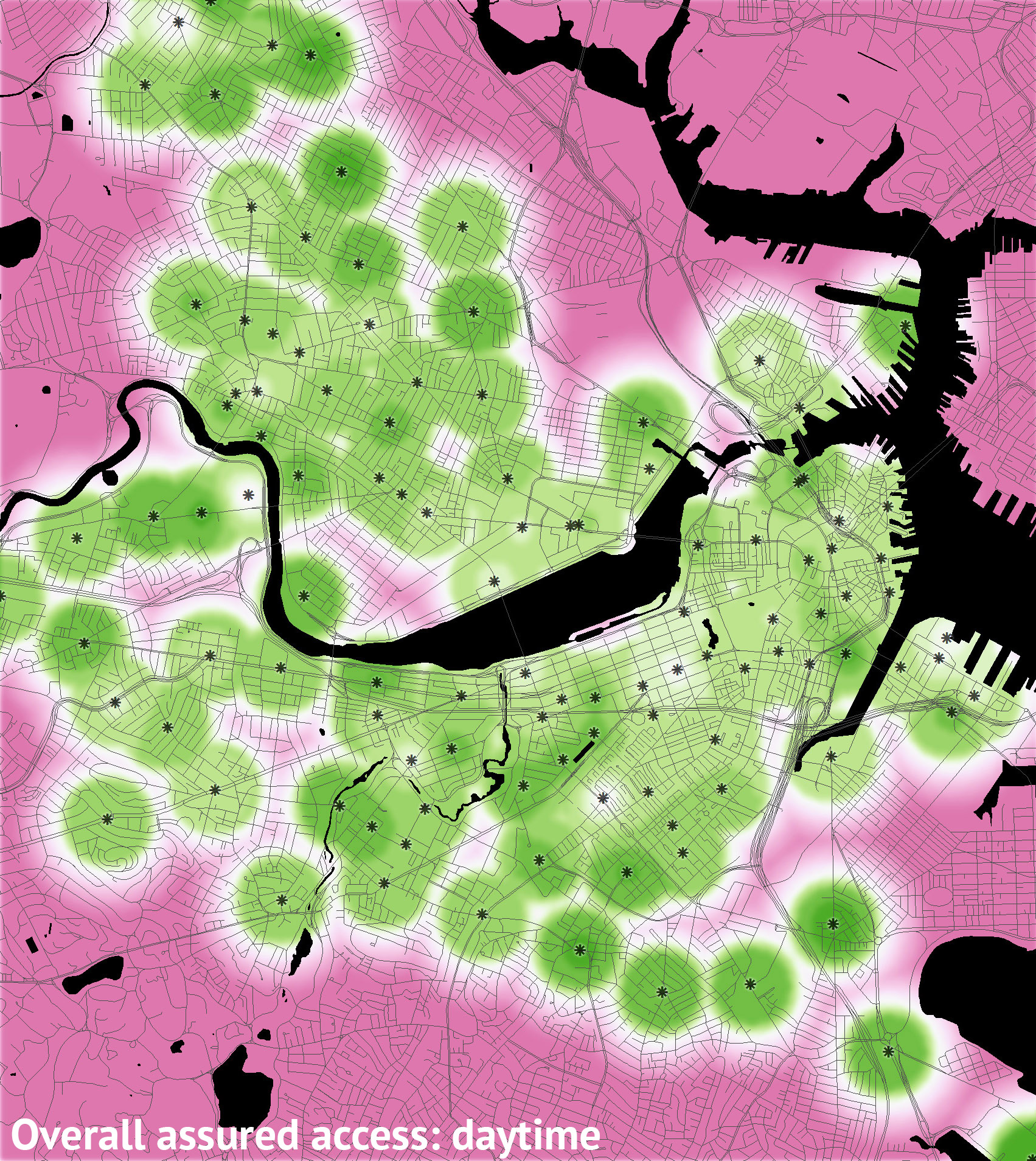
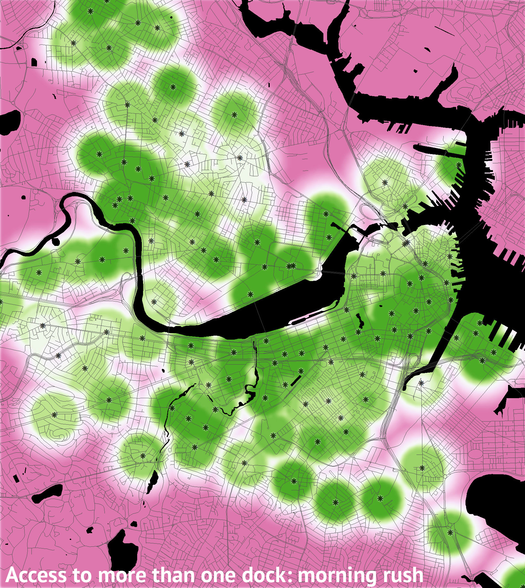
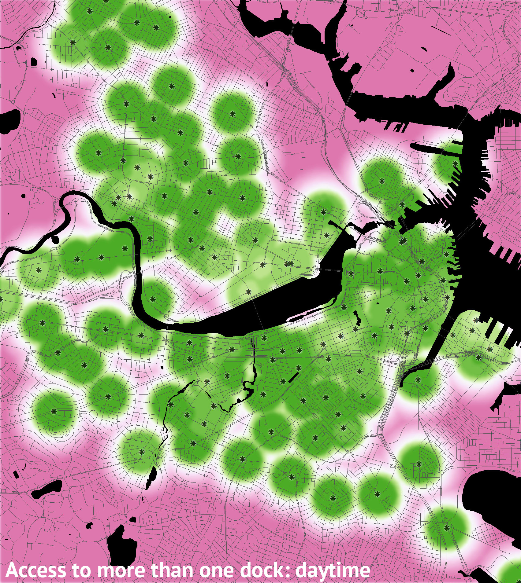
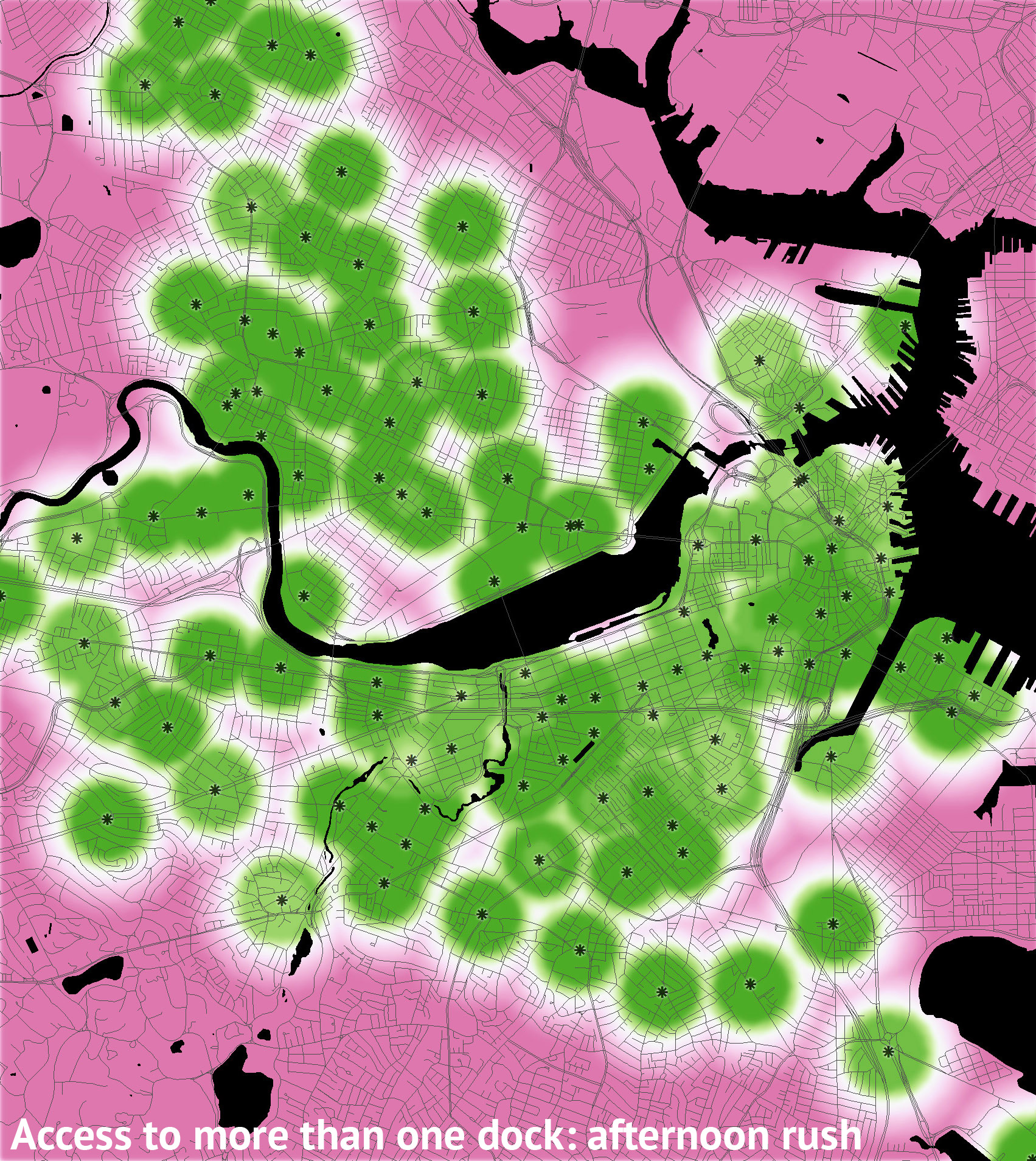
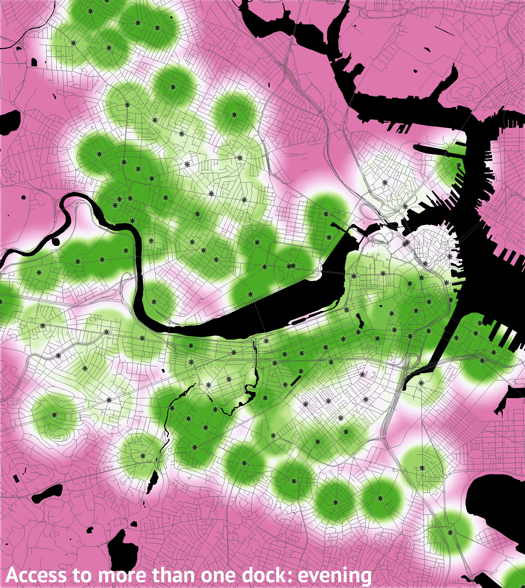
  • Time: Like any transportation system, Hubway sees different usage patterns during different times of day. The small multiples show how availability changes throughout an average day. The time slices are the morning rush (6–9 AM), daytime (9 AM–4 PM), afternoon rush (4–7 PM), evening (7–11 PM), and overnight (11 PM–6 AM).
  • Station availability: This is the percent of time when stations were available. Availability is defined in three ways, each with its own set of maps.
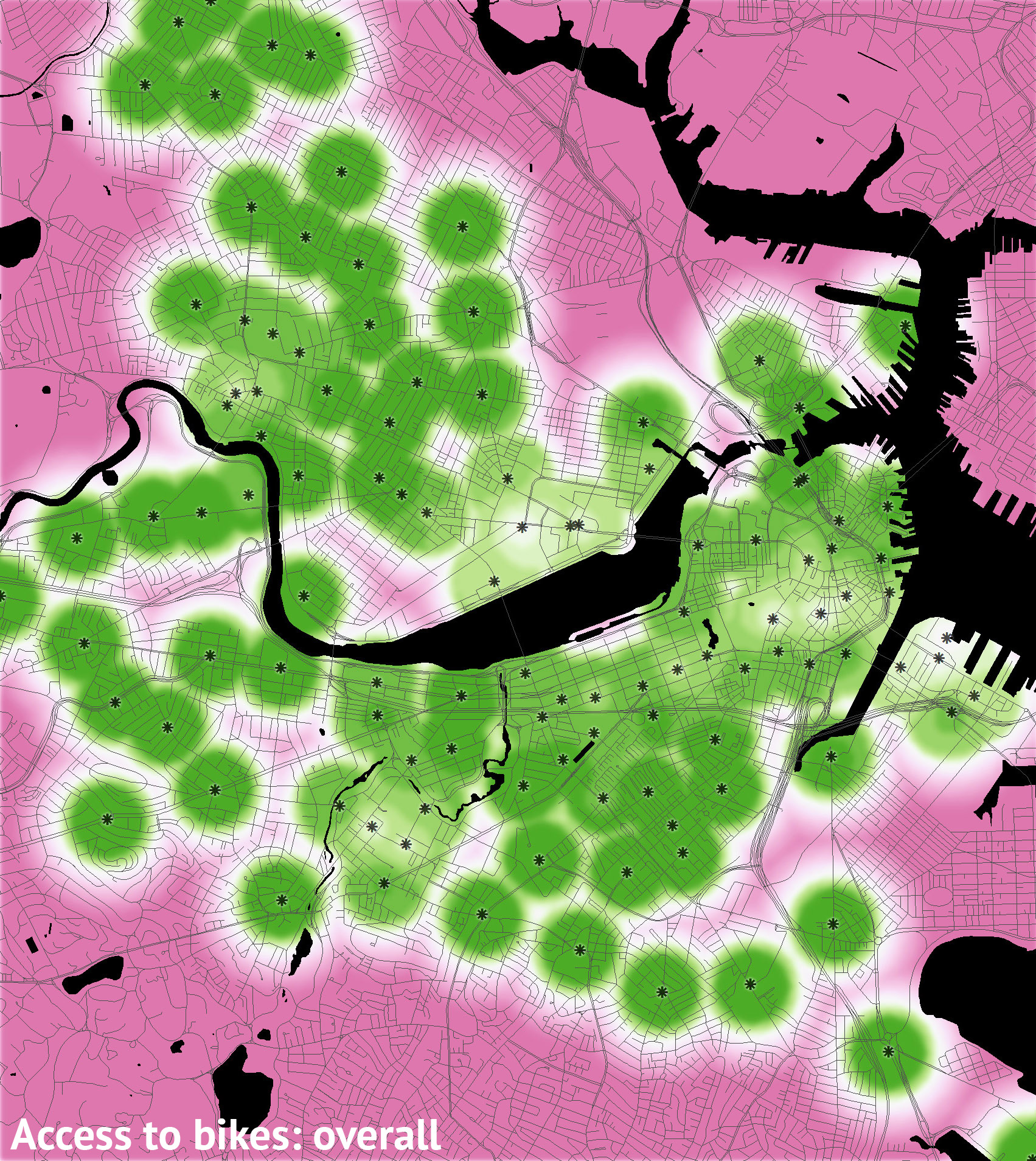
    • Number of bikes available: If there are no bikes at your departure station, you can’t go anywhere, or at best you have to walk to the next closest station.
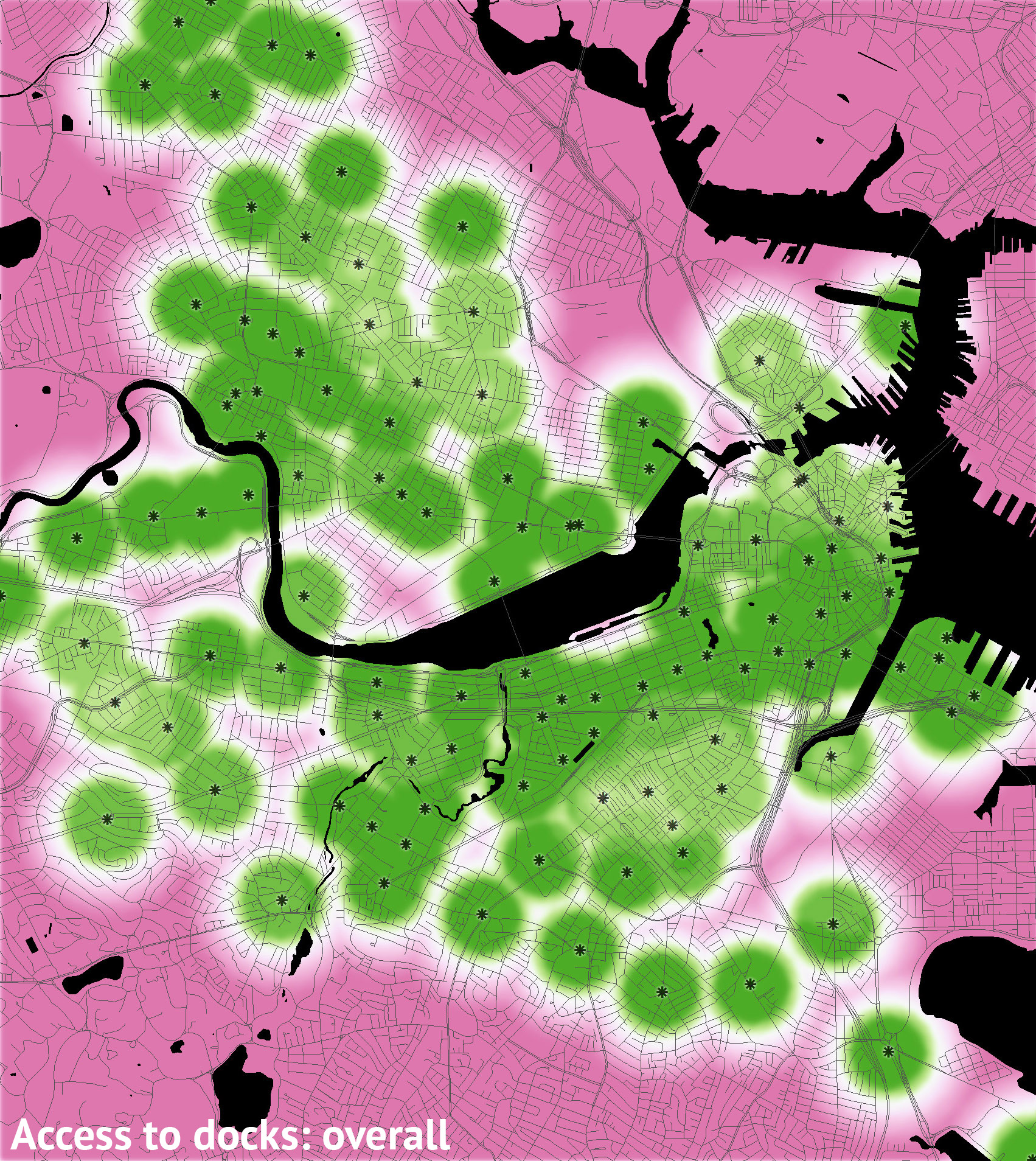
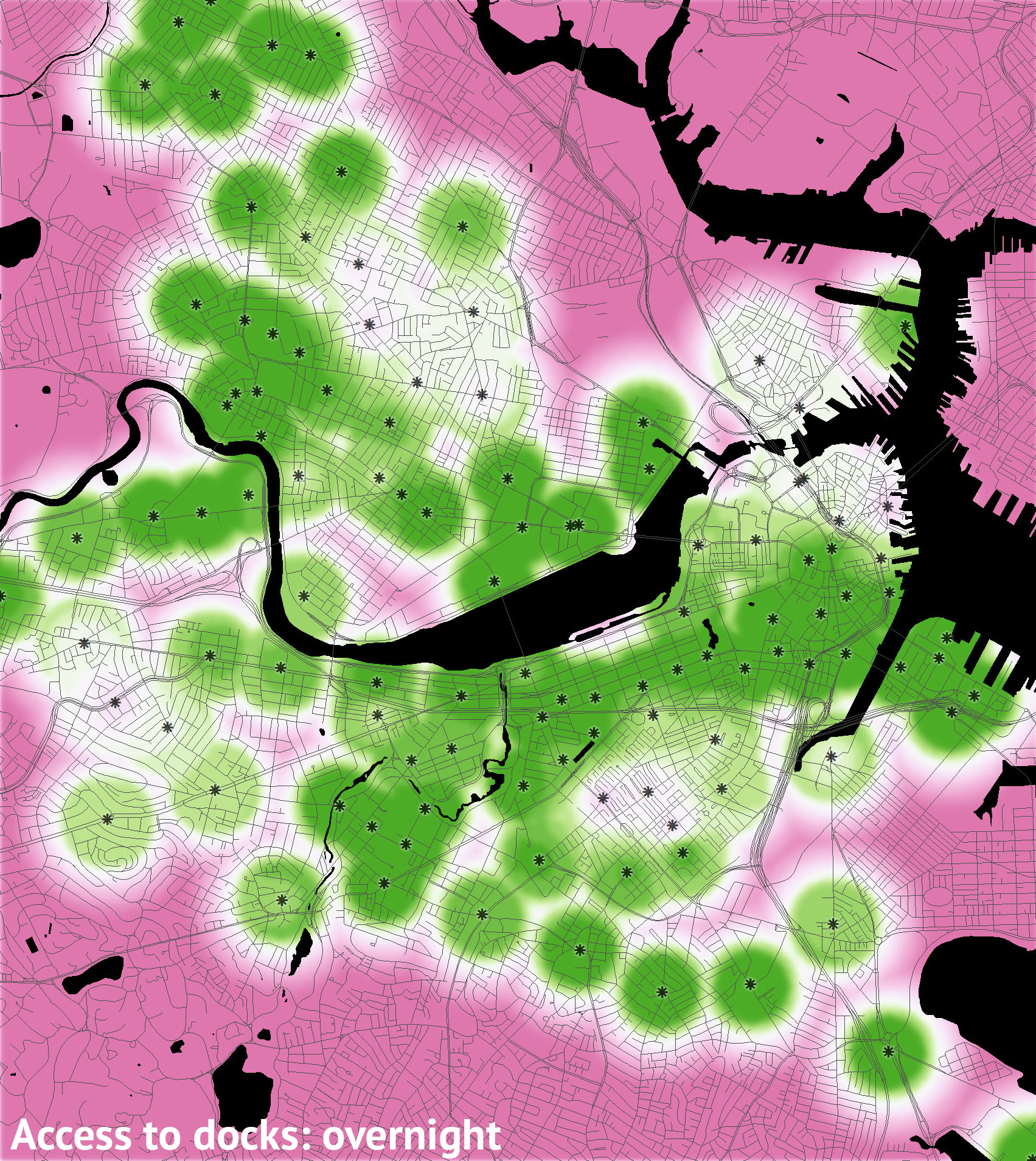
    • Number of docks available: If there are no empty docks at your destination, you’re in trouble, i.e., you can’t get there from here.
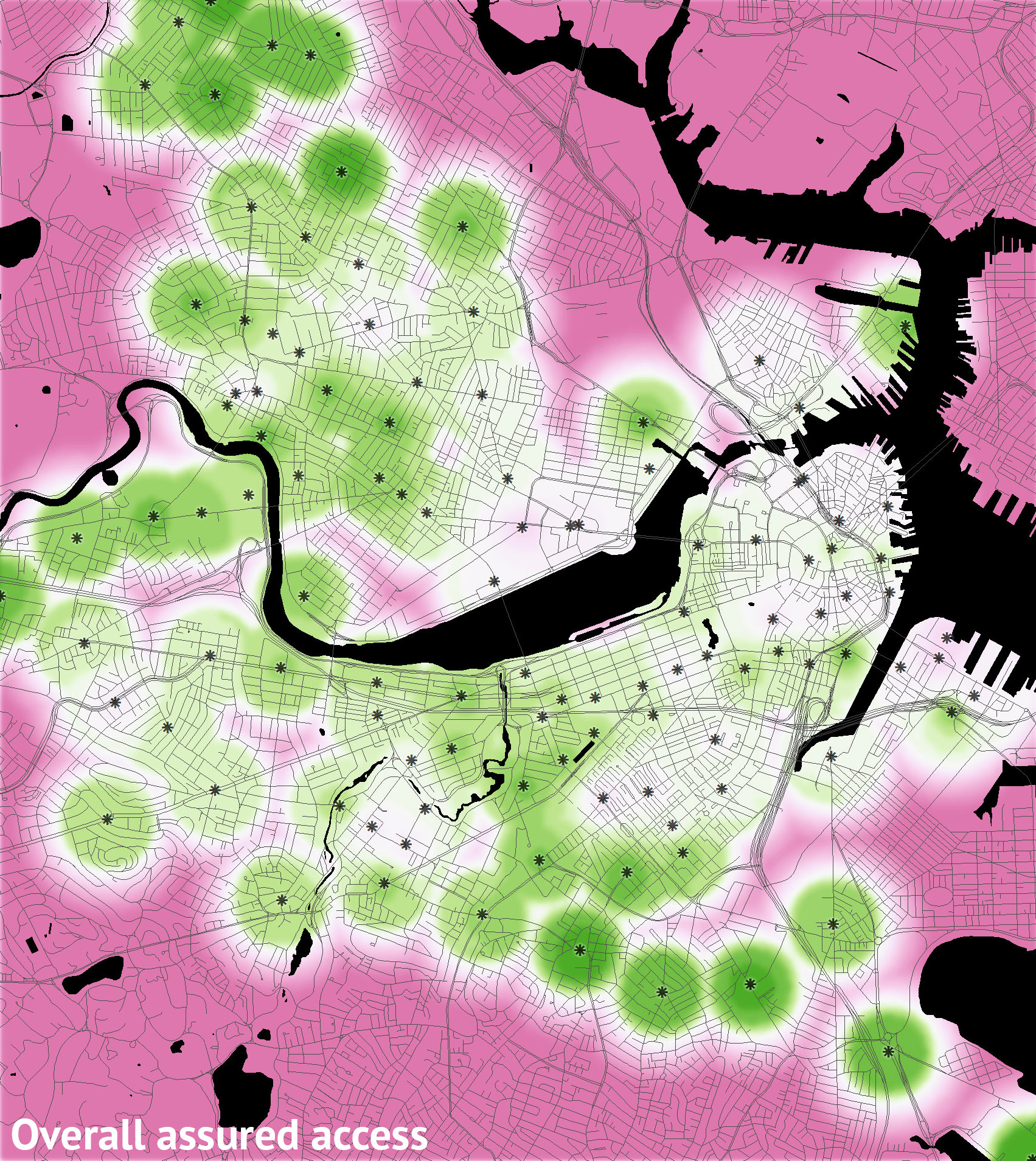
    • Number of docks and bikes available: The “overall” maps count a station as unavailable if it is either full or empty.

legend

Overall access

overalloverall_moverall_doverall_aoverall_eoverall_n

Access to bikes

emptyempty_mempty_dempty_aempty_eempty_n

Access to docks

fullfull_mfull_dfull_afull_efull_n

The maps above are all based on times when the number of bikes and/or docks was greater than zero. But if you’re like me, nonzero isn’t an assurance of availability. If I’m headed out and see that only one dock is free at my destination, it feels like a big risk. With that in mind, below is a series of maps based on a more comfortable margin: if a station has only one bike or one dock, it’s treated as unavailable.

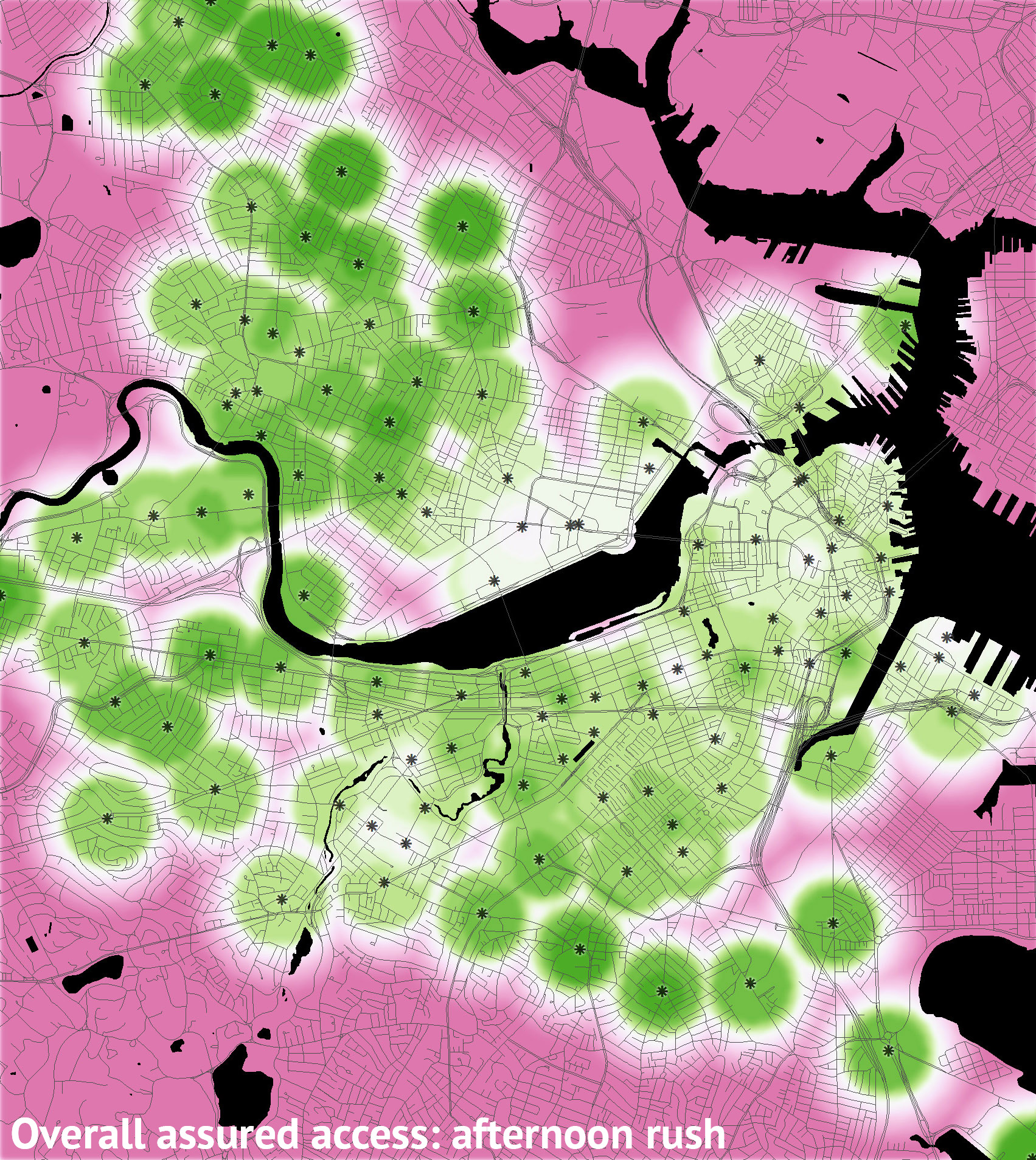
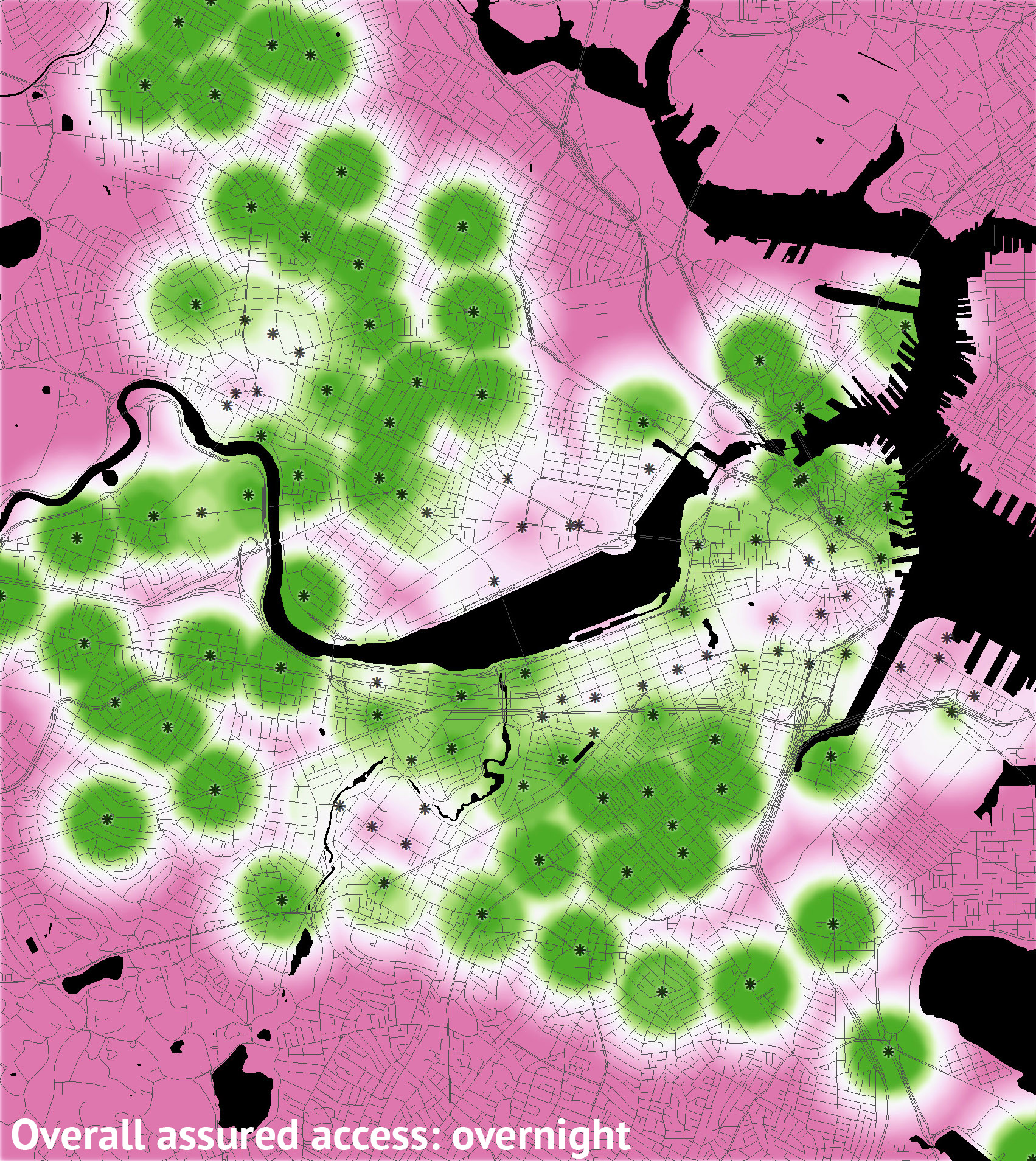
Overall assured access

a_overalla_overall_ma_overall_da_overall_aa_overall_ea_overall_n

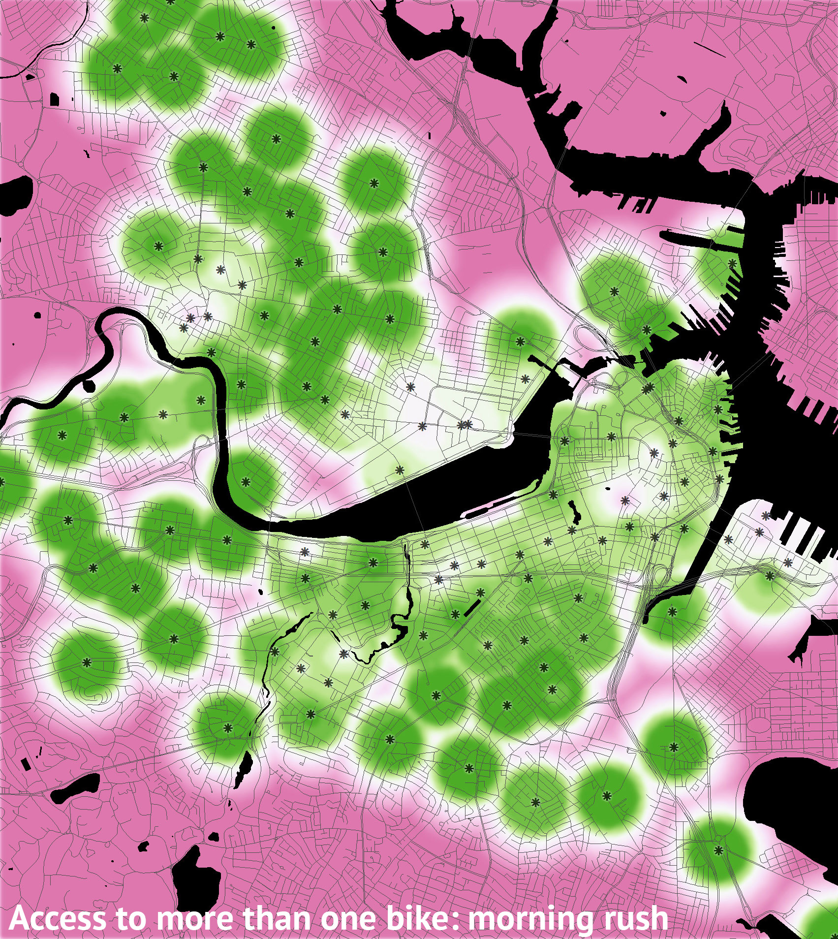
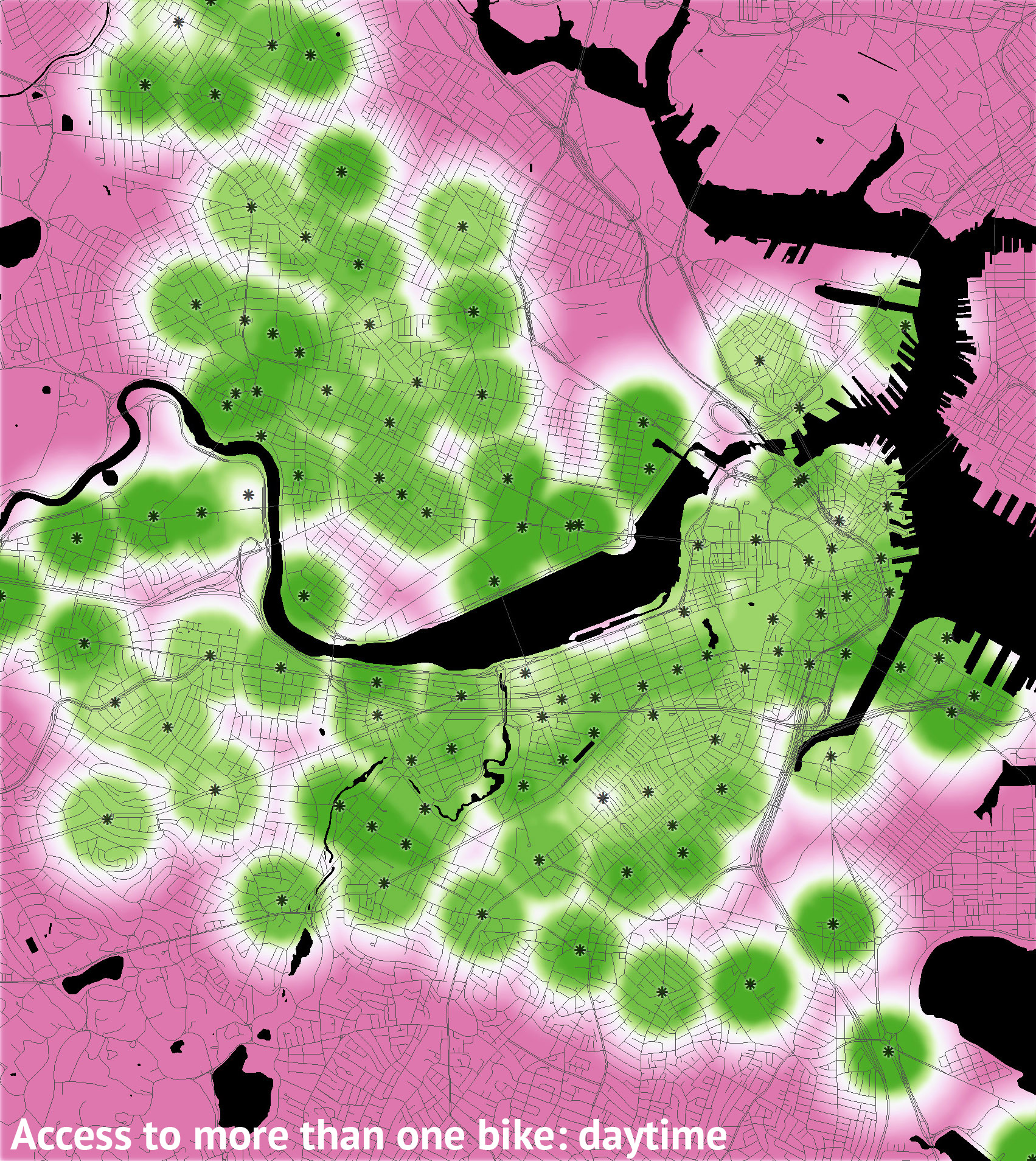
Access to more than one bike

a_emptya_empty_ma_empty_da_empty_aa_empty_ea_empty_n

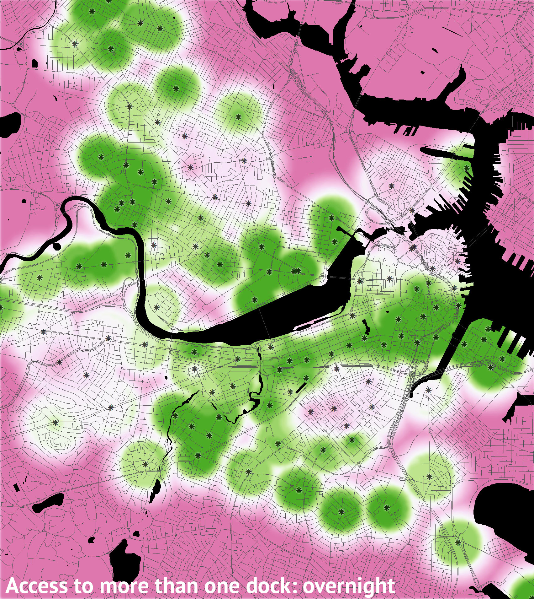
Access to more than one dock

a_fulla_full_ma_full_da_full_aa_full_ea_full_n

Having looked through all of that, a few observations:

  • There are gaps in Hubway coverage. Not that we needed these maps to know that, but besides the fringe areas, some of the interior is not well served, such as Cambridgeport and some of Brookline.
  • Daytime accessibility is good. In most scenarios, station availability is high and the maps are not easily distinguishable from a simple distance map.
  • Availability isn’t great in some high-employment areas. Probably the most dramatic thing in these maps is the emptying of Kendall Square in the afternoon. It makes sense that people would leave such a high-employment area in droves at the end of the day, but the Kendall area has also recently become a restaurant and bar hot spot, and Hubway bikes are not so reliably available during their busy evening hours. Similar patterns can be seen in the Financial District, the South Boston waterfront, and the Longwood area. Perhaps these places could use larger stations or more concerted rebalancing efforts.
  • Overnight: good luck! Access to docks during overnight hours—and bear in mind that much of this time is when the T doesn’t operate—is often limited in residential areas. If you’re out late and need to get home to Somerville, Cambridge, Brookline, Allston, Charlestown, the North End, or the South End, you may be in trouble. Usage overnight is low, granted, so it’s unlikely for someone to swoop into the last available dock before you do, but the stakes are high.

Overall the system is usable; there are few if any cases where stations aren’t available at least a majority of the time. And it’s a fantastic addition to the city’s transportation modes. But in a lot of situations it can’t be relied upon as the only transportation option. Never mind that it doesn’t even exist for a quarter of the year—you just never know when someone’s going to beat you to that last bike!

Posted in Transportation | Tagged | 1 Comment

Neighborhoods as seen by the people

UPDATE! We’ve got a new and better version of the neighborhood mapping project! Head on over to bostonography.com/hoods!

Below is a map that has been shown off a bit recently, both on Twitter and by me at a couple of events this month (namely, at a Boston Indicators Project open house and in the related Data Day also organized by MAPC). Loyal Bostonographers will recognize this: it’s an update to the survey data we’ve been collecting and last analyzed almost a year ago. Because the same types of questions invariably come up, I’d like to briefly explain what’s going on with this map.

Boston neighborhoods consensus

What is this?
This is a summary map of data collected in our neighborhood boundaries survey. We asked people to draw boundaries for 21 Boston neighborhoods and have overlaid the resulting shapes (about 4,800 from 950 respondents) to measure the amount of overlap and calculate consensus within each neighborhood.

Do people who live in a neighborhood see it differently from others? Do people who have lived there a long time see it differently from people who have lived there a short time?
Good question! Our survey did not collect any information on where people live or how long or anything like that. It’s a major reason why you should take this map with a grain of salt. Our results are interesting and should prompt further exploration, but they shouldn’t be seen as conclusive about anything because of the lack of this kind of information. Opinions of people who do not live in a given neighborhood shouldn’t be ignored, but to be certain about anything we’d do better to distinguish between residents and outsiders.

Why are Charlestown and East Boston excluded?
This survey was about the major top-level neighborhoods, and at that level Charlestown and East Boston can’t really be disputed because they are physically separated from the rest of Boston. Yes, there are smaller neighborhoods within both of them, but that’s not the level we were looking at here.

Then why are tiny neighborhoods like Bay Village and the Leather District on this map?
Quite simply, it’s because they are apparently important enough to have their own parking permits. That has a very practical impact on neighborhood definition.

Why is [Fort Point, Upham’s Corner, Readville, &c. &c.] not on the map?
See answers above. This map is about the larger major neighborhoods. Life may revolve around smaller subneighborhoods, sure, but that is for another survey. At the moment we’re interested in the fact that nobody can agree on the definitions of the big neighborhoods. An interesting future study would be more free-form, asking people simply to draw and name whatever they see as their neighborhood.

Why is Roslindale so ill-defined?
This may be in part due to genuine uncertainty about the neighborhood, but it’s also a lack of data. The outer neighborhoods didn’t get as many responses as the well-known inner neighborhoods. There is a lot of noise within the data, and when there isn’t enough signal to drown it out, the certainty appears to be less.

What can be concluded from this map?
As mentioned earlier, we can’t say anything confidently. But it seems that the old, central neighborhoods are easily defined—and fair enough, they tend to have distinctive visual identities that anyone can notice—while the other residential neighborhoods are less clear, even where there used to be real historical boundaries. The conclusion I’d suggest is that despite the practical necessity of boundaries, they’re arbitrary and meaningless in most aspects of life!

Posted in Projects | Tagged | 7 Comments

Live MBTA bus speeds

Live MBTA bus speeds map

‘Tis the season to revisit and update some of our past projects. You may remember the map from November 2011 showing 24 hours of GPS location data from MBTA buses, colored according to their speeds. (A local adaptation of maps made by the venerable Eric Fischer once upon a time.)

The cool thing about the existence of such a map in the first place is that the data behind it are live and constantly published. It’s the same data that has helped you catch the bus on time thanks to apps built around it. Every minute it’s something new, so why limit mapping to a single snapshot in time? I’ve learned better ways to automate this mapping since making that first map, so with a bit of code we can sit back and let the maps draw themselves as time goes on.

Starting today, we’ll keep an archive of daily bus location/speed maps, and also maintain more of a live map that shows the most recent data. The latter is a web map that you can pan and zoom, and it’s updated every hour. It shows either the most recent three hours—so you can look at different times of day and see, for example, the difference between rush hour and late night—or the full 24 hours of the previous day.

As the collection of archived maps grows, you can find a particular day’s map at a URL of this format:
https://bostonography.com/bus/archive/mbta-bus-YYYY-MM-DD.jpg
(e.g., https://bostonography.com/bus/archive/mbta-bus-2013-05-29.jpg)

The most recent day’s map will always be at:
https://bostonography.com/bus/archive/yesterday.jpg

Meanwhile, check out the web map, and discuss!

Live MBTA bus speeds map

Details for nerds

Design: The design and concept of the maps are essentially the same as the older map. They are partly meant to convey overall patterns of MBTA bus service and allow comparison over time, and partly meant to be pretty pictures.

Color: Unlike the original map, these are more true to the traffic light metaphor commonly used in traffic maps. I wanted to stick with this because it’s fairly well planted in most of our brains, and further because the colors are all vibrant (unlike proper sequential color schemes), which is important in an aesthetic piece like this. Red-yellow-green is a big problem for color blind people, however. Thanks to some tips from Twitter peers, I worked with colors that vary in levels of blue. Viewed through the helpful tool Color Oracle the colors can be distinguished, although obviously they’re not great.

Technical: We hit the NextBus data feed frequently and save bus locations to a database. The database keeps a rolling 24 hours of data, so old records are deleted as new ones arrive. Image rendering is done by some pretty simple PHP scripts that grab the data, string the points together into lines based on vehicle ID, calculate distances and speeds, then draw thousands of lines either on top of a street map image (for the static, archived maps) or on blank map tiles (for the web map). The code is available on GitHub, with the caveat that it represents an easy way of doing this, not necessarily a good way. Improvements welcome, especially if I can understand them!

Base map: The street map underneath the bus lines uses OpenStreetMap data and was a quick design in TileMill. In the web map, the tiles are served using this thing.

Posted in Transportation | Tagged , , | 10 Comments

A plow, now!

Remember that time last weekend when it snowed a whole bunch and we all waded through four-foot drifts to get out of the house, went skiing down city streets, or else enjoyed lots of bacon and beer in the comfort of home?

The geography of this event can be summed up as “snow everywhere,” but besides vague or anecdotal accounts there is some data to look at. Beyond the snow itself, we can track the progress of storm response. The city of Boston set up a web map that tracked the live location of snow plows and their ground covered, which would be excellent for a summary map, but in an excessive triumph the site was overloaded and had to be shut down because the demand was interfering with the city’s ability to track plows itself. (Otherwise, we could make a nice map like our friend Derek Watkins did for NYC.)

So instead of the plows, how about people clamoring for plows? The city compiled a list of snow-related calls from the ever fascinating constituent services request data, around 15,000 in total from Friday through Monday. Most of these calls are labeled as requests for snow plowing. While there are a couple of hot spots (er, cold spots?) geographically, the temporal aspect is interesting. Who was impatient on Saturday morning? Who still had a snow-clogged street on Monday afternoon? (To say nothing of the problems that have lingered for days more.)

Boston snowstorm complaints

And in animated form through the weekend (pretty much 100% copied from this map):
Animated map of Boston snow-related complaints

Conclusions? Well, none over time, really, except that peak complaint time everywhere was between Saturday afternoon and Sunday afternoon. Overall, with a couple of exceptions there appears to be something of an inverse relationship between population density and request density. In high-density areas, plowing a single street satisfies more people than in a lower density area, where plows have to cover more ground to reach everyone. Some of the highest density areas are also important business districts too, and may have been a priority. Also, residents in the high-density areas are probably less likely to drive regularly, and thus there are fewer urgent demands for clear roads. Or maybe something else is going on. What’s your opinion or experience?

Whatever happened with snow removal, thumbs up to Boston for keeping the complaint data open and up to date!

Posted in Seasonal | Tagged , , | 1 Comment

Bostonhenge

New Yorkers want to own everything. Even the sunset once in a while: you may have heard of the phenomenon known as Manhattanhenge, when the setting sun aligns with Manhattan cross streets. It occurs twice a year—really four times if you count the rising sun, which is apparently too early for anyone to be in the mood to talk about.

Here in Boston, like most everywhere else in the country outside New York, we’re at the disadvantage of not having the insane skyscraper street canyons that make Manhattanhenge remarkable. But perhaps our lack of any overall street system makes up for it; Manhattan gets only a couple of days each year, while the sun rises and sets over different streets on a number of dates here.

Boston November sunset

For one thing we have MIThenge, when the sunset aligns with MIT’s Infinite Corridor. A phenomenon involving the sun’s reflection on the Hancock tower has also been noted.

As for streets, well, our straight streets don’t tend to be very long, but here’s a map of a few of those that theoretically offer views of the sunrise or sunset. (Click it for bigger, better size.)

Bostonhenge

This map is only based on geometry and a sunrise/sunset calculator, so it’s no guarantee of a good show, but these streets and others may be worth checking out on the right days. I think something fun could be done with “Commhenge” and the Prudential observation deck—as you may have noticed, the street points right at the Pru. You may know some other good streets from your own experience, so please share!

Go watch those sunrises and sunsets, Boston. Life is short; enjoy the colors!

Boston streets analemma

Tim said there should be a cool analemma infographic. I’m not sure I succeeded here, so let’s hope he’ll come to the rescue.

Posted in General | Tagged , | 10 Comments

Blue and Bluer: Massachusetts and Boston 2012

2012 Boston and Cambridge presidential votes

You’ve seen tables and maps of counties and towns with the numbers for President Obama and Governor Romney in November’s election. But you may not have seen the detailed story in Boston. Well, that’s what we present above, in collaboration with friend, colleague, and scholar Kirk Goldsberry, a geographer currently at Harvard whose Texas election maps made the rounds recently (although lately he’s known for his NBA visual-spatial analytics). This is about as detailed as one can get: it’s a map showing a dot for every Obama and Romney vote in Boston and Cambridge. Dots are distributed randomly within precincts, minus areas that are unpopulated according to several data sources—note that although this is a 1:1 map, the dot locations do not reflect actual individual voter locations.

The first thing you’ll notice is that these cities are very, very blue (i.e., Democratic). The split in Boston was 79% to 19% in favor of Obama; in Cambridge it was 86% to 11%. Given the blue baseline, it’s interesting to pick out the areas of Romney support, but even there you won’t find much in the numbers. According to early data, Romney carried only two precincts in Boston (in South Boston), one of which gave him a slight majority and the other of which he won with a plurality on a margin of four votes. He outperformed his national vote share (about 47%) in only one additional precinct, and he lost by less than a 10% margin only in a further three. In other words, you might say that Romney performed reasonably well in only six of 253 precincts in Boston. Across the river in the People’s Republic he didn’t have a prayer anywhere: his best precinct gave him only 18.7% of its vote.

Top Obama and Romney precincts in Boston/Cambridge

The “strong” Romney areas were in South Boston, and you can see some moderate support in places like the North End, Charlestown, Beacon Hill, Back Bay, West Roxbury, and part of Dorchester. Looking at the dot map you may start to think of race and ethnicity patterns in the city, and indeed there are very real correlations. As was the national trend, Romney’s strongest support was in areas with a mostly white population. Obama’s support, meanwhile, was exceptionally high in areas with mostly black population. It’s harder to see on the map because of the overall blue-ness, but among the 61 precincts with a majority black population, Obama averaged 96% of the vote.

White population vs Romney vote, Boston and Cambridge by precinctBlack population vs Obama vote, Boston and Cambridge by precinct

Compare the vote map with a map of a few race and ethnicity categories below. Whether we like it or not, voting patterns are inextricably linked to—and to some extent predictable by—demographic patterns, and not just the super basic racial patterns we’ve mentioned here. To fully understand the electoral landscape of the city, there are many other correlations to investigate.

Boston and Cambridge race & ethnicity

Stepping back to the state level, Massachusetts is near the top of the list of “blue states,” reliably voting Democratic in national elections and being home to the “Massachusetts liberal” bogeyman. Take a look at a county-level map of the 2012 presidential election and you’ll see that Massachusetts was one of only four states in which President Obama won every county. (Two of the other three are our neighbors, Vermont and Rhode Island.)

But counties—largely meaningless non-entities here—in one race paint a simplistic picture. What are the actual partisan voting patterns within the state? Here’s one way of looking at it:

Massachusetts 2012 election composite

This is a visual technique I first tried on 2006 elections in Ohio. It combines red–blue spectrum maps of several different races into a single, averaged image. In this case we have the major national and state elections of 2012: President, US Senator, US House, Massachusetts Senate, and Massachusetts House. Essentially, maps were overlaid on one another and average blue and red pixel values were calculated. (They were then converted to something more like cyan and magenta for aesthetic and legibility purposes.) It’s not a proven technique and we can’t claim that it accurately represents regional political sentiment, but it does roughly represent voting patterns in the recent election.

What probably strikes you first is a few particularly red areas. These are home to the several state races that had an unopposed Republican candidate, and they only stand out because the rest of the state is so blue. If for some reason you doubt Democratic strength in Massachusetts, consider this: in the recent election 3 of 9 US House districts, 24 of 40 state Senate districts, and 90 of 160 state House districts had no Republican candidate. That’s right, a majority of state legislative districts had no Republican candidate. (Not all of these had unopposed Democratic candidates; some had third party or independent challengers.)

Bottom line? Whether it’s the city or the state, this is blue country, my friends. But you knew that already.

Data sources:

Posted in Political | Tagged , , , | 5 Comments

Handy turkey maps of Boston

(Or, “Bostonography goes back to kindergarten.”)

Sidewalk turkey
This town is no stranger to turkeys. Above is a rude, slow pedestrian near Harvard Square, for example.

Wait, maybe Harvard Square is a turkey! We tried our hand at mapping this thought:
Harvard Square turkey hand map

Actually, the whole region is a turkey. And look, its head is right where the original Thanksgiving was! As they say on a different North Shore, shaka brah:
North Shore/South Shore turkey hand map

Step back and we can see that the whole of Massachusetts, in fact, is a turkey:
Mass turkey hand map

The Boston wharves turkey sports proudly struts around in Boston Common underpants and, naturally, needs corrective lenses to see Spectacle Island:
Boston wharf turkey hand map

And what do you see when you look at the Back Bay skyline? Why, a turkey of course:
Back Bay skyline hand turkey

Where do everyone’s favorite turkeys play baseball? In America’s Most Beloved Turkey:
Fenway Park turkey hand map

Please, show us maps (in turkey form) of your favorite places!
We’re looking at you, Mr. Sullivan!

Happy Thanksgiving, folks.

Posted in Holiday | Tagged , , | Comments Off on Handy turkey maps of Boston

Visualizing Hubway, for real this time

How convenient. As soon as we got around to our previous post, in which we mapped some Hubway bike sharing data, a new visualization contest started. This time, MAPC and Hubway invited people to visualize every Hubway trip to date (October 1, 2012), providing a record for each that included the start and end points, the date and time, the particular bike used, and some information on the user. Juicy, delicious data, folks.

There’s a ton one can do with this data, but one only has so much time. I took a swing at it on behalf of Team Bostonography by building an interactive map that allows you to filter trips by about ten different variables and view where trips occurred under the specified conditions. The map queries a database for the given combination of filter settings and returns trip counts for each station to every other station. On the front end it’s built with Leaflet and uses MAPC’s basemap tiles. (<greasy salesman>And the basemap tiles are a product of my company; we worked with MAPC to develop those styles back in the spring.</greasy salesman>)

Hubway Trip Explorer

You can view trip volumes (represented by line width and/or color) either for individual stations or for the whole system at once. The available filters are these:

  • Time of Day: A time range in which the trip either began or ended
  • Date of ride: Months and days of the week on which the trip occurred
  • Day or night: Whether the ride occurred during daylight
  • Duration of ride: How long the ride took
  • Member type: Registered annual member or Casual (1 or 3 day) member
  • Sex of rider: Uh, sex of rider
  • Age of rider: Yup
  • Home of rider: Where the rider lives, from a selection of several zones
  • Precipitation on day of ride: Whether there was any precipitation that day
  • Average temperature on day of ride: The 24-hour average temperature for the day

In order to account for the the fact that some stations (e.g. everything in Cambridge and Somerville) are much younger than others, the overview maps represent trips per day of station activity, and the individual station maps show volumes as a proportion of the total trips for that particular station. It’s easy to see the potential of some of those newer stations—one or two of the Harvard Square stations, for example, actually show up strongly enough even as raw counts despite being much shorter-lived than the original set of stations.

To highlight a few salient or interesting bits of information coming from the data, I also made a short series of infographic-like things with maps and charts. Some of them are admittedly not super informative or not charted in ideal ways, but they nevertheless provide glimpses of some avenues to explore in the data. See them below or compiled into a PDF.

Hubway Snapshots
Hubway Origins & Destinations
Hubway Daily Cycles
Hubway: Getting Green
Hubway Demographics

Those graphics include much of what I found interesting from the data, so I won’t try to talk through many of my own conclusions. I will say that looking at certain time slices (times of day and/or days of the week) tends to be the most revealing—especially combined with the home zip code of the rider. We’re all about geography here, after all!

Again, there are gazillions of questions to be asked and answered with the data, and we’ve only gone after a few of them. Be sure to look through all the submissions to this contest to see the awesome things people have done here and the information they’ve uncovered!

Posted in Transportation | Tagged , , | Comments Off on Visualizing Hubway, for real this time

MBTA + Boston Bikes Visualization

Back in January, the MBTA and City of Boston sponsored a developer challenge to develop new apps and visualizations making use of real-time bus locations and Hubway bike sharing station data. For the visualization challenge, they provided three days’ worth of bus GPS location reports as well as point-to-point trips in the Hubway system. Just before the data become the officially out-of-date age of one year old, which is too old especially in light of the recent Hubway expansions, we figured we should post what we put together for the contest.

We worked with Kirk Goldsberry—Geography professor at Michigan State University, current visiting scholar at Harvard’s Center for Geographic Analysis, and frequent proposer of cool map ideas, known best these days for his NBA spatial/visual analysis—who had also been interested in mapping this kind of data and who had some good ideas for how to approach it. Dr. Goldsberry’s plan was to focus not simply on the point data but rather on the broader paths and areas affected by these data. In what areas might we find activity associated with buses? What parts of the city see the most Hubway riders on their streets? We weren’t able to address the idea fully, but it was from this angle that we viewed the data, especially the Hubway trips.

Hubway and MBTA bus map

One part of our submission was a set of overview graphics. (Download it in higher resolution as a PDF if you wish.) Above is an overview map of the bike and bus trips in the center of town, in our classic style of crazy jumbled lines. The bus locations, shown in yellow, are straightforward plots of the GPS coordinates. The Hubway trips, each one shown in semi-transparent blue, are speculations about the routes riders may have been, based on the origin and destination stations. (More interesting maps and explanations of that in a moment!) The final thing on this map is orange points indicating where buses reported doors open near Hubway stations, presumably where passengers boarded or alighted. It’s a feeble way to get at possible connections between the bus and bike systems, indicating the opportunities to transfer from bus to bike or bike to bus. Altogether it’s hard to say whether this map reveals anything in particular, but it shows the coverage of the systems in question, anyway.

Hubway and MBTA bus trips: Oct 9–11, 2011

Hubway trip durations

Following the overview map were two quick charts, above. The first shows the number of Hubway trips and bus location reports per hour over the three days. There’s a different pattern on each day: one is a Sunday, the next is a holiday, and the third is a regular weekday. The third shows a predictable bimodal distribution with intense morning and evening rush hours, while the others peak in the middle of the day. Our favorite (but troubling) thing revealed by this chart is the small Hubway spike around 2 AM Sunday morning: presumably people are pouring out of bars and hopping on Hubway bikes. The second type of chart is a matrix of all the Hubway stations, showing the median trip duration from each station to every other station. The two take-home points here are that yearly registered Hubway members take shorter trips than the “casual” (one or three day) members and that the longest trips tend to be the ones that start and end at the same station. In both charts we can see a lot of non-commuting usage of the system, which raises interesting questions of exactly what role bike sharing plays in the overall transportation system.

A final question we wished to address was that of common routes taken by Hubway users. Without knowing the exact location of each bike, via GPS or RFID, we had to extrapolate potential routes based on reported “departure” and “destination” locations. This is an important point—these routes are “potential” or “possible”, not actual. They are based on Google Bicycling directions via the Google Directions API. After calculating all potential routes, we sliced the data up by routes “to” and “from” each station. Once we had all of these routes, we could count the number of potential routes at each road segment. The last step of production was made much easier by using Matt Ericson’s MultiExporter .jsx script for Adobe Illustrator. The result is a set of 57 small multiple maps highlighting areas of Boston with the highest potential for Hubway activity. Some areas, like the corner of Beacon & Arlington Streets, could have had as many as 650 bicyclists pass through over the course of the three days when the data was collected. Meanwhile, the largest number of bicyclists to leave any location headed in the same direction was 230. That number of people likely headed southwest from South Station. Take a look at the maps below or (warning: gigantic file!) download the full resolution versions here.

[portfolio_slideshow pagerpos=disabled size=full include=”1844,1845,1846,1847,1848,1849,1850,1851,1852,1853,1854,1855,1856,1857,1858,1859,1860,1861,1862,1863,1864,1865,1866,1867,1868,1869,1870,1871,1872,1873,1874,1875,1876,1877,1878,1879,1880,1881,1882,1883,1884,1885,1886,1887,1888,1889,1890,1891,1892,1893,1894,1895,1896,1897,1898,1899,1900″]

There are a lot of other ways to look at the data, some of which we tried but didn’t publish, so we’d be happy to whip up other maps if there are requests and we can remember how we did any of this. Otherwise, dear readers, do you see any especially interesting patterns?

Credit goes to Tom Auer for first suggesting the approach of looking at volume by street segments.

Posted in Transportation | Tagged , | 4 Comments

Street, Road, and Avenue

Our friend Derek Watkins recently made a map which he claimed copied something I once did (although he did it much more beautifully), so why don’t we return the favor? He also made a few other maps of Portland, Oregon for the new extent(PNW) blog he’s running along with Nick Martinelli—you should check it out because it’s kind of like the Bostonography of the Northwest—and although those additional maps seem to be inspired by formerly local cartographer Bill Rankin, they have in turn inspired a few quick maps right here. (Because honestly we haven’t found much time lately for maps that involve more than copying someone else.)

Anyway, what we’re interested in is street names again. This time it’s the type of street: Street, Avenue, &c. Some cities, like the Portland that Derek mapped, have very orderly patterns of streets and avenues, but “orderly” is not a word that is often used with Boston streets outside the Back Bay or Southie. Still, there are patterns. Have a look:

Boston Streets

Boston Roads

Boston Avenues

Streets, Roads, and Avenues seem to account for the vast majority of street names in the immediate Boston area. Streets clearly occupy most of the central cities, while Roads are a bit more prevalent in the suburbs, especially toward the west. Avenues, meanwhile, dominate some small pockets and comprise a few notable long roads, but otherwise are not nearly as popular.

Having looked at enough maps of the Boston area day after day, something that struck me was how well the “Streets” map seemed to correspond to population density patterns, which can also be seen in aerial images. While we haven’t gone so far as to draw any statistically meaningful conclusions, a visual glance does suggest decent correlation. Here you can see the Streets again with population density greater than 10,000 per square mile shown in yellow in the background:

Boston "Streets" vs population density

It seems clear that “Street” is the type that dominates urban areas much more than elsewhere. To me this makes some sense. The several types suggest different characters: Roads are long paths between disparate places; Avenues are broad, less organic thoroughfares within a city; and Streets are the smaller urban ways. What do you think? Does this hold true in the Boston area?

Posted in General | Tagged | 11 Comments