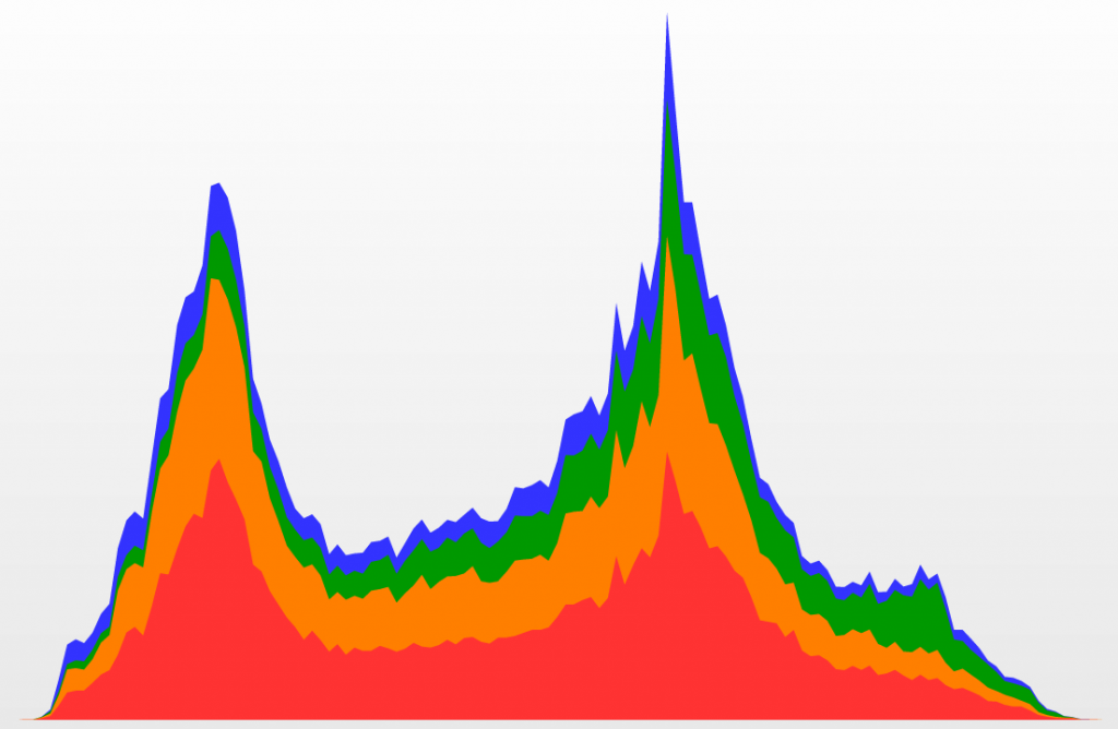
If you haven’t noticed—and I sure hope you have if you ride the T—MBTA schedule and location data are infinitely more accessible than they were about a year and a half ago. A couple of guys at the nascent Massachusetts Department of Transportation did some heroic things with open data, leading to releasing complete MBTA schedule data last year (to Google Maps and the world) and real-time bus and train locations earlier this year. The upshot is that they’ve improved rider experiences on the cheap by opening data and letting skilled and motivated developers in the community create useful applications.
As part of this effort, a developers’ conference took place last year, part of which was a visualization contest. Two days’ worth of fare payments on trains and buses (hundreds of thousands for each day) were released with a challenge to create a visualization of a “day in the life” of the MBTA. I attended the conference but never got around to visualizing anything more than the chart at the top of this post. Thankfully other people had more follow-through.
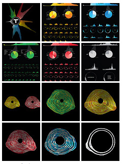
My favorite was the beautiful series of charts by Ryan Habbyshaw, Brad Simpson, and Todd Vanderlin.
Make sure to check out all the other entries. There are more awesome charts, maps, and even data sonification. If anything feels missing, note that the data can’t distinguish which line a passenger used at stations where lines intersect, nor is the location of (most) payments at Green Line surface stops known.
I like looking at the temporal pattern for each station and inferring which places are mostly destinations for people and which are mostly origins. As expected, the outer stations mostly peak in the morning as commuters head into town while the downtown stations peak strongly in the afternoon. But there are some that have bimodal patterns, which I like to interpret as indicating areas of good city life—a nice mix of living and working. Central Square, Andrew Square, and Mass Ave are a few examples of such a distribution. Then there are a few that don’t have big peaks, such as Airport and Community College, where people tend to be coming and going all day.
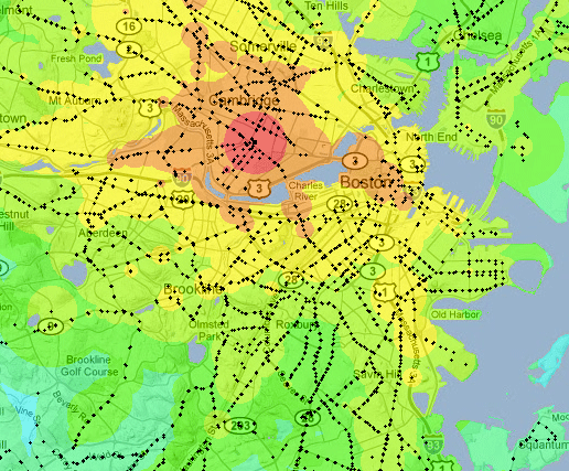
Another MBTA map worth mentioning is this transit time map by Dan Tillberg. Click a point and see how long it’ll take to get everywhere from there via the T. This map is interesting to me because it shows how well my concept of central Boston corresponds to transit times. When I think of the “city” here, I think of an area roughly like the 30-minute zone from, say, Park Street. Thirty minutes from Central Square, meanwhile, pretty well matches my personal range of motion (which I keep documented). It’d be an interesting exercise to compare mental maps to travel-time maps like this.
Though less colorful, similar information (for many other cities as well) is now available in the impossibly cool Mapnificent.
This is certainly not an exhaustive list of maps and charts of MBTA data. More to come as it’s discovered. Links are welcome!


Hey there…just wanted to express my excitement that you exist. I’m looking forward to a ton of interesting map-related posts!
Thanks, I’m looking forward to it too!
I think there are two interesting quirks in the data: the numbers are skewed by all of Park Street’s and Government Center’s traffic being assigned to the Green Line. The Green and Orange lines in effect poach riders from the Red and Blue lines because of they are not being divided between the two lines. Also, the Blue Line gets a healthy amount of traffic from the airport, but the Red Line doesn’t get the corresponding benefit from riders transferring from the Silver Line (which itself is barely included in the data at all).
The other is that both the dates in question had home games at Fenway (causing the big bump in the Green Line’s numbers at about 10:00). That raises an interesting philosophical question about how you define a “typical” day for the T, because there’s always something going on — if not the Red Sox, maybe the Bruins or Celtics or another Fleet Center event, or the BSO at Symphony Hall or performances at the downtown theaters, or a concert at Fan Pier, or an event at one of the universities, or a good band in one of the clubs, etc. etc. etc. If they could find that one Monday in February when there’s literally nothing to do, it would provide an interesting baseline to look at the impact that events have on the system. At the very least, it’s a shame they didn’t do at least one non-Red Sox day to give us some grounds for comparison.
But it’s certainly a good step forward that the MBTA is releasing anything, and I’m appreciative of the designers that play with it and you for passing their work along!
Danny, good points both. My recollection is that a few of the projects attempted to divide the numbers between two lines at each of the transfer stations, but I’m not sure how. Perhaps a ratio can be guessed by looking at the total boardings on each line at other stations. The T does report numbers of total riders on each line somewhat regularly, that is, unlinked trips (if I remember the term correctly) where, say, a rider coming from the airport on the Silver Line and transferring to the Red Line will count toward both. I don’t know the methodology behind that sort of count, although I have also seen a diagram of transfer counts at the downtown stations—something I’ll likely link to on this blog before long.
The Red Sox games are indeed very noticeable in the data here, and it would indeed be interesting to see a baseline day, although it’s a fair point that there is always something happening. With that thought in mind, given something like a whole year’s worth of data it would be a fun exercise to watch all the little spikes and try to identify what they are. Sports games are easy, but I bet some events would be more of a challenge. Anyway, I’m told it may be possible for more data like this to be released, so maybe eventually someone can plug in a non-Sox day to one of these visualizations.