Whether you blame it on cows, humans, or nature, Boston’s street network is very confusing to visitors and unseasoned newcomers. We cartographers can do nothing but delight in how lost you are going to get.
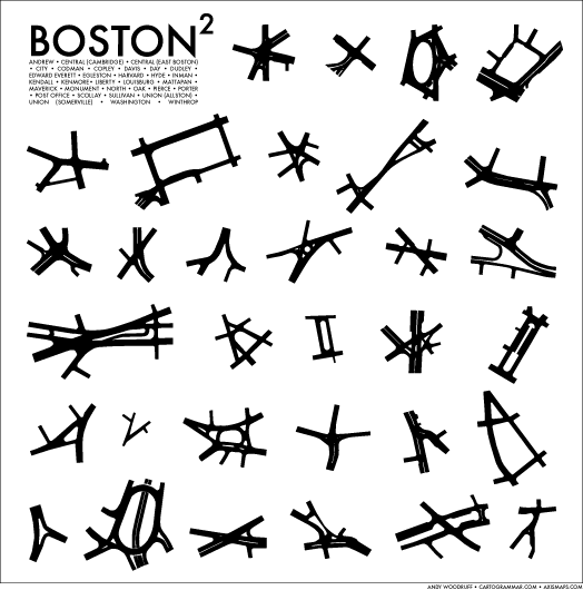
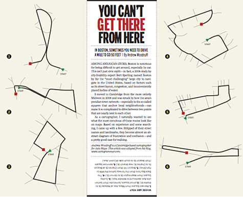
Thence spring my two minimal, sort of stylized depictions of street and traffic patterns in the central Boston area, reposted here from my blog. The first shows a series of “squares” around town and how they are anything but square; the second (here in a layout subsequently published in the Boston Globe, much to my thrill) demonstrates a few potentially bewildering traffic patterns imposed on the street network, indicating hypothetical (but realistically silly) short driving routes through several major squares. Boston’s street layout lends the city a type of charm that is hard to come by elsewhere in this country, and it generates those extra moments of satisfaction when you’ve mastered new parts of it. Whenever I see tourists studying maps, I always hope they’ll provide me a challenge by asking for directions. (Although when they do it usually ruins my day because I fail or don’t do better than pointing and saying “somewhere that way.”)
We can of course look to our old pal Kevin Lynch for a few words and images about the navigational challenges of Boston’s streets. Here, for example, is a sketch depicting how Mass. Ave., Boylston Street, and Tremont Street confusingly all intersect each other at roughly right angles.
Besides traffic difficulties, what else is going on with these squares?
Micro region
The city is like miniature region because the overall organization of streets is like what you’ll see if you look at a smaller-scale map and see how cities and towns dot the landscape with major roads connecting the dots (perhaps as is evident in the Mass Streets map from last month). In the urban area, instead of cities and towns we have squares and neighborhoods, and instead of highways we have a variety of surface thoroughfares. In fact, it’s pretty much exactly the same pattern; in the old days, some of what are now the squares and neighborhoods connected by city streets were different towns and settlements connected by a series of roads. Bit by bit neighborhoods (which often do have coherent street patterns within) filled the gaps, and Boston annexed some of the separate towns, until there was a rather solid central city with an interior web of streets running every which way.
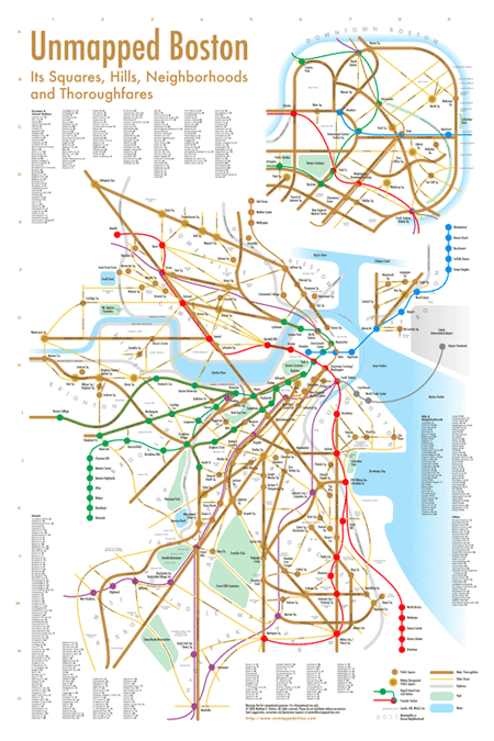
The Unmapped Boston poster by Matthew Harless very nicely demonstrates how Boston is organized as a bunch of nodes and connecting edges. It’s also a handy resource for identifying many squares that you won’t find labeled elsewhere.
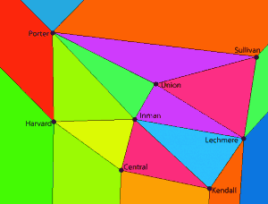
For a total nerdball and mostly meaningless approach to connected nodes, we could compare reality to the edges on a Delaunay triangulation of the squares. Here’s a garish section of my side of the river via this applet. A few actual streets are discernable among those edges, like Mass. Ave., Cambridge Street, and Beacon/Hampshire Street.
Macro mall
In a less grounded thought, I wonder if city streets can effect something like the Gruen transfer—a concept in shopping mall design in which supposedly intentionally confusing layout derails shoppers from their original purpose, leaving them wandering with glazed eyes and spending money all over the place. Boston’s street-level retail scenes may not literally provoke such spending sprees, but I can imagine the streets’ layout, sights, sounds, and smells spurring a similar kind of aimless wandering, even if it doesn’t result in shopping. Back at the broader scale, does Boston’s tangled web of streets and squares encourage exploration and discovery? At the very least it gets you lost and sends you all over the place—almost a literal tourist trap.
Identity
Anyway, the best thing about the wacky squares is the unique, strong identity of each. They’ve all got their own geographic, residential, and commercial character, and if you live near one it’s your square. And the charm, oh the charm of the confusing intersections and navigation from square to square instead of by compass directions. Whether you pick up a poster or a t-shirt of your local square, or simply say its name with pride, I hope you get as much of a kick out of Boston’s squares as I do.


Pingback: The Cartography of Unsquare Squares
Pingback: bibliografie pentru workshop « Experienta Urbana
Pingback: Best of 2011 « Michael Cushen
Pingback: The chaos of driving in Massachusetts | Mass by Volume