It’s your lunch break, and you want to grab some food to eat in the park. Or maybe you’ve just gotten off work, and you want to pick up a meal to take home with you on the T. But curses, you’re just not in a take-out neighborhood!
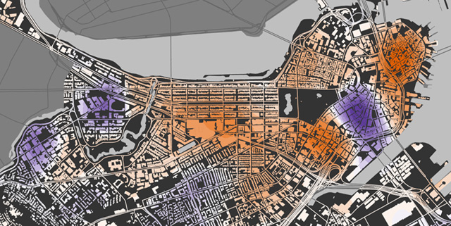
Yes, there is such a thing as a take-out neighborhood in contrast to a sit-down part of town. It’s not surprising if you think about it, but if you’re like me you may not have thought about it before. Consider the map above: orange colors mean more restaurants that do not offer take-out while purple colors mean more restaurants offering take-out. There are some stark but predictable patterns. The North End, Chinatown, and Back Bay restaurant scenes are more about the sit-down experience, while the Financial District caters to workers with many more take-out options. The former set are destination neighborhoods in some ways, drawing tourists and locals seeking Italian or Chinese cuisine, or perhaps simply “city” dining. The latter, along with the other hotspots around Fenway Park and the Longwood medical area, draws a population that needs to eat but isn’t looking to savor a meal.
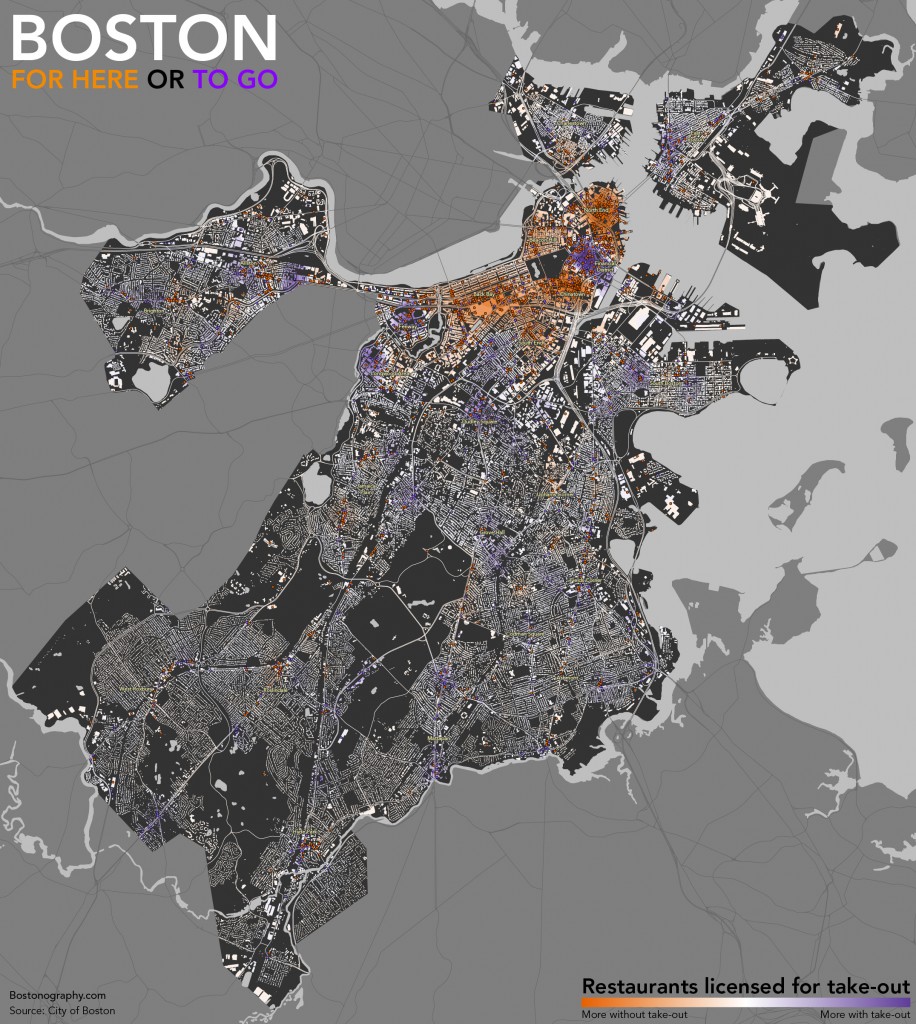
The full Boston city map is linked below; give it a click. Most of the rest of the city tends a bit toward take-out options, which makes sense for the casual nature ordinary residential neighborhoods, although some of the squares—destinations for their neighborhoods—favor restaurants without take-out. What do you see in this map? Does anything stand out?
The map is based on restaurant license data from the city (a bit out of date but still generally useful), which is among a handful of datasets available at an obscure online location. There are apparently different licenses for restaurants offering take-out and those without take-out, allowing this comparison of 3200+ restaurants. Bear in mind that the take-out license does not mean only take-out but rather in most cases both take-out and dine-in service. Be aware also that the map is not as straightforward as it seems. The map shows hot spots of both types based on density, but these hot spots depend on one type being more dominant. If there were a dense area of restaurants split evenly between the two types, they would effectively cancel each other out and appear as the same neutral, whitish color as sparse areas.

One Response to For Here or To Go