How convenient. As soon as we got around to our previous post, in which we mapped some Hubway bike sharing data, a new visualization contest started. This time, MAPC and Hubway invited people to visualize every Hubway trip to date (October 1, 2012), providing a record for each that included the start and end points, the date and time, the particular bike used, and some information on the user. Juicy, delicious data, folks.
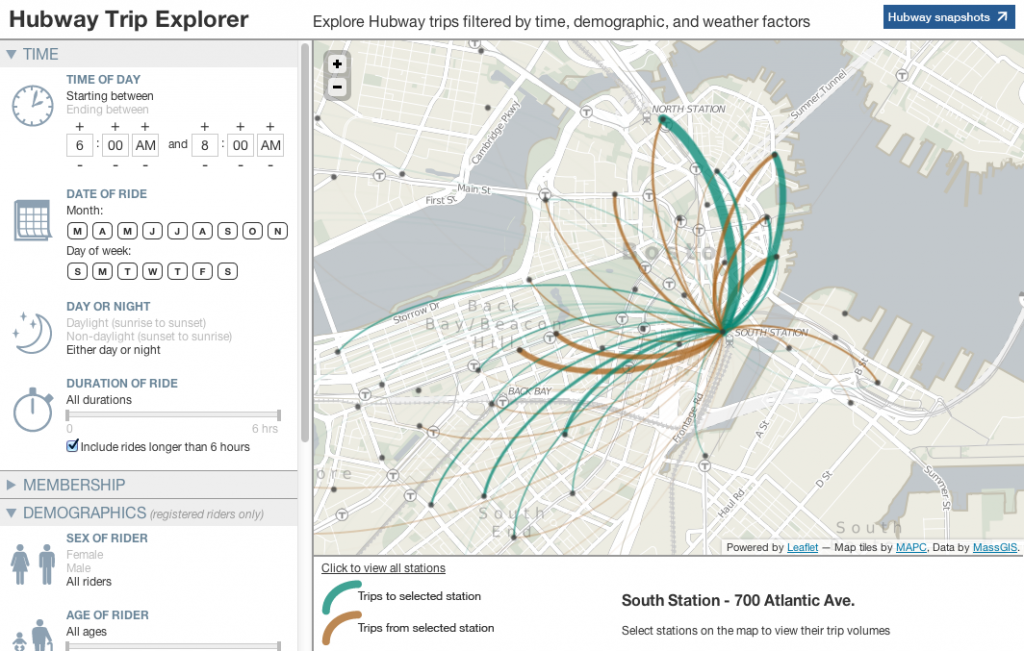
There’s a ton one can do with this data, but one only has so much time. I took a swing at it on behalf of Team Bostonography by building an interactive map that allows you to filter trips by about ten different variables and view where trips occurred under the specified conditions. The map queries a database for the given combination of filter settings and returns trip counts for each station to every other station. On the front end it’s built with Leaflet and uses MAPC’s basemap tiles. (<greasy salesman>And the basemap tiles are a product of my company; we worked with MAPC to develop those styles back in the spring.</greasy salesman>)
You can view trip volumes (represented by line width and/or color) either for individual stations or for the whole system at once. The available filters are these:
- Time of Day: A time range in which the trip either began or ended
- Date of ride: Months and days of the week on which the trip occurred
- Day or night: Whether the ride occurred during daylight
- Duration of ride: How long the ride took
- Member type: Registered annual member or Casual (1 or 3 day) member
- Sex of rider: Uh, sex of rider
- Age of rider: Yup
- Home of rider: Where the rider lives, from a selection of several zones
- Precipitation on day of ride: Whether there was any precipitation that day
- Average temperature on day of ride: The 24-hour average temperature for the day
In order to account for the the fact that some stations (e.g. everything in Cambridge and Somerville) are much younger than others, the overview maps represent trips per day of station activity, and the individual station maps show volumes as a proportion of the total trips for that particular station. It’s easy to see the potential of some of those newer stations—one or two of the Harvard Square stations, for example, actually show up strongly enough even as raw counts despite being much shorter-lived than the original set of stations.
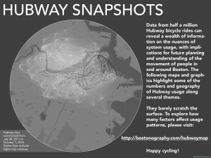
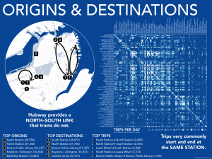
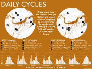
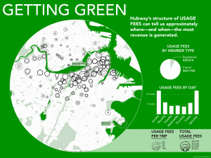
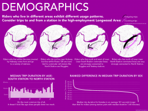
To highlight a few salient or interesting bits of information coming from the data, I also made a short series of infographic-like things with maps and charts. Some of them are admittedly not super informative or not charted in ideal ways, but they nevertheless provide glimpses of some avenues to explore in the data. See them below or compiled into a PDF.
Those graphics include much of what I found interesting from the data, so I won’t try to talk through many of my own conclusions. I will say that looking at certain time slices (times of day and/or days of the week) tends to be the most revealing—especially combined with the home zip code of the rider. We’re all about geography here, after all!
Again, there are gazillions of questions to be asked and answered with the data, and we’ve only gone after a few of them. Be sure to look through all the submissions to this contest to see the awesome things people have done here and the information they’ve uncovered!
