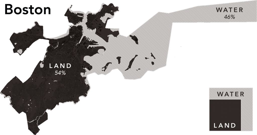
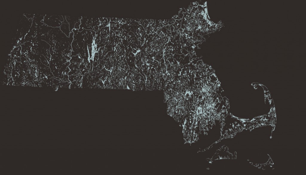
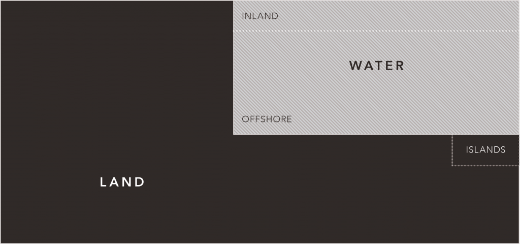
This is not a a paradigm-obliterating viral map. Boston is 46% water and this shows where it all is. Most of the water is offshore. Some of it is inland.
But what if you don’t care where it all is? That little chart in the corner shows the same proportions. It’s a geography teaching tool, without employing—er… geography.
Comparative Geography: Land v. Water
A few years ago, I stumbled on a genre of dusty old geography books: the elementary text book. One of my favorites, Methods and Aids in Geography (1888), features numerous comparative geography illustrations.
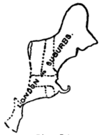
At the time, for example, the population of all of New England and New Jersey was equal to that of London and its suburbs. The book also sports maps (which we’ve seen recently, ad nauseam, like number 7 here) comparing state areas to country areas, countries to countries, continents to continents, planets to… ugh, you understand.
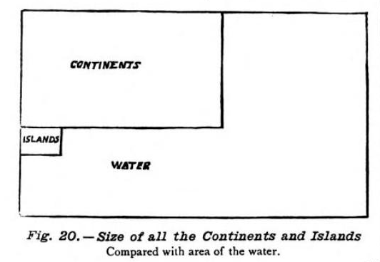
Of all the great gems in this book, there is one chart that especially caught my eye, a sort of proto-treemap, comparing the world’s land and water areas.
I like the simplicity of this chart and since Massachusetts is so watery, I decided to reproduce it for our fair state.
I crammed all of these guys…
Into this chart:
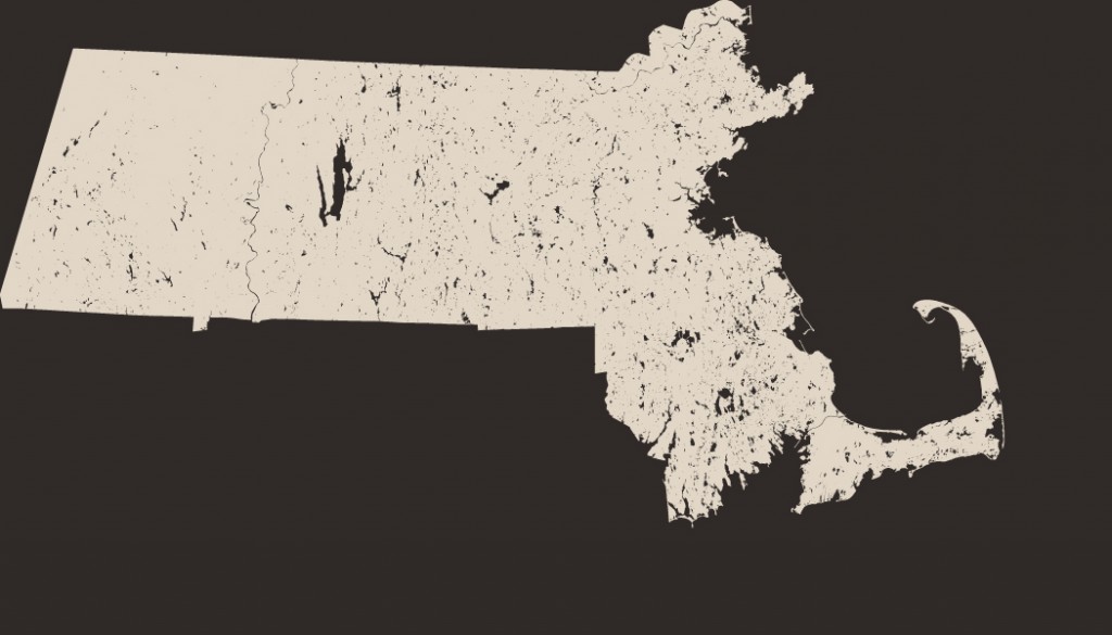
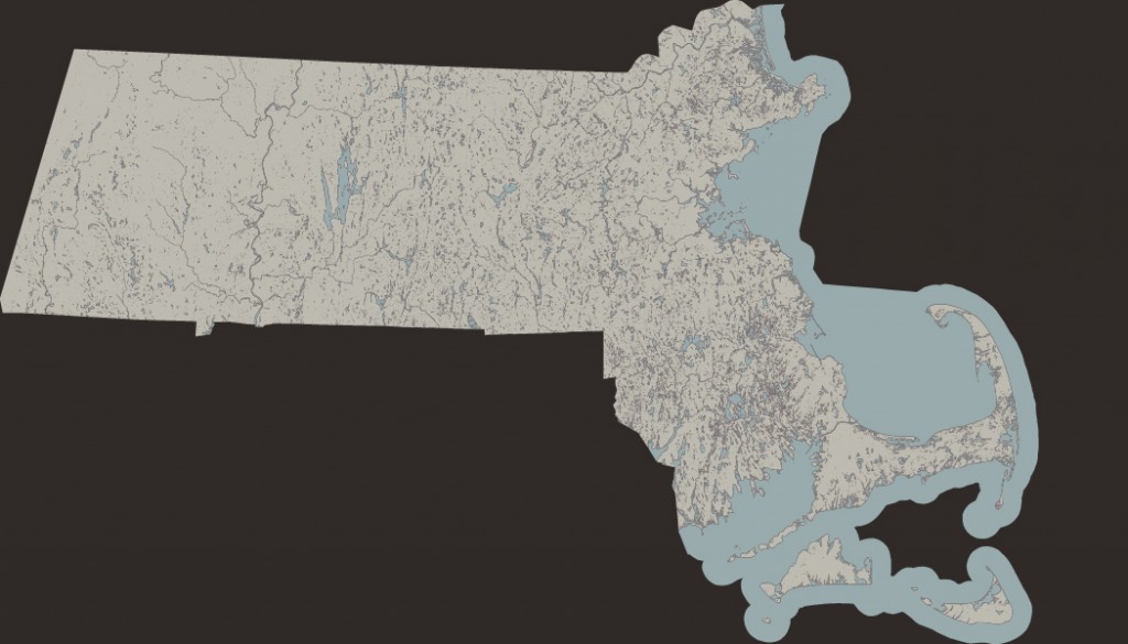
You can be the judge, but I think if you’re looking for area comparisons, this works better than a map. Like, say, this map:
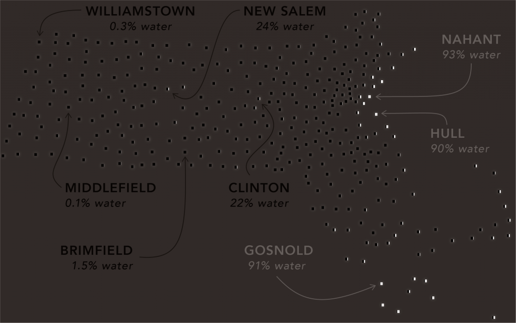
Bonus Map!!!!11!!11!


2 Responses to Boston is 46 Percent Water