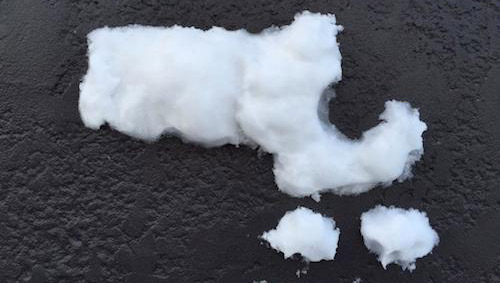
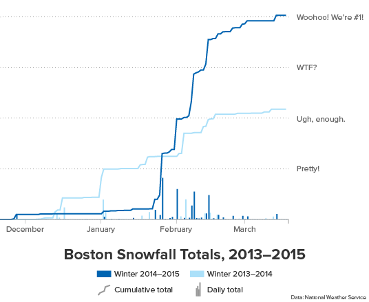
It’s the end of Winter 2015 and, well, we don’t need to tell you that it has snowed a bit. Last Sunday we celebrated breaking the all-time seasonal snowfall record with 108.6 inches.
Below is an animated map of SNODAS-modeled snow depth during the heart of this winter, when we saw approximately 300 feet of snow fall in the span of three weeks. What’s kind of interesting here is that after a while the big snowstorms become barely noticeable. It mirrors the ground experience of snow depth kind of maxing out at “a metric s***load” — when Mom called after each storm asking how much snow we got, the answer was always “I can’t even tell anymore.”
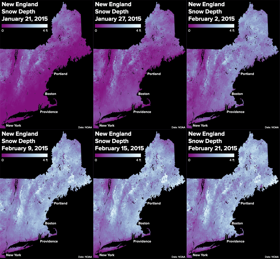
There’s more to the story, of course, than sheer wonder at big numbers. Those of you who don’t work from home (like Andy) or live somewhere else (like Tim) faced daily misery and probably turned on your neighbors in the Great Parking Wars. But back at a broader level, a fascinating story still unfolding from this winter is the political ramifications of boatloads of snow. It’s been a test for the new governor. It’s shaping public opinion on the 2024 Olympics. And, most notably, it’s caused dustups and debate about public transportation.
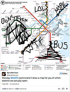
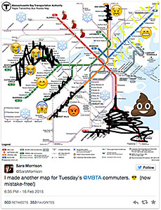
This is a map blog, so we won’t dive into the political issues, but suffice it to say that the havoc wrought upon the MBTA is one of the biggest stories of the winter. You all remember the following maps from Sara Morrison—can we even call them facetious when they were in fact totally accurate?
We here at Bostonography are of a more analytical bent (but don’t get us wrong, we love poop emoji), and although we weren’t on the ball enough to look into transit data as the winter progressed, we’d be very interested to see the MBTA delays and outages quantified, especially in a spatial context. If anyone out there is looking into that, please show it off!
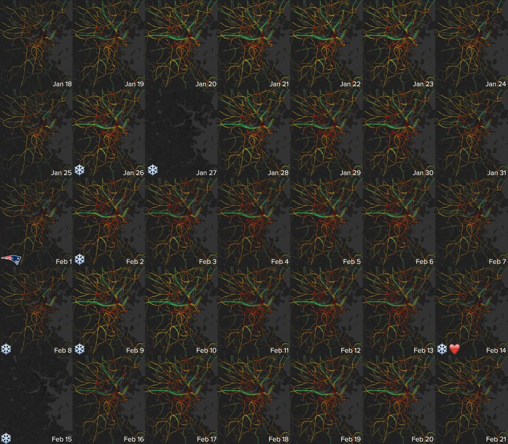
Rail transit woes made the biggest headlines, but at some point we did remember that we’ve been automatically mapping bus speeds every day for a couple of years now. Generally it’s very difficult to notice a difference in these maps no matter the circumstances, but here, we thought, we might finally see a trend due to snow-clogged roads. Below is five weeks’ worth of maps, with major snow events marked. Apart from the days where service was suspended entirely, sure enough there is some noticeable reddening in February as the city reached its breaking point. But even then, the effect is much smaller than you might expect. (Takeaway: MBTA buses are always slow, no matter what.)
But just how much show did Boston get this year really? Can old-timers still claim crazier days full of barefoot walking to unheated schools through neck-deep snow? Well, they can claim whatever they want, but this year was incredible. Two of the top ten biggest snow storms in Boston history passed through this winter (a claim that only 1978 can also make). Sure, none of this year’s storms topped the list, but once you get to two feet, what the heck is the difference anyway?
For a quick comparison, let’s take a look at the aftermath of the second and sixth-largest storms in Boston history, a Feb. 6-7, 1978 storm (27.1 in.) and a Jan. 26-28 storm from this year (24.6 in.). We were able to grab clean Landsat images from a few days after each. Here, we compare Martha’s Vineyard.
Boring, right? Different sensors (and band combinations—the 1978 is a false color image) aside, the images just look vaguely snowy. Ok, maybe the 2015 image looks a bit snowier. But that could be because it had a bit less time to melt (or because there wasn’t already ten million inches of snow on the ground in 1978!). Still, looking at these images gives you a sense of what our landscape looks like when it gets blanketed by a large snowfall.
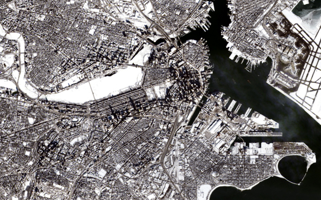
Boston is just out of the 1978 Landsat 2 image, but we get a nice view of it in 2015. The Charles: covered. The Common: covered. Rooftops: covered! Boston was officially snowed in. And it would be for another few weeks.
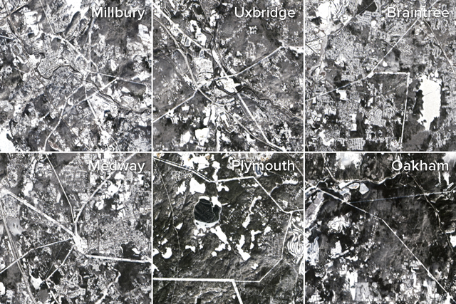
Looking over the rest of the state in this Landsat image from February 1, you notice dozens of jagged lines. The snow has acted as a sort of terrestrial fingerprint powder, highlighting lines running through our landscape that you wouldn’t otherwise see: utility right-of-ways. That’s right, those gross, overgrown, humming-power-line highways are kinda pretty from space.
But these single snapshots don’t give a very good sense of the process of accumulation or what things might have looked like at different times during the winter. To try to get a sense of these things, we turned to MODIS. Thankfully, though the MODIS instruments are a coarser resolution (250m) than Landat (15m), they take pictures of every spot on earth almost twice every day! At that rate, you can do things like look at so-called winter storm “Nemo” as it passed over Massachusetts two years ago.
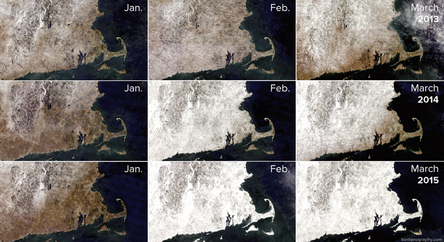
With an image or two being taken every day, it is also possible create composite images showing conditions over chunks of time. Here, we have used Charlie Loyd’s Wheather scripts to reduce cloud cover and reveal areas with consistent snow cover over the last three winters. The brightest whites are areas with the most consistent snow cover for that month. Just look at how snowy it has been this year compared to the last two years! Even Cape Cod and the islands remained covered throughout all of February.
It may be snowing in New York at the moment (not that we would know anything about that), but as of 6:45pm tonight, it’s spring. So, happy spring, folks. May the blinding memory of the winter of 2015 become ever rosier in time. Go Sawx.



OMG awesome, *thank* you.