One of the things that quickly struck me—and that, I think, becomes apparent to most newcomers and visitors—after moving to the Boston area is how small it is for a “big city” in the United States. It is of course very dense compared to most places in this country; among cities over 100,000 in population Boston ranks seventh in population density (Cambridge is fifth), and among the fifty states Massachusetts is the third most densely populated.
There’s nothing novel about population density maps, but I can’t recall seeing many density maps based on new Census data, and it may be interesting to examine local patterns in some detail, so here are some maps based on the 2010 Census (data here). They’re all based on Census blocks, which in urban areas more or less correspond to actual city blocks. As usual, click these for larger versions.
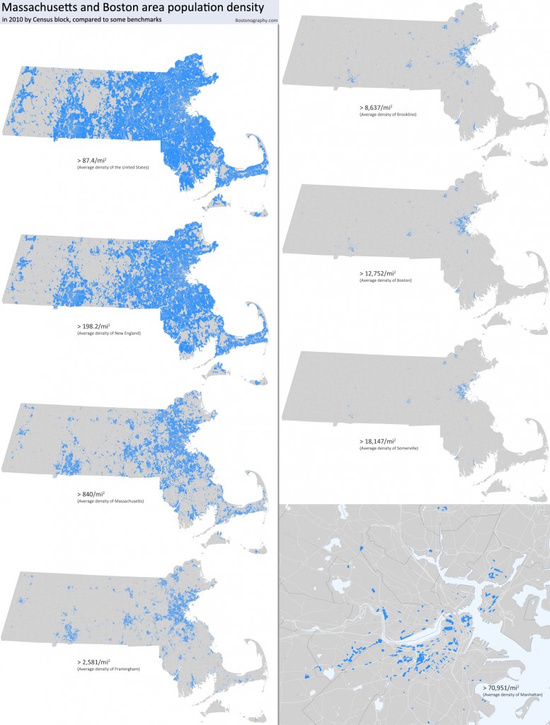
First, we thought it would be fun (okay, not fun in the usual sense, but in the nerd sense) to compare population density in Massachusetts to some averages in the above series of maps. At the low end is the average density of the U.S. (we are the third most populous country in the world, but we are pretty huge); nearer the high end is the average density of Somerville (the most densely populated city in New England and one of the densest in the country); and at the extreme is the average density of Manhattan. Only a few blocks have Manhattan-level density, most of them of course in and around Boston; they’re in the most central neighborhoods and in college areas (Harvard, Northeastern, and along Comm Ave in Allston/Brighton). Might it shock those people worried about the “Manhattanization” of Boston that much of quaint old Beacon Hill is in one way already Manhattanized?
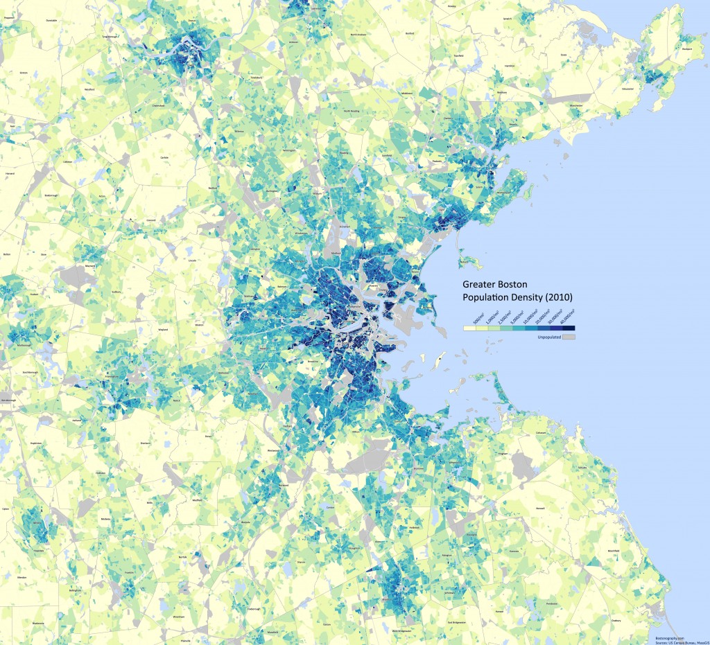
Here also is a standard but detailed map of population density in the Greater Boston area, classified so as to highlight variations in the highest-density areas. The patterns here aren’t surprising and seem to correspond quite well to the built-up areas you’d see in an aerial image. The densest blocks of all seem to be in the most central Boston neighborhoods, South Boston, some of Cambridge, the aforementioned Comm Ave corridor in Allston/Brighton, Chelsea, and most solidly East Boston.
There are a few things I take away from the density map. First, looking at density is one way to judge what the core of the city of “Boston” is. I am adamant that the “central city” in any non-bureaucratic sense is not defined by weird municipal boundaries, and if density is a valid metric it provides some confirmation. Based on this map I would judge it to be an area roughly defined by the four T lines, with the exception of the Riverside and Braintree branches.
The second thing is to note how much unpopulated area there is right in the middle of the city. Some of this is institutions—MIT takes up a lot of space in Cambridge, for example. (That one is unfortunate. It makes Boston and Cambridge feel farther apart.) Some of it is simply intense non-residential use, like the Financial District or industrial areas. What’s really interesting, though, is how closely some of this corresponds to landfill. Compare to this 1858 map, for example. On this map Charlestown doesn’t look much bigger than it was a couple hundred years ago, nor does South Boston. The former is practically an island—no wonder it seems like there’s no good way to get to it! The Back Bay and South End seem to be the only places where major landfill became real city neighborhoods.
A third thing is the density patterns of the broader metropolitan area. For those who picture the very dense central areas when they think of Boston, it may be a surprise that the whole Boston metropolitan area has a population density much lower than some of the classic sprawling cities of the South and West (see a list of metro areas or older numbers for urban areas). There’s a sort of patchiness to the outer parts of the Boston area that causes this, and it’s somewhat apparent in this map. We have dense town centers with lower density areas in between rather than vast tracts of medium-density suburbia. Altogether most of it still meets the “metropolitan” and “urban” standards, though, which are actually rather low.
But hey, sprawl isn’t only about density, so maybe we’re still better than everyone else.
Addendum by Tim
 Andy and I routinely share blog post drafts with each other before making them live. For instance, one of us might say to the other, “Say, fella, I drafted that health code map with restaurant rodent violations if you want to have a look at it,” and, upon reading, the other responds, “Awesome. Ship it.” We are generally very friendly and accommodating of each other. Not this time!
We have discussed population density on and off since the formation of Bostonography. It seems to come up regardless of the actual topic of our conversation. It came up while I was working on the radio maps, for example (the population density of New York City means that the Yankees Radio Network can use far fewer signals to reach far more fans). Density was also essential to Andy’s post on building footprints. Naturally, the places where people live interest us as cartographers. Integral to understanding these places is knowing just how many people live there (and over how much space).
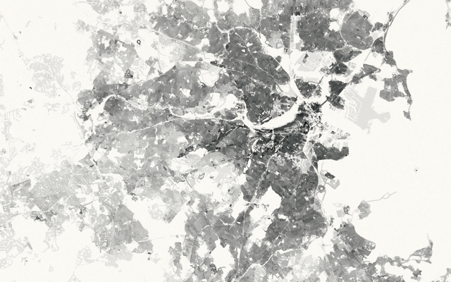
So, I couldn’t help myself. I had to chime in on this post with a couple of maps. First, the map above (big version here) indicates areas of high population density with dark grays and areas of low density with light grays. This map is similar to Andy’s yellow, green and blue map above, but does not offer a legend. Instead, the color ramp includes 20 shades of gray, ranging from 0% black to indicate zero people per square mile (imperceptible on this map) to 100% black for areas with over one million people per square mile. Rather than using census data to map population by block, here I have transfered census data to street segments and residential land use areas provided by MassGIS. The density captured by each of these features is different; the larger land use polygons summarize neighborhoods, while the road segments capture a block at a time. The result looks mottled in places, but over all, I believe it gives an accurate general impression of the population density of Massachusetts. By combining land use and roads features, a compromise is made between resolutions that might otherwise be either too coarse or too fine.
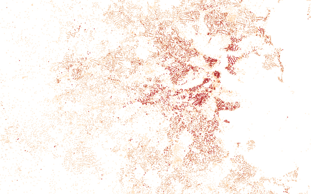
The second map (big version here) I’ve made shows population density by census block centroid. The polygons that make up Massachusetts’ 157,508 census blocks contain millions of vertices. This geometry can look cluttered at certain scales. Replacing each polygon with a dot located at its center could prove to be a reasonable generalization technique to allow for higher data density on a smaller map.
That’s all. Apologies for kibitzing on Andy’s post.


Landfills – A number of areas of filled land were, of course, never intended as residential neighborhoods. Those along the harbor waterfronts were initially dedicated to commercial maritime activities; others were set aside for institutional development (MIT, the Fenway) or recreation (the Esplanade); and then there’s Logan.
It will be interesting to see if and how some landfill areas evolve. Some of course aren’t going to become residential, but others—namely the South Boston seaport area—are filling in a bit with residential development. Still, I don’t suppose we’ll see the map change dramatically anytime soon.
Would be interesting to compare today’s density with that of, say, the 1940s, when more than 800,000 people crammed into Boston.
Hey Adam, Awesome suggestion. Population and demographic change maps are fun and can often be illustrative of a known (or reveal some kind of previously unknown) trend. I worked on a fun project at The Times this fall, mapping demographic change along the NYC Marathon route. Of course you need to have the data to make such maps… and sadly, we don’t for Boston (yet!).
Pingback: Boston Real Estate Blog, Boston Condos : Boston Density
Fascinating maps. It’s fun to look at the last map (Manhattan-density areas) and try to identify them. I’m pretty sure I used to live in the rectangle in Central Square, Cambridge. And it wasn’t too hard to identify the larger rectangle just NW of Harvard Sq as Radcliffe.
But what’s the triangle in extreme NW Cambridge, just behind Alewife? I’d thought the area directly west of the station was mostly commercial — office parks and the like.
There is what seems to be a large apartment building by Alewife, except that it’s actually across the street from that triangle. It has 563 people, but it wouldn’t make the Manhattan cut if the Census had in the correct block on the other side of the street.
Speaking of such errors, the most densely populated Census block is here… because they’ve counted everyone in the building as being within the tiny teardrop-shaped loop in the parking lot. It’s well over a million people per square mile!
Pingback: How to Get High Urban Density Without Lots of Skyscrapers | Mike the Mad Biologist
Hi guys
Your work is great. My son Ben who’s a geographer turned me on to your site.
I have a practical question. I want to get my undergraduate students out on the streets of Boston and Brookline to estimate population block by block. Then they’ll corollate their findings with non-human species diversity and vegetation cover.
Any convenient way to have them do the human population estimate? The census blocks you talk about might be a start but they seem a little daunting….
Thanks!
Sam
Hi Sam,
At the block level, I suspect that these Census data really are the best, especially because they are so accurate (as for 2010, anyway). Not sure what the easy way is to get at it all, though, apart from working with GIS. If it’s more about actual human spaces (i.e. buildings), then it gets more daunting—though not impossible—as the GIS work multiplies.
Out in the field, though, well I’m not so sure how to estimate population. We’re just so used to clicking on things and making the internet tell us what’s out there!
Sorry, this is not a very helpful reply!
A few years ago (before the 2010 census) I walked two neighborhoods in Boston with my students, to estimate green space and population density.
Our methods were crude, but… basically we counted windows and floors and then did estimates of how many were bedrooms with people sleeping in them.
I am not confident in the absolute numbers–they were high-density neighborhoods but perhaps not so high as our estimates! However, the comparison between the two neighborhoods was interesting and more meaningful. One was a very dense neighborhood in the Blue Hill Avenue area across from Franklin Park. The other was a more renovated, somewhat gentrified area on Cedar Street; it had about 40% of the density of the Blue Hill neighborhood.
Anyway, I encourage you to try a brute force technique like this (and share the technique, please!) if you are not too fussy about the absolute numbers.
Pingback: Boston Density Blog Post « Lorem ipsum dolor sit amet…
Let me first say, I am a true map nerd at heart. The work you’re doing is awesome! Now on to why I am commenting… I have been aggressively seeking a population density map for the city in which I reside – Pekin, Illinois.
Having first heard the term loosely floated around and having seen a HUD Low Income Limits map which could produce a general feel, I was wondering what factors are needed to put together a map specifically generating population in an area? The town Economic Development Coordinator and GIS Department are having one helluva time making this happen.
Obviously any aerial map can show how our city is sprawling and where its true density lies, but I seek a population density map to actually show a tangible head count in our city’s most dense and most redevelopable area.
Thanks,
Erik
What GIS tools are you using to craft these maps?
hey any of you know why Boston is so densely populated?