UPDATE! We’ve got a new and better version of the neighborhood mapping project! Head on over to bostonography.com/hoods!
OLDER UPDATE: There’s also a newer map of what’s described below.
As you may recall, we’re running an ongoing project soliciting opinions on Boston’s neighborhood boundaries via an interactive map. We want to keep collecting data, but we’ve already received excellent responses that we’re itching to start mapping, and when we hit 300 submissions recently it seemed like a good enough milestone to take a crack at it. (That’s actually 300 minus some junk data. If you offer the ability to draw freeform shapes, some people draw random rectangles and triangles, and some people draw… er, other long, tipped objects.)
There are many questions to be asked here. Where are the areas of consensus? Where are the disputed zones? Where are the no-man’s lands? &c.? Let’s tackle these one at a time in a series of posts and maps. Today we look at consensus.
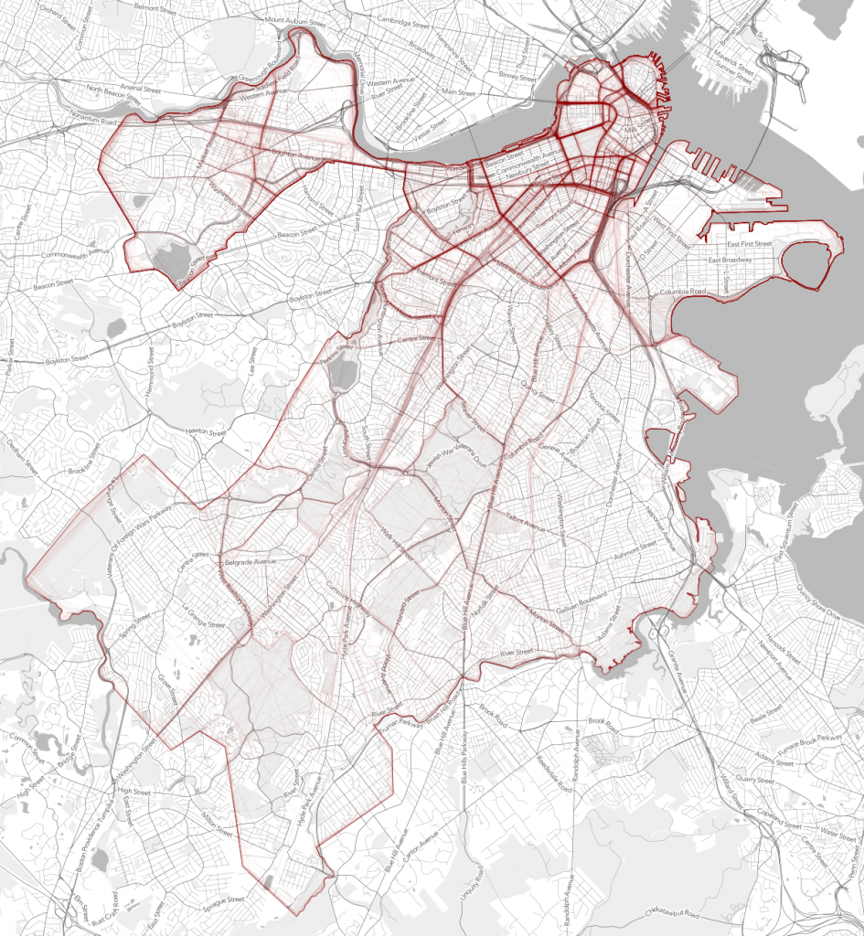
But first, let’s check out a raw picture of the boundaries everyone has drawn. This map, which is clipped to the city limits, shows that the word “tangled” is apt in reference to neighborhood boundaries. Some lines are strong as a result of many people drawing in the same place, but many others are all over the place.
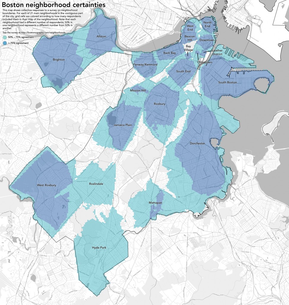
Based on those strong lines we can kind of see where there is decent agreement on boundaries, but we can quantify this for all of the neighborhood extents. What we have is 21 sets of polygons, each set representing the shapes people drew for one of the neighborhoods in our survey (the main neighborhoods except for the physically isolated Charlestown and East Boston). Within the set for each neighborhood we can look at the amount of overlap between polygons and consider overlapping areas to be areas of agreement between two or more respondents—as many respondents as there are overlapping polygons in that area. In this exercise we’re interested in those counts. We could find the area in which all polygons overlap, for instance, which would represent the area that 100% of people agree is part of the neighborhood. Total consensus usually doesn’t show us much or doesn’t exist, though, because of some especially bad data (some people just didn’t have a clue, although we tried to weed those out) and, well, because definitive agreement probably is impossible anyway. But we can still find the areas where there is moderate to strong agreement—at least among the self-selected people who responded to the survey.
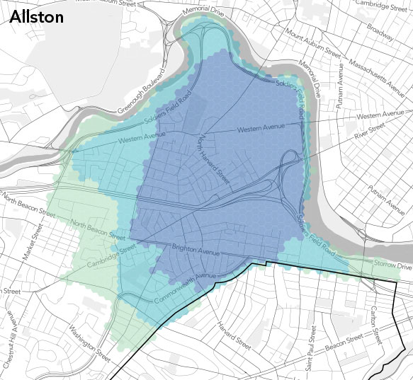
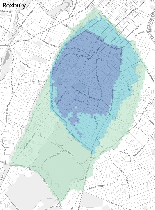
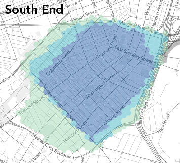
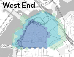
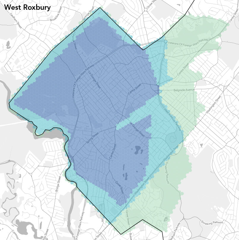
We’ve chosen to look at areas of greater than 25% agreement, greater than 50%, and greater than 75%. They’re handy numbers that seem represent a notable minority, a majority, and a strong majority. So let’s get to the maps. We’ve laid down an arbitrary hexagonal grid across the city and for each cell tallied how many respondents’ polygons it intersects in each neighborhood, then divided that count by the total number of respondents for the neighborhood, which ranged from a little over 40 to 150ish. Here, then, are the neighborhoods in almost alphabetical order, with the number of submissions noted for each.
(Note: when we started these, hexagons had slightly more carto-hipster cachet. These are not really the hexagonal bins that have been recently popular—albeit legitimately useful—but rather kind of a coarse raster approach that looks nicer than squares.)

Allston (n=120). The first map, I think, demonstrates how closely the categories tend to follow certain streets in all the neighborhoods. Market Street and Everett Street mark the western edges of the 25% and 75% categories, respectively, with 50% a little less defined on that side. Each level then cuts east and south in a couple of steps. It’s interesting that the commercial center of Allston, the Harvard Ave corridor, is only barely within the area of strongest agreement. A neighborhood “center” isn’t always in the middle!
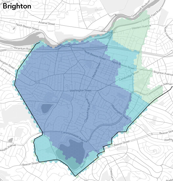
Brighton (n=109). Not surprisingly, Brighton’s eastern edge matches up fairly well with Allston’s western edge. They’re not exactly interlocking jigsaw puzzle pieces, however, because not everyone who drew one neighborhood drew the other, nor were they necessarily careful to make the borders match precisely.
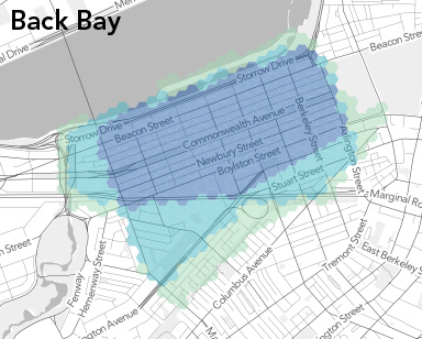
Back Bay (n=139). There are some hard lines here. Nobody goes past the Charlesgate, or past Mass Ave south of the Pike. An interesting section is that south of Huntington Ave. It has the character of the South End but Back Bay parking permits, presumably because the Southwest Corridor partially cuts it off from the former. Still, it doesn’t enjoy majority Back Bay status in this map.
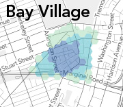
Bay Village (n=80). Not much room to mess around in this tiny neighborhood. The majority stays south of Stuart Street, with the supermajority between Arlington and Charles. The part north of Stuart, although small relative to the whole city, will be interesting to look at later as a no-man’s land; it seems hard to classify even though it has decent Bay Village representation here.
Beacon Hill (n=145). This may be the neighborhood with the most consensus. Everyone agrees on the southern, western, and northern boundaries. On the east side, the question is only whether Bowdoin, Somerset, or Cambridge/Tremont Street is the edge.
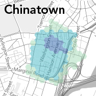
Chinatown (n=113). It’s a little surprising how small the greatest agreement is here, at least to me. I’d probably draw something like the 50% shape. Note that even the Chinatown gate is just outside the 75% region. Perhaps it’s just hard to know which street is which on a map of this dense area, leading to more uncertain shapes from our respondents.
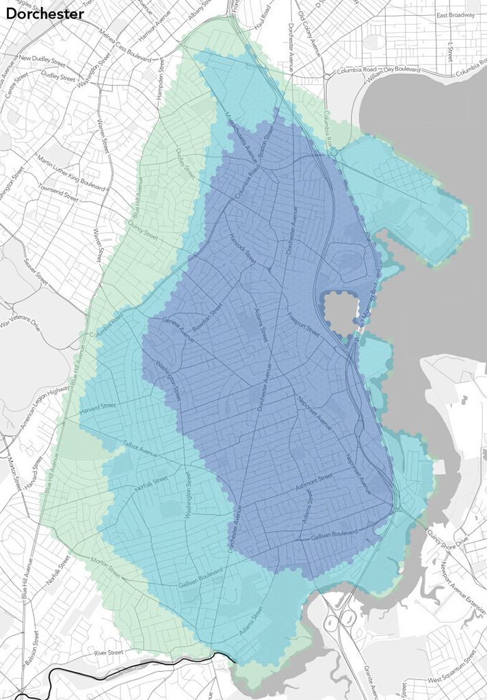
Dorchester (n=54). Dorchester is large enough that we probably need more responses in order to see more agreement. (This is the most populous neighborhood, of course, but it doesn’t have as many responses as some others, probably in part because it’s harder for non-residents to grasp.) Still, we have some good edges here: Blue Hill Ave for 25% and the Fairmount line for 50%. We’ll see those again in the Roxbury map.
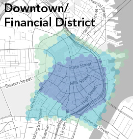
Downtown/Financial District (n=118). “Downtown” is fun to try to define, but we’ve wrapped it up here, perhaps not entirely appropriately, with the Financial District. Besides the easier-to-locate Financial District, to some degree this looks like a process-of-elimination neighborhood: if it isn’t Chinatown, the North End, &c., it must be downtown. Maybe that’s because it’s least residential neighborhood of the bunch, so there’s not really a strong identity.
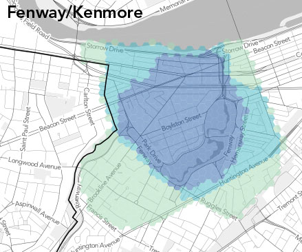
Fenway/Kenmore (n=128). I’m a bit surprised by how many people consider the Fenway neighborhood to end, well, at the Fenway itself on the west side. A minority of respondents here consider some of the Colleges of the Fenway to be actually in the neighborhood. What they’re thinking, presumably, is that this is the Longwood Medical Area and that the LMA is not part of the Fenway. It’s an intriguing zone because we left it off our neighborhood list, forcing people either to include it in an adjacent neighborhood or leave it blank. But we can talk more about that in another post.
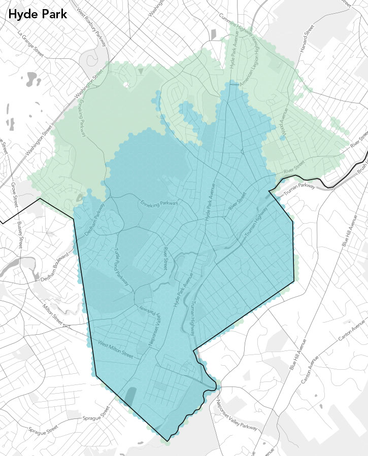
Hyde Park (n=42). We had few enough people drawing Hyde Park (or enough of them were clueless) that there is nowhere with more than 75% agreement. And to be honest I’m ignorant enough about Hyde Park that I can’t comment much on this one. It’s as outlying as outlying neighborhoods get in Boston. Anybody see anything interesting?
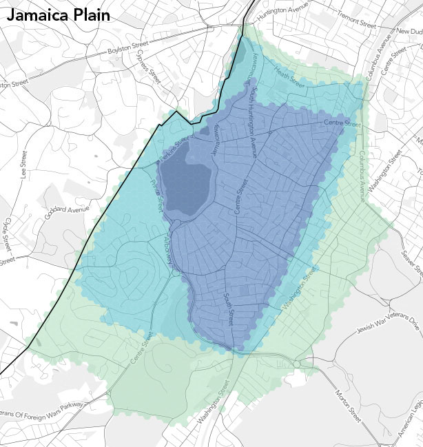
Jamaica Plain (n=74). There are ome fascinatingly well defined edges here. On the east side, people thing the neighborhood ends either at the Southwest Corridor, at Washington Street and then in a line up to Jackson Square, or at Franklin Park et al. and Columbus Ave. The 75% line on the west and south nicely follows the parkways, too (otherwise it’s just the city limits).
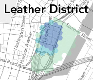
Leather District (n=76). Tiny neighborhood #2, easily lost between Chinatown and downtown. But hey, it has its own parking permit! There’s not a lot to talk about at the scale of our maps this time; some folks have it bleed over to Fort Point Channel but otherwise it’s mostly confined to a few blocks.
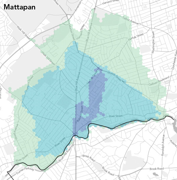
Mattapan (n=45). The 75% agreement is a very odd and small sliver, probably again due to a lack of data, or at least good data. But there are some clearer definitions at the other levels, for instance along Morton Street. As with the other southernmost neighborhoods, I can’t say much about this one personally. Comments are welcome!
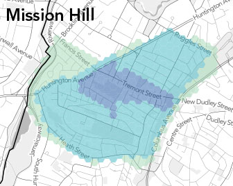
Mission Hill (n=82). There’s a lot of agreement here below 75%, with the only real difference being the section below Francis Street. 75% agreement is only in a small area for some reason, not extending far from Tremont Street. Note that fewer than 25% consider the Longwood area to be part of Mission Hill.
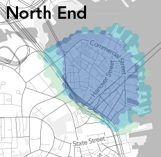
North End (n=151). Along with Beacon Hill this is one of the best-defined neighborhoods, being easily recognized by residents and outsiders alike. The only uncertainties seem to be parts of the Bullfinch Triangle and Christopher Columbus Park (where, it’s worth pointing out, there is a sign welcoming you to the North End), and all the piers. But even those places are mostly above 50%.
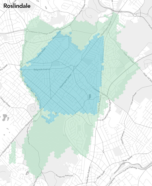
Roslindale (n=41). Wait, is Roslindale a real place or just the name of an RMV branch? Poor Rozzie had the worst data of the lot. It’s just, you know, down there somewhere in between other neighborhoods. What you see here is after some purging of especially bizarre data that were throwing everything too far out of whack. No strong majority here, although the 50% and 25% area are reasonably clearly defined in places. Some of the rest, though… who knows. There’s even a weird floating piece of 25% territory.
Roxbury (n=64). I personally think Roxbury is the most interesting neighborhood to watch in all this. It has uncertainties on at least three sides, and it and its neighbors seem to have reasonably strong identities to both their residents and outsiders (in contrast to some places that only have the former). The South End-Roxbury border debate is well-publicized, and the JP border gets fuzzy too. Mission Hill isn’t always even considered separate from Roxbury, and the border with Dorchester varies widely, as already mentioned. Apart from some weirdness in the south part of 75% land, there are some interestingly clear-cut camps here.
South Boston (n=92). There seems to be a lot of unity in Southie, apart from the Seaport area and a bit of the other end. Maybe it’s just because there’s not much to compete with: there’s water on most of three sides and something of a dead zone on the other. South Boston is a neighborhood that has grown considerably over the years thanks to landfill, and this map is suggesting that people’s idea of the neighborhood has mostly, but not entirely, grown with it.
South End (n=116). Well, a lot of this has already been touched on by way of talking about surrounding neighborhoods. There’s a lot of agreement on Mass Ave as a border, despite the parking permit zone that crosses it (I think). Otherwise, the edges seem to match what we see in the adjacent neighborhoods, and within there is strong agreement.
West End (n=114). I suspect that to old timers and casual scholars of Boston, the West End doesn’t even exist; it was torn down in the 1950s. But something is there: a weird land of hospitals and towers in the park. Everyone agrees on a tight loop of roads defining the West End, but beyond that it’s harder to say.
West Roxbury (n=43). The last alphabetically and somewhat fittingly one of the most distant neighborhoods, this one again suffers from a lack of good data. It has the fortune of meeting the city boundary for much of its edge, but away from that there are some funny shapes. And once again I don’t have much to add. We need more data and your thoughts!
What does it mean?
Although we talk a lot about boundaries, this post included, the maps here should also remind us that neighborhoods are not defined by their edges—essentially, what is outside the neighborhood—but rather by their contents. And it’s not just a collection of roads and things you see on a map; it’s about some shared history, activities, architecture, and culture. So while the neighborhood summaries above rely on edges to describe the maps, let’s also think about the areas represented by the shapes and what’s inside them. What are the characteristics of these areas? Why are they the shapes that they are? Why is consensus easy or difficult in different areas? What is the significance of the differences in opinion between residents of a neighborhood and people outside the neighborhood?
We’ll revisit those questions in further detail in future posts, and also generate maps of other facets of the data. Next up: areas of overlap between neighborhoods. Here we’ve looked neighborhood-by-neighborhood at how much people agree, so now let’s map those zones that exhibit disagreement. Meanwhile, thanks so much for all the submissions for this project; and if you haven’t drawn some neighborhoods, what’s your problem? Get on it!

Thank you very much for doing this. It is fascinating and will be very useful to anyone studying and trying to understand Boston. A few random comments:
History lacks power. Some boundaries that are historically clear have become very confused. By historically clear, I mean areas that were historically defined in incorporations/annexations or landmaking. The blocks between Huntington and Columbus were filled in the South End project and are clearly part of the South End street grid, but claims are made by both South End and Back Bay. The border between Dorchester and Roxbury and the borders of Hyde Park were clear when those places were there own municipalities, but are now highly confused. Similarly, fewer than 25% considered the neighborhood once known as the Polish Triangle to be part of South Boston, even though it was clearly part of Southie’s annexation to Boston and not part of the City of Dorchester.
Lack of history is powerful. West Roxbury, JP, Mission Hill, Fenway/Kenmore, and Hyde Park were at least partially part of Roxbury and then West Roxbury at some point in the history of incorporation and annexation. Mattapan and part of Hyde Park were parts of Dorchester. The lack of clear historic boundaries I think is part of the reason these boundaries are always contested.
The power of race in defining neighborhood boundaries shows. Exhibit A is probably Egleston Sq and the area between Franklin Park and the SW Corridor with competing minorities claiming it for JP and Roxbury and the majorities excluding it from each.
Forest Hills is an orphan. My grandmother grew up there, and my best friend lives there. Both would tell you its part of JP. In these maps, it’s excluded from JP while some suggest Roslindale or an edge of Roxbury.
Thanks, James. Those are some great insights. The one about race is particularly intriguing. That race and ethnicity would play a role in defining neighborhoods is obvious (they don’t call it Chinatown for nothing, after all), but the kind of exclusion you mention in Egleston Square hadn’t occurred to me. It will be interesting to look at demographics when we do some maps of the orphaned or disputed neighborhoods.
“The lack of clear historic boundaries I think is part of the reason these boundaries are always contested. ”
Only sometimes. The three sections of the old Town of West Roxbury – Jamaica Plain, Roslindale and West Roxbury – never had ‘borders,’ so any current border is a matter of historical convention. This is why Roslindale bumps up against Jamaica Plain along Washington street at Forest Hills, yet Jamaica Plain goes much further south along Hyde Park avenue. This was because the railroad tracks and the 1896 granite embankment that carried them through Forest Hills cut off Washinton street south of Forest Hills from the Jamaica Plain. It was a physical entity that created a ‘border,’ where there was none down Hyde Park avenue.
This is also true of Dorchester and Mattapan. The Mattapan district grew out of the name Mattapan square, and came to mean everything north up to Morton street. But to the east, there was never a geographical entity to separate the two – no main road, river, railroad line, etc.
On the other hand, try getting a straight answer about the border between Roxbury and Dorchester. Blue Hill ave has something to do with it, but the original town line ran through streets and cut them in two with no logical basis – after all, the border was there before the streets. So now you apparently have residents from the heart of Roxbury Highlands who think they live in Dorchester, when the actual old town border is half a mile away. Another good example is shown here, with many people thinking the South End/Roxbury border should be at Mass. ave. The old border is blocks south of there.
So while there are problems where towns were split up into districts, there are just as many where there were certain borders between towns. The greater problem is that much historical knowledge has been lost from the districts themselves. Those who did know moved out without passing on the knowledge to the newcomers.
I think that by including the political boundary of Boston, you artificially reinforced certain neighborhoods. I bet that several users would have annexed parts of Brookline when delineating JP, or maybe even Alston/Brighton, but for your firewall…..
I would recommend at least including those borders in your neighborhood spotlights, so we can evaluate whatever influence these boundaries had.
Yeah, the city border is limiting in a way, which we didn’t think about much until it was too late. But it was added originally to help give some basic orientation, and the whole exercise does exist with in some parameters already, i.e. the supplied list of neighborhoods. What would be interesting for slightly different purposes is to provide neither a border nor a predefined set of neighborhoods, and ask people simply to freely draw their neighborhood or another neighborhood they know.
Anyway, good point on the maps here. If we get a chance we’ll add the city line to them.
I think that this problem is probably specific to Boston, which has such crazy borders, and is based on villages that precede some of the political boundaries. I can’t imagine it would make much of a difference in SF, New York, or other major cities. (LA would be an interesting comparison, but I think the definition of “neighborhood” in LA isn’t directly comparable to neighborhoods in other cities.)
Hokay, as somebody who lives in Roslindale about six doors down from Hyde Park …
The Roslindale map should be bluer further to the south – about half of Grew Hill is Roslindale and the other half is Hyde Park. There’s an interesting historical artifact at the bottom of the hill, near the golf course: The road suddenly changes names from Poplar Street to West Street for absolutely no apparent reason – unless you know that that was the town line before Hyde Park was annexed in 1912. Also interesting: Nowadays, the train tracks are considered the border between Hyde Park and Roslindale by Dale and Metropolitan. But there’s still a Boston/Hyde Park border marker on the “Roslindale” side of the tracks.
Thanks, Adam. If there’s one authority to trust on all matters Roslindale, it’s you!
Adam’s right about Roslindale. I lived for 11+ years on Asheville Road, which we always thought of as being in Hyde Park (zip code 02136), though on the cusp of Roslindale. My old Boston Fire Dept. directory has Asheville Road and the next two streets heading northwest (Hallron St and Grassmere Road) listed as being in Hyde Park; while, just beyond, McDonald St, Bateman St, Alpheus Road are all Roslindale). The directory only lists DeForest St as being in Hyde Park, though one end of it intersects with Poplar St (close to the beginning of West St).
Back when the area was overwhelmingly Catholic, there was a parish boundary here, too, with Asheville Road being in Most Precious Blood and Hallron St in Sacred Heart. But I crossed the border to attend Kindergarten at the Conley School and worked both sides for Hallowe’en candy.
Here’s a link to a 1904 (eight years before annexation) map of Hyde Park: http://maps.bpl.org/id/11141
On much of Clarendon Hill (as it was called then), there still weren’t any streets laid out. You can see a town boundary that seems to cut through the hill and what is now the George Wright Municipal Golf Course (maybe cutting through close to where the clubhouse is). With streets being added after annexation, what used to be a straight line boundary would have to zig-zag.
Including the official designated borders for some of these areas for comparison to where people think they are might be interesting. I know that some of them don’t have anything more than parking permit zones to go by. It might also be interesting to start asking people what part of the city they live in when they add their take on the borders. You could weight their response as a “local expert” in the consensus (e.g., Adam Gaffin’s Hyde Park/Rozzy borders are probably going to be more useful than someone from East Boston who has never tried to figure out those borders, but did so just to give you a complete map).
Great ideas, yes. We should, perhaps at the end of it all, combine the maps with the mess of borders like in that excellent Globe interactive.
As for asking people where they live, that definitely occurred to us sometime after this had been going for a while. It wasn’t added because for some reason I thought it was too late and all the data should be consistent, but I don’t suppose there’s any harm in tacking on the question now and using it for any future data.
I tuned in to this article to find out about the boundaries of Readville. I know it’s part of Hyde Park, but where does it end? Boston is certainly confusing and I’ve lived here 30 years!
I can shed no light on that specifically, but it would be great to do a follow-up version of this mapping project that looks at the smaller divisions like Readville, the various squares in town, etc. A lot of people identify with those districts more strongly than the larger neighborhood, no doubt.
Readville has two parts, east and west of the railroad tracks. Walcott sq is on the east side – all the housing off the square is Readville. On the west side, the Dedham border sets one margin, and River st another. The top of the triangle is where Reservation road comes over the railroad bridge from the west towards Hyde Park ave in the east.
Readville was the part of Hyde Park that was drawn from Dedham, so if you find a map of Dedham prior to 1868 you may be able to superimpose it with the map of Hyde Park to get the Readville borders. Technically, it should be two groups of homes–the W. Milton Street area and the Neponset Valley Parkway area east of Wolcott Square–and the Westinghouse Plaza complex.
I don’t know how useful this will be to you, but I lived on Caddy Road for 37 years. 50% of the respondents for Mattapan put it in Mattapan, and 25% of respondents for Dorchester put it in Dorchester. I always gave my address as being in Dorchester Lower Mills, and I would put the furthermost edge of Dorchester at the intersection of River and Idaho, about three blocks from Caddy Road. If I read this article correctly (which can be problematic for me…) I can now go and give you some better info by actually drawing a line. I’ll try to do so. Thanks for this!
Thanks, that area could definitely use more data on the map from people like you! It sounds like one of those zones that we’ll want to map next, where a good chunk of people are including it in two or more different neighborhoods.
The problem is, there’s no logical reason to put the line at Idaho. The hospital is clearly in Mattapan, and Lower Mills is Dorchester, but all you could probably say is that the border, such as it is, is somewhere in between.
The question is, did people who lived on Idaho agree with you?
The Dorchester-mattapan border is on groveland/maryknoll st. From river st the right side of Groveland St is Dorchester and the left side is Mattapan. One street over from Idaho St. This is also where Ward 17 Dorchester meets Ward 18 Mattapan. I grew up a street away and that is how it was documented. Ward 17 Precinct 14 is Dorchester Lower mills.
I grew up on Clearwater Dr which is considered Dorchester. Dorchester ward/precinct, house deed, city maps.
I live in the “Stonybrook” neighborhood of JP, which has a very strong identity both as a micro-neighborhood and as a part of JP. It is bordered by Washington St on the west and Franklin park on the east, with the Arborway on the south and Glen Rd (an extension of Green) on the north. I suspect that the only people who are calling it part of a neighborhood other than JP are simply uninformed. Same goes for Forest Hills, there is no doubt that that is part of JP and it’s surprising to see it in the green zone.
I think this is a fascinating project but wonder if additional data about the user would be informative so you can weight the contributions. Either where people live, or perhaps just a certainty marker (e.g. on a scale of 1-5 how confident are you of this neighborhood’s boundaries?). That would have to be collected per neighborhood, though; perhaps too much.
Thanks for the bit of info on your piece of JP. As you suggest, there is likely some degree of ignorance among people drawing the boundaries, although it’s also likely that one or two people do firmly believe something that others think is wrong.
Asking where people live is a good idea that we’ll probably implement, and asking about uncertainty is an interesting idea too. It may indeed be excessive to ask that about every neighborhood, although if we were doing this with any real rigor I bet we’d be asking it for sure. (And making the whole thing a much more boring exercise.)
Ask not just where people live, but where they work &/or go to school too, maybe.
I live in Somerville, but work in Allston, so I “live” on that end of Boston in that I spend a lot of time over there, and that’s the part of town I’ve become most familiar with, even though I don’t technically live there.
Not sure how you’d capture this info on a brief questionnaire, of course — e.g. do you want to ask how long the person has lived / worked / studied in a given neighborhood, or do you just want to let them plant a flag of familiarity and move on?
Indeed, I was thinking of this the other day too. The question has to be fairly simple for anyone to bother responding (and I’d rather make it optional than risk people abandoning the whole thing at that point). Or maybe it’s two questions, one asking where you live—selecting from the Boston neighborhoods and/or entering a ZIP code—and one asking which neighborhoods you consider yourself to know intimately based on living/working/going to school there.
Hilda – I’ve never seen that area called Stonybrook. The brook did pass through the Arborway car yard, but it crossed Washington street at Doyle’s and followed the railroad tracks north to Green street. Forty years ago, there was definitely no such name. These things do evolve, and if enough residents call it Stonybrook, then Stonybrook it becomes.
Why no mention of Charlestown?
Charlestown and East Boston were both omitted because there’s pretty much no room for opinion with either of them at this top level, being physically separated from the rest of the city. I should add that note to the post, though, so thanks for bringing it up.
Redistricting maps for Boston City Council haven’t the names of the streets at the boundaries so you can tell where a City Council District ends and the next begins. How are officials and activists working on Redistricting without precise maps?
Where’s the Ladder District !?…
That’s one of those sort of second-level districts that would better be served in a different kind of project that focuses on smaller areas instead of the big neighborhoods. Perhaps the Leather District (which we do include) would fit in that category too except that the city seems to elevate it, especially by giving it its own parking permit.
It’s interesting how unclear the consensus is on whether Dorchester Avenue is in Dorchester. On the northern end, most people would probably say that it does venture into Southie, but I think just about everyone from Dorchester would say that Dot Ave is in Dorchester all the way to the Milton border. Residents of Lower Mills, as someone noted, definitely consider themselves Dorchester residents.
Also, the area between Dot Ave and Washington and north of Gallivan is most certainly part of Dorchester, but is in the light blue 50% region on the map. Ashmont Hill, Codman Square, these places are without a doubt in Dorchester.
I like the idea of crowd sourcing, generally, but, like a lot of people who have commented, I think it would be worth it for you to throw out the people who have no idea what they’re talking about (who, to be frank, seem to make up a decently significant portion of those surveyed, when talking about outlying neighborhoods). The low n for outlying neighborhoods indicate that you need to work on getting residents of somewhere besides “downtown” to take your survey. Maybe it would be helpful if you said in the survey that people should only define neighborhoods if they think they have a decent guess at the boundaries. In that situation, I would probably recuse myself from drawing West Roxbury/Hyde Park, but you don’t want my opinion of those anyway.
Thanks. Dorchester and, as you noted, most of the neighborhoods outside the central core, will benefit from more data, which hopefully will roll in over time. You make a good suggestion about encouraging only knowledgeable answers, so I’ve added a little note in the instructions about that, at least until we can figure out a good way to collect users’ home locations. The less-informed responses are worth having too; it is meaningful to know, for example, that for many people when they think “Dorchester” they think of that smaller area even if it doesn’t encompass the whole neighborhood (which is an entity we’ll never perfectly define anyway, of course). But right, it’s best to know which responses are coming from people who know the neighborhood well and which are from the outsiders.
Live in JP here, near Stonybrook T (not to be confused with the “Stonybrook” sub-neighborhood). I must have made my map 2 months ago and was itching to see some results and I think it’s quite interesting. There are limitations like the “local expert” vs. “outsider” opinions and the list of neighborhoods being defined. To the second issue, I tried to define my neighborhood map without feeling forced to include every last swatch of land in every neighborhood and tried to only consider the areas I felt good about. To the first issue, the reason for this project isn’t to proclaim neighborhood identity on behalf of neighborhood residents but to bring all opinions together. For example: we know that Roslindale residents must have strong opinions as to their ‘hoods boundaries, but wouldn’t it be interesting (if not frustrating) to hear what a downtown resident thinks the borders of Roslindale are? I think that says something new about place, that it’s defined by “us” all together simultaneously and not just by lines on an expert map.
Thanks for your contribution, and hopefully the itch has been scratched a bit!
As for locals versus outsiders, your thoughts sum up a lot of what I’m thinking, at least (I won’t speak too much for my mapping partner, Tim). While it’s useful to know from whom each response came, in the end this is about collective ideas of what the neighborhoods are. If we wanted to aim for and trust only the expert opinions, it would be more about trying to establish definitive neighborhood extents—which is next to impossible anyway.
What are the neighborhoods of Dorchester?… for example Pope’s Hill
What are the neighborhoods of Hyde Park?…
Hyde Park neighborhoods, starting south and going clockwise:
– Readville, bordering Dedham
– Stony Brook Reservation, bordering W. Roxbury
– Sunnyside
– Hazelwood, bordering Roslindale
– Clarendon Hills, bordering Roslindale and Mattapn
– Rugby, bordering Mattapan
– Fairmount, bordering Milton
– Corriganville, bordering Milton
Hyde Park Center, now Cleary & Logan Squares, is in the middle.
Roslindale has several distinct sections – prospect hill (or mount hope? – which is literally the hill radiating out from johnswood north of cummins), the square or the “village” (commercial district), clarendon hills (south of cummins to beech street, east of washington street), south street (sandwiched between the arboretum and Washington), the area just west of peters hill south of walter street (I think it has an actual name – most locals call it peter’s hill neighborhood). There’s doctor’s row heading toward west roxbury on south street, the neighborhood along belgrade ave and the section north of walter street both have names, but I cannot remember what they are.
the area up around forest hills is kind of weird undefined area, and only the people who live along hyde park ave consider themselves part of roslindale.
Grouchy, I believe what you are describing as an “undefined” area of Roslindale near Forest Hills is White City. My grandmother grew up on Wachusett Street in Forest Hills. She and her sister consider the area of all those little side streets south of Eldridge between Hyde Park Ave and the cemetary to be “White City” in Roslindale. I have friends who live there now who have a similar understanding of it.
huh – very interesting. I was actually talking about the weird sliver north of archdale (which, on it’s own I think could be it’s own sub-neighborhood – the border is healy playground on the south). but good to know what that area east of hyde park between the cemetery is called. It’s kind of this forgotten section of Roslindale.
Any idea what the deal is with “prospect hill?” on old maps that hill is identified as “mount hope” but I think a bunch of locals called it “prospect hill” when they organized against a large development going in there.
and I forgot grew hill. the area next to the golf course.
The whole “White City” thing came up briefly at a City Council meeting recently when President Steve Murphy tried to get his colleagues to favor a plan that would shift one precinct from Matt O’Malley’s district to Rob Consalvo’s. Murphy started describing White City as being mostly Roslindale. O’Malley, who lives in JP now, but who grew up in another no-man’s land (Roslindale near where it meets West Roxbury and JP up where Centre Street takes one of its insane jogs to the left), just sat there shaking his head.
If we’re getting historical, let’s not forget Clarendon Hills, which you’ll find on old maps of the Roslindale-ish area atop Grew and Metropolitan hills – back when there was a train stop there and William Fox (as in 20th Century Fox) would take the train up from New York and walk to his summer home on Metropolitan Avenue.
White City was Jamaica Plain. I knew many people who lived there during the 1960s-70s, and they considered it Jamaica Plain. The original apartment buildings along Hyde Park ave. that gave the neighborhood the name were considered to be in Jamaica Plain when they were built.
Here’s a good rule of thumb – if your kids went to St Andrew’s school, you lived in JP. If they went to Sacred Heart, you lived in Roslindale.
“While it’s useful to know from whom each response came, in the end this is about collective ideas of what the neighborhoods are.”
I have to disagree with the sentiment expressed above. The problem is that an uninformed guess is not a ‘collective idea.’ Clearly, you have people with no clue drawing maps. It’s difficult for me to see the value in this. There are specific cases where it would be useful. For instance, I’ve seen claims online that there are residents of the heart of upper Roxbury who believe they live in Dorchester. This is expressed by the idea that the old Roxbury Memorial high school building – now BLA – is in Dorchester. That’s like saying that the Bunker Hill Monument is in Somerville. Still, if residents believe it, it would be worth knowing. This exercise, however, is not canvassing residents. It’s just inviting anyone with the time and inclination to have at it.
That being said, what you’ve got is a combination of head-scratchers and real controversy. The people who live between Centre street and the V.F.W parkway near the Hebrew Rehab hospital will tell you they live in West Roxbury, in spite of the fact that the end near the Arboretum is much closer to Roslindale center than to West Roxbury center. Traveling a little south along Centre street, the residents on the east side of Centre street between Weld and South streets just got their zip code changed from Roslindale to West Roxbury as well – higher property values, don’t you know.
But yeah, the fact that some people don’t know that the area between Moss Hill and the Faulkner Hospital is Jamaica Plain is useful only in the same way as a wrong answer on a test is useful to a teacher. There is no dispute among residents here – just a lack of knowledge. There are places about which reasonable people can and will disagree, and then there’s the uninformed guess. I did a map for Jamaica Plain because I know it best and first hand. I may have to do a few more just to account for gross errors in the existing maps.
Sure, Mark, that’s all worth talking about, so thanks for your thoughts. There is definitely a fair amount of noise—the uninformed guesses—in these maps, although we did weed out the ones that were most obviously way off target. But I’d wager that most are rooted in at least some knowledge or experience, and the hope of course is that more responses will eventually drown out the noise and narrow all this down to the legitimate uncertainties. (So indeed, if you do draw a few more neighborhoods that you know, it will be helpful!)
That said, bear in mind that speaking of right and wrong here is essentially the problem in the first place. The “wrong” answers are not useful only if the purpose is to come up with the definitive, resident-drawn map of neighborhoods. We can probably admit that it’s an impossible task, but it’s worth attempting even if the best we can do is calculate percentages like in these maps. It’s not the only thing that matters, though.
The “wrong” information, at least if it represents and actual belief and not a totally random guess, is still interesting because the outside less-informed perspective probably has real consequences (as we’ve seen every time residents cry out in objection to the city drawing some line) and at the very least prompts questions about the geography and character of the city. Why, for example, can a lot of outsiders identify Beacon Hill pretty well but not Jamaica Plain? Why, in the collective perception, is one part of Dorchester is so much more Dorchestery than another? Sometimes it may be obvious and sometimes not, but the significance of it is probably more than zero.
The bottom line, of course, is that we can’t discern any of this from the maps at hand because we didn’t collect certainty information nor the user locations that would help us guess at it. Still, in the future if we can gather this information, it’s worthwhile not to discard the supposedly wrong bits as useless.
I believe that technically, or at least historically, Allston is a neighborhood of Brighton. The visualizations above don’t show how well the crowdsourced data supports that as a modern interpretation, but I’m curious…..
That’s right in terms of current administration as far as I know, too. We could look at the raw data here and see how many people drew Brighton to include Allston, although there’s a bias that discouraged that because we included Allston as a choice in the first place. Allston seems to be talked about as distinct from Brighton often enough (note even the list on the city’s website) that it was worth treating it so here, but it would indeed be interesting to know how many people actually interpret it that way and where those people are.
One thing we shouldn’t take from this is to fold our arms and say “Well people just don’t know what they’re talking about”. Let’s stick to what we can conclude. People seem to agree on the North End and Beacon Hill because they’re super popular tourist destinations defined by history, geography and distinct road patterns. Brighton, Allston and Fenway/Kenmore seem to have a ton of submissions but a good amount of border disagreement, perhaps because tech savvy students live there (a group that has the time and patience to fill out the map, but perhaps the temporary nature of their residency doesn’t lend itself well to neighborhood boundary distinctions…furthermore maybe there’s an ownership of Alston by BU students and Brighton by BC…so even if they were mixed up together on a block either school would claim the block for their school). There are so few submissions for Dorchester, Hyde Park, West Roxbury, Mattapan and Roslindale. It could mean that folks who care to fill out the map simply don’t live there. A lack of internet access or interest could be a big burden on our data for these neighborhoods.
If you live on Quincy Street about half of the folks you ask will say you live in Roxbury and about half will say Dorchester. Is that frustrating? Do you take it personally? Then do something about it! Find a way to create a boundary if you care to by increasing neighborhood activism…or whatever.
Quincy street runs through both Robury and Dorchester. Drawing the line is the problem. And for those people who live near any theoretical line, they have more to worry about.
Definitely true. I picked Quincy Street because it’s so prominent an example not because of its plague of social woes. As for a boundary line, it currently doesn’t exist. Most people would agree that driving down Quincy Street you cross from Dorchester into Roxbury, but the exact moment that happens is up for grabs. Some people think they know, but unless everyone agrees, no one really knows for sure. Mostly this makes for interesting conversation, but it becomes politicized when the BRA makes decisions based on their own version of a neighborhood map or when congressional districts are reworked.
This is super cool and spot on. Someone needs to tell the city what is up – neighborhood boundaries change over time for sure.
This is great! Can you overlay the 75% regions all on one large Boston map? I would find that very interesting. Same with the 50% regions too, actually. Thanks for organizing this project.
Excellent idea! A citywide map has been added to the post above. It’s just one map with both 50% and 75%, so the 50% areas bleed together, but it gives and overall idea. There’s more empty space than I realized.
FYI, I did the survey after reading this a couple of days ago, and hit a couple of technical snags that messed up my results.
On a couple of neighborhoods — the North End was one, and the other might have been Mattapan, I forget — the browser did something weird where I clicked the first coordinate for the neighborhood boundary, then on trying to click on the second coordinate, the map zoomed or slid instead, and somehow this finalized the polygon for that neighborhood and I couldn’t add more coordinates. I could move the single point around, but that was it.
So if you’re getting people that are randomly omitting neighborhoods, some of that may be ignorance (I was certainly taking a lot of guesses about unfamiliar areas myself), but some of it may be operator error skewing your survey results.
Chris, thanks for doing the survey, first of all. We heard about that same glitch a little while back, too, and obviously never got around to trying to fix it. (The closest thing to a solution is simply to draw the problem neighborhoods again in a second submission.)
I think single-point geometries are cleaned out in the process of working with the data, although it’s worth double checking. If so, they don’t exactly skew the data themselves; they just mean less data for some neighborhoods. Most people didn’t draw all the neighborhoods anyway. Of course, it’s especially unfortunate if the problem neighborhood was one of those where we could really use a lot more data!
If you preserved each overall submission, then at least in cases like mine, all the boundaries would more or less fill the available space, saved for the hole(s) left behind by the polygons where the glitch happened. Not sure if filling that gap in after the fact would count as too much interference in the data, but it may be enough to somewhat even out any underreported areas for you.
So far the data haven’t been sliced up by individual submissions, so we don’t notice the kind of gaps that I think you’re talking about. But that does raise an interesting point. In some future maps we should look at the gaps that individuals have left, not just gaps in the aggregate data. Meanwhile, for maps like the ones in this post, filling in the gaps after the fact would be just as useful as having filled them in the first place, and in general I’d think it’s worthwhile.
I checked on the “Polish Triangle” and found that a small part of this lies in what was historically South Boston. A city atlas from 1919 shows a “former line between South Boston and Dorchester” the runs southeasterly from Washburn and Boston Streets to Dorchester Avenue and Howell Street, then to Story Street and the railroad tracks. This is just a little south of what are now the tracks and the expressway (so the Polish American Citizens Club, for example, would be in what was historically South Boston). There are other historic South Boston maps that show it going as far south as Mt. Vernon Street, which is four blocks north of Edward Everett Square. But these are ward maps, with no explicit reference to former town boundaries.
Mattapan-Hyde Park boundary. The map from 1904 shows a straight boundary line more or less where you now have Greenfield Road then, on the other side of the Fairmount Line, continuing along Rector Road, then crossing River St and continuing along Mattakeeset St to the Neponset River. Any other sense of boundary would reflect how people (residents, primarily) construe demographic identity. Given the racial change in this area since the 1970’s, that sense of boundary may have changed quite a bit. When I was growing up, we thought of Ross Field as being in Hyde Park. I’m not sure everyone feels that way now.
Residents on the Hyde Park/Mattapan border just got their houses officially moved to Hyde Park rather than Mattapan. Property values, etc. Same as happened in Roslindale/West Roxbury not long ago. Mumbles is buying votes, apparently. Pretty soon, Roxbury and Mattapan will be down to a few blocks each, and West Roxbury will border Jamaica Plain
Are Boston City Council Districts, Wards, Precincts different?… at
http://www.cityofboston.gov/citycouncil/districts.asp
compared with
http://www.bostonredevelopmentauthority.org/maps/mapsPDFs.asp
I’d like to comment on the city-wide map shown above. There is a big hole in the middle of the southern residential part of the city, and that’s not an entirely bad thing. I would argue that neither Franklin Park nor Mt Hope cemetery belong ‘in’ any district. Although Franklin Park is often considered Dorchester, it was never part of the Town of Dorchester. In fact, the original name was the West Roxbury Park, and the north border followed the border between Roxbury and West Roxbury. On the east side, the border of the park was well inside the old Roxbury/Dorchester border. If anything, it should be considered Jamaica Plain, but since so few houses were ever built before the park was created, it never had many residents to associate with any particular district.
Mt Hope is similar. It was never developed – which is why the land was available – so there’s little logic putting it just inside the borders of Mattapan or Roslindale.
The problem with my argument is that the old Mattapan Hospital land between the park and the cemetery was obviously considered Mattapan by at least whomever named the facility. Now that that land is seeing residential development, the area will probably be considered Mattapan, as it abuts Mattapan across Harvard ave.
The Wikipedia page for Jamaica Plain includes a list of sub-neighborhoods with rough boundaries and is a pretty useful supplement to the map and discussion: http://en.wikipedia.org/wiki/Jamaica_Plain#Sub-neighborhoods
It has a generally expansive view of what constitutes JP when it comes to some of the disputed areas. It includes Franklin Park (which is described as being in the Jamaica Plain, Roxbury, and Dorchester neighborhoods on its own page). There seems to be a universal consensus that Franklin Park is not part of Jamaica Plain – the strongest consensus places the border around Amory/Lamartine, the next strongest extends to Washington St, and the 25% consensus places the border of Jamaica Plain right at the border of Franklin Park. It includes Parkside and Egleston Square as sub-neighborhoods of Jamaica Plain, though these parts are excluded by most contributors to the map.
I have always considered the zip code 02130 as defining the boundaries of Jamaica Plain, but there is a small part of 02119 that juts into an area that I would consider JP. The Jackson Square T station is just beyond the borders of 02130 in 02119, and it’s listed by the MBTA website as Jamaica Plain. The Stop and Shop on Centre St. (02130) is in the Jackson Square neighborhood and is listed by the Stop and Shop website as Jamaica Plain. The strongest consensus on the map places the Stop and Shop in JP but not the Jackson Square station. I think that James Madden is spot on that race plans a key role in defining boundaries. As you move into the blacker and more Latino sections of JP, you get less consensus and a bit more confusion about what neighborhood you’re in. On the north side a lot of people assume that landmarks officially listed as JP are part of Roxbury, while on the south side nobody can seem to agree where Roslindale begins (but to be fair, I don’t think anybody could possibly be expected to define the boundaries of Roslindale – I certainly couldn’t do it).
The most interesting part of the JP map for me is that there is only a 50-75% consensus that Jamaica Plain extends to the western city limit. The tiny area between Jamaica Pond and the Brookline border is apparently no man’s land. As you go past the pond down Perkins St there is no sign of demarcation welcoming you to Brookline. I would suppose that Jamaica Plain would logically have to extend until you’re no longer in Boston, but the Brookline/Boston border is entirely arbitrary and it isn’t like the two sides are in different “neighborhoods.” The city limit/02130 boundary isn’t drawn along a particular road, it’s just randomly drawn in a way that splits Hellenic College down the middle for no apparent reason.
Historically, Jackson square was just that – in intersection, not a neighborhood. Jackson square was where Centre street, Columbus ave and Amory street met. That intersection was never considered Jamaica Plain by residents. The Stop and Shop, at the old Plant Shoe site, and before that Bromley Park, did come to be thought of as Jamaica Plain. The railroad tracks, and after 1896, the embankment the tracks were raised up on, were a natural border between JP and Roxbury at that location. It has nothing to do with race – this was at a time when there were no minorities living in the area.
I am a new Boston resident, this is so helpful…and totally validates my confusion. Thank you for doing such a thoughtful study~
Pingback: Linkage « An Ergodic Walk
Pingback: Neighborhood boundaries « God plays dice
Pingback: What is a neighborhood? | Urban Mapping Blog
This turned out to be very interesting. I like seeing the stongest borders vs. the weakest. It would be interesting to see what creates these. In most cases, its not the road (maybe the greenway this is true). The West end to beacon hill is both interesting and expected, and confirms some of my ideas a while back. It would be interesting to overlay different data sets over the first image, (shops, density, green space, public space, etc). I am a lot more interested in the inner city, more urban definitions, I have been living in boston for 8 years, and very rarely travel west of roxbury, while this may just be me, I do feel it is common. In that case, its just a pure guess for me.
I’m really looking forward to seeing the inner city no-mans lands, if there are any common areas that people choose to include in neighborhoods.
Hi — I just discovered your site courtesy of the link on boston.com, and I can’t believe I never knew it existed till now. I’ve been fascinated by Boston maps since I started learning in high school about how drastically the city’s shape has changed, so this is right up my alley. (My high school was in the middle of the Back Bay, which was fascinating in itself, and I always wondered things like why do the Turnpike and the railroad cut beneath the street grid in such a weird way. I was amazed to discover that it’s because the railroad was there before they’d even built the land.) This is a wonderful collection and I’m looking forward to devouring the rest of it.
In particular, having spent a slightly ridiculous amount of time online not long ago trying to work out the exact boundaries between Allston and Brighton and between the Back Bay and South End, and of course getting completely frustrated, this project in particular is really satisfying. Can’t wait to see what you do with it in the future.
Pingback: What happens when you let Boston residents crowdsource neighborhood boundaries | Legally Sociable
Redistricting maps are needed that indicate the Districts’ bordering streets’ names. How are the people expected to understand Redistricting? How do Redistricting officials and Redistricting advocates understand Redistricting? Clear precise maps are needed that have the names of the Districts’ bordering streets. That way people can see at what street a District ends and the next District begins.
I did some of the neighborhoods, but kind of gave up with the southern ones. I’m not from Boston, though I lived there in 1980-1984 (Beacon Hill and Brighton). I grew up in Cambridge, which has equally warm neighborhood boundary discussions (e.g., my home neighborhood, “Neighborhood Nine” is ridiculous – look at the definition in Google Maps).
After Brighton I moved to Chestnut Hill (the Brookline part, and the two and three-decker part at that), an equally ill-defined neighborhood, socioeconomically, and that crosses municipal (and county) boundaries.
Now I live in Belmont, Waverley Square, which has similar boundary problems. It is also a neighborhood of mostly two and three-deckers, and shares a lot of common socioeconomics with that part of Watertown closest by. There is the Problem of Trapelo Road, which is both a barrier and a Main Street, depending on how fast those idiots are driving on Trapelo.
I suspect that a lot of the boundary issues relating to main roads have to do with how much they are boundaries and how much they are barriers.
The border of Chinatown just came up, so I came here to check out your results. Unfortunately, your Chinatown map is so small that I can’t see the streets well enough. Any chance of getting a larger image to pop up?
Certainly! The hexagon grid isn’t exactly at an ideal resolution for a small neighborhood like Chinatown, of course, but in any event here’s larger image you can check out.
Thanks, Andy. When someone was shot outside the Glass Slipper recently, someone wrote that it was in Chinatown. I just wanted to see how many people think that the old Combat Zone is now part of Chinatown.
Interesting, if sad, example of boundary confusion comes today, when the Globe reports four people were shot in Dorchester, but the Herald reports they were shot in Roxbury.
I suspect the Herald got Roxbury from Boston Police, which, when it comes to incidents in Roxbury, Mattapan and Dorchester, tends to use whichever neighborhood the responding police district is in – and in this case, the shooting scene is under the jurisdiction of B-2, which is located in Dudley Square, which everybody agrees is in Roxbury, so their alert is headlined:
Boston Police Investigate Multiple Shooting in the area of 36 Harlem Street in Roxbury. BPD tends to do better in other neighborhoods – their similarly grim alert on another quadruple shooting gives the neighborhood as Roslindale, even though the responding district was E-18, which is in Hyde Park.
The institutional memory of Boston is pretty well dead. There was a time when the guys working in the BPD radio room knew the entire city, street by street. Then, the pulled the cops off the job and put them on the street, replacing them with civilians who were just punching a clock, and didn’t really care how many Washington streets there were in Boston. Once that sort of knowledge is gone, it doesn’t come back. The same thing happened to newspapers over the years. There was a time when editors would have known the whole city and corrected errors by reporters. Those people are gone, replace by college grads with internships in Cleveland or San Jose.
Pingback: Les data en forme » OWNI, News, Augmented
Pingback: The Week In Data » OWNI.eu, News, Augmented
Pingback: Bostonography: quand les habitants redessinent les contours de la ville | Territoires de paix
How are Precincts officially delineated? What official documents delineate, define Precincts?
Documents of the City of Boston
http://catalog.hathitrust.org/Record/000065780
http://archive.org/search.php?query=boston%20city%20documents&page=5
Ward boundaries were created under the authority of Acts of 1924 Chapter 410
http://www.malegislature.gov/Laws/SessionLaws/Acts/1924
The Municipal Register is online through Boston Public Library
http://archive.org/stream/municipalregiste1927bost#page/150/mode/2up
Family Search has an excellent page which describes all of the iterations of Boston’s Ward boundaries through the years
https://www.familysearch.org/learn/wiki/en/Boston,_Massachusetts#Maps.2C_Wards.2C_and_City_Streets
Precinct boundaries are determined by the Election Commission. Ask for the definitions of the boundaries and the Minutes of the Board of Election Commissioners of the City of Boston at
http://www.cityofboston.gov/contact/?id=33
Sources
http://www.cityofboston.gov/archivesandrecords/
http://www.bpl.org/govinfo/online-collections/regional-boston-and-massachusetts/
and the library at the Office of the Boston City Council
Pingback: Per Square Mile: Google Maps of the Year
Pingback: A Community Built Neighborhood Map
Pingback: The Messy Practice of Defining Neighborhoods | City Blocks
Pingback: Mapping Boston’s Neighbourhoods » Coffee Spoons
Having worked with community coalition in Boston for more than a decade, these maps are fascinating. We always have foundations asking for stats for our neighborhoods, and we say there’s no way to get those stats. They are skeptical, but these maps go a long way to showing why it’s true. For nonprofits working in a neighborhood, the boundaries are defined by the realities of people’s lives. And if you’re working with elderly folks, that’s different from teens, etc.
People’s understanding of these lines are dramatically impacted by race and class. If you bought a home at the realtor told you it was in the South End, you agreed to pay a higher price than if it was in Lower Roxbury. So now you live on the ‘wrong’ side of Mass Ave, but you are VERY invested in still considering your block to be in the South End. And so you tell your new neighbors, and your visitors, and your kids, that it’s the South End. And pretty soon, it IS the South End.
If you look at zip codes, or BPS boundaries, or census blocks, or boundaries for many state and city social services, they all use different boundaries. So if you are more aware of your zip (ie the realtor example above), you believe one thing. And if your child is receiving services from a city agency and you are placed with the Dorchester office, then you believe another thing.
it would be very interesting to be able to compare this to 50 years ago- was there more or less agreement? my parents have always said they grew up in Roxbury, but I think some of their homes were clearly in Dorchester….
thanks for doing these cool maps!
Pingback: Neighborhoods as seen by the people | Bostonography
Pingback: @bostonography Crowdsourced neighborhood map of #Boston | Jack Gately
This is really interesting data – I’d love to apply it to other cities. How can we do something similar for San Francisco?
This is fascinating, but what in what neighborhood does Franklin Park lie? It’s always a big debate. If you live in JP near the park then you say it’s in JP. If Dorchester, etc. Historically it has been placed in total in Roxbury and Police B2 and city councilor for district 7 has the whole park. But the BRA often places it in Mattapan.
Pingback: New York City Tours | newyorkcitytours-abc.com