Boston’s Sketchy Appeal

The other day a colleague asked me, “Hey Tim, how do you make one of those Google Maps with a pin in it so I can show my friends how to get to my birthday party?” I knew he was joking for two reasons: 1. His birthday was months ago, and 2. He is well aware of my fascination with digital pushpins. Nevertheless, this mock question resulted in an interesting realization (take that, Ricky!).

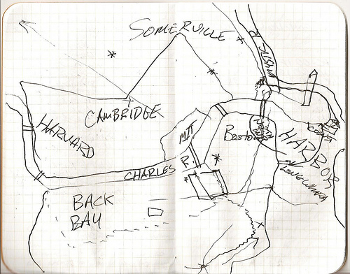
Digital maps have done all kinds of wacky things to the way we interact with spatial representations and how we imagine our surroundings. But one thing that hadn’t dawned on me until this conversation was that the sketch map may well be an endangered species of cartographic representation. I found the map below on Flickr with the caption, “Map I drew for my dad while we were having a beverage at Quincy market showing where things were in Boston.” This is great, right? A casual conversation required some visual aid, and a sketch map was employed. But would all fathers and sons nowadays have done this?

The need to sketch a map on a napkin or the back of a receipt to show a friend how to get to your favorite coffee shop is slowly disappearing like Marty McFly’s fingers in Back to the Future. Increasingly, we share locations through some mobile application, or we send a link to a digital map where the location is highlighted, or, if we have any faith in our friend’s ability to use technology, we simply… tell her the name of the location. After all, she can look it up just as quickly as we can, right?

Finding things—coffee shops, candy stores, ball parks, bowling alleys, Grandma’s house, &c.— has become so easy that the sketch map (made for directing or orienting someone to a place) may no longer be necessary. I know, I know—this is not news. Digital maps, GPS and (even if more recently) place-based mobile applications have been around for a good long while. But while everyone is jumping on the bandwagon of new spatial technology and communication, it seems no one is stopping to ask: what are we losing when we click on a Google Maps link instead of poring over a friend’s sketch map?

I bring this up because I think we are losing quite a bit. Why does our friend like this place? How does he imagine the neighborhood? What is most important to him in that neighborhood? What does he exaggerate? What does he forget? All of these are questions that cannot be addressed the same way through a weblink (these unanswered questions are the notes Marty McFly misses on his guitar as his fingers disappear).

Perhaps some people do not care about these questions—or at least don’t care enough to specifically want to explore them through sketch map-based communication. But I do. And it turns out I’m not alone. Check out the Hand Drawn Map Association (HDMA), an “ongoing archive of user-submitted maps and other interesting diagrams.” These folks are collecting sketch maps of places all around the world, and helping to keep maps like these from going completely extinct. Once you’ve visited awhile, why not draw a map and submit it? You might learn something about the way you view your world.

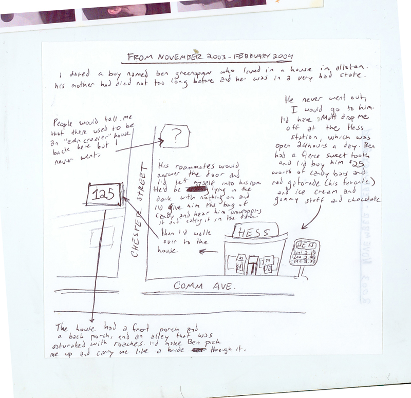
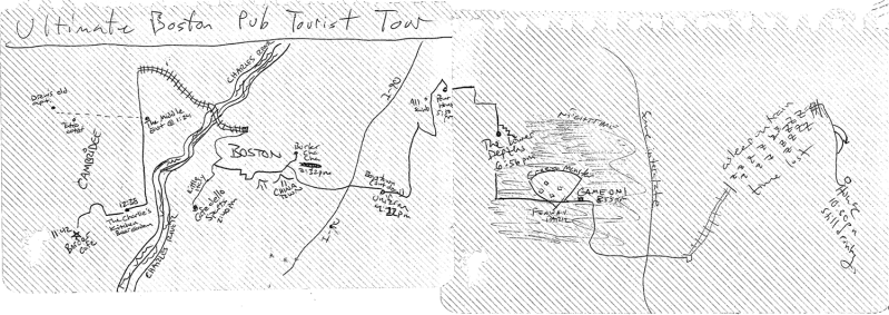
Here is a typical map found on HDMA. Based on the roads in this map, I think I know this place (and I’m resisting the temptation to include a link to a Google Map that locates it for my readers). But I definitely don’t know it the way that it is portrayed here. I bought my first car across the street from this intersection, but I remember no Hess station. So who’s wrong? Me? The guy who drew this? No—neither of us are wrong. This is a sketch map; the author’s representation of that space as he remembers it. Unless spatial accuracy is the main goal of the sketch (which it rarely is), it is no more or less valid than the way anyone else imagines that space (but, still, I swear there wasn’t a Hess station there the last time I checked!).

Another force keeping the sketch map from going the way of the dinosaur is the “art map,” a vague genre of map that includes everything from Nantucket-shaped coffee spills to wood–carved block diagrams. (In other words, anything that is artistic—as if that were something that could be determined objectively.) While people do seem to have developed  a dependence on digital maps because they are convenient (to say nothing of hip and “futuristic”), they have not given up their fascination (or even obsession) with “artistic–looking” maps. These often come in various forms of would–be wall hangings: painted pin maps, watercolor maps or stained glass maps. Thankfully, many of these maps are created by hand, and just maybe serve as a reminder to those who did not create them that perhaps they could try.

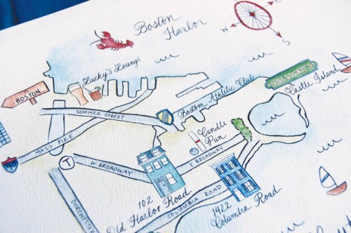
One place we find plenty of art maps these days is in that calligraphy-emblazoned triple-thick envelope dropped in our mailboxes two or three months in advance of a loved one’s wedding. Above is a watercolor map made for a wedding in Boston. Nice map, right? Is it spatially accurate? Meh… who cares?! It’s beautiful and it’s personal.

It’s my hope is that these sorts of works inspire more people to make maps by hand. So the next time you’re sitting in the South Street Diner and plotting your day with some buddies, think twice before whipping out your smart phone. Map it out on napkin and send it to us. We love this stuff.
Posted in General, Unusual Medium | Tagged , , , , , | 5 Comments

Boston’s Inner Irish Green

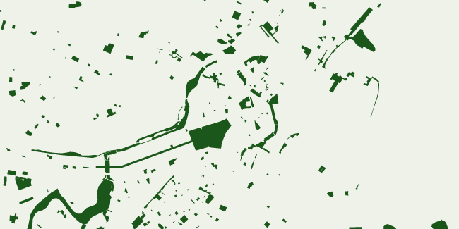
Happy St. Patrick’s Day, Boston. Today is a day held in very high esteem among the Boston Irish (by which I mean… everyone). And what better way to celebrate this day cartographically than to showcase the green in our fair city? Playing off of Andy’s post on building footprints, here is a map that shows only green spaces (most notably, parks).

By the looks of it, Boston seems well justified in calling itself “The Dublin of New England”. No need to dump green dye in the Charles. Have a look…

Look close enough and you might start seeing shamrocks.

Posted in General, Holiday, Seasonal, Unusual Medium | Tagged , , | 3 Comments

Three-decker diffusion

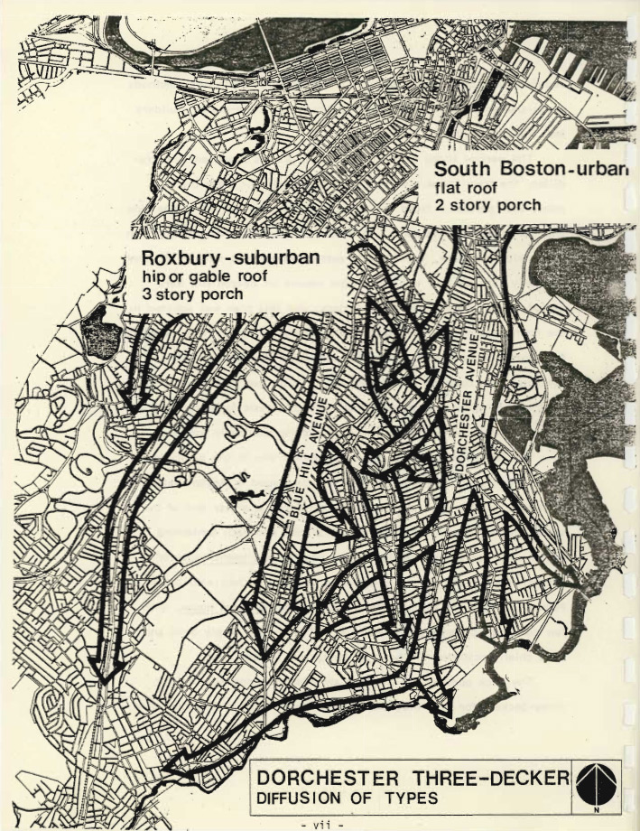
Ah, the triple-decker (or three-decker, if you’re more old school). What makes it special is that it is the vernacular style of Boston but is something that largely goes unseen in the common “Boston” tourist experience. Below is map on the diffusion of three-decker styles into Dorchester from Roxbury and South Boston, from The Three-Deckers of Dorchester (PDF) by Arthur J. Krim, hosted at the Sidewalk Memories site. The paper notes that fire laws in the central city—which, wouldn’t you know it, more or less coincides with tourist Boston—forbade wood construction, hence the triple-deckers kind of being the locals’ special secret today.

Diffusion of three-decker types

I’m not sure if these two styles are so identifiable today, as the author noted that they merged eventually, but one can certainly find a lot of both flat roofs and pitched roofs. It would be interesting to see what the geographical distribution of each is now.

Posted in General | Tagged , , | 1 Comment

A People’s Atlas of Boston

(Note: most links in this post have since gone dark, but you can still download the maps here.)

We Bostonographers are very interested in people’s personal maps, particularly Kevin Lynch style cognitive mapping, about which Tim has written a Boston-centric primer. So when one of us learns about an event about something called Notes for a People’s Atlas of Greater Boston, it is filed under “wish I’d known about it ahead of time.”

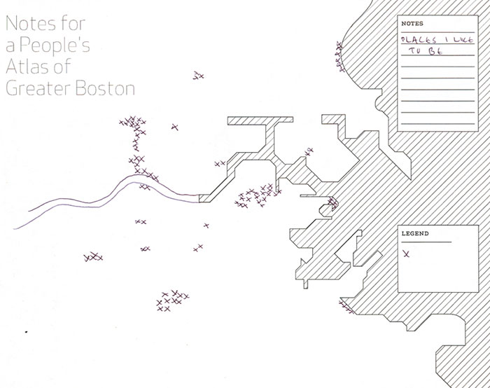
This People’s Atlas turns out to be less of a true geographic mental mapping endeavor and more of an ostensibly edgy, artistic, “maptivist” project. Still, it’s fun to see what people chose to indicate on a blank map of Boston. The template map is a (very deliberately, I’m sure) simplified map of the central Boston area, and participants were encouraged to map anything at all of personal importance or interest, albeit with many suggestions that we suspect spoil totally free thinking. The fourteen resultant maps are available for download and exhibit a variety of topics.

Browse through the PDF to see them all, but let me conclude here with the most smile-inducing map of the bunch, and possibly ever: PLACES I LIKE TO BE.

Places I Like To Be

If any of the mapmakers happens by here, we’d love to hear from you!

Posted in General | Tagged , , | 2 Comments

Footprints of Boston

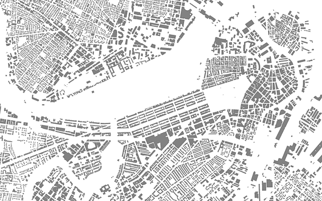
We mapmakers earn our keep by somehow adding value to raw geographic data; that is, the craft requires more than just plotting the location of objects on the Earth’s surface. But sometimes it’s hard to compete with the simple elegance of a stripped-down display of geographic shapes. Some of my favorite images of that ilk are maps of city building footprints.

Boston building footprints

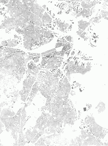
Or how about a much larger extent that includes most of the city?

Boston building footprints

Despite the objections of some detractors (you know who you are, and I know where you live), there is some worth to this kind of map. Sure, there’s really nothing to it—the map was simply cranked out from MassGIS data. If nothing else, though, it’s kind of pretty, revealing the sometimes aesthetically pleasing patterns of the built environment.

Besides being inconsequential eye candy, though, the map is somewhat useful for interpreting urban geography. Some manmade patterns are much clearer in this map than in an aerial photograph you’d find on Google Maps or elsewhere, which shows all this and more. Assuming some base level of local knowledge (say, where the ocean is), it’s possible to identify various spaces: built-up (gray) versus open (blank) areas, downtown (large, dense footprints) versus residential (smaller, separated footprints) areas, steetcar suburbs (long main drags with density dropping a block or two away) versus more interior urban areas (consistent density and often smaller, straighter blocks), and so on.

But mostly it’s a pretty picture. I’m not alone in thinking so, right?

Posted in General, Geography | Tagged , | 7 Comments

Light Drawing Massachusetts

There’s a debate—at least in academic cartography—about what constitutes a map. The first lecture in the introductory course at UW-Madison starts with a slideshow challenging students to determine which images are maps and which are not. Among the “traps” designed to trick students into guessing incorrectly are images of a Monopoly board and a 19th century bird’s-eye city view. These, according to our lecturers, are maps. What is not? The only current example of a non-map given in this introductory lecture is that of a photograph (taken at eye-level of Galway Bay, Ireland).

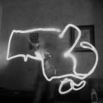
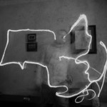
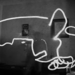
To get into the “what’s a map!?” debate on Bostonography would be moderately to extremely off topic. But I realized yesterday that something I created as a part of my Bogus Art Maps project—according to the introductory cartography course—is a map… and is not. So, I had to make some of Massachusetts.

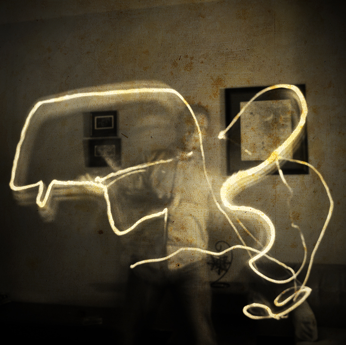
These are light drawings, created using technique that has been around for decades. They are made by taking a photograph in a dark space with a long exposure. While the film is being exposed (or, the sensor in your digital camera is… er, “sensing”) a light source is used to “draw” or “paint” the space in front of the camera. The result is an image that has been “burned” by the path of your light source.

Eat your heart out, Picasso. This is Massachusetts.

Posted in Geography, Photography, Unusual Medium | Tagged , , , , , , | Comments Off on Light Drawing Massachusetts

Bostovalentinography

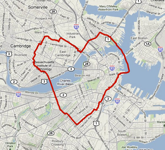
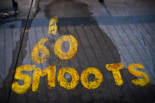
9,872 smoots. That’s how far I walked to make this deformed heart map for Valentine’s Day.

Heart-shaped path through Boston

That’s a GPS track of my path around Boston and Cambridge (and a bit of Somerville) to trace something like a heart shape. Over on my regular cartography blog there’s a quick summary of why I would do this kind of thing, but here let’s talk Boston. What did I observe about space and place in the city by trying to draw this shape on the landscape?

The heart of Boston

Boston from the ferry

First of all, finding a decent-sized heart shape in the local street system is not quite as easy as I expected. It is certainly much easier than in a city with a strict rectilinear grid, but a heart requires something like an octilinear (transit map style) system, ideally with ample curves. Boston’s streets may not be well-organized overall, but they do follow some order within neighborhoods and don’t leave a lot of options for hearts. As it turns out, the key here—and totally the best thing about this project—was to make use of the Charlestown Navy Yard–Long Wharf ferry, something I had yet to experience in my time living here.

Junkyard District

Very little of this route was new to me, but since exploration is partly the objective of such a project, I tried to pay attention to whatever was new. The one area that was an entirely new experience was the Cambridge/Somerville borderlands between the vicinity of Inman/Union Squares and Lechmere. I was a little fascinated by the gritty mesh of light industrial and residential uses, not to mention the one or more scrap yards. I also learned that Somerville police enjoy hanging out (or maybe just taking naps?) on the back side of Twin City Plaza. Fair enough; it does have high potential for being a pretty sketchy spot, although cops lurking back there bring their own special creepiness to it.

Unboston Boston

Franklin Square, South End

There was a great remark over at archBoston written by user DZH22 the other day: “If you wander around enough, it turns out that a lot of Boston looks nothing like Boston.” That’s a nice way of summing up the diversity of layout and architecture in Boston’s neighborhoods. Sure enough, “Boston” tends to bring to mind old churches and charming sections of the North End/Beacon Hill/Back Bay, and most of the city doesn’t look like that. Parts of the South End have always struck me as particularly interesting in this regard. Blackstone and Franklin Squares (pictured above), for example, just seem somehow different in form and scale from most other non-downtown places in the city. Not that this was a new revelation on this heart walk, but it’s always a pleasure to pass through that part of town. The South End as a whole has a way of being very city-ish while flying a little under the radar.

Boundaries

Cambridge/Charlestown DMZ

Stick with me long enough and you’re bound to hear about how I hate administrative boundaries such as cities or counties. On this excursion I passed between three cities: Cambridge, Somerville, and Boston. Cambridge and Somerville, in my mind, confirm my contention that city boundaries are largely meaningless. As I wandered the border zone between the two cities, most of the time it was nigh impossible to tell which city I was in. A “city” as a human settlement rarely respects jurisdictional boundaries, and it frustrates me to no end when, for example, Boston people treat Brookline or Cambridge like adversarial faraway kingdoms, and vice versa. That’s not to say that boundaries are always so invisible, however. Cambridge and Charlestown have a much more stark division, an apparent wasteland with only a single crossing.

For the love of a place

60 Smoots

The above are just a few observations that demonstrate the purpose of this kind of wandering. On the one hand it’s just a silly stunt for a blog post, but on the other hand it’s an activity meant to stimulate discovery and awareness of place by directing me through the landscape on a somewhat arbitrary path. Simply walking around with no specific purpose is a great way to get to know the city and develop more attachments to it. And when the city has its own local unit of measurement with which you can record the distance, you know it’s worth it.

Happy Valentine’s Day, Boston, or in the ever-wise words of Sav-Mor liquors: Blah blah blah. Drink.

A Valentine's Day map

Posted in Geography, Holiday, Photography, Seasonal | Tagged , , , , | 9 Comments

The Mighty Charles

I have a special place reserved in my heart for the Charles River. I love it. Sure, sure, most people do, right? It’s a significant river. Heck, Paul Revere crossed that river while embarking on his famous midnight ride. And after that random Sox fan jumped into the Charles during the 2004 World Series victory parade… gosh, how could you not love that dirty water?

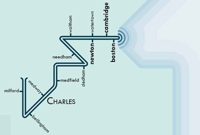
So, when I heard that my colleague, Daniel Huffman, had plans to make a series of transit-style river maps, my interested was obviously piqued. “So, hey, Daniel. Any plans to make one of your newfangled river maps of New England?” I asked. “Should I?” he asked. Um, yes, he should.  And he did.  And it is pretty great, so check it out if you have a moment.

Daniel’s Major Stream Systems of Southwest New England map features the Charles, Housatonic, Shepaug, Naugatuck, Hoosic, Quinnipiac, Connecticut, Farmington, Scantic, Westfield, Deerfield, West, Ashuelot, Millers, Chicopee & Ware, Quaboag & Five Mile, French, Quinebaug, Thames/Shetucket/Willimantic/Middle, Blackstone & Seekonk, Merrimack, Concord, Sudbury, Assabet, Nashua, Beaver, and Souhegan rivers.

Oddly, what river almost didn’t make the cut on this map? The Charles. “Yikes!“, you exclaim? Well, so did I when Daniel first asked if he should include it. It turns out that based purely on length, the Charles doesn’t stack up that well against other systems in New England. Still, it didn’t take much convincing to get him to admit that the map just wouldn’t be right without it. I think it was my story about watching my dad’s annual canoe race that was the clincher.

You must love the Charles. Dirty or not.

Posted in Geography, Transportation | Tagged , | 2 Comments

Map Pinning Boston

Bostonography provides us with the perfect forum for sharing bizarre, hybrid posts that randomly incorporate some of our favorite things. There is no doubt that soon enough, I will write something up on gummi candy maps of Roxbury… even if I have to make (and eat) them myself. But that’s for later; today’s contrived combination of cartographic interests will be map pins and… well, Boston, of course.

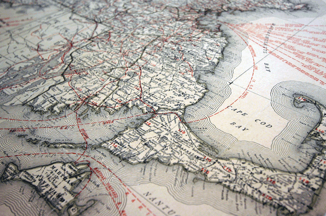
I opened this post with a cartographic image of Massachusetts. This map was designed specifically for the Rand McNally Map-Tack System some time in the first half of the 20th century. Yes, that’s right—Rand McNally sold something called a “Map-Tack System.” What made it a system, you ask? Well, Rand was simplifying a painstaking interactive mapping process that people had been struggling with for decades.

Pin maps have been in use for centuries. Heck, even Napoleon was into pinning maps. But until Rand’s Map-Tack System came along, folks who wanted one were forced to fashion their own map pins, coat their own maps, and build the mount themselves. A diagram in a short pamphlet entitled Charts and Maps as Used by Health Professionals (1918) suggests using cork and cellular board in a map mount’s construction. In Graphic Methods for Presenting Facts (1919), Willard Brinton, who has been discussed in two Making Maps posts, offered up a somewhat lengthy description of a do-it-yourself approach to building a pin map mount:

A very cheap yet satisfactory mounting for a wall map to be used with glass head map pins is made with three or more layers of corrugated straw board. The straw board used should be about 3/16-inch thick with a facing on either side of the corrugated portion. Three thicknesses of straw board are sufficient to give strength for any map up to one yard long. The two outside layers of straw board should be so arranged that the corrugations will run with the length of the map thus giving the greater strength in that direction. The middle layer should have the ribs running crosswise of the map so that the map mounting will be safeguarded from bending in either of the two different directions. Where very large wall maps are desired six or more layers of straw board may be used to give sufficient strength. If single sheets of straw board cannot be found as large as the map itself the map mounting can easily be built up of small sheets of straw board provided the joints in the straw board are so placed that they will not be over each other to weaken the finished structure.

Given these exhaustive specifications, it’s no wonder that Rand’s Map-Tack System was so popular (and it was – anyone notice the maps used by FBI agent Van Alden in the HBO series Boardwalk Empire). Rand provided the mount—which fit perfectly in the Map-Tack System cabinet, whose drawers were deep enough to accommodate pins. It also provided the maps (printed on “supercalendered paper with light inks”), and a whole host of pins, flags, spot signals, cords, beads, rings and other accessories. Gone were the days of fussing about to make your own straw board mount, coated map and custom pins.

Although I don’t have an image of it (I’m still looking), it’s more than likely that at some point, there was a map of Boston that was adorned with all of the aforementioned Rand Map-Tack System accoutrements. Intriguing-sounding pin maps from the first half of the 20th century are cataloged extensively on Google Books. Buried in old pamphlets, magazines and books are references to pin maps of the Boston area showing water and sewage works incidents; episodes of tuberculosis; illnesses in school children; crime; political district lines and distribution of car dealerships—they’re just not pictured (boo!).

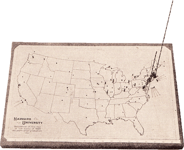
That is not to say what we don’t have a couple of examples. Here, for instance, is one of my favorite pin maps to date. This map from Brinton’s Graphic Methods for Presenting Facts shows the distribution of Harvard University graduates from the class of 1907. Note the vertical extensions of the pins on the East Coast. Nowadays, with digital pushpins, overlapping data points remain a logistical hurdle for cartographers. Although some methods exist for coping with this problem (aggregating data points at different scales, or fanning out the pins so that all are visible when clicked), none is perfect. The same might be said for this method; it’s clear that many Harvard graduates from the class of 1907 have remained in the Boston area, but quickly attaining any kind of hard data from this map would be difficult, if not impossible. Still, stacking beads on hardened piano wire is probably better than cramming all of the pins next to each other, no?

One of the biggest players in the “Map Pin Industry” during the first half of the 20th century was located in our sister city to the south, Providence, Rhode Island. Edexco sold “Devices for Graphic Business Records” and their advertisements featured long-armed businessmen going about their graphing with gusto. After living most of my life in the Boston area, it’s hard to believe that, at some point or another, I wouldn’t have noticed that men in Providence have fantastically long arms.

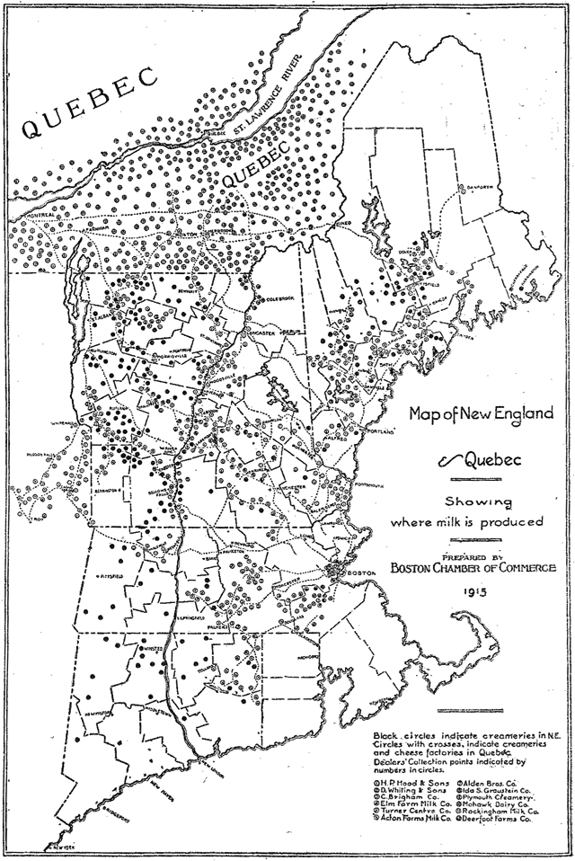
Edexco didn’t just sell the goods for making pin maps. They also published and sold vaguely scientific pamphlets on how pin maps should be used. These pamphlets featured guidelines on what type of pins to use, how to insert pins into a map, how to set up a mount, selecting appropriate color schemes, &c. They also offered a number of case studies featuring successful pin maps. Here is one such case study: A map showing where Boston’s milk was obtained in 1915.

When I look at this map, I imagine an extremely long-armed man spending endless hours meticulously placing pins to indicate the locations of creameries in New England and Québec. Don’t you?

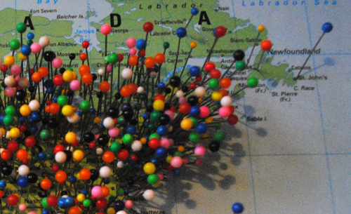
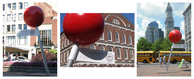
Sadly, that is all I have for old pin maps relevant to Bostonography. I’m sure there are more out there, though, so I’ll be sure to post them as I find them. In the meantime, I’ll leave you with an image featuring Boston’s “Visit the Pin” program from the summer of 2008. At the time, Google Maps had been around for a few years and the pin map (by then largely digital) had re-entered our collective graphic vocabulary. Boston decided to capitalize on this by placing larger-than-life pins throughout the city to promote various points of interest. Not a bad idea… although I can’t speak to how well the scheme worked. I was completely unaware of the program until years later.

Posted in General, Historical, Unusual Medium | Tagged , , , , , | 2 Comments

Conquering eagles and geese

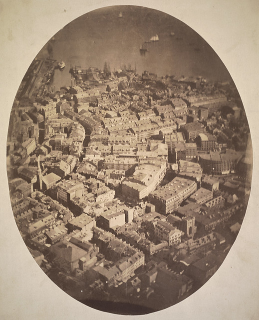
I don’t want to take this site too far down the road of posting historical items that are interesting merely for being historical, but it’s worth mentioning a first that Boston can claim. In 1860, from a balloon tethered on the Boston Common, James Wallace Black took the first aerial photograph of a city in the U.S.

Boston, as the Eagle and Wild Goose See It

It faces east toward the harbor. That’s the Old South Meeting House on the left, with Washington Street running toward the lower right and Milk Street toward the top. The photograph’s title, Boston, as the Eagle and the Wild Goose See It, comes from Oliver Wendell Holmes. James Wallace Black is known for his photographs of the aftermath of Boston’s 1872 fire, which I believe destroyed a good portion of what is visible in this aerial.

The image here is from the Boston Public Library’s Flickr set of Black’s photos.  The Boston Globe provides an approximation of what the same view would look like today.

While we’re at it, BPL posted a treasure trove of historical aerial photos to Flickr recently, mostly dating to the 1920s. They’re pretty fascinating, though it’s a bit depressing to see the neighborhoods that were razed in later decades.

Posted in Historical, Photography | Tagged , , | 3 Comments