Food as Boston

No, not a thoughtful post about the geography of food in Boston. It’s more the other way around.

First, we’ve all seen the vegetable Boston from Jen of Tiny Urban Kitchen, right? It’s possibly the best thing ever.

Second, when you need to draw a quick map of Harvard Square but have no pencil and paper handy, what do you do? Why, you use nearby bits of kale, of course. Thanks to my friend Sean for this improvisation. He also used a piece of a potato pancake to represent whatever he was pointing out.

Harvard Square in kale

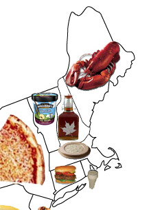
Third, let’s peek at this Food By State map that was making the rounds among cartography blogs recently. Massachusetts gets clam chowder, which seems fine. Another choice, though perhaps less statewide and certainly not modern, might have been baked beans. “Beantown” is a pretty unpleasant nickname so it’s better not to encourage it, but it does have an interesting geographical origin, involving triangular trade and what would become one of Boston’s more deadly sweeteners, molasses.

Food by State in New England

Posted in Unusual Medium | Tagged , , , , | Comments Off on Food as Boston

(Cartographic) Greetings from Boston

Ah, postcards. The travel microblogs of yore. For decades they were the preferred (if not only) method for sending updates and short messages from near and far to friends and family. If you ever find yourself bored in an antique store, head over to the postcard section (usually stuffed in a shoebox) and spend some time reading the messages scribbled on them. My favorite message to date was sent from Lutsen, MN and read, simply, “At last I have found a slot machine. I shall postpone my return.”

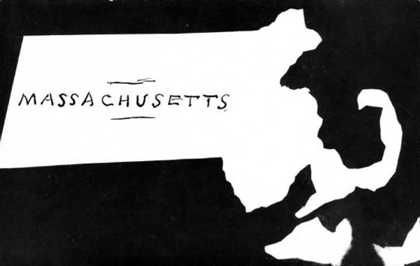
The messages on the backs of old postcards vary wildly. And thankfully for us, so do the images on their fronts. Here, I’ve compiled a small collection of Massachusetts map postcards. You will notice that the only thing that ties many of these postcards together thematically is that they depict space. The way space is being represented (or, er, distorted) depends on the purpose of the card. Above is what is called a real photo postcard. Technically, postcards of this kind still exist (as long as it is a postcard made from a real photo, right?). But in the eyes of a collector, this type of card is generally from 1890s – 1930s. The scratched out negative map of Massachusetts above, which I found on eBay, represents the only real photo map postcard I have ever seen. It’s not a bad likeness either, if you ask me.

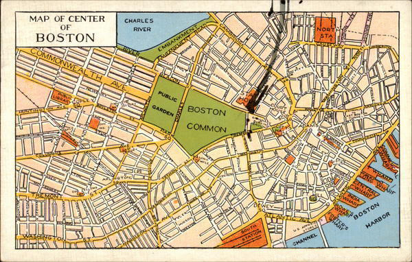
The most straight-up map postcard you will see would be something like this “Map of Center of Boston.” It is basically a reference map for walking, or possibly even driving. Postcards of this type were reasonably commonplace (especially when branded for promotional purposes) throughout the 20th century. But I wonder when people were supposed to use this map of the “center” of Boston. Perhaps it was meant to be employed as a reference until no longer needed, and then sent. Or, it could have been sent ahead to a future tourist who would be visiting the city soon.  Upon his visit, that tourist would likely then encounter a number of other postcard maps designed specifically for him (e.g., he would probably run into postcards of historic subject matter such as Paul Revere’s Ride and The Freedom Trail).

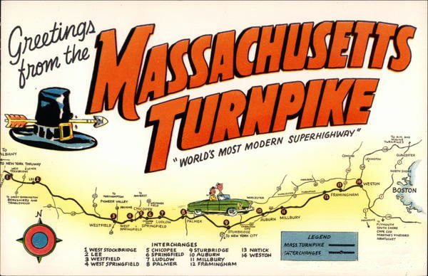
Here’s another kind of postcard map. This one promotes the Massachusetts Turnpike as the “World’s Most Modern Superhighway.” Ha. I must say, I like a few things about this postcard. First, you have to love any design that is adorned with a battle-torn, anachronistically buckled pilgrim hat. I mean, didn’t we all learn that Pilgrims didn’t wear buckled hats on our 2nd-grade field trips to Plymouth Rock? Second, the card implies that the greetings are coming directly from the highway (written whilst driving, in fact). So I have to ask: Who wants to be greeted from a highway? Perhaps that is also a thing of yore. Finally, as an extension of my second point, another question: Who likes a highway enough to buy a postcard of it? I mean, I know that turnpikes were new and hip and everyplace likes to tout their transportation infrastructure as supreme, but… um… I’d rather get a postcard of the Union Oyster House or something.

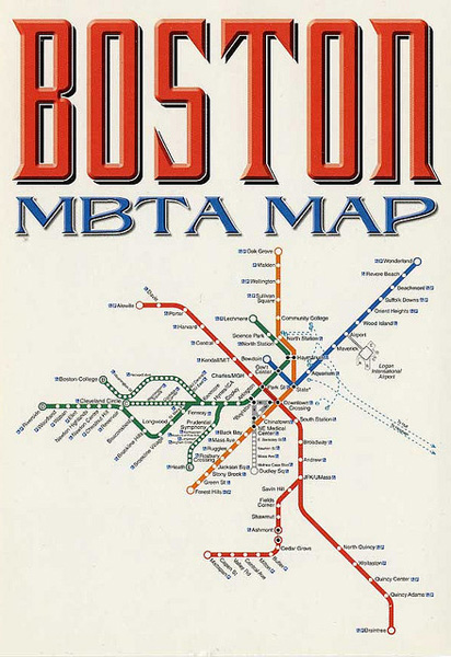
Speaking of transportation infrastructure, here is a postcard of the Boston T system (another gem from Cartophilia). Andy and I have had quite a lot of back-and-forth about the date of this map. Tricked by typographic design (and subtle yellowing), we both initially assumed it was from the 60s or 70s.  But after a bit of research, Andy believes it is likely from the last 10 years (N.B. look forward to a future post on the changing style of Boston T maps over the years).  This, like the map of downtown Boston, could be used as a reference for T riders, but the degree to which the design is reminiscent of Harry Beck’s famous London Underground map leads me to believe that it was likely sold equally as an art postcard.

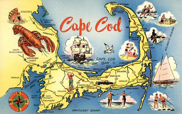
With this card, we move on from postcards with potential artistic appeal to those with indistinct artistic appeal. Here we have a fairly common type of map postcard.  I might call this an “arbitrarily proportional symbol” tourist map, where the variable is “fun.”  Because, let’s face it, what’s more fun than lobster? Sailboats, waterskiing and compass-rosing appear to be reasonably fun.  But it’s fairly clear that tall-shipping is the second-most-fun thing to do on the Cape.  Cartoon-style and automobile-themed postcard maps of the Cape were fashionable throughout the 20th century.

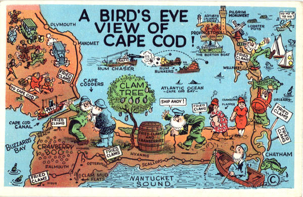
According to this map postcard, fried clams are notably more fun than lobster.  This card comes from an era when lampooning was the norm (exaggeration was also the norm, as in this postcard of a Maine potato). While most of the postcards we see on the racks these days are picturesque aerial views or scenic shots of monumental architecture, this card comes from an era when making things look significantly worse than reality somehow attracted tourists.  (N.B. P-town as an “Art Colony” inhabited by “always broke” artists).

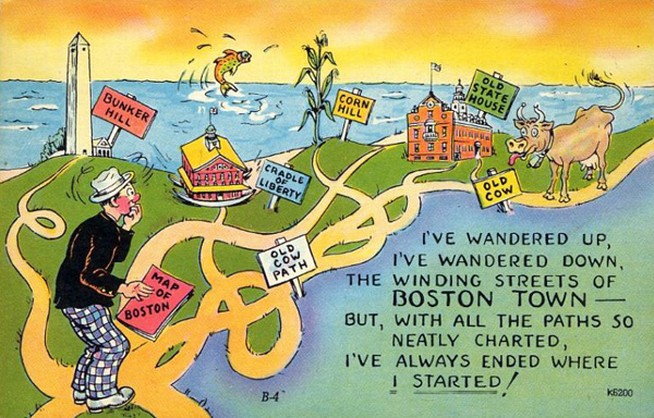
I would also file this postcard under “things portrayed worse than reality.” This style of postcard with bright yellows and oranges, saturated greens, rosy faces and grossly caricatured animals (like the cow and fish here) was common from the 1930s-1950s. They are often printed on card stock that resembles linen in texture (in fact, most postcards from this era are referred to as linens). This type and style of postcard often gets a lot of attention because some cards tend to be quite risqué.

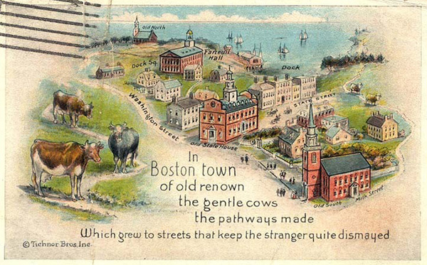
The topic of this postcard and the linen one above it (the confusion of navigating Boston) is one that lives on today. But faulting wandering cows for meandering urban design is now known to be misplaced blame.  The truth is a shame though, because the myth was clearly fodder for some choice cards in the early 20th century.  Either way, it seems to me that given the rate at which the extent of buildable land was increasing in the 1800s, it’s no wonder Boston’s streets aren’t strictly gridded.

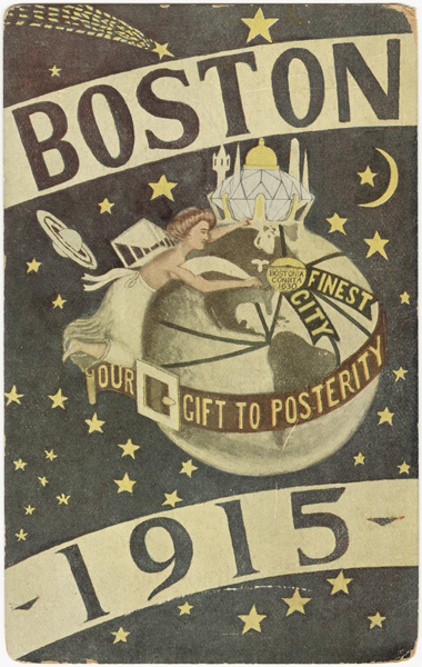
For fear of this post getting a bit long, I’ll end with this card (from the BPL).  It’s hardly a map of Massachusetts, I know.  But it is definitely a map (and Boston is labeled on it), so I had to include it.  Plus, how could I not include this postcard? I mean, just look at it. I have to say, without knowing what was going on in 1915, this card is a bit difficult to decipher (difficult-to-decipher cards were definitely a thing in the early 1900s—or at least, they are difficult to decipher by the standards of a 2010s blogger).  It clearly states that Boston is the “Finest City” in the… er, world. But of the majority of the card’s design remains incomprehensible to me. For example, who is this person and what is she doing with a cage on her back? What’s that diamond city in the north?  And, lastly, why is the earth wearing a belt (without any pants)?

Posted in General, Geography, Historical, Transportation | Tagged , , , , | 16 Comments

A Bostonian’s Idea of the United States of America

It’s hard to argue that humility is one of Bostonians’ virtues. Hub of the entire freaking universe? Yikes.

No more humble, of course, is the object of our inferiority complex, New York. With massive pride comes a (geographically, at least) narrow worldview, famously illustrated in Saul Steinberg’s 1976 “View of the World from 9th AvenueNew Yorker cover. You may also have seen an earlier map of a similar idea, Daniel K. Wallingford’s 1936 “A New Yorker’s Idea of the United States of America.” (Cartophilia has a bit about this map and some other “inflated views.”)

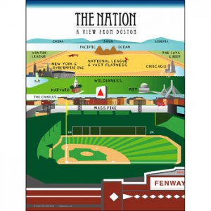
"The Nation-A View From Boston"

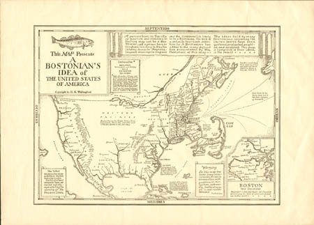
Every place has its take on the Steinberg illustration, of course. There’s the Sox-themed greeting card above, for example, and Tim assures me he has “seen all kinds of postcards and t-shirts of this ilk” (am I just not paying attention?), but there’s nothing nearly as famous as the original. Perhaps for that reason it’s a bit easier to overlook Daniel Wallingford’s other satirical map, “A Bostonian’s Idea of the United States of America.”

A Bostonian’s Idea of the United States of America

A Bostonian’s Idea of the United States of America

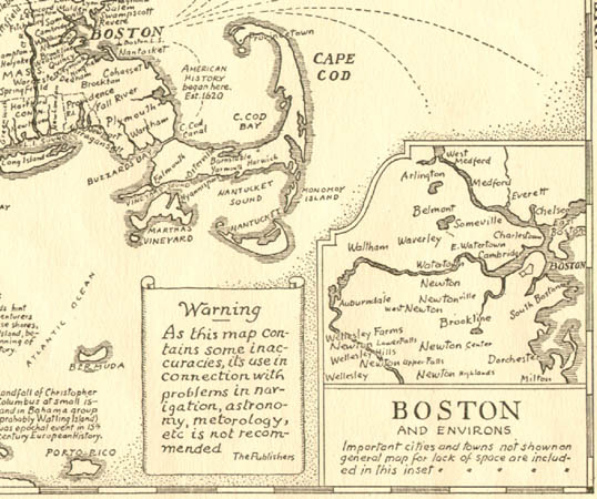
There do not appear to be any decent images of this map on the web; a few old links to the BPL map collection lead nowhere anymore. But we can get the idea. Massachusetts and especially Cape Cod bulge like a flexing arm. Points west and south are unknown, or humorously labeled. (Nice to see that my hometown of Dayton, Ohio at least gets a mention, though.) Otherwise we mostly have to imagine it until a better image turns up.

It’s almost surprising how accurately the Boston inset is drawn; based on some local attitudes I’d kind of expect the Charles River to be more vast and ocean-like, with the distant cities of Boston and Cambridge on either shore. That sometimes seems to be the Bostonian’s view as well as the Cantabrigian’s view. But Wallingford notes that a “Bostonian” can’t be so strictly defined:

A person born in the city of BOSTON and residing in BOSTON may not be a BOSTONIAN; yet a person born in Hingham, residing in Newton (dilatory domicile: Magnolia, frequent crossings to England and the Continent), is likely to be a BOSTONIAN. The lack of a definite text-book definition for A BOSTONIAN has added to the many difficulties encountered by the Publishers of this map.

The ideas held by many BOSTONIANS concerning The UNITED STATES have been gathered, evaluated, weighted, and combined. This map, a composite of these ideas, is the result.

Anyway, check out the links above. There are lots of interesting tidbits to see or read about. Here’s hoping for better circulation and display of this map soon!

Posted in Geography, Historical | Tagged , , | 8 Comments

Merry Christmas, Boston, unless you’re colorblind

If so, just enjoy this map of ambiguously colored dots. This will be clarified at a later date. It’s this, but in Christmas-y red and green, for part of Boston. In 1898.

Boston addresses

Posted in General, Holiday, Seasonal | Tagged , | Comments Off on Merry Christmas, Boston, unless you’re colorblind

MBTA visualizations

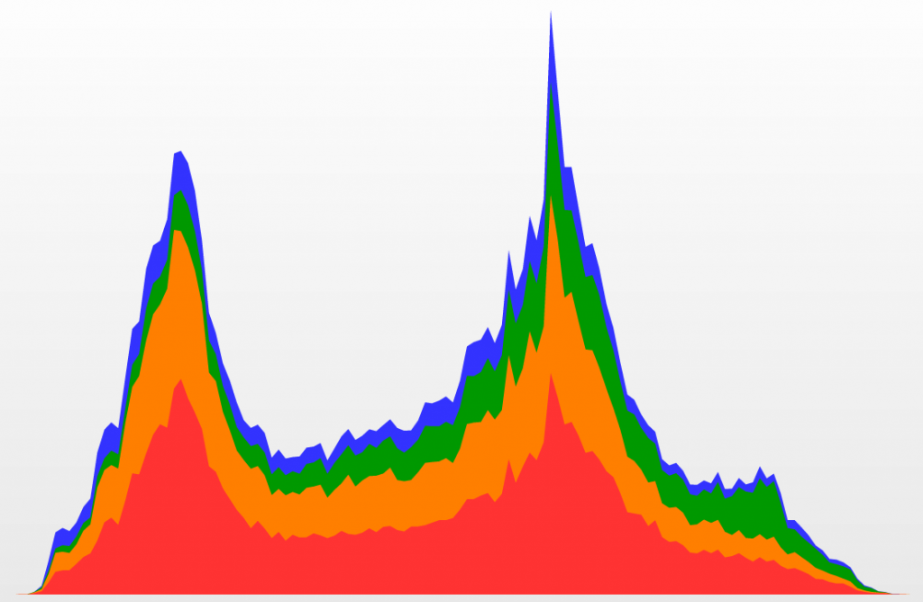
MBTA chart

If you haven’t noticed—and I sure hope you have if you ride the T—MBTA schedule and location data are infinitely more accessible than they were about a year and a half ago. A couple of guys at the nascent Massachusetts Department of Transportation did some heroic things with open data, leading to releasing complete MBTA schedule data last year (to Google Maps and the world) and real-time bus and train locations earlier this year. The upshot is that they’ve improved rider experiences on the cheap by opening data and letting skilled and motivated developers in the community create useful applications.

As part of this effort, a developers’ conference took place last year, part of which was a visualization contest. Two days’ worth of fare payments on trains and buses (hundreds of thousands for each day) were released with a challenge to create a visualization of a “day in the life” of the MBTA. I attended the conference but never got around to visualizing anything more than the chart at the top of this post. Thankfully other people had more follow-through.

My favorite was the beautiful series of charts by Ryan Habbyshaw, Brad Simpson, and Todd Vanderlin.

MBTA visualizations

Make sure to check out all the other entries. There are more awesome charts, maps, and even data sonification. If anything feels missing, note that the data can’t distinguish which line a passenger used at stations where lines intersect, nor is the location of (most) payments at Green Line surface stops known.

I like looking at the temporal pattern for each station and inferring which places are mostly destinations for people and which are mostly origins. As expected, the outer stations mostly peak in the morning as commuters head into town while the downtown stations peak strongly in the afternoon. But there are some that have bimodal patterns, which I like to interpret as indicating areas of good city life—a nice mix of living and working. Central Square, Andrew Square, and Mass Ave are a few examples of such a distribution. Then there are a few that don’t have big peaks, such as Airport and Community College, where people tend to be coming and going all day.

Central Square, Mass Ave, Andrew Square

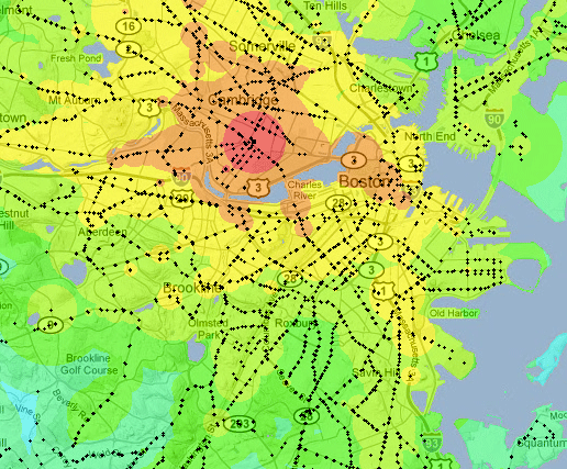
Another MBTA map worth mentioning is this transit time map by Dan Tillberg. Click a point and see how long it’ll take to get everywhere from there via the T. This map is interesting to me because it shows how well my concept of central Boston corresponds to transit times. When I think of the “city” here, I think of an area roughly like the 30-minute zone from, say, Park Street. Thirty minutes from Central Square, meanwhile, pretty well matches my personal range of motion (which I keep documented). It’d be an interesting exercise to compare mental maps to travel-time maps like this.

MBTA transit time map

Though less colorful, similar information (for many other cities as well) is now available in the impossibly cool Mapnificent.

This is certainly not an exhaustive list of maps and charts of MBTA data. More to come as it’s discovered. Links are welcome!

Posted in Transportation | Tagged | 4 Comments

Kevin Lynch & The Imageable Boston

You’re walking around Boston and a friendly stranger approaches you. “Say, I’m new in town. What neighborhood is this?” she asks. You furrow your brow, laugh nervously and say, “Back Bay? South End? Possibly both… or neither.” Then, for fear of coming off like a grade-a jerk, you apologize and explain that Boston is notorious for being a geographically confusing place to newcomers. You go off on a tangent about how you blame colonial cart paths and Frederick Law Olmsted’s string of Emerald Necklace parks for the wonky non-grid that makes up much of Boston’s city streets. By the time you finish your tirade, your new friend is gone.

You are a little disappointed that you couldn’t share more, but you understand. Boston is a city that evokes all kinds of emotions in its inhabitants and visitors. You are no exception. You have a real sense of Boston. You live there. You navigate its paths on a regular basis, visiting landmarks and nodes of activity within city districts. You even cross over intangible edges between neighborhoods and along the outskirts of town. And all of this adds up to your mental image of the city. How you live in your city, how you experience and cognize its time and space, and how it is imagined by you and your fellow inhabitants is the heart of the research of the proto-Bostonographer, Kevin Lynch.

Kevin Lynch was born in Chicago in 1918. This might seem like an unnecessary detail, but I believe it had some bearing on his professional career. During Lynch’s adolescent years, Chicago was a hotbed of cutting-edge (landscape) architecture and design. Art Deco was in full swing, with the Tribune Tower being declared “the most beautiful and distinctive office building in the world” in the 1920s. Beaux-Arts style buildings were also making an impact on the Chicago landscape. The London Guarantee Building and 35 East Wacker Drive (“The Jeweler’s Building”) are two examples of this style that continue to influence the way natives imagine their city.

To grow up witnessing the Chicago landscape reinventing itself year after year must have had some influence on Lynch and how he imagined the urban environment. But the path Lynch took from high schooler to urban planning visionary was less than direct. Between 1935 and 1948, lynch spent time at Yale (studying architecture), in Wisconsin (studying more architecture under Frank Lloyd Wright), at Rensselaer Polytechnic Institute (studying engineering and biology), in the South Pacific (as a member of the US Army), in The Philippines and Japan (as a member of the Army Corps of Engineers), at MIT (getting a BA in urban planning) and in North Carolina (as a practicing urban planner). Oh, and he spent some time in Florence for good measure.

You can see the pit stops in Lynch’s life brought out in his works. But the stop (or, really, terminus) in which we are most interested is that of Boston. In 1948, at the behest of his wife (who was vocal about preferring Boston over Greensboro, North Carolina), Lynch took a faculty position at MIT. And it’s lucky for Boston that he did, because he used his new hometown as a case study in much of the research he did from that point forward.

Lynch’s most famous work, The Image of the City, was published in 1960. It proved to be an approachable little book that – through its quirky illustrations and clear and concise explanation of the process of perceiving one’s landscape – has inspired geographers, architects and planners for decades. The Image of the City was the product of field work that he performed in Boston (as well as Jersey City and Los Angeles) from 1954 to 1959 on the project The Perceptual Form of The City. Lynch and Professor Gyorgy Kepes (also of MIT) conducted interviews, made field sketches and took photographs all in an attempt to get at how city-dwellers perceived their landscape.

Scholars generally refer to The Perceptual Form of The City as a seminal “mental mapping” project. But it was much more. Mental maps are great (goodness knows, I’m a huge fan) and getting a glimpse of how minds store space is fascinating. And in that vein, sure, Lynch was interested in putting the maps from Bostonian minds on paper (as he did in numerous and compelling ways), but he was also interested in the way people experienced their landscape and soaked up their city. Lynch wanted to know how people sense their city and how they use that sense to go about their lives within it. If such a thing was knowable, Lynch believed it could be leveraged in future planning efforts.

For Lynch, key to the process of teasing out the individual and collective perceptions of a city was the concept of imageability. You may have noticed by now that many of these concepts are fairly fluffy, based on feelings or impressions rather than – well, science. But that’s the whole point. Lynch and planners of the Lynchian School (if one exists) are more interested in the sense of people who live in the space than the science behind the stuctures within it. That said, “imageable” is a term Lynch invented to indicate how well a place can be taken in, mentally mapped, experienced.

A highly imageable city… would seem well formed, distinct, remarkable, it would invite the eye and the ear to greater attention and participation. The sensuous grasp upon such surroundings would not merely be simplified, but also extended and deepened. Such a city would be one that could be apprehended over time as a pattern of high continuity with many distinctive parts clearly interconnected. The perceptive and familiar observer could absorb new sensuous impacts without disruption of his basic image, and each new impact would touch upon many previous elements. He would be well oriented, and he could move easily. He would be highly aware of his environment. The city of Venice might be an example of such a highly imageable environment. In the United States, one is tempted to cite parts of Manhattan, San Francisco, Boston, or perhaps the lake front of Chicago.

Now, I could see some Bostonians taking exception to the high imageability of their home city. Lynch points out that a person should be well oriented and highly aware of their environment in an imageable city. But it’s no secret that newcomers are often confused and disoriented by the crooked streets of Boston. Newcomers also complain about how misleading transit maps are, when a 20 minute subway ride would have been a 5 minute walk. But does this debunk the high imageability of Boston? No – these things are true of many cities.

What makes Boston so highly imageable isn’t that it is easy to navigate; it’s the prominent and memorable components of the city. One might not know the most direct route from Fenway to The North End, but a mental map of the city may still contain depictions of the Citgo Sign and the entrance to the Callahan Tunnel. Lynch breaks the perceptual city up into handy and easily understood components. He believed that cognitive maps and the mental images that people compile about the space around them are mainly composed of paths, edges, districts, nodes and landmarks (none of which are mutually exclusive).

Lynch loosely describes paths as “channels along which the observer customarily, occasionally, or potentially moves. They may be streets, walkways, transit lines, canals or railroads.” This concept should be immediately familiar to anyone who has ever lived… well, anywhere. The route you take to walk your dog, your favorite weekend bike loop, the Silver Line bus route – these are all paths that potentially help shape your perception of space and place.

With paths in mind, you can see how Boston would be a highly imageable city. After all, Boston is an incredibly walkable city. Lynch would accept established paths in this framework, like those through the Boston Common and Public Garden, or even the Freedom Trail. But paths can also be personal – paths to grab tea, paths to your buddy’s office, quiet paths, loud paths, fast paths, paths to the T, etc. In Boston, we have these paths. With a large enough number of paths, a greater mental grid is perceived, while the uniqueness of each path is retained.

Lynch describes edges as, “the linear elements not [necessarily] used or considered as paths by the observer. They are the boundaries between two phases, linear breaks in continuity: shores, railroad cuts, edges of development, walls.” He goes on to point out that edges are not always impenetrable and, in fact, are often seams between two districts or areas.

Boston is loaded with edges. Lynch cites the Charles River as the most prominent example. Though the Charles may be considered a path by kayakers and rowing teams, the vast majority of Cambridge and Boston inhabitants are likely to treat it as an edge. It certainly functions as and edge on my cognitive map of Boston. Other edges in Boston might be the historic central artery or The Fens as well as Beacon, Tremont, Boylston and Arlington streets surrounding the Boston Common and Public Garden (or even Charles street, separating the two).

Edges often (but not always) separate what Lynch calls districts or, “medium-to-large sections of the city, conceived of as having two-dimensional extent, which the observer mentally enters ‘inside of,’ and which are recognizable as having some common, identifying character.” Districts, like paths, can be official or political, but I would argue that they could also depend largely on the individual who is perceiving the surroundings. “My neighborhood,” for example, could be considered a district that may or may not overlap with other districts.

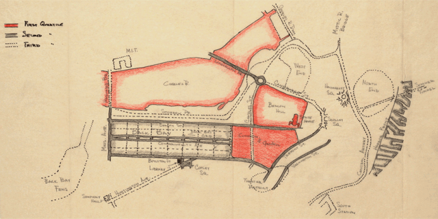
The map above is a rough consensus map of districts that existed in Boston in the 1950s. The hard line represents the minimum agreement area, while the dashed line represents the maximum area. The overlapping areas cause confusing situations like the hypothetical dialogue above. Examples of districts in Boston include Beacon Hill, Back Bay and the South End.

Lynch refers to two distinct types of nodes. Some nodes are junctions of paths and are therefore often transportation-related, while others may simply be a concentration of some type of use or characteristic. Nodes are important to the whole of how a city is perceived because they are related to the concept of path, since they often represent path junctions. They are similarly related to the concept of district since junctions are often prominent features within them. Lynch asserts that nodal points are to be found in almost every mental image of a place, and in some cases they may represent the most dominant feature.

Imageable nodes in Boston abound: South Station, Copley Square, Kenmore Square, Back Bay Station, etc. Lynch also refers to Louisburg Square as a node, though I might argue that nowadays there simply isn’t enough (auto or foot) traffic to constitute this designation (which he bases on the homogeneity and enclosed nature of the square). Nevertheless, it could be argued that Lynch (and this is something I definitely agree with) is remarkably loose with his “definitions”, erring on the side of “no wrong answer” in human perception.

A landmark is an element within the city that – like a node – is a point-reference. But in the case of a landmark, the city-dweller only observes and does not normally pass through. In other words, if Kenmore Square is the node, the Citgo Sign is the landmark. Landmarks can vary in size from a distant hill to your next door neighbor’s doorknob.

The gold dome of the State House, The Custom House tower, The John Hancock and Prudential Towers, and – of course – the Landmark Center in Boston all represent possible landmarks. But these are obvious. Parking meters, grave stones, T entrances, and fence posts can all be landmarks too. I might even argue that a person who you often see in the same place could be a landmark (you know you are getting close to Back Bay Station when you see the “Animal Cruelty” lady, for example).

Past Landmarks have a particularly interesting spot on the collective mental map of Boston. Who, for example, hasn’t gotten directions in Boston based on “where the old Gulf station used to be”? It’s a shame they don’t program GPS devices to give directions based on long-gone landmarks. They would surely be a hit with long-time Boston natives.

So this is how a city is perceived according to Lynch. The inhabitants sense their city, in whole and as a sum of its paths, edges, districts, nodes and landmarks. You might wonder how Lynch managed to unpack such a complex idea into such understandable terms (and in a way that makes us feel like we knew it already). The fieldwork that took place as a part of this study was remarkably exhaustive and holistic. Lynch didn’t just doodle mental maps. He conducted countless interviews on how people experienced their surroundings (what Boston looked like, how it sounded and – yes – smelled to them). One such interview offers a vivid account of the way the light hits the buildings where the pigeons hang out and rambles on to Boston’s “odd skyline”.

Lynch also collected memory maps, a sort of mental map that is drawn some time after a place is experienced. These were drawn following biking and walking tours. He did this with his students (here is an interesting example that synthesizes many student maps) and research associates (here is an example showing what could be mapped 12 hours after a walking tour).

Another part of The Perceptual Form of the City project was to have Boston extensively photographed. When paired with the interviews, these photographs offer an eerie insight into the mental maps of Boston’s 1950s inhabitants. Some of the photos are taken every few feet along a sidewalk and are careful to include major paths, nodes and landmarks. Watching them in sequence is like mimicking the act of walking and mentally mapping.

In addition to some of the more obvious photographs (like most images in this post), the photographer captured some brilliantly subtle elements to the visual landscape, including several images of visual limits. This set of unassuming landmarks and visual limit images comprised shots of sidewalks, grass, fences, cobbles, walls and advertisements.

Lynch is primarily known for The Image of The City, but he continued to teach at MIT and produce equally fascinating work for decades after it was published. In one such book, What Time is This Place?, Lynch eloquently discussed how time is experienced and absorbed in the urban landscape. Instead of relying too heavily on the historic nature of Boston in this volume, he pointed to more commonplace ways the passage of time was being perceived in the city (footprints in concrete as a snapshot in time, observing what people are carrying as an indication of the time of day, trees as seasonal clocks, &c.).

Less than a decade after Lynch passed away in his summer home on Martha’s Vineyard, a collection of his works was published by The MIT Press. The anthology, City Sense and City Design, is jam-packed with great material, much of which concentrates on Boston and the Boston metro region (including a proposal for new planning practices written with the Boston Redevelopment Authority). One of the more wacky (at least from a post-Cold War perspective) projects Lynch got into later in his career involved mapping what would happen if Boston were hit by a 1-megaton nuclear bomb. For a time, he was also quite interested in humans, waste and space.

What I will leave you with here, though, is a map of a place just outside of Boston, a place that is in fact often confused with Boston. In the mid-1960s, Lynch performed a project entitled Visual Analysis: Community Renewal Program for the town of Brookline, Massachusetts. The goal of the project was to reveal potential problems in the way inhabitants perceived their town (with the idea that perhaps some of these problems could be remedied). The map below represents the collective public image of Brookline based on interviews performed as a part of the project. What do we think, Bostonographers, has this perception changed much since 1965?
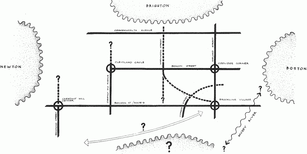
Note: Lynchian paths and nodes that make up the town while fuzzy edges and districts are in the distance (my favorite being the question mark to the south that could still in be Brookline).

Posted in Geography, Historical, Photography | Tagged , , , , , , , , , , | 5 Comments

This is Bostonography

Greetings, Bay Staters and curious outsiders. This is Bostonography.

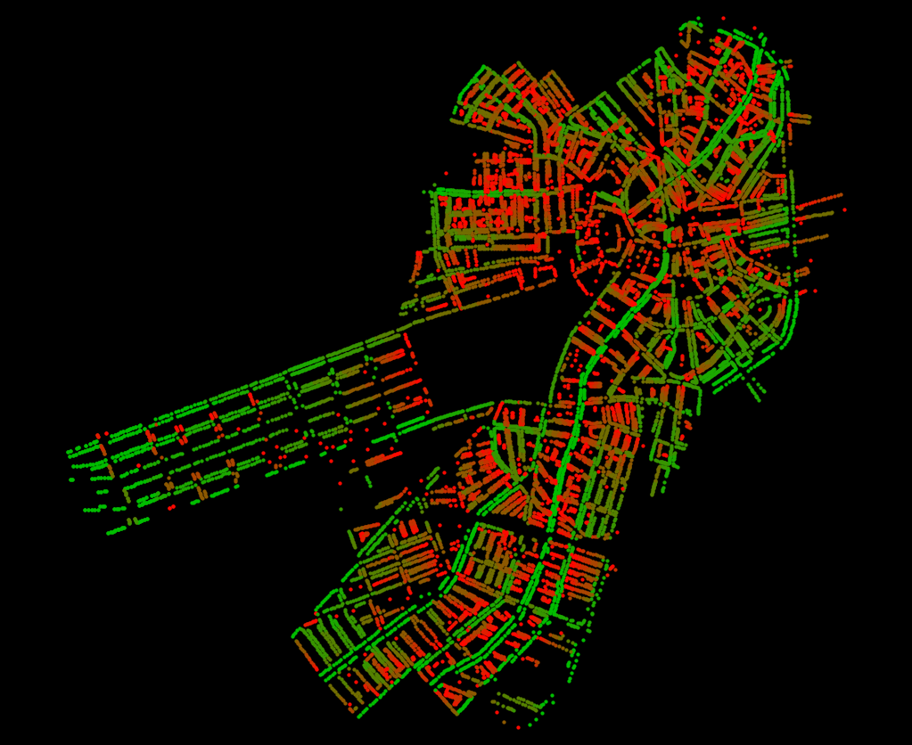
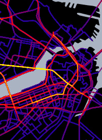
My name is Andy Woodruff. I am a cartographer and one-fifth of Axis Maps. I have lived in the Boston area for a little over two years, having arrived in Cambridge in 2008. That’s a lifetime short of being accepted as a real local, but nevertheless I have a great fondness for Boston, Cambridge, and the rest of the area. When I’m not doing my day job, too often I’ve spent my time describing the city with maps. (Below, for example. More on that one eventually.)

Paths traveled in Boston

And why not? In its geographical form Boston is, for lack of a better word, unique in this country. (Permit me to use the word “Boston” loosely to describe the urban settlement centered on Boston, ignoring arbitrary administrative boundaries.) Culturally and physically speaking, it is an eminently mappable city. And I’ve witnessed the pride in the city that can be inspired by maps that speak to the character of Boston. This is part of my motivation in creating this site.

“Bostonography” could mean a lot of things, but my idea of it is maps and graphics that describe Boston and life in Boston, and the underlying stories about the city. This isn’t a collection of every single map or image that turns up; it’s about those that represent particularly interesting facets of Boston’s culture or geography. Or sometimes it’ll just be especially cool Boston-themed work. The material on this site might range from eye candy to thorough academic studies.

Tim Wallace, area native and Ph.D. candidate in Geography at the University of Wisconsin-Madison, joins me as a partner in this endeavor. He brings to the table a real knack for uncovering fascinating images and stories as well as the perfect level of scholarly interest in Boston’s cultural geography. He also brings lots of gummy candy. Not having overlapped in our graduate school time at UW, Tim and I largely know each other through conference encounters, which are great for hatching schemes like this site. For a bit more about us, check the About page.

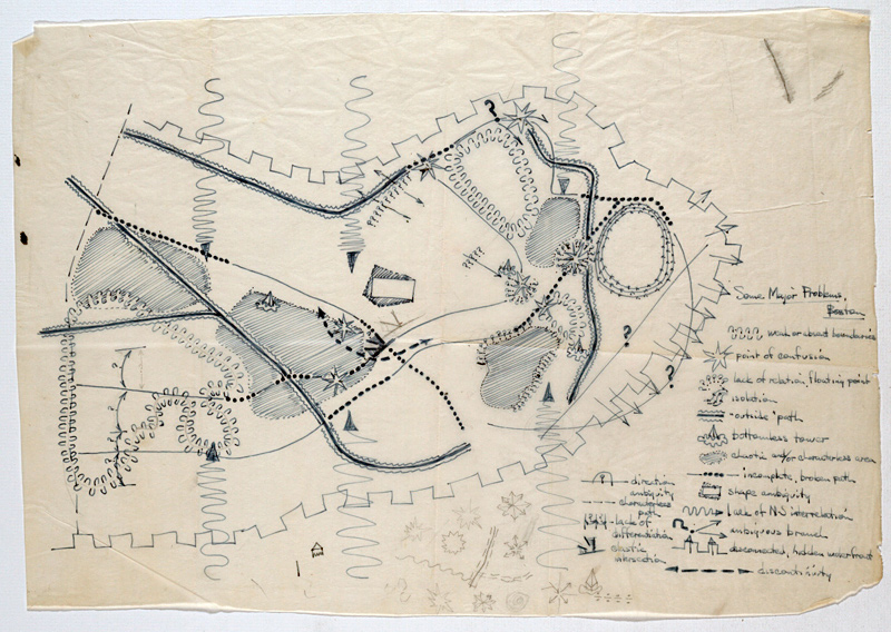
So there you have it—an introductory post. We’ll dive into some actual interesting stuff very soon, starting with the work of the influential Bostonographer Kevin Lynch (one of his maps, showing “some major problems” in Boston, is below as a preview). So thanks for dropping by, and stay tuned to the RSS and/or Twitter feeds!

"Some Major Problems" in Boston

Posted in General | 14 Comments