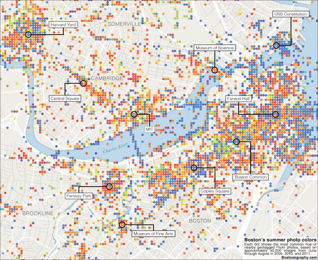
Boston is a colorful city, literally. From the green grass and trees of the Public Garden to the red bricks of the North End to the white triple-deckers of Dorchester, there is a variety of colors to see in the city’s physical environment. What is the distribution of colors across Boston? This week’s Boston Sunday Globe includes our effort to map the city’s summer colors based on photographs. (The map above is a somewhat more up-to-date version of what ran in the Globe.)
Here’s what we did: grabbed some 50,000 geotagged photos from Flickr, analyzed the pixel colors of each photo, then mapped a grid of the most frequent color hues. It’s a follow-up on something I tried a couple of years ago. The method is largely unchanged, but the display is different. Every dot on this map shows the most common hue of photos around that point. It’s calculated based on a rectangular grid, but showing circles instead of solid squares turns out to look much nicer. Most attempts at finding the true average color of photographs will result in dull, muddy colors, hence the display only of hue here. Saturation and brightness of each color are bumped up to full for display on the map. A notable outcome (drawback, perhaps) is that dark and unsaturated brownish colors, very common in photographs, show up as orange on the map.
So what does the map reveal? For one thing you’ll probably notice the geographical extent of the map and distribution of dots. The map here contains a large majority of photos taken in the inner Boston area, which includes a good chunk of Cambridge and excludes most of the non-central Boston neighborhoods. Looking at the actual colors, one probably notices a lot of blue and orange. Blue presumably indicates a strong presence of sky or water in photographs, so it shows up near landmarks (where photos often look upward and contain a lot of sky) and near open views such as those from bridges. Orange colors represent a variety of warm colors from brown stones to interior incandescent lighting. One thing that interests me is the spots where blue and red/orange meet, for example in Copley Square, where the blue of sky and the Hancock tower meets the orange of the Boston Public Library’s interior. Meanwhile, greens are relatively scarce outside the Public Garden, in spite of Boston’s many parks. Apparently people don’t take many photos of greenery, or else they do it more in the spring.
What the map most likely shows is the colors of tourist Boston. A comparison of the photo distribution with the Boston map in Eric Fischer’s super awesome Locals and Tourists set suggests so, anyway. This map is also only a seasonal snapshot, incorporating photos from June–August in 2009–2011. Fernanda Viégas and Martin Wattenberg have done an excellent—and Boston-based—piece showing how colors in Flickr photos vary seasonally, displaying the proportions of colors in the Boston Common over the course of a year. The map here would look different in the autumn or winter, no doubt.
Overall it’s important to remember that this isn’t a faithful map of the colors of natural and manmade Boston; it’s a map of the colors of what people choose to look at and what they choose to share. A lof of the time it’s scenery and landmarks, but I’d wager good money that this map includes at least one photo of someone’s cat doing something cute. And, unfortunately, there are surely the artificial colors of things like hipsters’ Instagram photos, too. What do you, dear reader, find interesting in Boston? Grab your camera and get out there!

Pingback: Michael Cushen