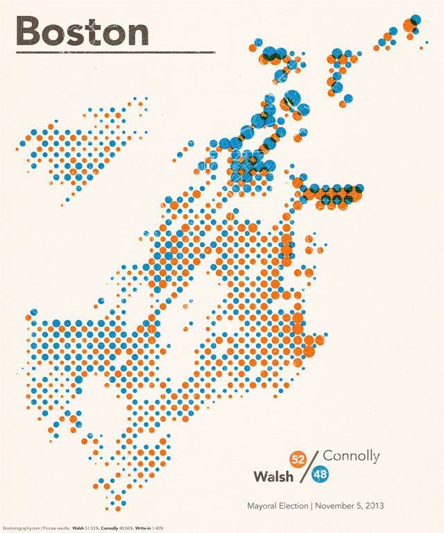
Following last week’s mayoral election in Boston, Andy made a series of 1 dot = 1 vote maps for Boston Magazine. Color me disappointed that these aren’t yet on a list of “20 stunning maps that will bend your mind with amazement, forever changing how you think about the world” on Fuzzbeed or the Puffington Host. They should be. Because, well, as Andy once said to me about an entirely unrelated matter, “just look at them.”
Anyway, Andy was kind enough to share his data with me so that I could play around with some election map ideas I’ve been kicking around. The result, for now, is above. It’s a halftone-style map showing areas won by each of the two candidates, Martin Walsh and John Connolly. In two nested grids, dots are sized proportionately to the number of votes received in that grid cell.
Conveniently for this style, the election was close. In a blowout, it would simply serve as a voter density map. Boring.

Did you just assume that voters were evenly distributed in their precincts and use the percent of land inside each bin to divide voters into squares? Was any correction necessary for really dense areas, or are there not that many people downtown?
Nice technique! The overlaid streets are a very nice touch 🙂
Thanks, Nate! I was going for a streaky monoprint look and thought adding roads might do it.
The source file for this map was technically dasymetric (Andy clipped out unpopulated areas). But since we don’t actually know where the voters live, we are forced to assume they are evenly distributed in each precinct. We could have gone a step further (by snapping vote points to buildings proportionately based on housing units, for example), but since I was aggressively reaggregating the data, I didn’t think that would do much for this map.
Pingback: Alex Krogh-Grabbe | Boston Mayoral Election Maps