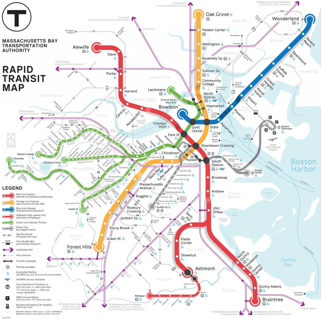
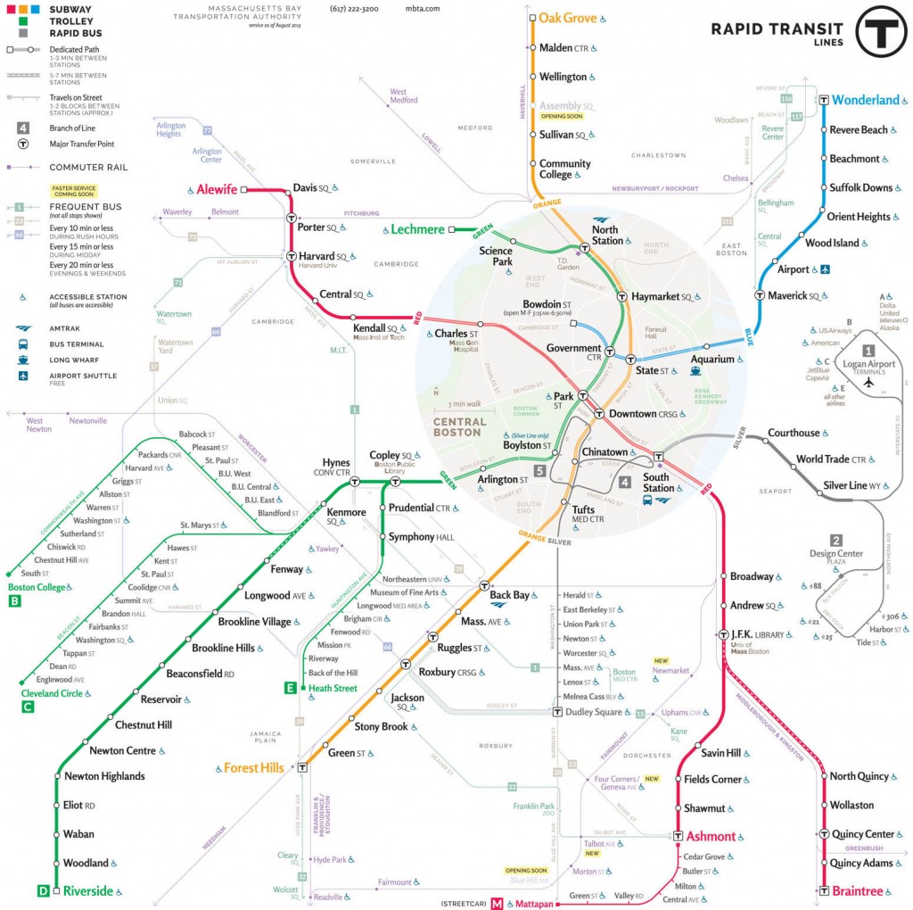
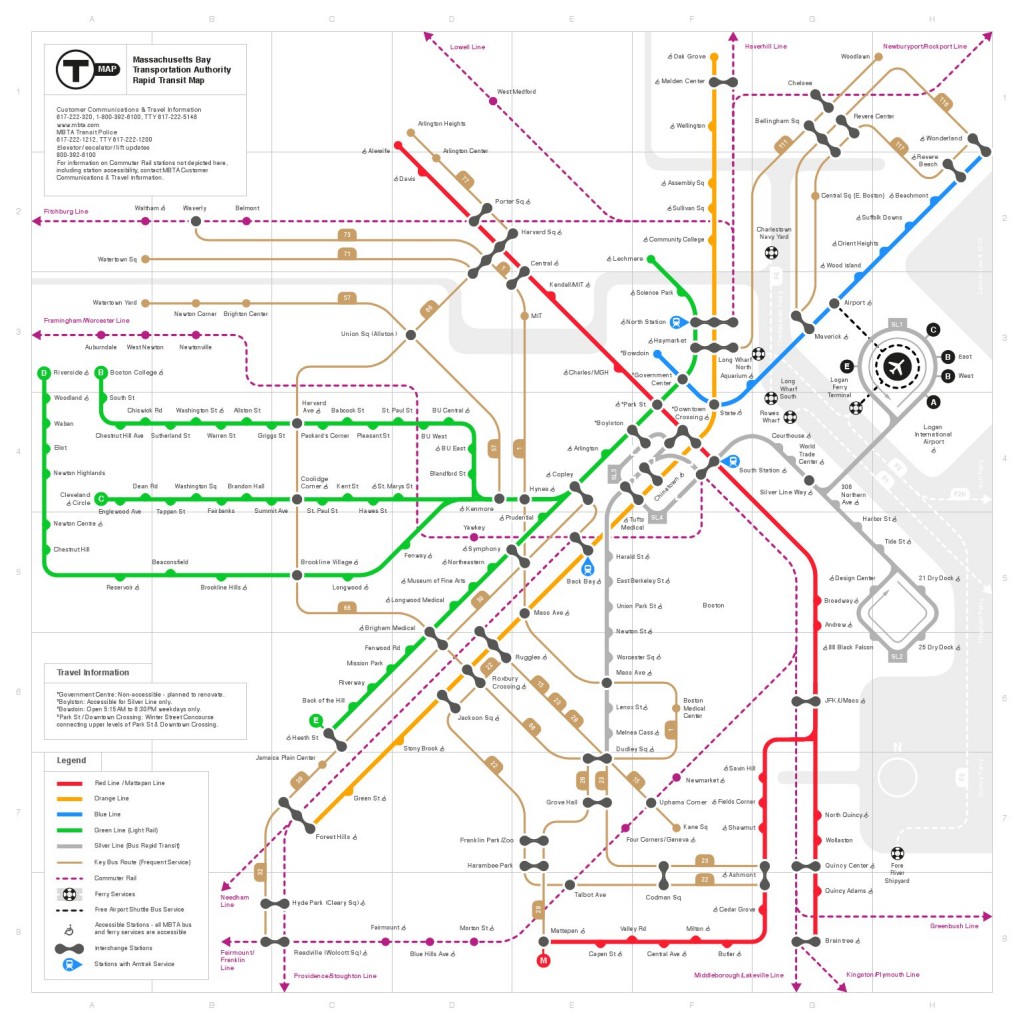
Remember the MBTA map redesign “competition” from the summer? Well, looks like a good number of people were glad to surrender the rights to their work for free, and we the public now get to vote on six finalists. (But don’t miss all the other submissions too.) To brush up on the problems with the current MBTA map, take a look at the review by the eminent transit map designer and critic Cameron Booth.
This is a Boston map blog, so what good would we be if we didn’t chime in with a few words on each map? They’ve all got some interesting ideas.
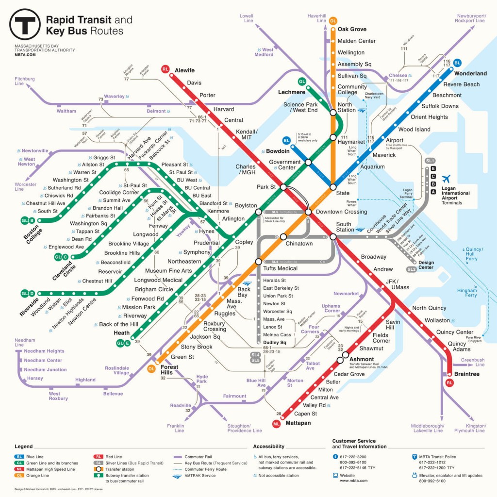
Map 1, by Michael Kvrivishvili

Cameron Booth also reviewed this one a while back, so maybe there’s not much to add. It’s a fairly conservative approach to improving on the current map—the overall style is similar but with a number of things that make it more usable. One thing that bugs me about this map is the sharp 90-degree turn of the blue line at State Street. Some older T maps had this too, and I liked that the more recent maps smoothed that out into something more gentle.
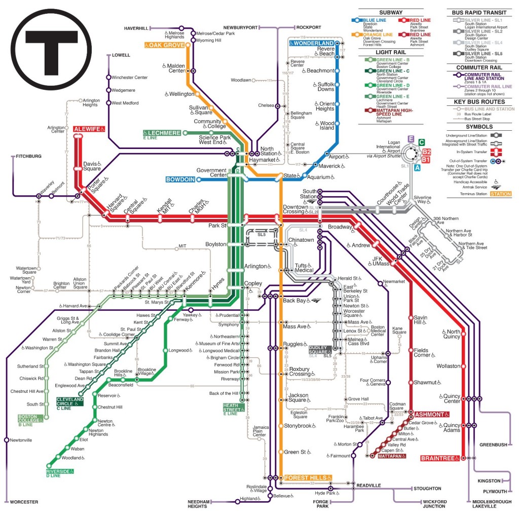
Map 2, by Kat Lawrence

This one is quite a departure from the current map. Corey Zev Holland makes a case for it.
What’s good
Separating the branches of the Green Line and the Red Line is very useful, mostly for the Green Line, and the different shading for those lines is nice for legibility. The topology of this map is great in a lot of places. It’s not just the connections between lines; out-of-system geographical relationships are implied nicely. For instance, notice how the E line stations line up fairly well with their Orange Line neighbors.
Suggestions
I think this map could use some basic geography underneath it to help users (tourists especially) find themselves. For example, it’s useful to know which side of the river you’re on, in my opinion. Showing water, at least, would also clarify where implied proximity is actually true. Reservoir and Cleveland Circle are quite correctly close to each other on this map, but it’s a similar distance from Aquarium to Maverick, when in fact there is a literal ocean between them.
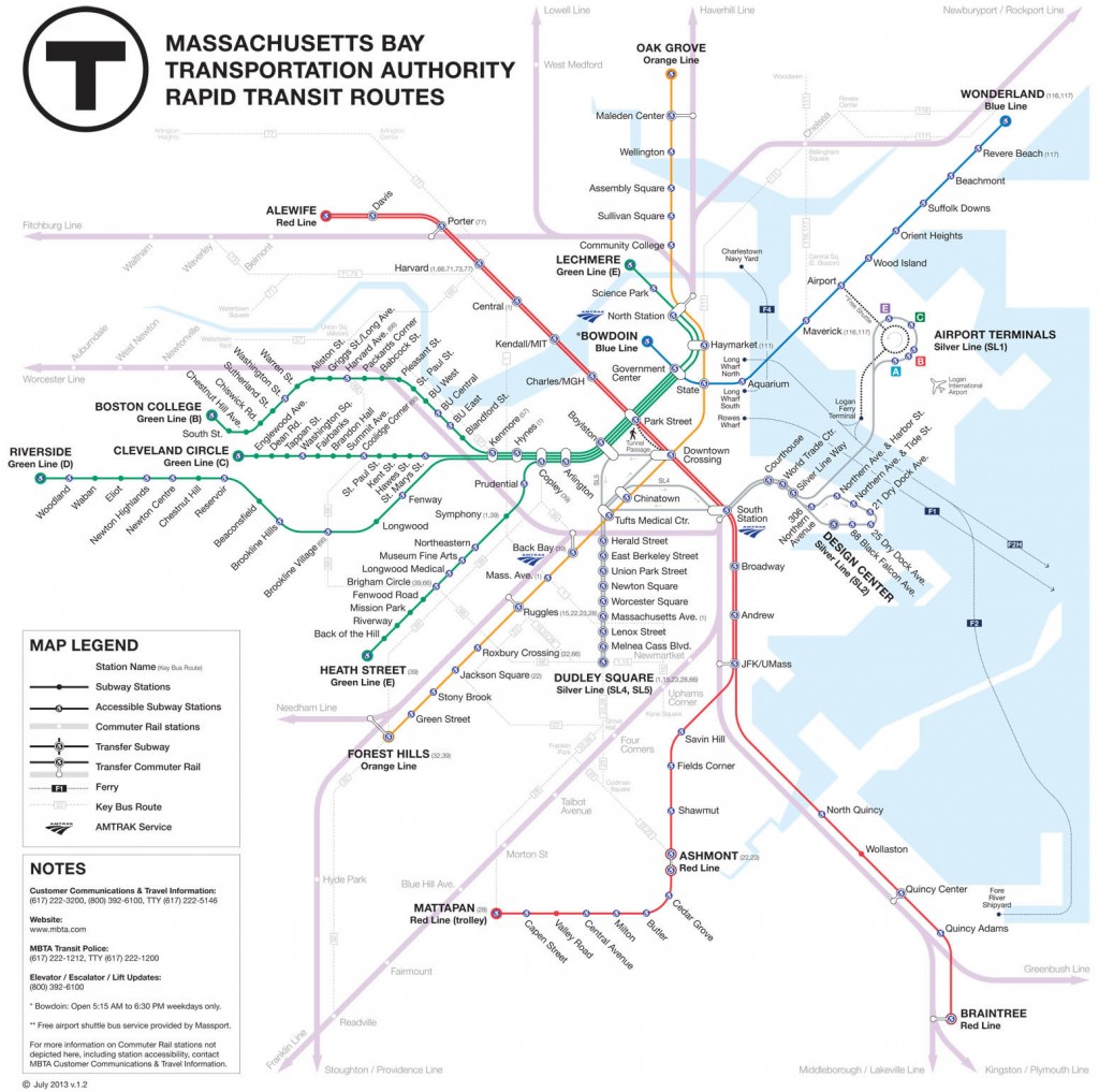
Map 3, by Joshua Simoneau

Here’s one that is also pretty conservative in its changes, which is a nice, realistic approach to improving the MBTA’s maps. The shape of the existing map is largely retained, but there are plenty of changes.
What’s good
Again there are separate lines for different branches, which is great. I really like that the bus and commuter rail lines are pushed way down in the visual hierarchy, as these are responsible for a lot of the clutter in the existing map. Various little flaws in the current map are fixed here too.
Suggestions
The separate Green Line branches really need labels at their downtown ends to be useful. And as long as these maps have to show the commuter lines, it would be nice to see some improvements to make them more useful, since the way they branch out from one another is kind of complicated.
Map 4, by Kenneth Miraski

Well, interesting! This is very different from most transit maps.
What’s good
The style here is really fun and inviting. It’s a compromise between simplicity and geography, and it ends up working reasonably well. Representing subway versus surface lines is nice too, even though this only really matters for the light rail branches. Commuter and bus lines have a more ordinary style than the rest of the map, but still are decent.
Suggestions
Cameron Booth pointed out that the drop shadows on the ribbon-like surface segments have no consistent light source, which will now drive you crazy every time you see the map. Ditch the Boston city line, which is irrelevant to the MBTA system. The displaced labels on the Orange line through the SW Corridor (owing to the adjacent commuter rail) might be confusing. All told this map is probably too whimsical-looking to work as an official map, but it could do well in other settings.
Map 5, by Jon Feldman

This map gets away from the current one by blending a couple of different styles and making some additions.
What’s good
The downtown geographic map is a very interesting experiment. I like the attempt to show the actual relationships between stations in an area where they are nearby and distances are walkable. There are only maybe three parts of the MBTA system where this is true (downtown, the parallel Green/Orange lines from Copley through part of the E line, and the Cleveland Circle area), so it’s worth trying to show it in some way. The indication of bus frequency is a nice addition here, although I can’t quite tell what the third color means. Different line styles for street-running vehicles and dedicated paths can be useful, too.
Suggestions
Well, the geographic inset has its trade-offs. It’s good for the surface relationships, but this is also the area where underground topology matters most, and maybe simpler is better for that. And, as mentioned above, there are a couple other spots where it might be useful to show the surface geography, as long as the map is going down that road. Station labels on this map, with their bold text followed by lighter text, exhibit a good thought but probably wouldn’t work in reality. Yes, “Kendall” is the operative word, for example, but the signs and announcements read “Kendall/MIT” so the map should probably reflect that better.
Map 6, by Zemien Lee

This is another one that goes clearly in a different direction from the current map.
What’s good
I like that it’s, well, different. It’s very clear as far as topology and connections go, including the bus routes and all. Basic Boston geography (water) is shown, which is helpful, and it’s simplified down to what it needs to be and nothing more. Overall this is a very clean and clear map.
Suggestions
Clarity comes at a price: labels are far too small to work in the real world. Bus lines could be toned down a lot and still be useful while allowing the rapid transit lines to stand out as they should. The ubiquitous black transfer symbol is too much, too; it should be reserved for the Red/Blue/Orange/Green interchanges, with a subtler symbol for bus and commuter rail connections (which in many cases are essentially an out-of-system transfer).
In sum
All in all, each map has some pretty good ideas and styles that could be used in a new MBTA map. So good job by the T in soliciting some free work, I guess. It will be interesting to see how people vote, and what ends up going into a redesigned map.
One suggestion I’d like to make for any map: somehow indicate where you have to pay on board (as opposed to turnstile entry), i.e., the non-D surface light rail lines. And put up signs at these stations, too! Everyday users know the drill, but I’ve seen confusion by out-of-towners at places like the MFA stop.
