Booze

Ah, The Super Bowl. Whether the home team is in the game or not (ahem… ours is), we can’t help but use the occasion as an excuse to hit up the local watering hole and have a few drinks with the gang. But what does “local” mean in this case? Many towns and neighborhoods throughout Massachusetts have a variety of pubs, bars and taverns in the space of a few blocks. Other parts of the state are virtually devoid an establishment where you can sit down and have a drink.

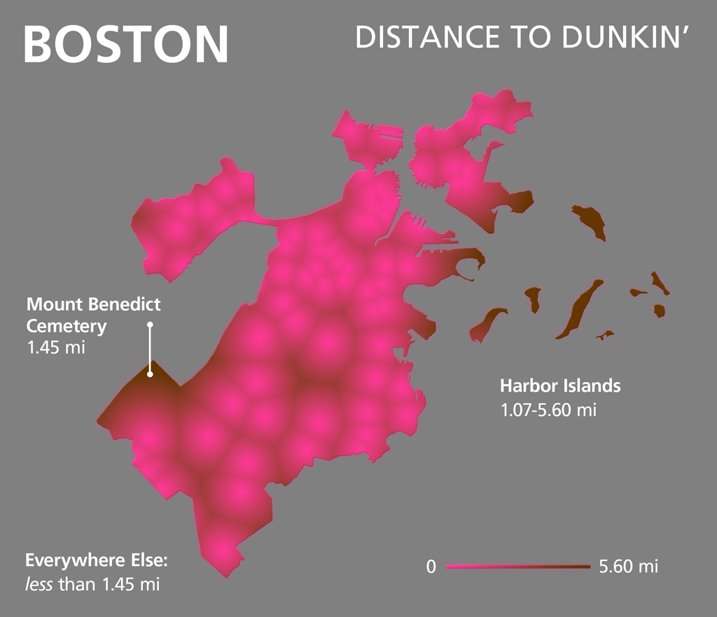
In November, The Boston Business Journal published the locations of all restaurants and bars licensed to serve liquor, wine or beer in Massachusetts. After a reader challenged us to make a map showing the distance to the nearest Dunkin’ Donuts for every location in Boston, we’ve been contemplating other datasets for which this kind of analysis might be worthwhile. Liquor license locations seemed appropriate this week, since an abnormally huge number of people in The Bay State will be taking advantage of them this weekend.

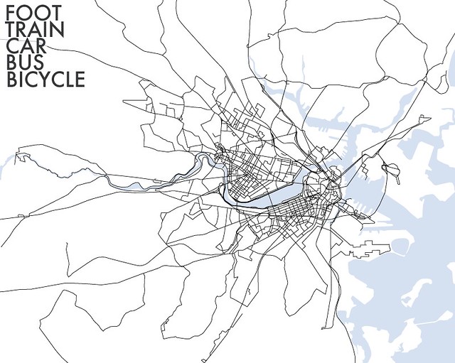
The first map pictured here shows street segments and building footprints in the Boston area coded according to their proximity to liquor licenses. The result could be used as a walking distance map, though one is never too far from a liquor license in the city. Parts of Brookline are barely a mile from a liquor license, while other “liquor deserts”, like South Boston, East Boston and Roxbury are only around half a mile.

A similar map of the whole state, using just road segment distances from liquor licenses doesn’t look too far off a population density map. With a distance map, however, the number of liquor licenses in a one location does not influence the look of the neighborhood or region like it would in a density map.

Density (or, vaguely, heat) maps can be made in a number of ways. In the case of the population maps from last month, the “density” was determined as a function of people inhabiting a certain space (people per acre, for example). The more of a certain phenomenon in one locale, the higher the density. In order to do for towns, you simply divide the area of the town by the number of people who live there. If you aren’t wild about arbitrary administrative boundaries, density can also be visualized purely based on the phenomena. In this case, the density of liquor licenses in the Boston area was calculated for each 10x10m area on the map by tallying up all licenses within 500m (1/3 of a mile, or roughly a walk from Copley Square to the Public Garden).

The Boston liquor license density map does a decent job pointing out the more popular hot spots for bars and restaurants. It comes as no surprise that the North End and Harvard Square have portions with a higher density than in other parts of the city. It may be interesting to see, however, that Davis Square has a larger concentration than Porter Square, or that the Harvard Business School and Athletic Facilities are in a very low spot.

The statewide density map could be used by citizens of central Massachusetts this weekend. If you want to head to a bar or restaurant to watch The Patriots do battle with The Giants on Sunday, you might head to an area with a larger concentration of liquor licenses… and hopefully more standing room. Speaking of the Patriots, check out the little warm spot that surrounds Foxboro. Without Gillette Stadium there, would we see that blob?

Heat maps are fun and they often garner a great deal of buzz. But more often than not, a heat map fails to tell the entire story. For this reason, I took a step back and made some trusty ol’ per capita maps (with a small twist; they are actually people per license).

While the heat maps essentially show access to establishments with liquor licenses, people per license maps show where supply is exceeding (local) demand. Admittedly, this is an odd metric for a metropolitan area. The people drinking at Logan, for example, are almost certainly not inhabitants of East Boston. Still, we may get a good idea of how much drinking is going on in neighborhoods throughout Brookline, Cambridge and Somerville.

A statewide map showing people per liquor license reveals a definite trend. Aside from the urban cores of Boston, Worcester and Springfield, other hot spots emerge. Coastal areas like Provincetown, Nantucket and Edgartown have fewer people per license due to the seasonal influx of tourists. Less populous towns in the western portion of the state also show up with low numbers of people per license. Two reasons for this come to mind. First, with smaller numbers of inhabitants, losing or gaining a handful of licenses could easily skew the proportion. Secondly, the majority of Massachusetts “dry” towns are located in the western half of the state. Some neighboring towns could have a higher demand for liquor licenses due to local and regional clientele. To illustrate this possibility, have a look at Monroe. It is surrounded by dry towns and has the third-lowest rate of people per liquor licenses in the town (~90).

Of course all of this is predicated on licensed drinking. In a internet-search-fit of disbelief over the fact that there are no establishments licensed to serve liquor in Weston, I came across this article from last autumn. So, it would seem, if you’d like to watch the game this weekend over some drinks, I have three options: your home, a licensed establishment, or a modern-day speekeasy.

Wherever you drink, be safe and don’t try to read these maps whilst driving.

Go Sawx. Er, I mean, go Pats!

* Five notes: 1. Dataset includes establishments licensed to serve on the premises. Liquor, convenience and grocery stores are not included. 2. Some errors may exists in the liquor license location data. Some new licensees may be missing and recently defunct ones included. Also, when mapping 8,000+ disparately formated addresses, 100% accuracy is nearly impossible. Apologies if we’ve misplaced or left your favorite liquor licensee off the map. We did not intend to offend. 3.  Apologies if the unit of measure in the density maps (square kilometer, or ~250 acres for you farmers) seems a tad misleading. Of course the map isn’t chopped up into nice square kilometers. That would be entirely too Canadian for a Boston-based blog. Instead, it is an arbitrary unit of measure by which density was measured. It just as well could have been square feet or square miles. 4. The last two maps are mixed-resolution. For a simple statewide choropleth by town check out this guy. 5. Because of various complaints for leaving out many parts of the greater Boston area (and for using the metric system), here is one last map. The unit of measure: football fields.

Posted in General, Geography | Tagged , , , | 21 Comments

Density

One of the things that quickly struck me—and that, I think, becomes apparent to most newcomers and visitors—after moving to the Boston area is how small it is for a “big city” in the United States. It is of course very dense compared to most places in this country; among cities over 100,000 in population Boston ranks seventh in population density (Cambridge is fifth), and among the fifty states Massachusetts is the third most densely populated.

There’s nothing novel about population density maps, but I can’t recall seeing many density maps based on new Census data, and it may be interesting to examine local patterns in some detail, so here are some maps based on the 2010 Census (data here). They’re all based on Census blocks, which in urban areas more or less correspond to actual city blocks. As usual, click these for larger versions.

Massachusetts population density multiples

First, we thought it would be fun (okay, not fun in the usual sense, but in the nerd sense) to compare population density in Massachusetts to some averages in the above series of maps. At the low end is the average density of the U.S. (we are the third most populous country in the world, but we are pretty huge); nearer the high end is the average density of Somerville (the most densely populated city in New England and one of the densest in the country); and at the extreme is the average density of Manhattan. Only a few blocks have Manhattan-level density, most of them of course in and around Boston; they’re in the most central neighborhoods and in college areas (Harvard, Northeastern, and along Comm Ave in Allston/Brighton). Might it shock those people worried about the “Manhattanization” of Boston that much of quaint old Beacon Hill is in one way already Manhattanized?

Greater Boston population density 2010

Here also is a standard but detailed map of population density in the Greater Boston area, classified so as to highlight variations in the highest-density areas. The patterns here aren’t surprising and seem to correspond quite well to the built-up areas you’d see in an aerial image. The densest blocks of all seem to be in the most central Boston neighborhoods, South Boston, some of Cambridge, the aforementioned Comm Ave corridor in Allston/Brighton, Chelsea, and most solidly East Boston.

There are a few things I take away from the density map. First, looking at density is one way to judge what the core of the city of “Boston” is. I am adamant that the “central city” in any non-bureaucratic sense is not defined by weird municipal boundaries, and if density is a valid metric it provides some confirmation. Based on this map I would judge it to be an area roughly defined by the four T lines, with the exception of the Riverside and Braintree branches.

The second thing is to note how much unpopulated area there is right in the middle of the city. Some of this is institutions—MIT takes up a lot of space in Cambridge, for example. (That one is unfortunate. It makes Boston and Cambridge feel farther apart.) Some of it is simply intense non-residential use, like the Financial District or industrial areas. What’s really interesting, though, is how closely some of this corresponds to landfill. Compare to this 1858 map, for example. On this map Charlestown doesn’t look much bigger than it was a couple hundred years ago, nor does South Boston. The former is practically an island—no wonder it seems like there’s no good way to get to it! The Back Bay and South End seem to be the only places where major landfill became real city neighborhoods.

A third thing is the density patterns of the broader metropolitan area. For those who picture the very dense central areas when they think of Boston, it may be a surprise that the whole Boston metropolitan area has a population density much lower than some of the classic sprawling cities of the South and West (see a list of metro areas or older numbers for urban areas). There’s a sort of patchiness to the outer parts of the Boston area that causes this, and it’s somewhat apparent in this map. We have dense town centers with lower density areas in between rather than vast tracts of medium-density suburbia. Altogether most of it still meets the “metropolitan” and “urban” standards, though, which are actually rather low.

But hey, sprawl isn’t only about density, so maybe we’re still better than everyone else.

Addendum by Tim

Andy and I routinely share blog post drafts with each other before making them live. For instance, one of us might say to the other, “Say, fella, I drafted that health code map with restaurant rodent violations if you want to have a look at it,” and, upon reading, the other responds, “Awesome. Ship it.” We are generally very friendly and accommodating of each other. Not this time!

We have discussed population density on and off since the formation of Bostonography. It seems to come up regardless of the actual topic of our conversation. It came up while I was working on the radio maps, for example (the population density of New York City means that the Yankees Radio Network can use far fewer signals to reach far more fans). Density was also essential to Andy’s post on building footprints. Naturally, the places where people live interest us as cartographers. Integral to understanding these places is knowing just how many people live there (and over how much space).

So, I couldn’t help myself. I had to chime in on this post with a couple of maps. First, the map above (big version here) indicates areas of high population density with dark grays and areas of low density with light grays. This map is similar to Andy’s yellow, green and blue map above, but does not offer a legend. Instead, the color ramp includes 20 shades of gray, ranging from 0% black to indicate zero people per square mile (imperceptible on this map) to 100% black for areas with over one million people per square mile. Rather than using census data to map population by block, here I have transfered census data to street segments and residential land use areas provided by MassGIS. The density captured by each of these features is different; the larger land use polygons summarize neighborhoods, while the road segments capture a block at a time. The result looks mottled in places, but over all, I believe it gives an accurate general impression of the population density of Massachusetts. By combining land use and roads features, a compromise is made between resolutions that might otherwise be either too coarse or too fine.

The second map (big version here) I’ve made shows population density by census block centroid. The polygons that make up Massachusetts’ 157,508 census blocks contain millions of vertices. This geometry can look cluttered at certain scales. Replacing each polygon with a dot located at its center could prove to be a reasonable generalization technique to allow for higher data density on a smaller map.

That’s all. Apologies for kibitzing on Andy’s post.

Posted in General, Geography | Tagged , , , | 15 Comments

A Cartographic Year in the Life of Boston

In early December, we Tweeted the following: Bostonographers—Tweet your favorite Boston-based news story of 2011. Boston is a place where things happen. What happened this year & where? We received one response . . . and that’s only if you count my uninspired wisecrack, “Go Sox.” (And I don’t).

What was the meaning of this Tweet? you may ask. Well, beyond our inherent curiosity about how Bostonians imagine the space and time through which they experience their lives, we were actually trying to accumulate some place-based stories for a map—a news roundup, year-ending map.

Last month, Andy and I were lucky enough to chat with Nate Berg of The Atlantic Cities. Early in our conversation, we discussed how cartographers and neogeographers are often asked the question, “Hasn’t everything already been mapped?” The idea of showing a year in news over space—on a glorified, albeit simple locator map—illustrates how “everything” cannot, and will not ever, be mapped. The inhabitants of time and space—migrating birds, tectonic plates, MBTA construction—are always in flux. Maps, like photographs, capture ephemeral moments.

Here is our cartographic snapshot of 2011 in Boston.

Last Sunday, The Ideas section of The Boston Globe carried a grayscale version of this map along with a short essay on “a year in the life” of the city. The stories we included were topically and spatially subjective, but we hope they succeeded in giving an impression of a dynamic city—a moment of Boston in flux.

Again, this was Boston in 2011 according to a few folks at Bostonography and The Boston Globe. And since our original Tweet query fell flat, we ask: Would you add anything?

Happy New Year, folks. Here’s to another year of Bostonographing!

Posted in General, Geography, Holiday | Tagged , , | 1 Comment

A year of Bostonography

Well, we’ve lasted a year. And we’re not even close to tired of this yet! Success!

Thanks for your readership, comments, tweets, links, emails, and encouragement over the past year. We’ve been beyond pleased with the interest and support you’ve expressed. Hopefully we’re having some tiny effect on one of our original goals, getting people into the geography of Boston as an interesting place. It’s great to see that we’re not lonely in the category of people who get a kick out of mapping this city. We’ve scored a few features in the Globe and were even interviewed one time! Maps, it seems, are an excellent way to get people thinking about the city in new ways.

Tim and I, your humble authors, almost never see each other (the poor fella lives a thousand miles from Boston), but we maintain our enthusiasm for this website. We know each other from conferences, and indeed the Bostonography plan was formed in October of 2010 at a cartography conference in St. Petersburg, Florida. Then we lived a year-long joke of only running into each other in places besides Boston. We met up in Paris, New York, and Madison before finally managing a Boston summit a month ago. We vowed to undertake a mapping project that weekend, but instead only accomplished our secondary goal of discussing business over frappes. We did, however, both break our single-day Boston walking distance records with a 14.5 mile trek around town, and we even found a map on the ground.

Even though we can’t manage to make a map when there’s such an easy opportunity, our recent posts have mostly been our own maps while links to other things are more commonly in our tweets. But this project isn’t just about our work; we’re very interested in helping spread others’ work and encouraging similar activity. So keep those links and ideas coming!

Thanks again, Bostonographers. And because we hate a post without an image, here’s a (different) year of something Bostonography-ish. It’s everywhere I went locally, by all modes of transportation, in 2010.

2010 tracks - all modes

Posted in General | 5 Comments

An MBTA bus-iness day

Bus speeds in central Boston(Click to see the whole thing!)

You know by now that real-time bus location data are available for the MBTA via NextBus. It’s very handy for riders, of course, but for cartographers it’s also something else: a gold mine of mappable data.

We’re working on doing something interesting with bus data, but above is a map to start. Click it or this for a big fat map of most of the MBTA bus system. (Or an unlabeled version or no-roads version for only mysterious pretty colors.) It shows a bit more than 24 hours’ worth of bus location data from last Friday, November 4, with colored lines representing the speed of each vehicle. Red indicates speeds less than 10 miles per hour, yellow is 10–25 mph, and blue is faster than 25 mph. It’s drawn from 2,058,574 data points in all. The concept is totally lifted from Eric Fischer, who really is the master of mapping all things geotagged and whose work you may have seen. (This “Locals and Tourists” map of Boston, for example.) The map here more or less emulates what Mr. Fischer did for Muni in San Francisco. We can, no doubt, expect to see future awesome bus maps of various cities from him.

For the most part buses on this day had average speeds predictably somewhere below the normal city street speed limit, with the very slow spots being around major intersections and hubs like Ruggles or Harvard Square. There are also some generally slow areas besides those, such as most of downtown. As you can see, most of the MBTA system would be toast if faced with the classic Speed scenario. The “fast” (and remember this category goes all the way down to 25 mph) lines are mostly confined to the rush hour expressway routes and some suburban roads. I expected to see more red than there is, though. I don’t often ride the bus, but the experiences burned in my mind are things like watching pedestrians cross the Mass Ave bridge more quickly than my #1.

You’ll notice that some routes show up as ill-defined webs rather than solid lines. This is presumably sometimes due to GPS inaccuracy, but other times it seems that a bus does not report its location frequently enough, which leads to long straight-line segments that skip the intricacies of a route. Loss of signal is evident in the tunnels in and around downtown, where, for instance, the Ted Williams Tunnel shows up as a bunch of straight lines leaping from the seaport to the airport.

As a bonus, this map is a keepsake because it represents data collected on the last day of this year’s Green Line shuttle bus replacement between Lechmere and North Station, which can be seen on the map. I guess that’s the closest thing we’ll get to real-time Green Line data anytime soon. Meanwhile, good thing the weekend Red Line closures have begun so we can generate more memorabilia!

Posted in Transportation | Tagged , | 26 Comments

A new BPL home for the Leventhal Map Center

In case you missed it, this past weekend was the grand opening of a beautiful new public space for the Norman B. Leventhal Map Center in the Boston Public Library at Copley Square. You probably already know the Map Center, which boasts a top-notch collection, some of which can be seen on their website and Flickr. Now it has its own little exhibition area, reading room, and learning center in the northwest section of the McKim Building. I went to check it out and see Mr. Leventhal, Mayor Menino, and the library bigwigs speak and cut the ribbon.

Ribbon cutting at the Leventhal Map CenterPhoto by Kirk Goldsberry, whose phone camera is better than mine, and who promised to punch me in the face for posting this here.

The exhibit right now features “Unconventional Maps” and has some pretty interesting ones. You can also find some cartography books there, which I hadn’t previously found on the library shelves. (Not so much atlases and the like, but rather the kinds of texts that we cartographers have at home.) There are kid-oriented displays, too. Herry the Herring Gull is here to teach us about maps!

Herry the Herring Gull

So go check it out. Be sure to admire the stained glass map above the entrance!

Posted in General, Historical | Tagged , , | Comments Off on A new BPL home for the Leventhal Map Center

Autumn streets

Our last post was about summer colors. Boring. It’s autumn in New England! It’s those happy few weeks when the weather is pleasantly cool and the dazzling yellow, orange, and red trees distract us from thoughts of the dismal season that lies ahead.

Dorchester Heights Monument

Naturally we won’t let the famous New England autumn pass without mapping it somehow. Mapping leaf crunchiness was beyond us (sorry), but we figured we could at least find out something about foliage colors. Where might you find more red leaves, or more yellow leaves? Which areas have the most varied foliage? Tim and I are not experts and can’t predict these things with any certainty, but as trained pseudoscientists we can generate rough ideas and speculations with the best of them.

Easy advice for leaf peeping is to go find a forested area, but we wanted to look locally in the central urban area. Luckily one of the more interesting data sets that local cities and towns often collect is an inventory of street trees. Boston, Brookline, Cambridge, and Somerville have all done this at some point. They are undertaken so that the cities know the types of trees out there, their health, maintenance issues, and so forth. We were interested in the tree species information, an important factor in autumn leaf color.

Availability of data to us regular slobs on the internet is a mixed bag. Brookline seems to offer only a short summary. Boston data do not seem to be available either, but there is one detailed report. Cambridge has individual tree information in its GIS viewer, but the data can’t easily be exported to a useful format. Only from good old Somerville were we able to download a complete set of tree data after noodling with the report GET requests in its viewer (that data is here). Why cities make their geographic data so hard to access and use I don’t know, but that’s a topic for another day.

With data on tree species, we can create an approximate picture of potential autumn colors across space. And I do mean approximate; our methods involved things like searching Google Images for a given tree species and noting the typical autumn color that shows up in photos. (Many other caveats apply, too.) Take Somerville:

Somerville autumn colors

That’s a map of something approximating the potential autumn color of every street tree, as gleaned from the aforementioned Google searches. One thing that becomes apparent is that some streets seem predominantly lined with one type of tree and thus have a mostly uniform color on the map. Overall it looks like there may be a bit more color variety in the eastern half of the city than the western. Somervillians, do you think it’s true?

It’s hard to say anything about color variety with as much precision as the Somerville map implies, but there are definitely some local spatial patterns of tree species that may have an effect. We noticed this in neighborhood-level maps of Boston and Cambridge, based on the Urban Forest report for Boston and rough samples for Cambridge. Here, for example, is a comparison of the relative prevalence of the two most common maple species, Norway and Red—maples being a major part of colorful fall foliage.

Norway and Red maples in Boston and Cambridge

Leaves of Norway Maples, which overall are the most common of any tree species in Boston (the species is considered invasive, in fact), generally turn yellow in the autumn while those of Red Maples (as the name suggests) are liable to turn red, hence the map colors. Norway maples make up a larger percentage of trees in the outer neighborhoods than elsewhere, while red maples are most prevalent in Cambridge and, for some reason, especially the Fenway-Kenmore neighborhood. So head to the Fenway if you want to see red, I guess. For detailed maps and summaries of Boston’s trees see that report as well as this handy guide to the various species.

Our questionable methods aside, remember that these are only street trees. They can make for some nice autumn scenes, but the real beauty may not be on city streets. Perhaps you’ll find something among the notable trees of the Public Garden indicated in the map below. (See the PDF for the map key. This map from the city looks delightfully old; we’re not convinced that some of these trees are still standing.)

Public Garden notable trees

Or take a walk in the Arboretum and other local wooded places. (Personal recommendation: Mount Auburn Cemetery.) Or get out of town! Just look how much forested land there is nearby. The map below does not even extend as far as 495. Click it for bigness.

Forest cover in the Boston area

Hit the trails and let us know where the best colors are.

Minuteman bike path
Minuteman Bikeway, Arlington

Posted in Seasonal | Tagged , , , , , | 6 Comments

Boston’s photographic colors

Photo colors in Boston

Boston is a colorful city, literally. From the green grass and trees of the Public Garden to the red bricks of the North End to the white triple-deckers of Dorchester, there is a variety of colors to see in the city’s physical environment. What is the distribution of colors across Boston? This week’s Boston Sunday Globe includes our effort to map the city’s summer colors based on photographs. (The map above is a somewhat more up-to-date version of what ran in the Globe.)

Here’s what we did: grabbed some 50,000 geotagged photos from Flickr, analyzed the pixel colors of each photo, then mapped a grid of the most frequent color hues. It’s a follow-up on something I tried a couple of years ago. The method is largely unchanged, but the display is different. Every dot on this map shows the most common hue of photos around that point. It’s calculated based on a rectangular grid, but showing circles instead of solid squares turns out to look much nicer. Most attempts at finding the true average color of photographs will result in dull, muddy colors, hence the display only of hue here. Saturation and brightness of each color are bumped up to full for display on the map. A notable outcome (drawback, perhaps) is that dark and unsaturated brownish colors, very common in photographs, show up as orange on the map.

So what does the map reveal? For one thing you’ll probably notice the geographical extent of the map and distribution of dots. The map here contains a large majority of photos taken in the inner Boston area, which includes a good chunk of Cambridge and excludes most of the non-central Boston neighborhoods. Looking at the actual colors, one probably notices a lot of blue and orange. Blue presumably indicates a strong presence of sky or water in photographs, so it shows up near landmarks (where photos often look upward and contain a lot of sky) and near open views such as those from bridges. Orange colors represent a variety of warm colors from brown stones to interior incandescent lighting. One thing that interests me is the spots where blue and red/orange meet, for example in Copley Square, where the blue of sky and the Hancock tower meets the orange of the Boston Public Library’s interior. Meanwhile, greens are relatively scarce outside the Public Garden, in spite of Boston’s many parks. Apparently people don’t take many photos of greenery, or else they do it more in the spring.

What the map most likely shows is the colors of tourist Boston. A comparison of the photo distribution with the Boston map in Eric Fischer’s super awesome Locals and Tourists set suggests so, anyway. This map is also only a seasonal snapshot, incorporating photos from June–August in 2009–2011. Fernanda Viégas and Martin Wattenberg have done an excellent—and Boston-based—piece showing how colors in Flickr photos vary seasonally, displaying the proportions of colors in the Boston Common over the course of a year. The map here would look different in the autumn or winter, no doubt.

Overall it’s important to remember that this isn’t a faithful map of the colors of natural and manmade Boston; it’s a map of the colors of what people choose to look at and what they choose to share. A lof of the time it’s scenery and landmarks, but I’d wager good money that this map includes at least one photo of someone’s cat doing something cute. And, unfortunately, there are surely the artificial colors of things like hipsters’ Instagram photos, too. What do you, dear reader, find interesting in Boston? Grab your camera and get out there!

Posted in Photography, Seasonal | Tagged , , , , | 3 Comments

Help us map Allston Christmas

Northeastern chair

2011’s great Moving Day is nearly upon us. We have this crazy idea for the occasion. Well, actually it’s the same idea we have for everything: make a map of it.

Tim and I have both spent time in cartography school in Madison, Wisconsin. Most leases in the student areas there turn over on August 15, an occasion known as Hippie Christmas, when the streets are full of filthy furniture and all kinds of treasures. We’ve had our truck-parking challenges and homeless summer nights. That’s fun, but this is Boston, baby! Boston has about as many students as Madison has anybody.

Tracking U-Hauls stuck at Storrow Drive overpasses is too easy. Our idea is this: map all the couches, chairs, &c. seen on the street as the September 1 moving day approaches and passes. We intend to conduct some expeditions around Allston and other places ourselves, but we’re hoping to crowdsource this too. Please help us on this noble mission! Here’s how:

  1. See furniture or the like discarded or otherwise sitting on the street or sidewalk because of a move.
  2. Note its location.
  3. Tell us about it! Tweet at us (@bostonography), send an email (bostonography@bostonography.com), reply to this post, or otherwise track us down. Describe what you saw and/or send a photo (photos are definitely encouraged), and give its location as specifically as possible so that it can be pinpointed on a map.
  4. Hope, along with us, that something interesting comes of all this data. Enjoy documenting your city.

It’ll be fun. Are you in?

Posted in Projects | Tagged , , | 11 Comments

More on Radio Maps

Our recent map on Red Sox and Yankees radio broadcast areas has raised a number of interesting questions. Chief among these revolves around a concern we had from the get-go: radio waves are not fixed. They vary wildly based on antenna direction and height, weather, ionospheric conditions, proximity to water, amount of groundwater, interference, &c. The Radio Rivalry map uses broadcast areas provided by the FCC. So, while they cannot ever be 100% accurate due to the aforementioned reasons, they do represent a nice, conservative and authoritative estimate based on parameters provided by each radio station and The M3 Conductivity Map.

Here is the AM/FM breakdown by team. Two things strike me about the distribution: 1. For whatever reason, the Red Sox have far more FM stations. So, there are a number of towns in Northern New England that all have great radio reception for the game (while Boston is still relying on AM for both English and Spanish broadcasts). 2. The Yankees Radio Network appears to be more efficient with fewer overlapping broadcast areas. In these cases, one must wonder if the overlapping stations in the Red Sox network are catering to different demographics. Perhaps, perhaps not.

The relevance of this map has also been brought into question. Does this map have any meaning in a society that relies so heavily on mobile technology, satellite radio and cable television? Ironically, this is the same era that has redefined what many consider “free” through the implementation of smart advertising (e.g. Google & Facebook). So, who is paying to broadcast the Red Sox and Yankees? Advertisers, right? If the advertisers do not make money, they will cease buying slots during the games, and the games will no longer be carried. So, yes, I think that this map is relevant. At the very least, it shows where advertisers are willing to pay for slots during Red Sox and Yankees games. And if they are willing to pay for the slots, there must be people who are listening to the games and buying their product (you know the jingle).

So, why make this map? I’ve wanted to make a map like this for years. I grew up listening to the Red Sox on the radio and still do today. I like watching games on television as well, but I don’t have the same attachment to the experience. There is something about radio that gives you the impression that you are connected from afar. The way the reception cuts in and out and the way you angle the antenna. It’s a ritual and an experience completely unlike catching a game on your DVR so that you can fast-forward through commercials. I have vivid memories of baseball games being delivered through the medium of radio. I listened to the Red Sox win the World Series on American Forces Radio in The Netherlands. I’ve also listened to a Red Sox game while on a camping trip in Northern Nova Scotia (though to be honest, the reception wasn’t great).

On another level–and this must be typical of any road-tripping Red Sox fan–I have often wanted a map like this for reference. It seems like every time I am driving through Maine, New Hampshire or Vermont in the summer, a game is on and I know there must be a station nearby but I simply cannot find it. Well, now I certainly know (for this season, anyway). Here is a quick and dirty reference Google reference map.

The rivalry between the Red Sox and the Yankees is often touted as the fiercest in sports. It is an obsession—some might say a lifestyle—in Boston and New York. Tee shirts are made, bets are placed and emotions run high. Even the athletes treat these games with greater importance than other match-ups. The meaning imbued in seemingly inconsequential mid-season games can be epic. In 2006, Red Sox and the Yankees met for a double header that resulted in both regular season 9-inning game length records. One game took 4 hours and 45 minutes; together they lasted 8 hours and 40 minutes (an average game will last just under three hours). This rivalry is nothing new either; it has been going on for decades. All the while, sports writers throughout the country have hashed, rehashed, dissected, bisected, analyzed, debated and mapped it. This is our contribution; this is our map.

Posted in General | Tagged , , , , , | 15 Comments