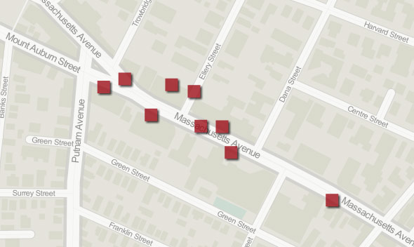
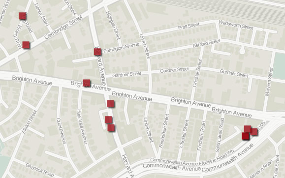
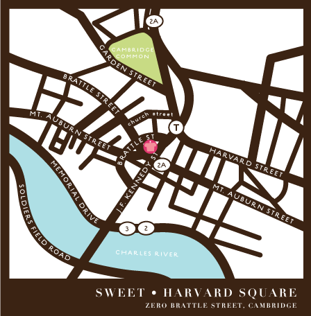
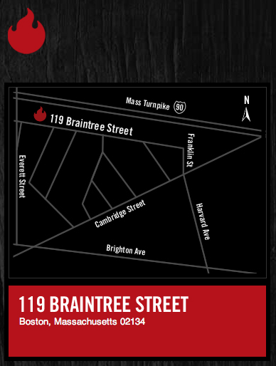
 A few weeks ago, I stumbled upon this image. It shows the location of Sweet Cupcakes in Cambridge. When I saw it, I instantly decided to write a post about how businesses in Boston imagine the space they inhabit through web-based locator maps.
I must say, I was pretty excited about this idea. There was some potential there. Locator maps, the little graphics that show the location of a something within a larger and more familiar geographical context, have been used widely by businesses, newspapers, magazines and others for decades. But while newspapers and magazines may want to avoid cartographic editorialization on the flavor or feel of a story location, a business likely does have something to say about their place in the world. Much like the claim I made in the Boston’s Sketchy Appeal post (that hand-drawn maps reveal a personal and perceptual landscape), I believe that a locator map (even if inadvertently) reveals a number of things about the business that employs it. The style, scale and extent of the map all communicate how the business views its landscape. The way the map is generalized also reveals something about what the business values in its environment. So, you would think that most businesses would want their locator maps to be unique and clear.

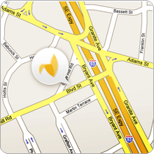
But my initial search for web-based locator maps was mostly fruitless. I checked web sites of local book stores, coffee shops, bowling alleys, restaurants, &c and—without fail—every establishment chose to use some form of web map (mostly Google or MapQuest) rather than design their own locator graphic. It seems that, in many cases, the convenience and supposed whiz-bangery of web maps has trumped the appeal and personal touch of a custom-made locator map. In other cases, a compromise between web map and personal touch is reached. The image above, taken from the Jackrabbit Design contact page, places the company logo (rather than a default Google-style pushpin) inside a comic speech bubble which has been placed upon a Google Map. I quite like this image because of what it represents. It brings to mind ideas that teeter between web map blandscapes and a lush and vibrant landscape which is inhabited by designers (Google did not design that sweet logo!).
In many ways, the Jackrabbit Design map sums up the zeitgeist of graphic design on the GeoWeb. You know that awkward phase we all went through growing up? You should—you’ve spent your adult years slowly weeding the evidence out of family photo albums. Well, that is the phase that design is going through on the GeoWeb now. And it seems a quick survey of business locator maps in the Boston area prove it.

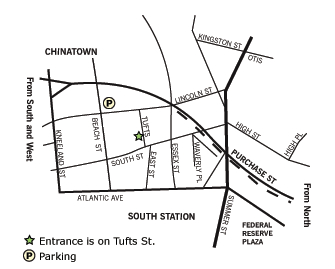
As is the case with sketch maps, however, all is not lost. While businesses of all sorts, sizes and locations are turning to web maps to provide locational information to their clientele, there is one industry that is more-or-less holding strong: Graphic Design. And thank goodness they are, because who else would we want making our maps? (Um, well, other than cartographers, I suppose). Above is a classic-style locator map that places the offices of Carter Halliday in a landscape of downtown Boston that—while not overly emotive—is clearly imagined by the business, not Google, Bing or MapQuest.

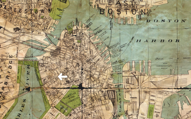
For businesses that don’t want their clientele to rely a custom locator map for navigation, there is a simple solution: provide a link. This compromise is implemented by many design firms in and around Boston; the custom map, when clicked, takes the user to a web mapping platform for more locational and navigational information. The image above is taken from the contact page of the Boston-based firm Fathom Information Design. Their choice of locator map clearly communicates the firm’s impression of Boston as a city rich with spatial and historical information that is largely absent on a typical web map. What’s more? When clicked, the user is redirected to the firm’s location on a Google Map. It’s the best of both worlds.

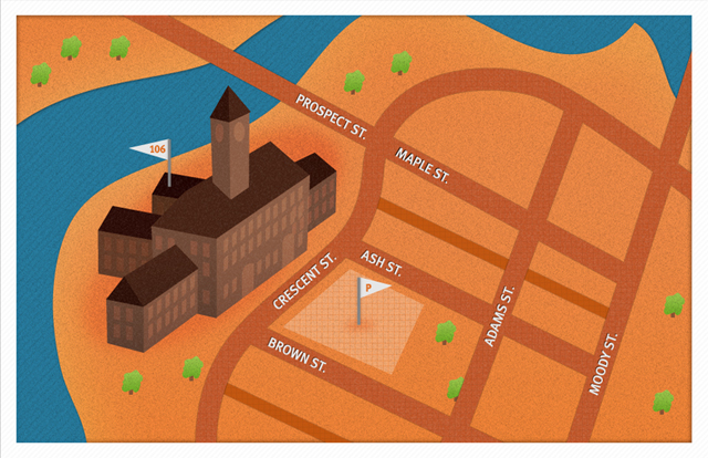
Another (obvious) opportunity that design firms have when creating a locator map is to… well, show off their design skills. This locator map, taken from the contact page for Fresh Tilled Soil, does just that. In addition to giving users an idea of how this company imagines its surroundings (the Charles River and mammoth historical architecture play some role in their spatial identity, not pushpins or mottled satellite imagery), they have given potential clients a taste of their graphic communication style. In other words, this image says, “We can do the job without relying on a someone else.”

And that’s the truth. These design firms do not need to rely on Google or MapQuest or Bing or Yahoo for their locator maps. They are more than capable of creating better maps for representing their location (for example, see what Hunt & Gather has done above). Don’t get me wrong, the major web mapping platforms have their place (gosh, that’s an awkward word choice here) and are increasingly being developed with design acumen. But the web mapping giants are a product of an one-size-fits-all web; their implementation of cartographic design is not (as of yet) place or space-specific. They create an impression of space that shows New York and Lesotho using the same palette, while we all know the world doesn’t look the same everywhere.

So, bravo to the Boston-based businesses (like Verndale, above) that have designed their own locator maps and given us an impression of how they perceive their place in the world. When web-based cartography grows out of this awkward phase (and, believe me, it will), we will have them to thank for pushing back against the idea of a global landscape of homogeneity.
