Red Sox, Massachusetts

A map of Massachusetts showing places that share names with Red Sox players over the years.

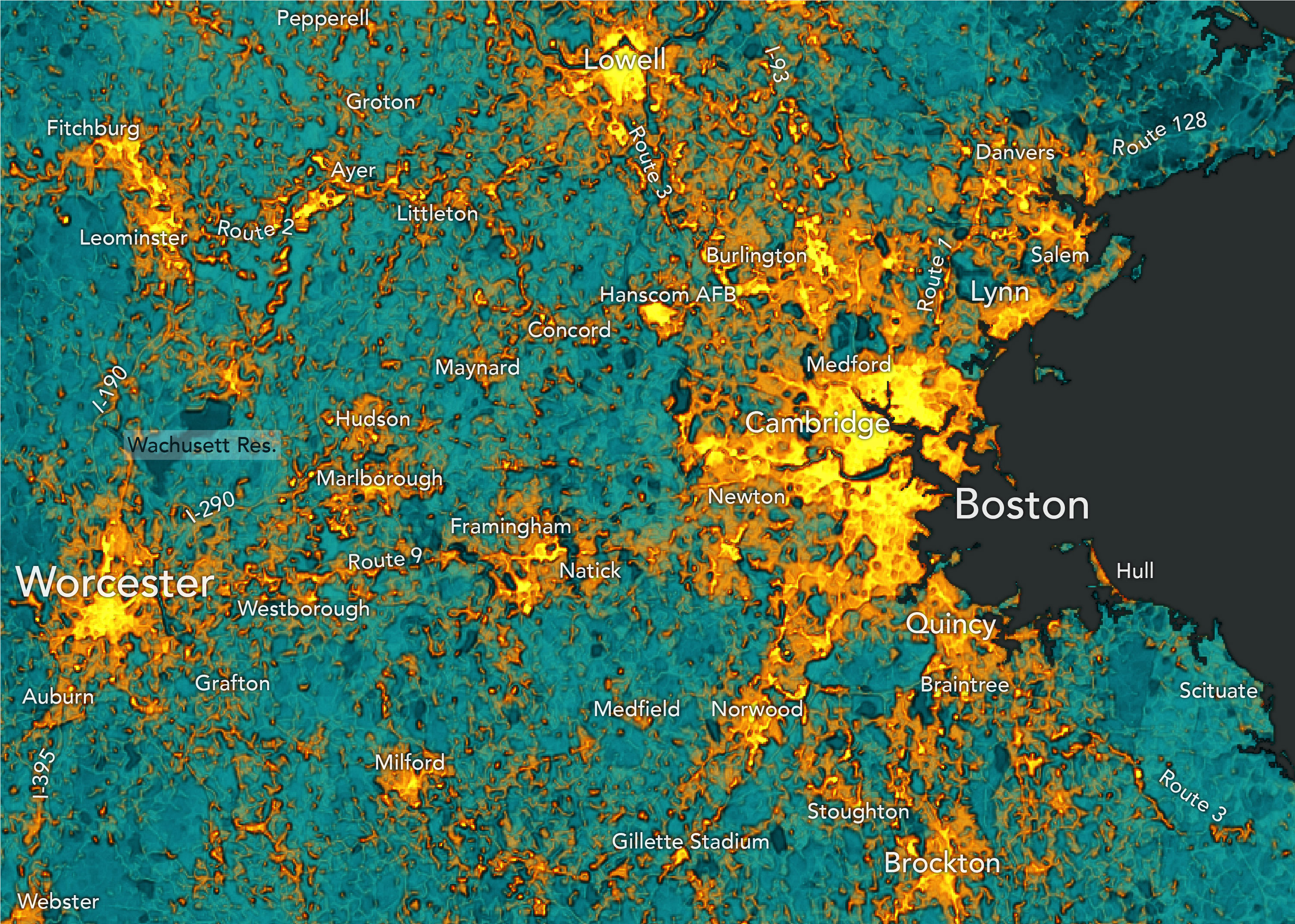
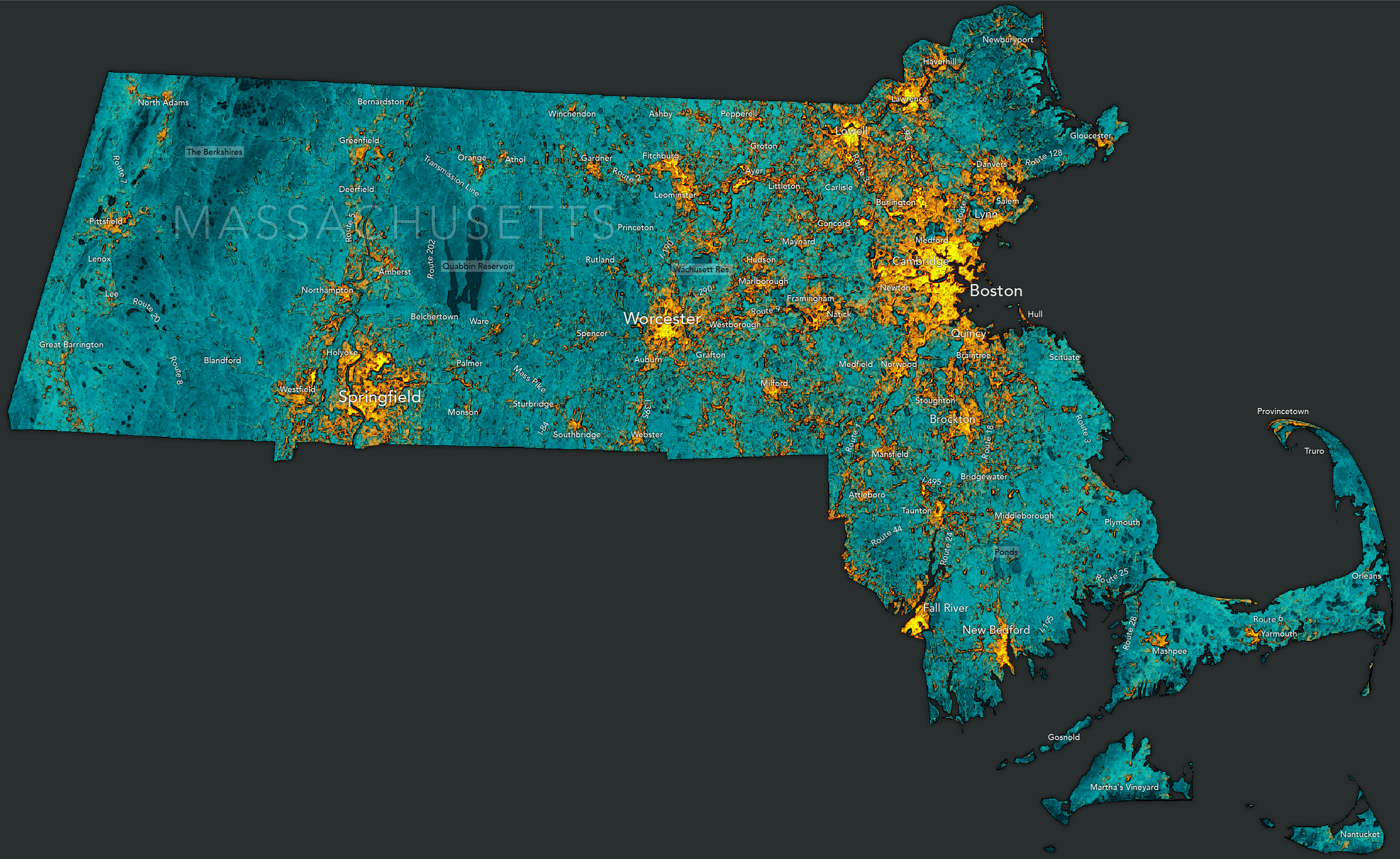
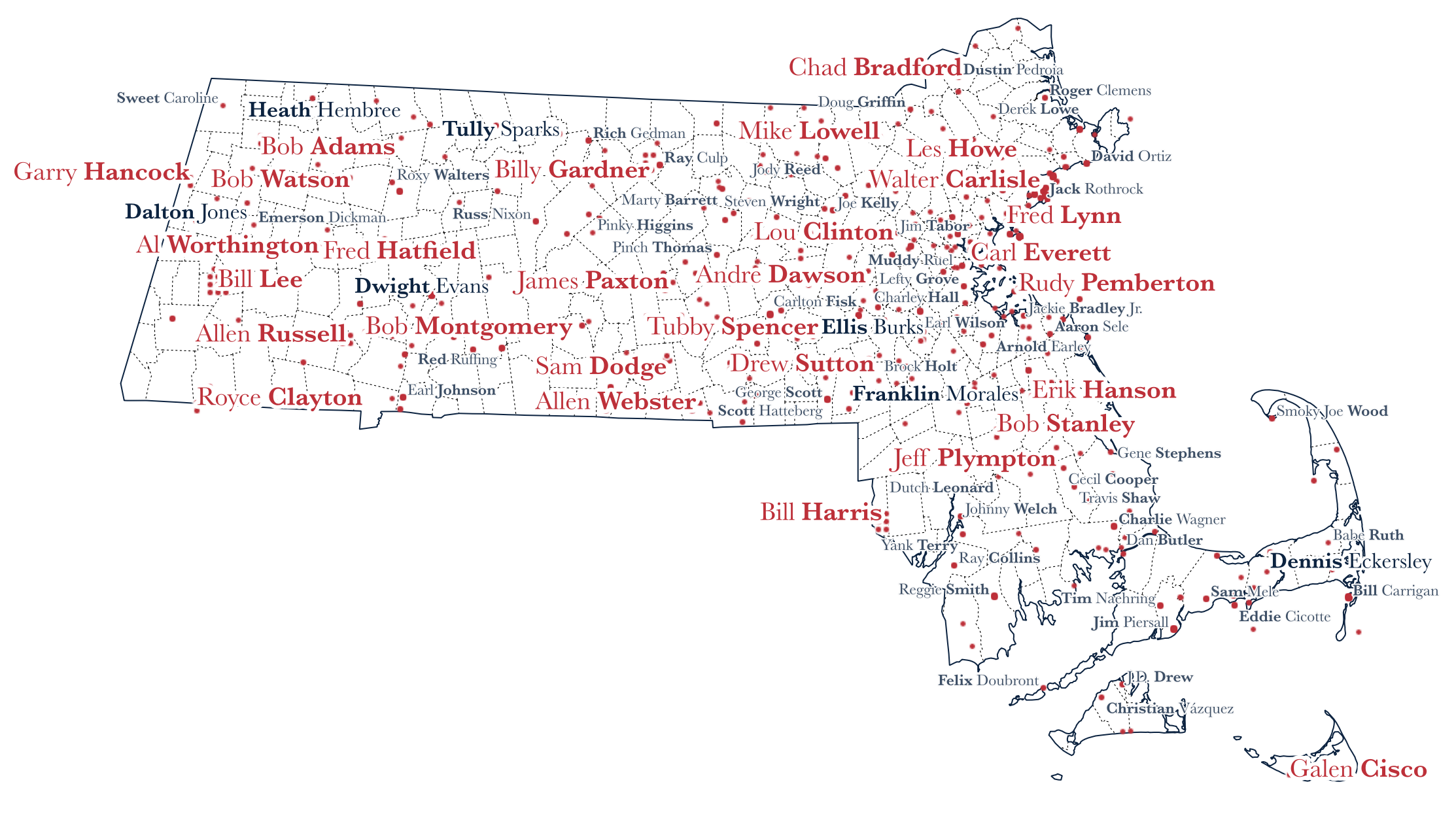
The 2023 MLB All-Star Game is tonight and the Red Sox are sending a single representative, closer Kenley Jansen. Since it may not be the most riveting game for Red Sox fans, let’s turn our attention to the place where geography and baseball trivia meet—Red Sox, Massachusetts.

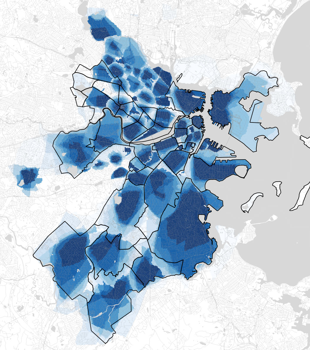
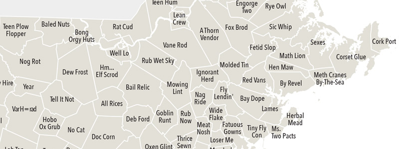
Inspired by this Ned.wtf blog post, a map of Red Sox, Massachusetts shows where 987 Red Sox players (pitchers and batters) from over the years share names with places and features in Massachusetts.

A map of the Boston area showing places that share names with Red Sox players from over the years.


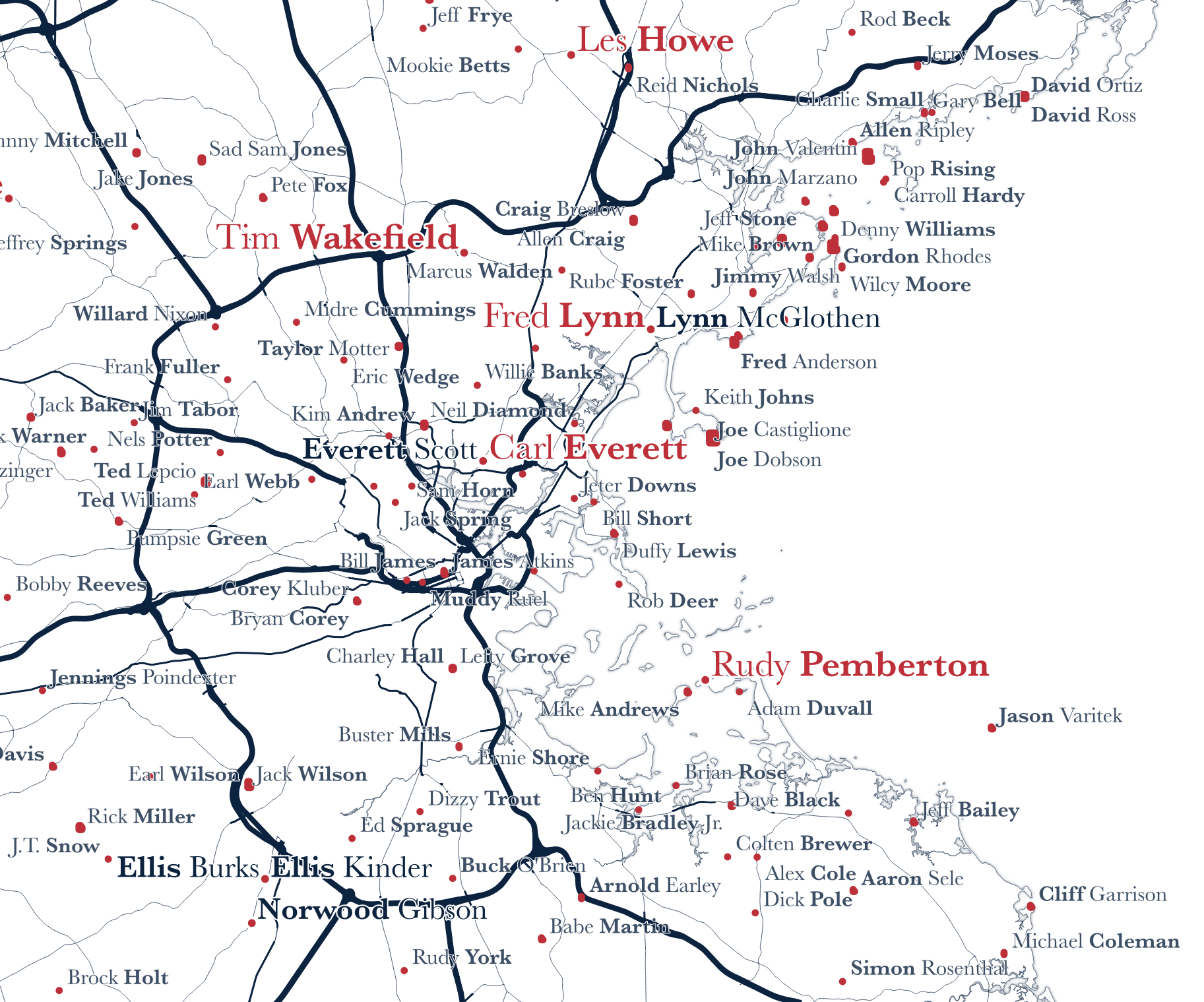
By my count, at least 53 Red Sox players share their last name with populated places in Massachusetts.

  1. Joe Harris, 1905-1907
  2. Walter Carlisle, 1908-1908
  3. Larry Gardner, 1908-1917
  4. Tubby Spencer, 1909-1909
  5. Allen Russell, 1919-1922
  6. Sam Dodge, 1921-1922
  7. Chick Maynard, 1922-1922
  8. Les Howe, 1923-1924
  9. Dud Lee, 1924-1926
  10. Bob Adams, 1925-1925
  11. Jack Russell, 1926-1936
  12. Bill Harris, 1938-1938
  13. Mickey Harris, 1940-1949
  14. Rip Russell, 1946-1947
  15. Fred Hatfield, 1950-1952
  16. Sid Hudson, 1952-1954
  17. Al Worthington, 1960-1960
  18. Ray Webster, 1960-1960
  19. Lou Clinton, 1960-1964
  20. Galen Cisco, 1961-1967
  21. Billy Gardner, 1962-1963
  22. Bill Lee, 1969-1978
  23. Bob Montgomery, 1970-1979
  24. Fred Lynn, 1974-1980
  25. Mike Paxton, 1977-1977
  26. Bob Stanley, 1977-1989
  27. Garry Hancock, 1978-1982
  28. Bob Watson, 1979-1979
  29. Wes Gardner, 1986-1990
  30. Tom Bolton, 1987-1992
  31. Greg Harris, 1989-1994
  32. Jeff Plympton, 1991-1991
  33. Jeff Russell, 1993-1994
  34. Andre Dawson, 1993-1994
  35. Erik Hanson, 1995-1995
  36. Joe Hudson, 1995-1997
  37. Reggie Jefferson, 1995-1999
  38. Tim Wakefield, 1995-2011
  39. Reggie Harris, 1996-1996
  40. Rudy Pemberton, 1996-1997
  41. Mike Stanley, 1996-2000
  42. Lenny Webster, 1999-1999
  43. Sang-Hoon Lee, 2000-2000
  44. Carl Everett, 2000-2001
  45. Josh Hancock, 2002-2002
  46. Terry Adams, 2004-2004
  47. Chad Bradford, 2005-2005
  48. Willie Harris, 2006-2006
  49. Mike Lowell, 2006-2010
  50. Royce Clayton, 2007-2007
  51. Drew Sutton, 2011-2011
  52. Allen Webster, 2013-2014
  53. James Paxton, 2023-2023

At least 23 players share their first name with a populated place in Massachusetts.

  1. Tully Sparks, 1902-1902
  2. Norwood Gibson, 1903-1906
  3. Everett Scott, 1914-1921
  4. Otis Miller, 1930-1932
  5. Lee Rogers, 1938-1938
  6. Ellis Kinder, 1948-1955
  7. Lee Thomas, 1964-1965
  8. Dalton Jones, 1964-1969
  9. Dennis Bennett, 1965-1967
  10. Lee Stange, 1966-1970
  11. Lynn McGlothen, 1972-1973
  12. Dwight Evans, 1972-1990
  13. Dennis Eckersley HOF, 1978-1998
  14. Lee Graham, 1983-1983
  15. Ellis Burks, 1987-2004
  16. Lee Smith HOF, 1988-1990
  17. Dennis Lamp, 1988-1991
  18. Otis Nixon, 1994-1994
  19. Lee Tinsley, 1994-1996
  20. Paxton Crawford, 2000-2001
  21. Franklin Morales, 2011-2013
  22. Clayton Mortensen, 2012-2013
  23. Heath Hembree, 2014-2020

Some 229 players share part of their name with part of a populated place name. Wally the Green Monster, for instance, shares part of his name with The Green in Middleboro. I won’t list them all here. Rest assured it’s a group of many Toms, Bobs and Teds.

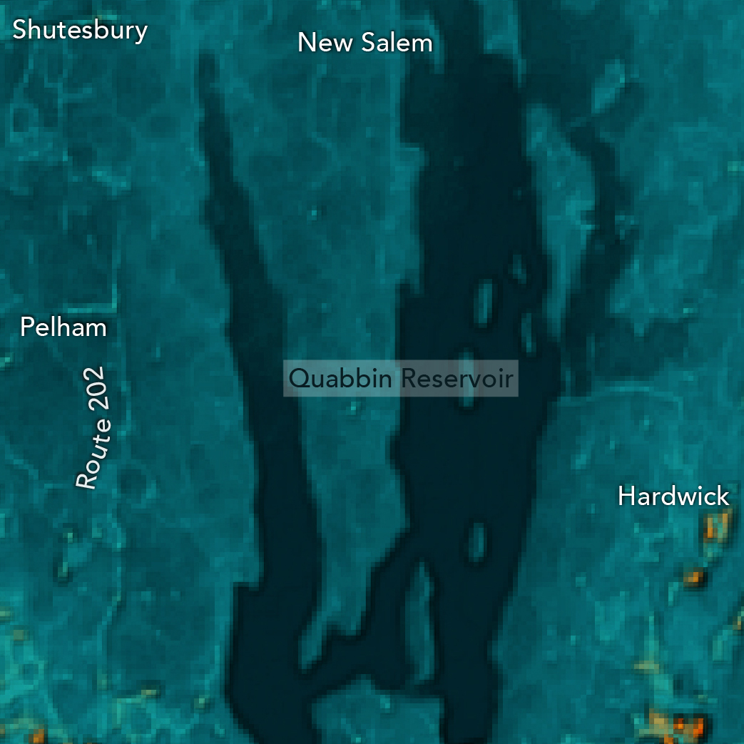
The remaining player names match to other geographic features that include summits, lakes, islands, reservoirs, streams, bars (coastal, not sports), bays, capes, and swamps.

To explore them all, check out this Felt Map. And, as ever, go Sox.

I welcome corrections, additions and heckles. This map is silly more than anything else, and there is no objective right or wrong way to make it. But for those of you who are interested, a few notes on my methodology for this version:

    • Place names were drawn from GNIS. Aggregating with better sources for local place names would be fun. I did not do that here.
    • Player names and years were drawn from Baseball Reference. I know that Ellis Burks didn’t play for the Red Sox for 17 straight years, but this is how the source lists his tenure on the team roster.
    • Player names were matched to place names in order of priority: last name to full-place-name matches were the highest priority, followed by first name to full-place name, and so on. Where there were multiple places that matched players’ names, the closest place to Fenway was used.
    • Mapping across all of Red Sox Nation would be an improvement.
    • Of course I also did this for every other active franchise.
    • Yep, I also did this for this year’s All-Stars.
Posted in awesome, Red Sox | Comments Off on Red Sox, Massachusetts

Massachusetts: Hawt… and Nawt

A map of urban heat islands in Eastern Massachusetts. Brighter colors represent relatively hotter summer conditions.  This map was created from a Landsat 8 land surface temperature composite of the last couple of summers, and was made by Krishna Karra at Descartes labs. Yes, Krishna has lived in the Boston area before.

About a year ago I left the New York Times and headed west to Santa Fe, New Mexico. It’s admittedly the wrong direction for an eventual move back to Boston, but what brought me here is pretty great. I now work at Descartes Labs with a talented group of scientists and engineers who constantly puzzle over new ways to monitor our earth and predict what’s next for us all on both local and global scales.

Recently, while helping some journalists look into urban tree canopies and heat islands, my colleague, Krishna Karra, created a handful of really compelling land surface temperature composites using Landsat 8 and MODIS data.

Naturally, I immediately zoomed into Massachusetts—and was rewarded! The urban heat island effect is logically most pronounced in and around cities and towns that are surrounded by thick, heat-absorbing vegetation. That’s right: those beautiful maples, elms, oaks, hickories and pines that blanket Massachusetts are sucking up heat. And the cities with sparse vegetation are all the hotter for it.

Just look at these hawt (and nawt) spawts!

Boston metro heat islands

Boston. Combined with Cambridge, Boston makes up the largest heat island in the state. Three fun things to note here: 1. You can literally see the Boston-Brookline border in this heat island composite. Is it because of the parking ordnance? 😏 2. Hey, look—the Boston Common and Boston Garden are cool! 3. The Charles River is a veritable trench of chilliness compared to its surroundings.


Brockton-area heat islands

Brockton. Belmont Street and Main Street create ridges of heat, intersecting in the hottest part of town. Lakes and ponds sit back in contrast.


Natick and Framingham area heat islands

Natick and Framingham. I’ll confess—the weird crop here is because I grew up in Medfield. Hiiiii, Medfield! Anyway, there’s an awful lot of shopping and industry in this area that makes for some interesting heat patterns. Route 9 especially stands out as a hot line cutting across the image. For those of you who ride the MBTA Framingham/Worcester Line, you’ll feel validated to see that Lake Cochituate is every bit as cold and refreshing as it looks on those muggy August evenings when you roll by and see kids jumping into it.


Mount Greylock’s cold shadow

Mout Greylock. Here’s a fun one. North Adams, Adams and Williamstown are relatively hot for the region, but Mount Greylock stands in frigid relief. Look at that north face! Brrrr.


Nantucket heat islands within an island

Nantucket. Two things stand out in this image of Nantucket: town and the airport. Also, Russells Way sits as a warm ridge at the western edge of South Pasture and the sand of Tom Never Beach pops a little bit in the southeast.


Martha’s Vineyard heat islands within an island

Martha’s Vineyard. Like Nantucket, the hottest spot on Martha’s Vineyard is the airport (really the exposed pavement of the runways). Towns are a bit hotter than their surroundings too, but the real contrast here is in the brackish coastal ponds, like Edgartown Great Pond in the south.


Leominster-Fitchburg area heat islands

Leominster/Fitchburg. I hear if you’re from Ashburnham, you tell people you’re from the Leminstah/Fitchburg arear. That makes sense based on this map, because those towns are HOT. It’s interesting to see development along Route 2 spreading the heat to the southeast and northwest. Coggshall Park in Fitchburg and Johnny Appleseed State Park in Leominster offer cold relief abutting these otherwise toasty towns.


Lowell heat islands

Lowell. Lowell is hot. The Merrimack River is not.


New Bedford heat islands

New Bedford. New Bedford is something like the seventh most populous town in Massachusetts. It’s dense with development too, right up to the water’s edge, as reflected in this heat map. The hot streak of development along Route 6 cuts straight through town too.


Pittsfield area heat islands

Pittsfield. There are cool lakes in the hinterlands here. Pittsfield is a scorching island and heat from roads in the area are shown here rising above their surroundings. Even the relatively remote roads stand out.


Provincetown heat islands

Provincetown. One of the things I enjoy most about the patterns of heat islands throughout the whole state is that you can see local and regional cooling patterns. In the west, it’s The Berkshires. On The Cape, it’s the ocean. But Provincetown will not be cooled (at least not entirely)! And it’s not even the brightest and hottest area in this image. That would be the sands of The Cape in places like those at Race Point Beach. (Also you can just barely see the adorable Provincetown Muni Airport).


Cool Quabbin Reservoir area

Quabbin Reservoir. I’ve long been haunted by the Quabbin. And this image isn’t going to help that one bit. The reservoir and its immediate surroundings—including some towns—are ghostly cool. Route 202 and Hardwick offer the only warmth.


Springfield area heat islands

Springfield. This area definitely jumped out at me when I first took a glance at the statewide map. I know, I know—Springfield is a city. But the way it’s squashed between Central Mass (hellooo, Quabbin) and the Berkshires (both of which are cool parts of the state) had me falsely assuming Springfield would be a bit cooler. It’s not. It’s a massive heat island spanning both sides of the Connecticut River.


Worcester area heat islands

Worcester. Worcester and its spiderweb of state routes make for a real splat of heat in east-central Massachusetts. The heat spreads east before it’s abruptly brought to a halt by Lake Quinsigamond. The hottest areas only proceed east along Route 9 in Shrewsbury. Crow Hill and Bell Pond offer tiny areas of relief from heat exacerbated by the urban built environment.

Belchertown area heat islands

Belchertown. I know a lady from Belchertown. She’s a very kind human so I thought I’d take a look at this area too. As with several other snapshots like this of the state, many state routes and large local roads stand in hot relief over their cooler, wooded backgrounds. Tenneyville is the one exception here. Even the Mass Pike isn’t so hot.


The Whole State. The general concept of heat islands is that they are, well, islands. So it’s helpful to look at the metaphorical body of water they sit in to see their patterns across an expanse. Here is our beloved Massachusetts. The heat islands look like a population density map. And that makes sense. We build things like roads, airports and giant buildings where people live. In the snapshots above that show portions of the state at a different scale, we’ve observed that even within these islands, it’s not all hot. (So, no, I’m not saying let’s flood a bunch more towns!) Throughout the state, we see that parks and green infrastructure really do cool the urban and suburban environment.

So if it’s too hawt and you want it to be nawt, build a pahk, eh?

Posted in General, Geography, Seasonal, Transportation | Tagged , , | Comments Off on Massachusetts: Hawt… and Nawt

Mapping molasses

By now you’re aware that today marks 100 years since Boston’s Great Molasses Flood (or Molasses Disaster, or whatever you may call it). On January 15, 1919 a huge tank of molasses on the North End waterfront collapsed, releasing a viscous deluge that killed 21 people, injured a further 150, and damaged and destroyed structures. It’s not a story we need to tell here; it’s been thoroughly told by others over the years. Start with Wikipedia and end with Stephen Puleo’s book Dark Tide, which tells the whole tale in vivid, personal detail. (See him speak at the Boston Public Library tonight!)

But we can point you to maps, and tell tales of geography!

A contemporary map of the area is from the Atlas of the City of Boston 1917 edition. The blue circle next to Commercial Street is the molasses tank that had been constructed in late 1915.

For better context, here’s the same map with a puddle of molasses on it.

By the 1922 edition of the map, the tank of course was gone, along with some of the neighboring buildings.

At one time I had imagined a tsunami of molasses racing through the narrow North End streets, sweeping away crowds and houses in its path. As destructive as the disaster was, that picture really isn’t correct, nor are the events as imagined fancifully in the 1992 illustrated book Molasses Flood by Blair Lent (which of course Tim has read), inundating Faneuil Hall, the State House, and more.

The affected area was mostly the industrial-ish waterfront and Commercial Street itself (a big street by North End standards), and about one block of residential buildings facing that street. This Boston Globe Magazine article includes a nice little animation of the area covered. And geophysicist Steven N. Ward has gone the extra mile of simulating the physics of it all, with animated 3D renderings.

Today the immediate area retains hardly a trace of its 1919 self, at least on the harbor side of Commercial Street. The waterfront no longer bustles with industry, and the street no longer hosts an elevated railway (famously damaged by the force of molasses) nor freight tracks. The site of the tank itself is a baseball diamond in a peaceful park. The aforementioned Globe article has an interactive then-now comparison, or you can take a look at Google Maps.

To recall the molasses flood is to recall a different Boston, geographically. It’s not just which buildings are still here and which aren’t. It’s entire swaths of the city having a wholly different character. You wouldn’t see a ship unloading cargo in this part of the North End, and you’d hardly think of Cambridge—where molasses from the tank was destined—for industrial-scale distillation of alcohol. De-industrialization of some Boston-area neighborhoods is recent enough to be in many people’s memories, but some day it’ll all be like looking back at the days of the molasses flood, imagining a totally different city from what anyone alive knows.

The molasses episode also tells of a Boston that had a different outward relationship with its geography, for lack of a better way to put it. I’ve often remarked that for a coastal city, Boston seems very inland-oriented, at least in the central part of town. In places like the North End and downtown, the harbor mostly seems to serve as a pretty backdrop, not a focus of activity. That, I think, was different during most of the city’s history, with the sea playing a central economic role, and all that related activity occurring right in the heart of town. The downtown harborfront was still a major district in the collective mental map of Boston (below) in Kevin Lynch’s day, but now? I’m not so sure.

At a global scale, the molasses flood is a legacy of Boston’s part in the dark history of triangular slave trade across the Atlantic. The slave trade itself may have been outlawed long before, but it was central to the original flow of molasses from the Caribbean to New England, which would eventually lead to this tank and this disaster. (Side note: baked beans’ popularity thanks to the molasses—i.e., slave—trade is often cited as an origin of the “Beantown” nickname, so if you still needed a reason never to use that name, there’s one.)

A final, non-geographical thought: today with nobody alive who would remember it, we think of the molasses flood as a quirky, almost amusing story. To say nothing of its modern relevance —for example legal precedent or the parallel between 1919’s “did Italian anarchists do this?” and today’s “did terrorists do this?” reaction to disaster—if you stop to think or read (in Puleo’s book) about the victims’ suffering, man, it was a frighteningly awful thing to happen! Being crushed by a building and subsequently drowning in sticky, thickening molasses in the cold has got to be low on anyone’s list of preferred ways to die.

But it’s okay to move on. Enjoy a molasses cookie today and begin a century of happy molasses memories.

Posted in Historical | Tagged | Comments Off on Mapping molasses

Official unofficial neighborhoods, 2017

Time for an update on the classic-yet-ongoing neighborhood mapping project! To recap: we’re on version 2 of a web survey for mapping Boston-area neighborhoods, the boundaries of which can be the subject of much disagreement. We’ve asked people to draw neighborhood extents as they see them, in an attempt to collect enough of these crowd-submitted shapes to be able to say something about the overall popular perception of neighborhood geography.

Here’s the fuzzy map of neighborhoods according to a snapshot of some 2,300 submitted polygons in our data, as of March 2017.

Boston neighborhood consensus

This is a fun update over previous editions mainly for two reasons: it includes areas outside the city limits of Boston, and it is not limited to a pre-selected set of neighborhood.

The way this map works is:
1) Lay a somewhat-fine grid over the area. These hexagonal cells are something like 75 meters across.
2) For each cell, find the most commonly named neighborhood intersecting it.
3) Measure consensus on that cell as the number of submissions for that neighborhood intersecting the cell, divided by the total number of submissions for that neighborhood. Thus we can say something like, “75% of people who drew the South End agree that this location is part of the South End.”
4) Ignore any neighborhoods with fewer than 5 submissions. This weeds out all the joke/rude submissions, but also is just an arbitrary minimum for measurable consensus.

The consensus map does a decent job of showing where boundaries are hard and where they’re fuzzy or uncertain. Without that, a simple map categorized by name looks like this, in hasty random color screenshot form:

Boston neighborhoods categorized

It’s also worth doing a quick comparison to official boundaries. Here’s one with official lines for Boston and Cambridge overlaid.

Boston crowdsourced vs official neighborhoods

Boston does a pretty good job, with a few exceptions that I notice:

  • People prefer to subdivide downtown and the waterfront area into smaller neighborhoods.
  • Official Mattapan intrudes on Dorchester a bit—exactly how much is hard to say from our data, but certainly the bit beyond Morton Street looks too far.
  • Official Hyde Park eats a slice of Mattapan, even some bits with 100% Mattapan consensus in our data.
  • Official Jamaica Plain appears to intrude on Roslindale.

Much of Cambridge, however, is quite different, as people tend to think of the city in terms of squares like Central or Harvard, while the official boundaries put the squares between neighborhoods.

Keep the submissions coming! It would be great to see more neighborhoods pass the threshold and appear on this map, and as always it’s fascinating to see how the shapes evolve and settle. Thanks for everyone’s participation so far!

Posted in General | Tagged | 1 Comment

The Boston Projection

Boston is the center of the world

Cartography Twitter has become abuzz with some local map news: last week Boston Public Schools ditched the classic Mercator projection in favor of the Peters projection for classroom maps. A trivial-sounding story to some, it’s interesting because it’s change motivated by social justice—seemingly bold but in fact a late shot in a decades-old cartographic controversy. So, perhaps we can briefly share a bit of background on map projections with Boston-area map readers.

The first thing to know is that there is no such thing as an undistorted flat map. Every single one is “wrong” in some way or another. A globe is the only way to represent the world without significant distortion. Any attempt to flatten out the round Earth sacrifices accuracy in at least one way: size, shape, and/or direction.

The Mercator projection, which you see in things like Google Maps, and which you probably knew from classroom walls, is known for gross distortion of size at high latitudes. Thus Europe appears bigger relative to, say, Africa than is true; and Greenland looks to be the size of South America when in reality it’s something like one eighth the size.

The true size of Greenland

Although areal distortion is a side effect of the Mercator map’s original purpose—it preserves angles and was useful for navigation—some have argued that its exaggeration of northern latitudes promotes a very Eurocentric view of the world. Other map projections that maintain size accuracy (equal-area projections) are viewed as socially just, giving due attention to parts of the world long oppressed by European colonialism. In the 1970s Arno Peters made some waves promoting the projection which will now grace the walls of Boston schools, and which famously (to cartographers) made an appearance on The West Wing. BPS is a little late to the party, but has adopted the map for essentially the same reason: to remove an imperialist image and promote a different view of the world.

Many cartographers are critical of this projection, as the claims behind it are not novel and even erroneous, with some frustration that it proclaims “truth” yet necessarily trades one form of distortion for another. (Notably, shapes are badly distorted.)

No matter what side one takes, the fact is that a map projection is one of many tools in the cartographer’s kit that can be used to subtly—or boldly—promote a certain agenda or worldview. And as everyone knows, the only accurate world maps are those that correctly show Boston at the center of it all, right?

(adapted from Mike Bostock’s Projection Transitions)

Posted in General | 1 Comment

Much Sass State

Can you believe it’s almost the 400th anniversary of the the Pilgrims arriving at Hot Lumpy?

South Shore and Cape anagrams

Maybe you’re more of a North Shore type, and are excited for summer so you can visit the beach at Meth Cranes By-The-Sea or Wry Nut Probe for a swim in the Anal Cat Notice.

North Shore anagrams

Yeah, it’s a Massachusetts anagram map. Designed by our inner 12-year-olds.

Massachusetts Anagram Map

Anagrams were all generated by the amazing Internet Anagram Server (or I, Rearrangement Servant).

Posted in General | Tagged | 4 Comments

Myriad marathons

marathon_flowies

Happy Patriots’ Day, everyone!

Today thousands of runners are making that famous trek from Hopkinton to Boylston Street. That’s The Boston Marathon, the only one that counts, but there are many ways you can run 26 miles and 385 yards to reach that finish line. We thought it would be fun to put them all on a map. So there they are above: 581 different 26.2-mile routes to the finish line from all directions—plus the one official course.

If you protest that the map surely doesn’t show every possible marathon route, you would of course be correct. The number of unique routes of marathon distance is practically infinite. You could run all kinds of crazy routes and barely even leave the neighborhood! How about a spiral marathon?

Spiral marathon route!

What’s on our map is only a sample of routes that start outside the city, as the actual Marathon course does, flowing together as they approach Boston. We came up with a set of around 4200 candidate starting points, threw them at MapQuest’s open directions API both for walking and driving directions, and kept the routes that turned out to be close to the right length. We also did our best to toss any routes that use limited access highways. Best not to run on those.

flowy_section

Whether you’re running the Boston Marathon today or one of the myriad others, or are just taking a spin around the neighborhood, good luck and happy running!

Posted in Events | Tagged | 2 Comments

A day of traffic

If you’ve driven a car at all around these parts, you’ve certainly spent some time as a part of slow or stopped traffic. Despite how it may feel when you’re parked on the Southeast Distressway, Boston is, relatively speaking, not so bad. There are other cities in the US that have it worse. (See data such as the Urban Mobility Scorecard from Texas A&M.) Outside of special events or bad weather, what we have is a fairly predictable rush hour cycle. Traffic is slow for a few hours in the morning and early evening, and generally fine at other times.

Or so it appears to this layperson, at least. Not wanting to claim any expertise, I will leave this subject with a simple map of the ebb and flow of traffic in Boston. Here’s approximately 20 hours of traffic yesterday, a seemingly ordinary day, according to Google Maps.

The automated screen captures for that animation were collected using a script by Alyson Hurt of the NPR visuals team who was mapping something legitimately fascinating: traffic map as weather map. Next time the internet is abuzz about a winter storm, look at a live traffic map and you’ll get a pretty good idea of where it’s snowing.

Posted in Transportation | Tagged | Comments Off on A day of traffic

The island nations of Boston

The island nations of Boston

Some neighborhoods of the Boston area are actual islands, or were at one point. Others, however, can feel that way even when connected to each other by land. Water isn’t the only thing that can create a gulf between neighborhoods; sometimes it’s created by features of the urban landscape and the experience of passing through them.

To me, one of those things is an unpopulated area. Even if two pieces of the city are contiguous with no real empty space between them, if there’s a zone between them where nobody lives (perhaps a commercial district or even a nice park), the experience or idea of passing through there increases the distance between the two neighborhoods in my mind. Thus a neighborhood that is physically close becomes a “somewhere else” to me, and I remain on my island.

The above map aims to represent that experience, imagining land and water as defined by population. Any unpopulated areas (according to census data) become water, population density becomes the terrain, and Boston becomes a rugged world of islands and lakes.

Posted in General | 1 Comment

Map your neighborhood! (Again!)

When you think of your neighborhood, you probably think of many things—people, institutions, cultures… and geography. In your mind it probably has a spatial extent, or a center, or some fuzzy definition of what is “here” and what is “there.” Share that geography by drawing your Boston-area neighborhood on this map. Why do it? Quite simply, because if enough people contribute to the map, it will be a fascinating data set that shows we collectively see our city. It’s mostly for fun, but possibly meaningful to policymakers and such.


We’ve done crowdsourced neighborhood mapping before and were pleased with the response. Longtime payers of attention to this space will remember the project we started a couple of years ago:

Boston neighborhoods consensus

See some maps and discussion of that project here, here, and here. It was a fun project, and we were able to see some cool results. But that project was limited in several ways.

So we’d like to do it again… but better! If that’s all you need to hear, head straight on over to the new version of this survey and draw your neighborhood. Or read on to see why we’re doing this again, what we’re doing differently, and how the results can be much more meaningful.

The original idea was a reaction to regularly written news articles and internet comments about disputed boundaries between neighborhoods in Boston, and the fact that no single official set of boundaries exists. Fine, we thought, if you all say everyone else is wrong, show us what you think is right. And although the result of this, expectedly, seemed to represent fuzzy notions of place, the whole concept really revolved around questions of division and dispute.

Now we’d like to approach this as a general question of geography and the image of the city. The entire premise is much more open and, we think, much more in tune with what neighborhoods actually are—personal spaces, subjectively defined. We don’t want to ask “where is the line between these two places?” but rather “what is this place?”. Although in the end the map will still be built upon lines and discrete shapes, the data should now be more versatile and meaningful. Thanks to our carto-friend Nick Martinelli, there’s an easy implementation of a survey to address some of the new questions. With all that in mind, below is a summary of some of the improvements in this version of the project, which we think will provide a lot of new and interesting possibilities.

A wider scope

It was clear early on that our original project was very narrowly defined, and thus only narrowly meaningful. It was restricted to the city of Boston and a specific set of neighborhoods. While this did address some particular questions, with those limitations it’s impossible to get a real picture of the subjective internal boundaries of the broader “city” of Boston and its surroundings. Not everyone in Boston identifies with the a neighborhood in our list, and not everyone here lives in the city of Boston. So the new version leaves everything much more open. There is no predefined list of neighborhoods (you provide the names), and it’s meant for any and all cities/towns in Greater Boston.

A wider audience

We were always very hesitant to draw any real conclusions from the first project, and a big reason for that is that it is a self-selection bias. Quite simply, our data did not represent residents of Boston—it represented people who look at this site or other sites that linked to it. We don’t know exactly who those people are, but we’re pretty confident that they’re not a representative sample of people who live in the city.

The new version certainly doesn’t solve that by itself, but we’ve taken a couple steps to make it easier to reach more people. For one, it’s mobile-friendly, so anyone on a smartphone can contribute. Second, the drawing method is, we hope, a little simpler. Instead of clicking a multitude of vertices, you just trace a shape. We imagine that this would work well if someone were to, say, carry around an iPad to survey people. Just put the tablet in front of someone and ask them to draw on the map with their finger.

Not just borders

Not everyone thinks of their neighborhood in terms of where it starts and ends. For many, it’s a collection of points—perhaps a square, or a store, or a church—nodes and landmarks in the Kevin Lynch sense. In an attempt to capture neighborhoods as collections of landmarks, the map lets you drop a point marker as something that defines a neighborhood. It might be what you consider the central point of the neighborhood, or it might just be some place that you strongly associate with the neighborhood. What it means is up to you!

Authoritative data

Another shortcoming of the first version is that we had no way of knowing how trustworthy a submission was. It could have come from someone who has lived in the neighborhood for fifty years, or it could have come from someone who’s never even been there. Unless it was obviously a random scribble, we had no choice but to treat everything equally. The new survey, however, includes a couple of optional questions asking respondents how long they have lived in the neighborhood and city, if at all. This may be helpful in analyzing and mapping data, for example allowing us to give more weight to longtime residents, or to map how boundaries may have shifted over time.

Stories

Neighborhoods aren’t just shapes or points on a map. They are collections of experiences. A fun new feature here lets people share stories or comments about the neighborhoods they’ve drawn. You might use it to explain why you drew the shape the way you did, to share an anecdote about the place, or any number of things. There’s only so much a line on a map can say, so we want to make sure there’s a way to tell the rest of the story.

See results

Another new thing here is that you can see what everyone else has drawn so far. You might use this to guide your own drawing (although steering clear of the influence of others is preferred) or simply to browse and compare your map to the crowd’s. You can also vote, as it were, for neighborhoods that people have drawn, helping lend more weight to those. You’ll also be able to see any stories that people have attached to their neighborhoods. The raw data itself is also much more accessible to everyone.

Technology

Finally, and not insignificantly, this new version is a big upgrade in technology. Whereas the first one used Google Maps and a disaster of a database, the new one uses open-source maps on the front end (built on Leaflet and map tiles from Stamen) and the super powerful and easy-to-use CartoDB to store and display data. The drawing itself uses an unholy hacked-up combination of Leaflet.FreeDraw and Leaflet.Editable. If you’re not one for map technology, the upshot is that all this will make it much, much easier to submit, extract, and analyze data in different ways.

One of the best consequences of the original project was that it inspired Nick Martinelli to develop a similar project for several cities in the Pacific Northwest. Nick built everything in a much better and more reusable way, and posted his code to GitHub. That, in turn, is what we’ve used for our new version, along with a few modifications. So, thanks Nick! If anyone else out there is looking to do something like this, take a look at his project. You can get it up and running in almost no time.

Help draw THE map of Boston!

Enough talk! We want to know what Greater Boston looks like in the eyes of its residents. Please take a couple of minutes to draw your neighborhood at: bostonography.com/hoods

We will make some composite maps once there’s some data to work with, of course, but you too can look at the data and makes some maps! You can always get up-to-date polygon data and point data. (Warning: you may encounter some rude shapes in that data. This, we have found, is an inevitable consequence of asking people to draw things on the internet.)

Posted in Geography, Projects | Tagged , | Comments Off on Map your neighborhood! (Again!)