You can’t get here from there

There’s an excellent Far Side cartoon of which I’m often reminded around here: a man in a car has asked a farmer for directions from Point B to Point A, as indicated by the map in the man’s hand. The farmer is stumped, saying (to paraphrase) “most folks want to go the other way.” This seems to happen to me a lot when in a car or on a bicycle, i.e., when subject to traffic regulations. I have a clear picture of how to get somewhere but not how to get back, thanks to Boston’s uniquely bizarre system of twisting roads and one-way streets. Sometimes you can’t get there from here, but sometimes you can—you just can’t get here from there.

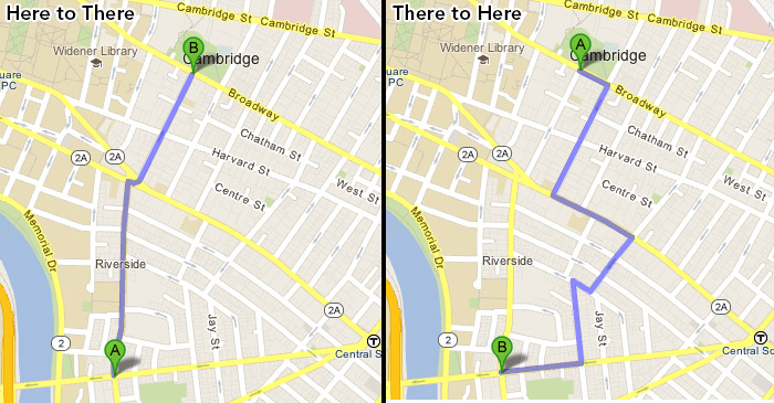
Here, for example, are a couple of routes to and from a point near my home in Cambridge that have given me pause more than once.

It’s super quick and easy to get to the main Cambridge library on a bike. Getting back takes some thinkin’. Google’s suggested routes from A to B and B to A don’t share any road segments at all.
A to B versus B to A: Cambridge Public library

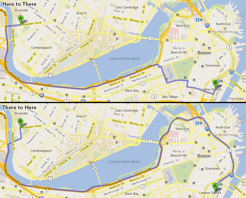
“Sure. I’ll drive you to the South Station bus terminal,” I say, helpfully. Then I drop off my friend and sit amid the taxis and realize I don’t know the best way to get back home.
A to B versus B to A: South Station

It’s not that the routes are objectively difficult; it’s that unlike many other cities where you can mostly retrace your steps, the return trip here often requires knowing a whole different set of directions. It’s not hard to figure out these days, either, what with smarty-pants phones. But to know offhand how to get to any one point from another AND back again is something to be proud of, I think, as it demonstrates a mastery in local geography, which doesn’t come easily. (If you’re a cartographer, you crave this point of pride.) This should also indicate what a difference there is in this town between walking and using wheeled vehicles, at least if you more or less obey traffic patterns on a bicycle, and it explains why I, for one, am so bad at giving directions to drivers like the man in the Far Side cartoon even if I know exactly how to walk there. Boston-area navigation is difficult enough on foot; throw in one-way streets and turn restrictions and you’ve got a vehicular nightmare. (Don’t get me wrong: I’m as hip as the rest of you and almost never drive a car in town, but these problems occur once in a while.)

Anyway, above are just two of my personal examples. The real question is: what are your own favorite examples of knowing how to get from Point A to Point B, but not Point B to Point A? Do share with all of us, and maps are encouraged!

Posted in Transportation | Tagged , | 35 Comments

Crowdsourced neighborhood boundaries, Part One: Consensus

UPDATE! We’ve got a new and better version of the neighborhood mapping project! Head on over to bostonography.com/hoods!

OLDER UPDATE: There’s also a newer map of what’s described below.

As you may recall, we’re running an ongoing project soliciting opinions on Boston’s neighborhood boundaries via an interactive map. We want to keep collecting data, but we’ve already received excellent responses that we’re itching to start mapping, and when we hit 300 submissions recently it seemed like a good enough milestone to take a crack at it. (That’s actually 300 minus some junk data. If you offer the ability to draw freeform shapes, some people draw random rectangles and triangles, and some people draw… er, other long, tipped objects.)

There are many questions to be asked here. Where are the areas of consensus? Where are the disputed zones? Where are the no-man’s lands? &c.? Let’s tackle these one at a time in a series of posts and maps. Today we look at consensus.

But first, let’s check out a raw picture of the boundaries everyone has drawn. This map, which is clipped to the city limits, shows that the word “tangled” is apt in reference to neighborhood boundaries. Some lines are strong as a result of many people drawing in the same place, but many others are all over the place.
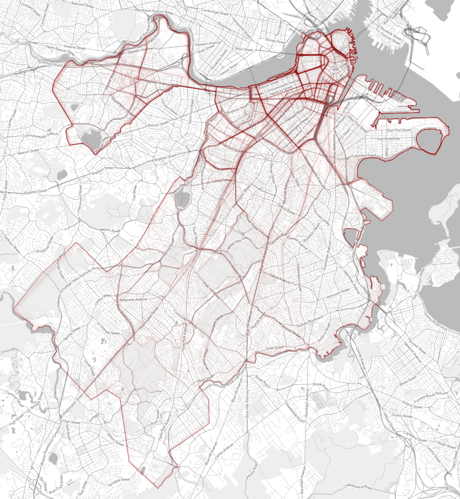
Crowdsourced neighborhood boundaries

Based on those strong lines we can kind of see where there is decent agreement on boundaries, but we can quantify this for all of the neighborhood extents. What we have is 21 sets of polygons, each set representing the shapes people drew for one of the neighborhoods in our survey (the main neighborhoods except for the physically isolated Charlestown and East Boston). Within the set for each neighborhood we can look at the amount of overlap between polygons and consider overlapping areas to be areas of agreement between two or more respondents—as many respondents as there are overlapping polygons in that area. In this exercise we’re interested in those counts. We could find the area in which all polygons overlap, for instance, which would represent the area that 100% of people agree is part of the neighborhood. Total consensus usually doesn’t show us much or doesn’t exist, though, because of some especially bad data (some people just didn’t have a clue, although we tried to weed those out) and, well, because definitive agreement probably is impossible anyway. But we can still find the areas where there is moderate to strong agreement—at least among the self-selected people who responded to the survey.

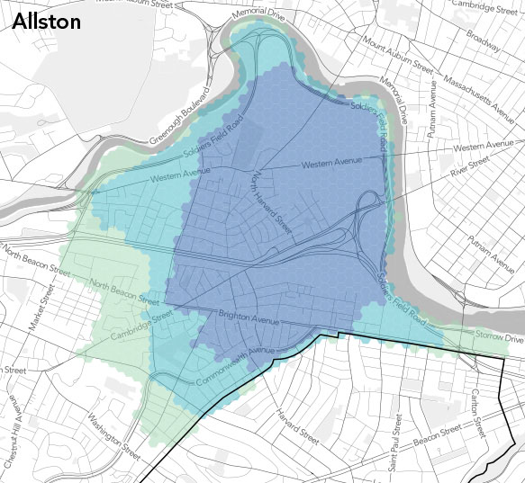
We’ve chosen to look at areas of greater than 25% agreement, greater than 50%, and greater than 75%. They’re handy numbers that seem represent a notable minority, a majority, and a strong majority. So let’s get to the maps. We’ve laid down an arbitrary hexagonal grid across the city and for each cell tallied how many respondents’ polygons it intersects in each neighborhood, then divided that count by the total number of respondents for the neighborhood, which ranged from a little over 40 to 150ish. Here, then, are the neighborhoods in almost alphabetical order, with the number of submissions noted for each.
(Note: when we started these, hexagons had slightly more carto-hipster cachet. These are not really the hexagonal bins that have been recently popular—albeit legitimately useful—but rather kind of a coarse raster approach that looks nicer than squares.)

Crowdsourced Allston extent

Allston (n=120). The first map, I think, demonstrates how closely the categories tend to follow certain streets in all the neighborhoods. Market Street and Everett Street mark the western edges of the 25% and 75% categories, respectively, with 50% a little less defined on that side. Each level then cuts east and south in a couple of steps. It’s interesting that the commercial center of Allston, the Harvard Ave corridor, is only barely within the area of strongest agreement. A neighborhood “center” isn’t always in the middle!
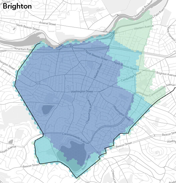
Brighton (n=109). Not surprisingly, Brighton’s eastern edge matches up fairly well with Allston’s western edge. They’re not exactly interlocking jigsaw puzzle pieces, however, because not everyone who drew one neighborhood drew the other, nor were they necessarily careful to make the borders match precisely.
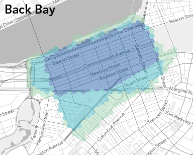
Back Bay (n=139). There are some hard lines here. Nobody goes past the Charlesgate, or past Mass Ave south of the Pike. An interesting section is that south of Huntington Ave. It has the character of the South End but Back Bay parking permits, presumably because the Southwest Corridor partially cuts it off from the former. Still, it doesn’t enjoy majority Back Bay status in this map.
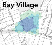
Bay Village (n=80). Not much room to mess around in this tiny neighborhood. The majority stays south of Stuart Street, with the supermajority between Arlington and Charles. The part north of Stuart, although small relative to the whole city, will be interesting to look at later as a no-man’s land; it seems hard to classify even though it has decent Bay Village representation here.
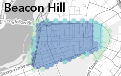
Beacon Hill (n=145). This may be the neighborhood with the most consensus. Everyone agrees on the southern, western, and northern boundaries. On the east side, the question is only whether Bowdoin, Somerset, or Cambridge/Tremont Street is the edge.
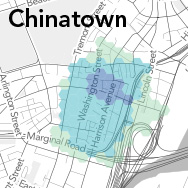
Chinatown (n=113). It’s a little surprising how small the greatest agreement is here, at least to me. I’d probably draw something like the 50% shape. Note that even the Chinatown gate is just outside the 75% region. Perhaps it’s just hard to know which street is which on a map of this dense area, leading to more uncertain shapes from our respondents.
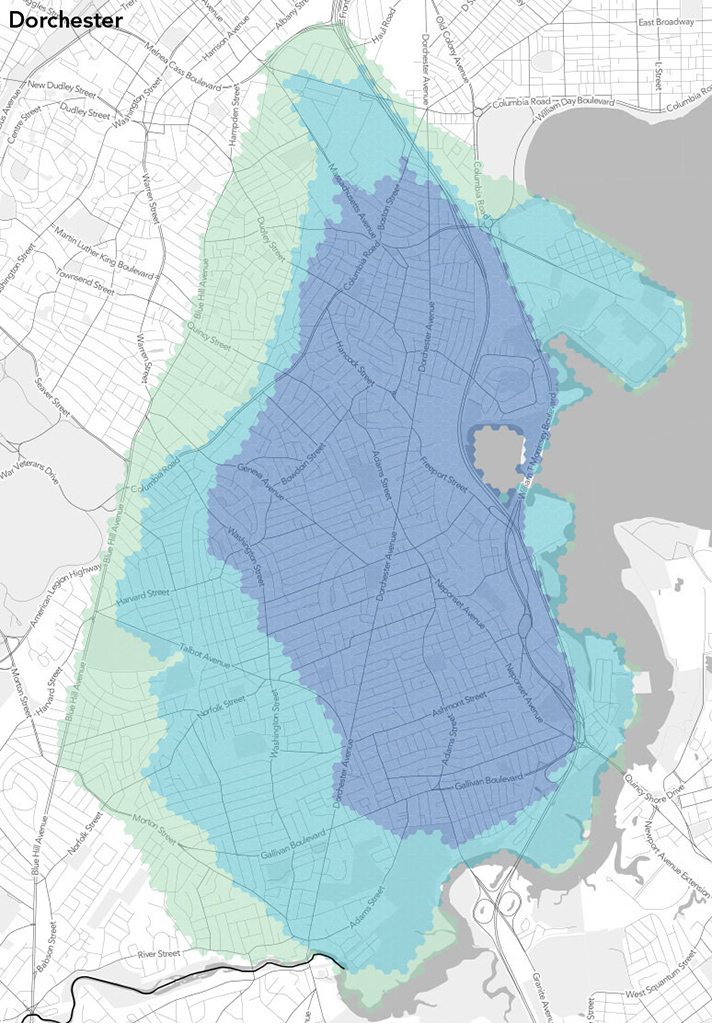
Dorchester (n=54). Dorchester is large enough that we probably need more responses in order to see more agreement. (This is the most populous neighborhood, of course, but it doesn’t have as many responses as some others, probably in part because it’s harder for non-residents to grasp.) Still, we have some good edges here: Blue Hill Ave for 25% and the Fairmount line for 50%. We’ll see those again in the Roxbury map.
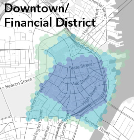
Downtown/Financial District (n=118). “Downtown” is fun to try to define, but we’ve wrapped it up here, perhaps not entirely appropriately, with the Financial District. Besides the easier-to-locate Financial District, to some degree this looks like a process-of-elimination neighborhood: if it isn’t Chinatown, the North End, &c., it must be downtown. Maybe that’s because it’s least residential neighborhood of the bunch, so there’s not really a strong identity.
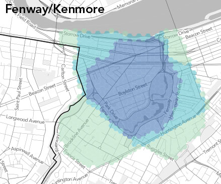
Fenway/Kenmore (n=128). I’m a bit surprised by how many people consider the Fenway neighborhood to end, well, at the Fenway itself on the west side. A minority of respondents here consider some of the Colleges of the Fenway to be actually in the neighborhood. What they’re thinking, presumably, is that this is the Longwood Medical Area and that the LMA is not part of the Fenway. It’s an intriguing zone because we left it off our neighborhood list, forcing people either to include it in an adjacent neighborhood or leave it blank. But we can talk more about that in another post.
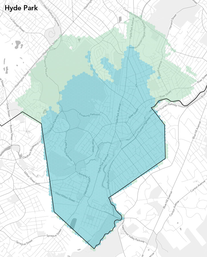
Hyde Park (n=42). We had few enough people drawing Hyde Park (or enough of them were clueless) that there is nowhere with more than 75% agreement. And to be honest I’m ignorant enough about Hyde Park that I can’t comment much on this one. It’s as outlying as outlying neighborhoods get in Boston. Anybody see anything interesting?
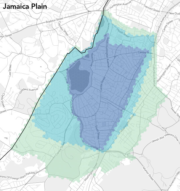
Jamaica Plain (n=74). There are ome fascinatingly well defined edges here. On the east side, people thing the neighborhood ends either at the Southwest Corridor, at Washington Street and then in a line up to Jackson Square, or at Franklin Park et al. and Columbus Ave. The 75% line on the west and south nicely follows the parkways, too (otherwise it’s just the city limits).
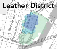
Leather District (n=76). Tiny neighborhood #2, easily lost between Chinatown and downtown. But hey, it has its own parking permit! There’s not a lot to talk about at the scale of our maps this time; some folks have it bleed over to Fort Point Channel but otherwise it’s mostly confined to a few blocks.
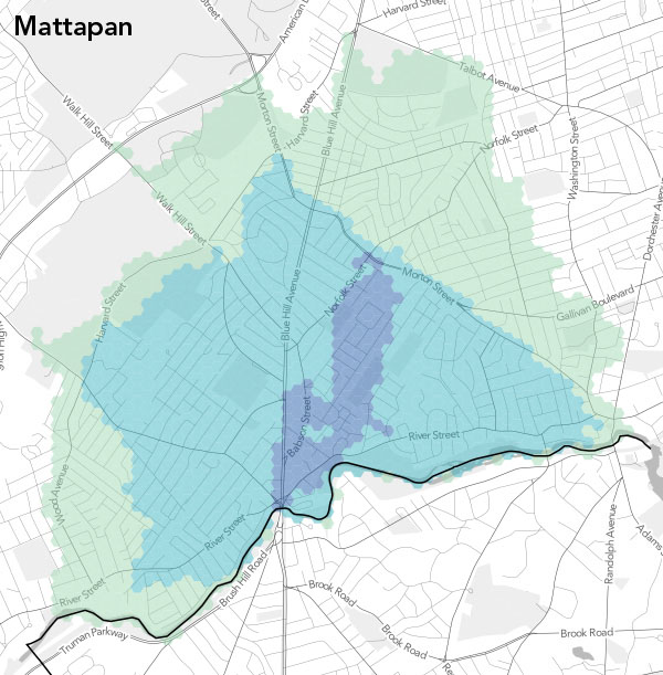
Mattapan (n=45). The 75% agreement is a very odd and small sliver, probably again due to a lack of data, or at least good data. But there are some clearer definitions at the other levels, for instance along Morton Street. As with the other southernmost neighborhoods, I can’t say much about this one personally. Comments are welcome!
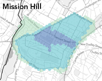
Mission Hill (n=82). There’s a lot of agreement here below 75%, with the only real difference being the section below Francis Street. 75% agreement is only in a small area for some reason, not extending far from Tremont Street. Note that fewer than 25% consider the Longwood area to be part of Mission Hill.
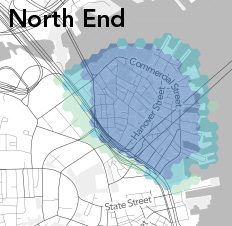
North End (n=151). Along with Beacon Hill this is one of the best-defined neighborhoods, being easily recognized by residents and outsiders alike. The only uncertainties seem to be parts of the Bullfinch Triangle and Christopher Columbus Park (where, it’s worth pointing out, there is a sign welcoming you to the North End), and all the piers. But even those places are mostly above 50%.
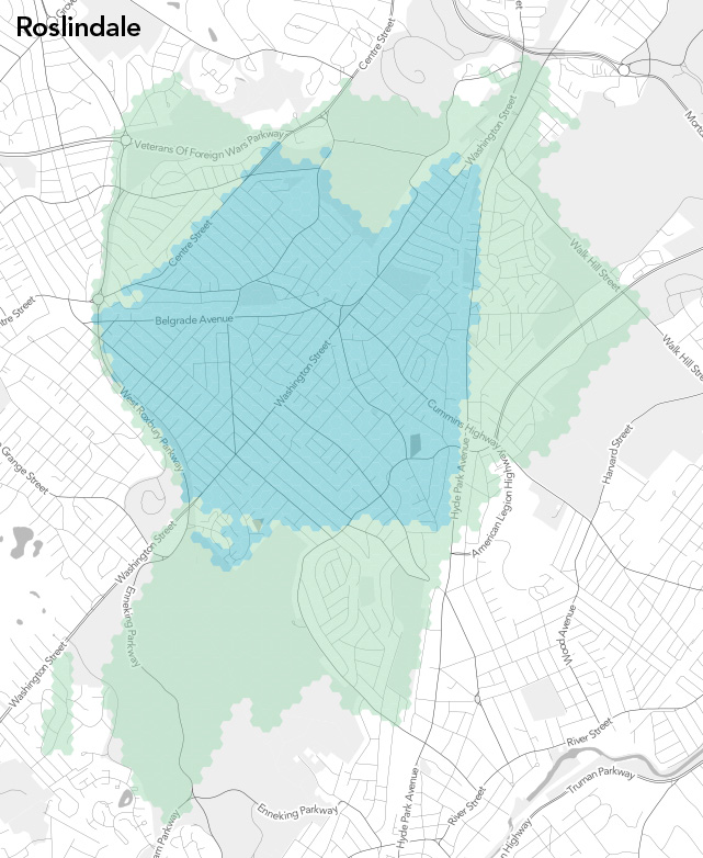
Roslindale (n=41). Wait, is Roslindale a real place or just the name of an RMV branch? Poor Rozzie had the worst data of the lot. It’s just, you know, down there somewhere in between other neighborhoods. What you see here is after some purging of especially bizarre data that were throwing everything too far out of whack. No strong majority here, although the 50% and 25% area are reasonably clearly defined in places. Some of the rest, though… who knows. There’s even a weird floating piece of 25% territory.
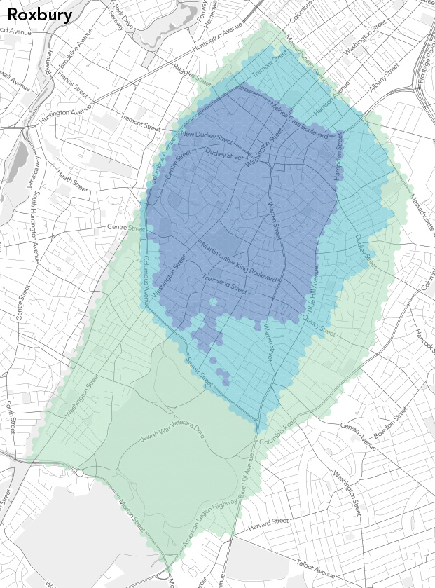
Roxbury (n=64). I personally think Roxbury is the most interesting neighborhood to watch in all this. It has uncertainties on at least three sides, and it and its neighbors seem to have reasonably strong identities to both their residents and outsiders (in contrast to some places that only have the former). The South End-Roxbury border debate is well-publicized, and the JP border gets fuzzy too. Mission Hill isn’t always even considered separate from Roxbury, and the border with Dorchester varies widely, as already mentioned. Apart from some weirdness in the south part of 75% land, there are some interestingly clear-cut camps here.

South Boston (n=92). There seems to be a lot of unity in Southie, apart from the Seaport area and a bit of the other end. Maybe it’s just because there’s not much to compete with: there’s water on most of three sides and something of a dead zone on the other. South Boston is a neighborhood that has grown considerably over the years thanks to landfill, and this map is suggesting that people’s idea of the neighborhood has mostly, but not entirely, grown with it.
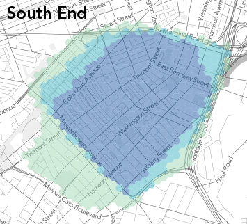
South End (n=116). Well, a lot of this has already been touched on by way of talking about surrounding neighborhoods. There’s a lot of agreement on Mass Ave as a border, despite the parking permit zone that crosses it (I think). Otherwise, the edges seem to match what we see in the adjacent neighborhoods, and within there is strong agreement.
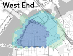
West End (n=114). I suspect that to old timers and casual scholars of Boston, the West End doesn’t even exist; it was torn down in the 1950s. But something is there: a weird land of hospitals and towers in the park. Everyone agrees on a tight loop of roads defining the West End, but beyond that it’s harder to say.
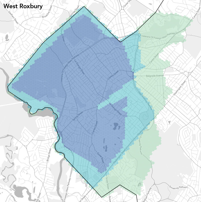
West Roxbury (n=43). The last alphabetically and somewhat fittingly one of the most distant neighborhoods, this one again suffers from a lack of good data. It has the fortune of meeting the city boundary for much of its edge, but away from that there are some funny shapes. And once again I don’t have much to add. We need more data and your thoughts!
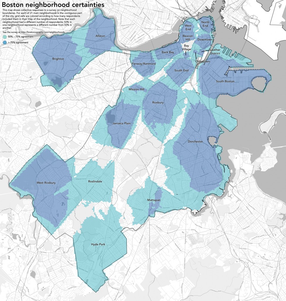
Boston neighborhood certainties

What does it mean?

Although we talk a lot about boundaries, this post included, the maps here should also remind us that neighborhoods are not defined by their edges—essentially, what is outside the neighborhood—but rather by their contents. And it’s not just a collection of roads and things you see on a map; it’s about some shared history, activities, architecture, and culture. So while the neighborhood summaries above rely on edges to describe the maps, let’s also think about the areas represented by the shapes and what’s inside them. What are the characteristics of these areas? Why are they the shapes that they are? Why is consensus easy or difficult in different areas? What is the significance of the differences in opinion between residents of a neighborhood and people outside the neighborhood?

We’ll revisit those questions in further detail in future posts, and also generate maps of other facets of the data. Next up: areas of overlap between neighborhoods. Here we’ve looked neighborhood-by-neighborhood at how much people agree, so now let’s map those zones that exhibit disagreement. Meanwhile, thanks so much for all the submissions for this project; and if you haven’t drawn some neighborhoods, what’s your problem? Get on it!
Posted in Geography, Projects | Tagged , | 90 Comments

Typographic Boston and Massachusetts

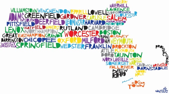
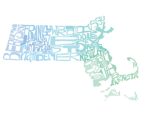
Typographic maps—that is, maps constructed mostly by typography—are quite the rage these days. I think I got in on, well, if not the ground floor then a fairly low level of the fad some four years ago with a small type-based map of the Prudential area in Boston (shown below), which later grew into a whole line of typographic map posters. Besides those posters, a number of other typographic maps of Massachusetts and/or Boston have since shown up on our radar, so here they are. Click ’em for the source pages, where there are larger images and usually prints for sale. Do let us know of any that were left out!

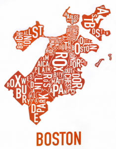
Ork Posters - BostonAs far as posters go, probably the “original” city typographic map is that of Ork Posters, which fills neighborhood areas with text bearing the neighborhood names. I vaguely recall that an early version of this used an “Allston-Brighton” label that essentially meant that their labels were switched, because “Allston” is first in the name but Brighton is first on the map. Or maybe I imagined that.

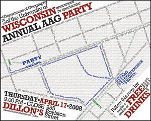
Typographic Boston party invitation mapThis is the first one I did, in 2008. It’s an invitation to a departmental party during the Association of American Geographers conference, which was in Boston that year. My roommate, who was in charge of the planning, commissioned a map and typographic map was my idea. Later I expanded this style into more of a full city map.

Welcome to Boston by Michael WensteinBoston Marathon map by Michael WeinsteinLocal designer Michael Weinstein has a couple of text-based Boston maps. The first, called Welcome to Boston, shows inner neighborhood names (plus Brookline and Cambridge) in different stylized ways, along with the T lines. Prints are for sale. The second shows the towns and streets along the Boston Marathon route, in a similar style.

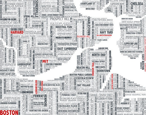
Boston typographic map by UrbanFootPrintDesignThis map from UrbanFootPrintDesign is solidly filled with horizontal and vertical text of several different styles (I haven’t taken a close look at how many typefaces are here), showing streets names, place names, and landmarks.

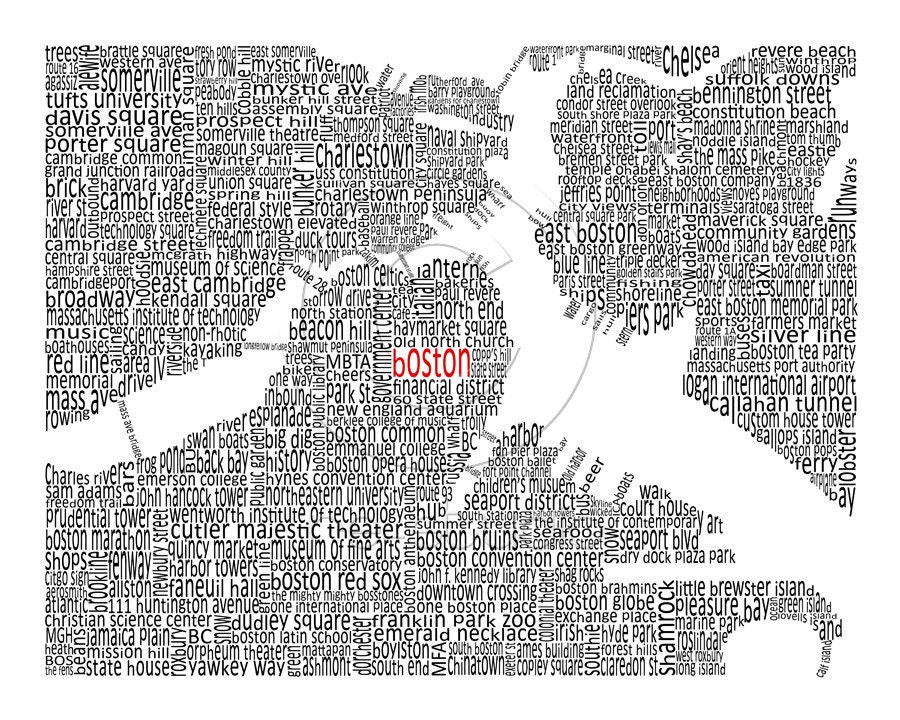
Boston typographic map by Jessica HarringtonUsing a similar technique but somewhat different style is this one by Jessica Harrington. She’s got a few other maps of regional interest, too, so poke around that Etsy shop linked in the image.

Typographic transit map by Fadeout DesignA typographic transit map from Fadeout Design shows nothing but the MBTA lines (yeah, Silver Line included) as text. The text is the names of stations. I think I’ve seen something like this but including a bunch of bus routes, too. Was that also just imagination?

Massachusetts towns text map by Molly MattinHere’s colorful one of the state filled with town names, by Molly Mattin. This and some of the other examples are not exactly typographic maps, of course, since they are hand-drawn illustrations.

Massachusetts counties text map by  Crystal PowellFinally, a county name map illustration from CAPow (Crystal Powell). I like the way that some of the coastal letters have the rugged edge of the actual coastline.

Posted in General | Tagged | 3 Comments

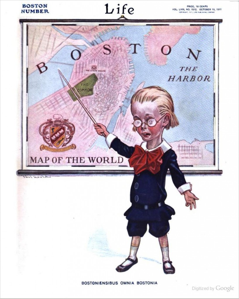
Life: The Boston Number

Ah, the satirical map.

Bostoniensibus Omnia Bostonia

The other day we ran across this delightful 1911 map illustration by Paul Goold on the cover of Life magazine. A child, simultaneously having a healthy glow but looking rather sickly, and clearly being what we would today call a total nerd, points to a “Map of the World” which, of course, consists only of Boston. Nice to see attitudes haven’t changed in the past 100 years—and let’s not forget that Daniel Wallingford map along the way. Hub of the universe, folks. (By the way, can someone give an exact translation of ‘Bostoniensibus Omnia Bostonia’?)

Turns out the whole October 19, 1911 issue is Boston-themed—a “Boston number”—and includes a number of short short essays, jokes, and poems about Boston. (This isn’t the photojournalistic Life magazine of later years, but rather an earlier incarnation as a “humor and general interest magazine.”) It opens with Hail, Boston!

Pilgrim Turkey

MANY attempts have been made to bring Boston down from its proud pedestal of superiority, but so far every one has failed. Boston sill leads everything else.

Nothing ever happens to America that has not previously taken place in Boston. This is why every true Bostonian sniffs complacently when someone else tells him “news.” He knows where the impulse first originated.

Much is made of Boston as an intellectual city, a reputation it still holds today but with a less aristocratic flavor. Sure, there’s a thread of satire through the issue on this “Perfect City” that has “[m]ore culture than Athens (Ga.)” and “[m]ore art than Paris (Ky.)” but if we can’t laugh at ourselves—or at least our predecessors a century ago—what can we laugh at?

Back Bay/Beacon Street

The most notable artwork besides the cover is a two-page cartoon by Harry Grant Dart depicting a busy Boston street scene, replete with humorous signs. There’s plenty of other art, too; it just isn’t about Boston. And one mustn’t discount the advertisements, which to our 21st Century eyes can be fascinating or entertaining. (“Sexology” illustrated for only $2! A Peerless automobile in front of the Museum of Fine Arts!)

If you haven’t noticed by clicking on any links so far, the entire issue is available for viewing on Google Books, along with perhaps every other issue of the magazine. Not every item in this “Boston number” is about Boston, but there are other Boston bits that I haven’t mentioned here, which range from resentment of immigrants to baked bean poetry. Look through them and marvel at how some things have changed but how many things still sound familiar today. Now if you’ll excuse me, I’m off to buy some Boston Garters.

Posted in Historical | Tagged , | 5 Comments

Wanted: your map of Boston neighborhoods

Let’s settle this.

Over and over it’s been made clear that there is little agreement on the precise boundaries of Boston’s neighborhoods. Most people agree on the existence of the major neighborhoods, but everyone has different opinions on where one ends and another begins. The South End may or may not be eating Roxbury. A chunk of Dorchester may or may not have been handed over to Mattapan. Mission Hill may nor may not be part of Roxbury. The confusion and disputes are understandable because the reality on the ground is that there are no hard lines except in a few cases of obvious physical barriers, but it’s also true that arbitrary borders do matter in politics, city services, and even personal identity.

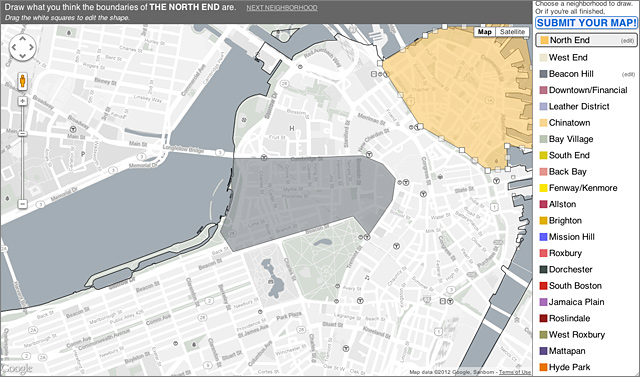
Well, we can look at the variety of city-defined boundaries (PDF) or at somebody else’s assertions and say “that’s wrong, stupid!” or we can all compare notes on what we think the neighborhood boundaries actually are. To that end, fellow Bostonographers, we would like to collect your opinions and map areas we all agree upon and where we disagree. We’ve made a simple mapping tool for you to contribute your neighborhood definitions. It lives at https://bostonography.com/neighborhoods and looks like this:

Boston neighborhood mapper

We ask you to draw and submit boundaries for most of the usual top-level neighborhoods, excluding Charlestown and East Boston because they’re pretty well indisputable, and with Allston and Brighton treated separately because they seem to be the most easily divisible sections of the official neighborhoods. You can submit a map of as many or as few neighborhoods as you wish, but we of course encourage you to draw all of them. Detail as intricate as you have patience for is appreciated, too, for the sake of the eventual maps of the results. Once enough people have contributed, we’ll post the data and some maps of it.

So get to it! Contribute, spread the word, and let’s create the ultimate collective map of Boston’s neighborhoods.

Posted in General | Tagged , | 28 Comments

Happy birthday, Red Line

Do you live, work, or ever travel in the area between Harvard Square and Park Street? If so, you know a piece of the MBTA Red Line that celebrates its 100th birthday today!

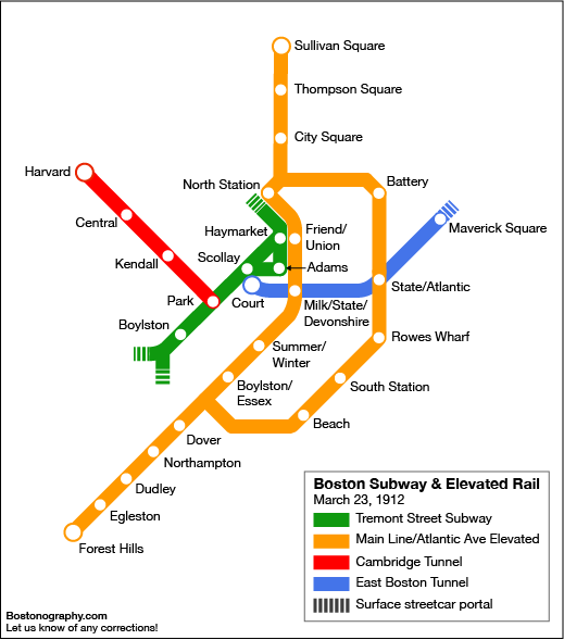
Yes, what is now the Red Line between Harvard and Park Street—the Cambridge Tunnel, the Longfellow Bridge and short elevated rail over Charles Circle, and the tunnel under Beacon Hill, opened on March 23, 1912 as part of the Boston Elevated Railway’s system. This was the last of the present-day four subway lines to begin operation, the underground sections of the current Green, Blue, and Orange lines having been started in 1897, 1904, and 1908 respectively. The Green Line’s Tremont Street subway is of course famously the oldest subway in the United States. (Note, however, that the Tremont Street and East Boston subways were built for streetcars, making the Cambridge Tunnel the second heavy rail tunnel in Boston, after Washington Street.)

Boston Subway & Elevated Rail - 1912

Here is a map of rail rapid transit that existed 100 years ago today, with some approximation and no doubt some mistakes, using the modern style and colors. The Red Line gradually extended south into Dorchester through the 1920s and later to the South Shore and Alewife in the 1970s and 80s.

The Cambridge Tunnel opened as part of a system rather different from what it is today. Besides all the sections yet to be built, there were significant lines that no longer exist: the Charlestown, Washington Street, and Atlantic Avenue elevated lines, the first two making up most of the Orange Line before its relatively recent realignments. The “oldest transit system in the country” excuse is often invoked to explain maintenance difficulties, but a 1912 snapshot shows that 100 years ago—when other cities had well-established transit systems—most of the current configuration did not exist. What Boston has is the oldest subway, the relatively short Tremont Street subway, not really the oldest system. Great chunks of it date no further back than the 1970s and 80s. The Red Line section that recently saw weekend closures to fix its deplorable conditions, for example, opened only 27 years ago. For a more complete history, check out this excellent series of maps showing the extent of Boston transit by decade, including the great network of streetcar lines that used the tunnels, most of which no longer exists.

Suburbanites Are Happy - Big Tube From Cambridge to Boston Opens for Public Traffic

Thinking about the occasion from a geographic perspective, as is our wont, it’s interesting to study the news coverage of the opening of this “big tube” in 1912. Tim has found some old articles about this and other transit events of the era—check out a PDF collection not only for subway coverage but also because old-timey newspapers have hilarious advertisements for all sorts of quackery. Anyway, much is made of the short travel time—eight minutes—between Harvard Square and Park Street as compared to surface options. The word “suburbanites” appears in a few places too, remarking on how easy it now was for people in idyllic, faraway Cambridge to get to the big city. Things have changed. First of all, eight minutes is unlikely, what with an extra station (Charles) and what I guess must be a sharper (i.e. slower) turn than used to exist at Harvard. The city/suburb situation isn’t the same, either. As populations have dispersed, the core city isn’t just those very densest downtown regions but rather extends to places once called suburbs. Harvard Square itself is now a major node in the core urban area and is home to the third-busiest MBTA station in the whole system. The subway is no longer a way to get between city and suburb; it’s a way to move around within the city.

Don’t forget to celebrate again on Monday for the 156th anniversary of the first horsecar line. Then start planning your next transit celebrations for June 1, the 100th birthday of the Lechmere Viaduct, which will carry trains to the next planned system expansion, the Green Line through Somerville. And as you grumble about the endless delays and escalating cost of that yet-to-be-started extension, consider this and grumble more: since the opening of the Tremont Street subway in 1897, this is the longest we’ve gone with no real expansion of rail rapid transit.

Party hard today, Red Line riders, and enjoy your commute!

Posted in Historical, Transportation | Tagged , , , | 10 Comments

For Here or To Go

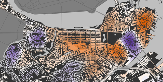
For here or to go: downtown Boston

It’s your lunch break, and you want to grab some food to eat in the park. Or maybe you’ve just gotten off work, and you want to pick up a meal to take home with you on the T. But curses, you’re just not in a take-out neighborhood!

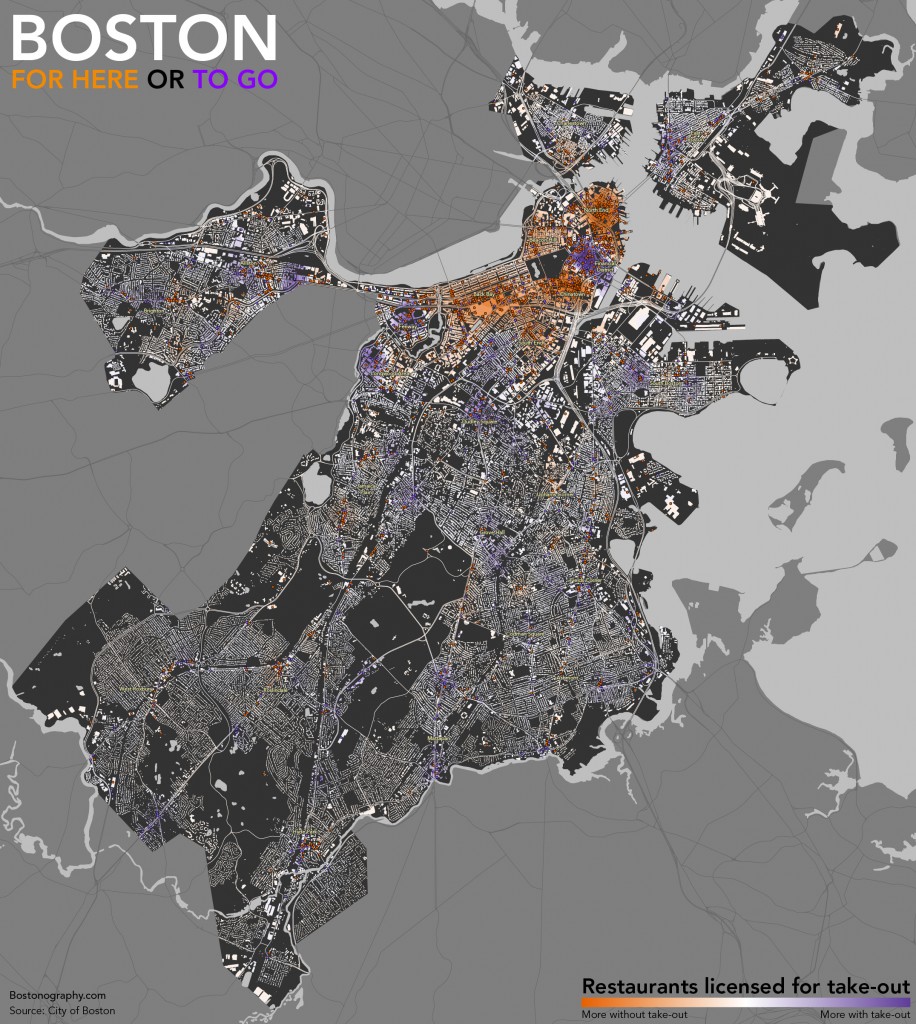
Yes, there is such a thing as a take-out neighborhood in contrast to a sit-down part of town. It’s not surprising if you think about it, but if you’re like me you may not have thought about it before. Consider the map above: orange colors mean more restaurants that do not offer take-out while purple colors mean more restaurants offering take-out. There are some stark but predictable patterns. The North End, Chinatown, and Back Bay restaurant scenes are more about the sit-down experience, while the Financial District caters to workers with many more take-out options. The former set are destination neighborhoods in some ways, drawing tourists and locals seeking Italian or Chinese cuisine, or perhaps simply “city” dining. The latter, along with the other hotspots around Fenway Park and the Longwood medical area, draws a population that needs to eat but isn’t looking to savor a meal.

The full Boston city map is linked below; give it a click. Most of the rest of the city tends a bit toward take-out options, which makes sense for the casual nature ordinary residential neighborhoods, although some of the squares—destinations for their neighborhoods—favor restaurants without take-out. What do you see in this map? Does anything stand out?

Boston: For here or to go

The map is based on restaurant license data from the city (a bit out of date but still generally useful), which is among a handful of datasets available at an obscure online location. There are apparently different licenses for restaurants offering take-out and those without take-out, allowing this comparison of 3200+ restaurants. Bear in mind that the take-out license does not mean only take-out but rather in most cases both take-out and dine-in service. Be aware also that the map is not as straightforward as it seems. The map shows hot spots of both types based on density, but these hot spots depend on one type being more dominant. If there were a dense area of restaurants split evenly between the two types, they would effectively cancel each other out and appear as the same neutral, whitish color as sparse areas.

Posted in General | Tagged , | 1 Comment

Allston: Trash v. Treasure Heap

It’s been nearly six months since Boston’s big moving day of 2011. Landlords will soon be demanding answers about lease renewals, if they aren’t already, and we will once again begin dreaming of that great holiday: Allston Christmas.

You may remember our call to map the detritus of moving day in 2011, and you may also remember that we never followed up with any results. The wait is over, folks; here are our moving day maps.

POINT:
ALLSTON IS A TRASH HEAP
by Andy

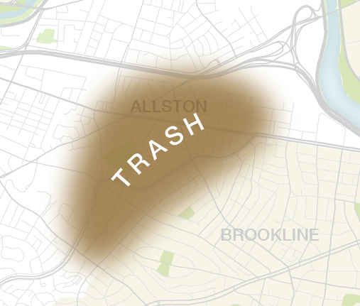
Allston trashmap

Allston Christmas field notesThanks to the few of you who sent us reports, but it would have taken an army to map and analyze all the junk on those streets—and the bedbug warnings attached to each piece of it. I went on a couple of bike excursions around Allston and kept detailed field notes such as the one at left, but it was an overwhelming task, and it really just amounted to trash everywhere. Everywhere that wasn’t occupied by a U-Haul truck full of next year’s trash, that is.

COUNTERPOINT:
ALLSTON IS A TREASURE HEAP
by Tim

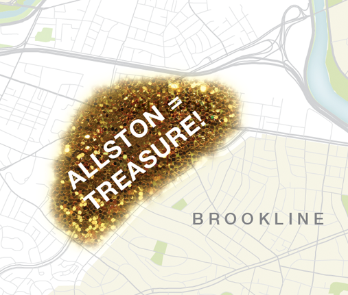
One person’s trash is another person’s treasure. Andy says Allston is a trash heap; I say it is a treasure heap! (No, it is not a ‘trove’; it’s far too large to be considered a ‘trove’.) Allston gets a bad rap for being untidy, noisy and… well, generally unpleasant. But we need to face facts. Without Allston, the rest of Boston wouldn’t seem nearly as nice. Every town needs a neighborhood filled with discarded furniture, derelict electronics and piles of parasite-ridden bedding. It is in light of these neighborhoods that our cities shine. Not to mention—there must be something valuable in that trash heap, right? Right?

– – –

Here are the data points we collected for Allston Christmas 2011. (If you don’t see the map below, clicky.)

Posted in General | Tagged , , , , | Comments Off on Allston: Trash v. Treasure Heap

Where to Buy Valentines in the 1800s

Your work day is done and you are getting ready to hop into your time machine to buy your sweetheart a valentine from 1800s Boston? Well, then we have just the thing for you! Courtesy of the Tufts Boston Streets database, we bring you four maps showing locations of confectioners and candy-makers through an era when sweets were booming in the Boston area (Cambridge has its own fascinating chocolate-dipped, candy-coated history).

Note: Boston’s road network, parks and extent of land were different in all of these views. Don’t use these maps to navigate your time machine.

Posted in Historical, Seasonal | Tagged , , , | Comments Off on Where to Buy Valentines in the 1800s

Thirteen neighborhoods: one city

If there’s one thing everybody knows about neighborhood boundaries in Boston, it’s that nobody knows where they are. But they’ll tell you you’re wrong if you try to draw lines. That’s fair enough, really—any line drawn will divide neighbor from neighbor. But the reality is that cities need to create discrete districts for many purposes, and this “hogmosh” seems to be controversial with some regularity.

Across the river, however, Cambridge has stable and—as far as I can tell—not so controversial neighborhood definitions. Apparently these are about sixty years old now. Thanks go to friend Katie B. for passing along this interesting 1953 report (PDF) on the establishment of Cambridge’s thirteen official neighborhoods.

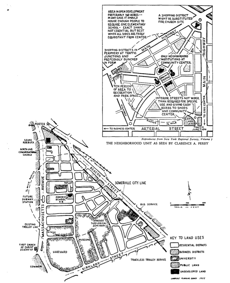
The report uses as a basis the “neighborhood unit principle” proposed by Clarence A. Perry in the 1920s and 30s. Under this idea, neighborhoods are mostly organized around civic institutions, most notably an elementary school. See this comparison of the ideal neighborhood to Neighborhood 8, now called Agassiz (and note the “future subway station” on Mass Ave).

The "Neighborhood Unit" in Cambridge

Anyway, read the document if it strikes your fancy. There are some other maps besides the one shown above. Here are few points and questions that seemed interesting:

  • Most of the thirteen neighborhoods are unnamed in this report, and most of those have since been given official names. Curiously, however, two are still known by their numbers: Area 4 and Neighborhood 9. Why have these remained nameless?
  • Boundaries look unchanged, with the exception of the boundary between neighborhoods 5 (Cambridgeport) and 7 (Riverside), which has moved from Western Avenue to River Street. Is it possible this came with the conversion of those streets to one-way? I don’t know when that occurred.
  • Toward the end of there report there’s a nice list of some established place names with a bit of history behind them. It’s a little fascinating!
  • We must note that while these neighborhoods are generally accepted for administrative purposes, they don’t necessarily coincide with how most of us think about the city. Some neighborhoods are clear, like East Cambridge. But Cambridge is often thought of in terms of its squares, and you won’t find, for example, a “Central Square” neighborhood—in fact that square is at the intersection of four different neighborhoods. It’s a difference between residential organization and commercial organization, perhaps. The city does have definitions of those “square” business districts for planning purposes, but they’re not the neighborhoods you’ll see numbered on those shiny visitor parking permits!
Posted in Geography, Historical | Tagged , | 9 Comments